The nostalgia-inspiring sets of Mad Men might have brought the phrase ‘mid-century modern’ back into the common vernacular, but in truth, this is an interior style that never completely fell out of fashion.
One of its hallmarks – and the reason for its enduring appeal – is its focus on functionality. “The principle behind many of the iconic mid-century furniture designs was ‘form follows function’, which simply means that the furniture was designed for its purpose without unnecessary features,” says Diana Ribarevski of Coco Republic. Best of all, the era’s natural materials and organic, sculptural forms are completely compatible with almost any contemporary home. Groovy, baby.
Here 10 are elements of mid-century style to adopt when considering decorating your own pad.
1. Build
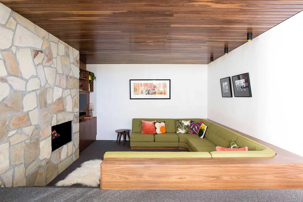
Mid-century architecture experimented with different forms that reflected how people lived in their homes. The new concepts of open-plan living and indoor-outdoor flow are still fundamental to architecture today.
2. Design
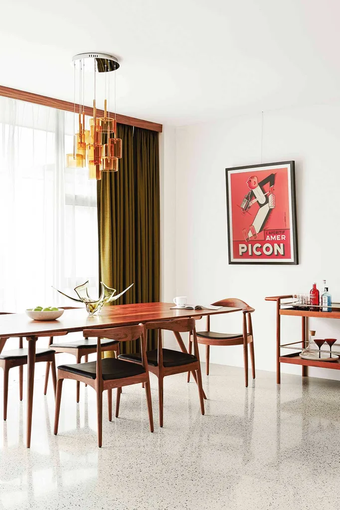
“The furniture silhouettes work well with new fabrics or textures,” says Rhiannon Orr of Design Orr Build. “When reupholstering an original chair, it can adapt to the style of your home, yet still nod to its beginnings.”
3. Accessories
The emphasis is on artisan design. “Anything with that handmade nature will work well,” says Rebecca Pountney, interior designer, Yellow Letterbox. Think mouth-blown glass, hand-thrown ceramics and wall-hung weaves.
4. Style
It is the marriage of sculptural form with practical comfort that has made pieces of the era so covetable. “MCM design holds a huge emphasis on anthropometric and ergonomic elements,” says Rhiannon.
5. Source
“For the materials, the broadest spectrum can be seen in a mid-century kitchen,” says Rhiannon. “Vinyl floors, timber joinery, tile splashbacks, brick and graphic patterns can all be thrown together.”
6. Finishes
Ceramic is a mid-century material that’s easy to embrace. “The tactility of handmade ceramic pieces is coming through in lighting and tiles,” says Rebecca.
7. Texture
Feature walls clad in timber are enjoying a comeback, whether crafted from solid wood or economical timber-look laminates.
8. Paint
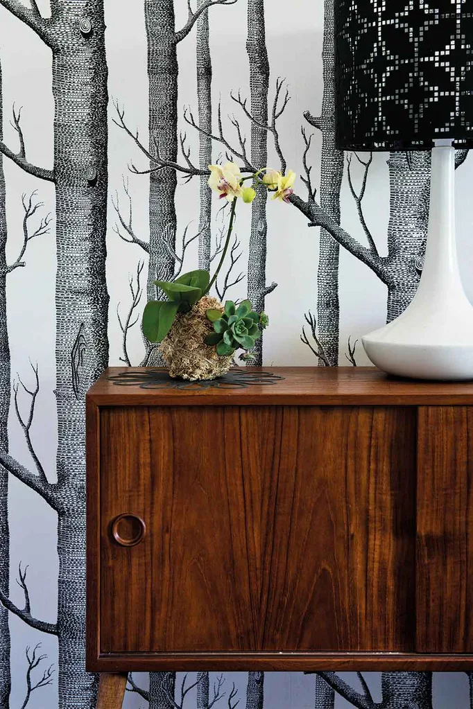
The palette demands a warm white. “Warmer greys also work well with mid-century style,” says Rebecca. Try Dulux Flooded Gum or Haymes’ Pale Mushroom series.
9. Palette
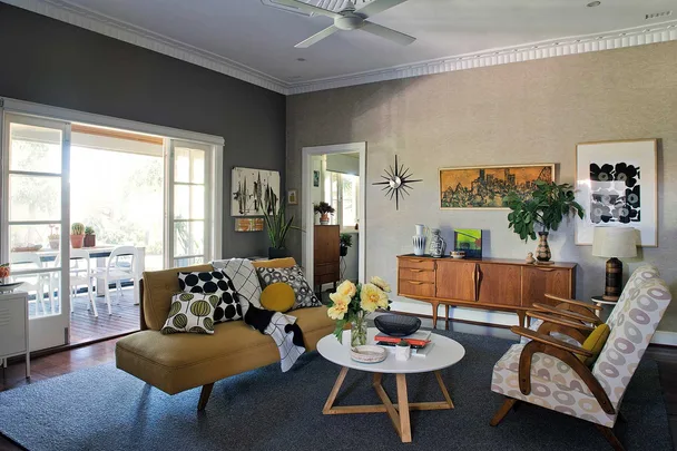
Re-imagined for today, hues are a little moodier. “For an accent colour, the golden yellows of the ’50s have moved towards chartreuse and mustard,” says Sarah Stephenson of Wattyl.
10. Sources
An updated look has been influenced by the re-emergence of foliage in interiors, says Sarah. “The combination of these new yellows and green leaves is a perfect contrast to the clean lines of midcentury modern furniture design.”
You might also like:
Home tour: a mid-century dream
The Australian mid-century furniture brand making a comeback
A fresh and modern take on a vintage home
 Jody D'arcy

