With Leigh’s feature fireplace to work with and the first elimination looming the teams have outdone themselves in the latest House Rules renovation.
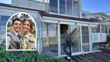
Nestled into the sand dunes on Victoria’s beautiful Mornington Peninsula lies Leigh and Kristie’s half-finished home dream home. The beginnings of the renovation carpenter Leigh has so far carried out alone – with every piece of timber, every nail and screw put in place with his own two hands.
The lived-in beach shack and adjoining an incredibly spacious new building came with a vision from the toughest team to please yet. It was difficult for Leigh to leave his vision in the hands of a bunch of rookie renovators, all of whom are competing for their place in the competition so working to please not just the homeowners, but three judges who don’t all share Leigh and Kristie’s “California Cool” aesthetic.
Leigh & Kristie’s rules:
1. Chill out with “California Cool” style
2. Get earthy with copper, timber, limestone and concrete
3. Deck out the entry hallway like a luxury yacht
4. Be bright in the family bathroom and laundry
5. Make the master suite a flowing coastal retreat
Bonus Room – Guest Bedroom
Bonus Room Rule – Give us a luxe surfie crash pad
Josh & Brandon: (Entry, Lounge & Powder room)
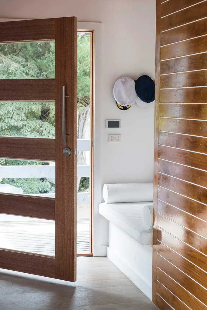
In the entry Josh and Brandon had their own specific rule of “Deck out the entry hallway like a luxury yacht”. With the help of designer Carolyn Burns-McCrave, they took their design to the next level by building an upholstered seat into a nook at the entrance, which Drew said they had “perfectly lit” with wall sconces. Professional upholstery completed the bench seat in the luxury style with a stunning white fabric finish.
Along the wall in the hallway, their carpentry skills came to the fore with them creating a timber-lined wall and finishing it to a high shine – just like the impressive carpentry skills it took to execute, according to the judges. White fill lines along its length to create the effect of a luxury yacht and the judges were blown away, Wendy called it “Absolutely fabulous,” and LLB saying “It’s doing such a good job in making this entryway feel welcoming and warm,” said LLB.
“For me it’s great the boys have come out and shown the skills that they have – they shine!”
Drew Heath, Architect, House Rules Judge
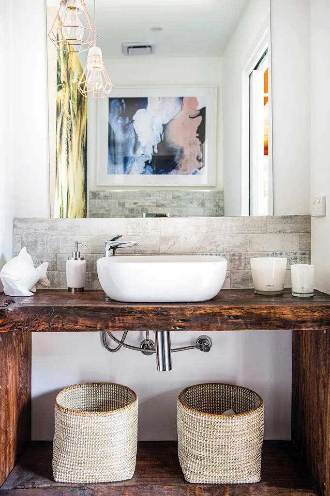
In the powder room Brandon created a hand-made vanity from a salvaged railway timber found locally and whilst as a decorative statement piece it impressed Wendy, Drew was disappointed not to see the luxury yacht design carried through to the powder room as well.
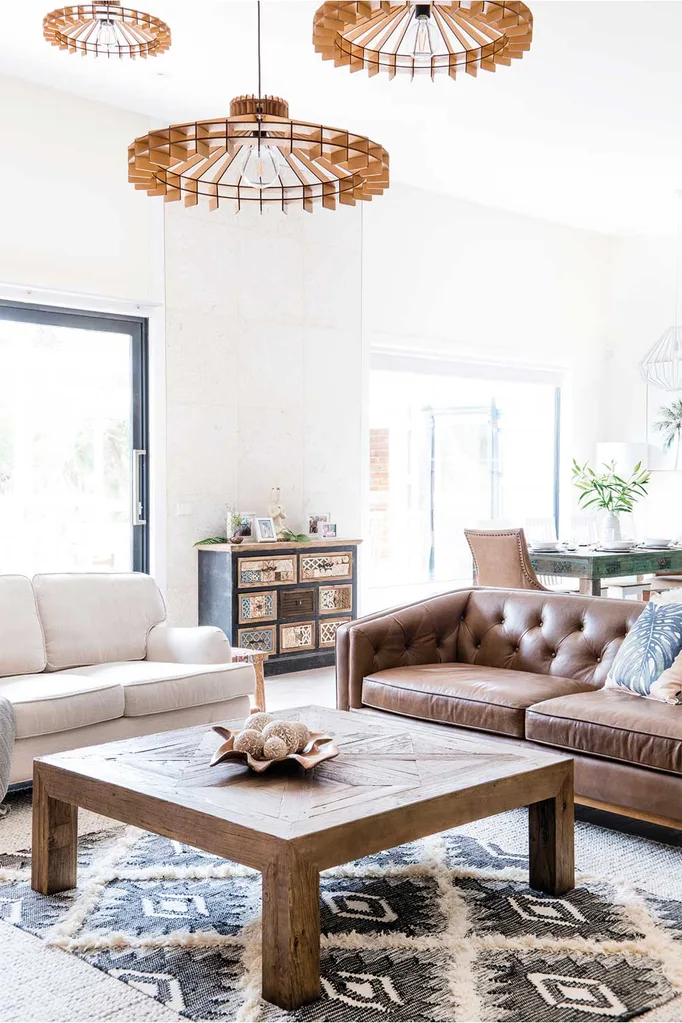
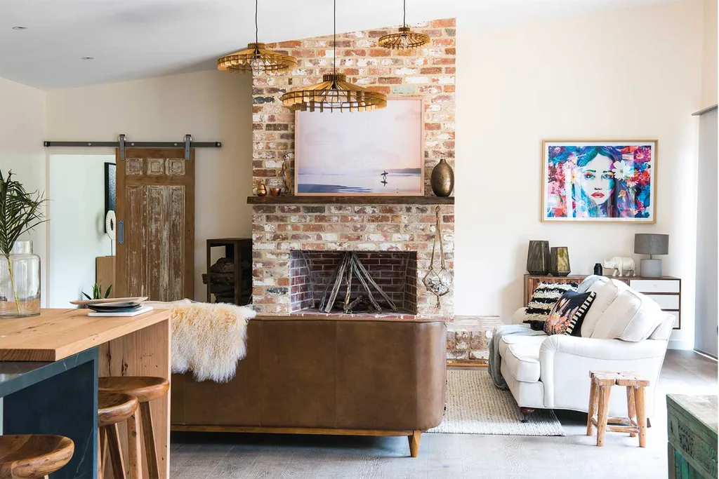
The brothers had the unenviable task of taking on Leigh’s prized fireplace in the lounge room – the only element close to finished of his renovation and his pride and joy. Josh and Brandon laid the brick hearth with care and a nice detail of rounding the top two course of brick, which was universally admired, however the boys choice of artwork was too poppy for the space.
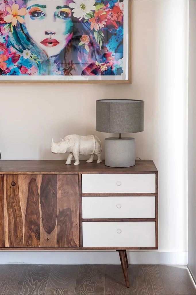
A total judges’ score of 26/30 put the brothers on top of the leaderboard so far and included a 9/10 from Laurence who said, “This week my braves, you have officially got better, WAY better, BIG TIME better!”
Kim & Michelle: (Bathroom, Walk-in robe, Hallway)
The mother and daughter team struggled to finish their zone the week, with the sheer scale of their zone, including the most enormous hallway so far in the competition. The shabby finish on their wallpaper and painting in the hallway failed to please the judges. “Wendy called the space, “A tragedy.”
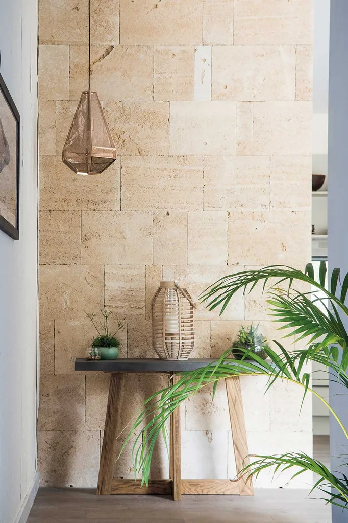
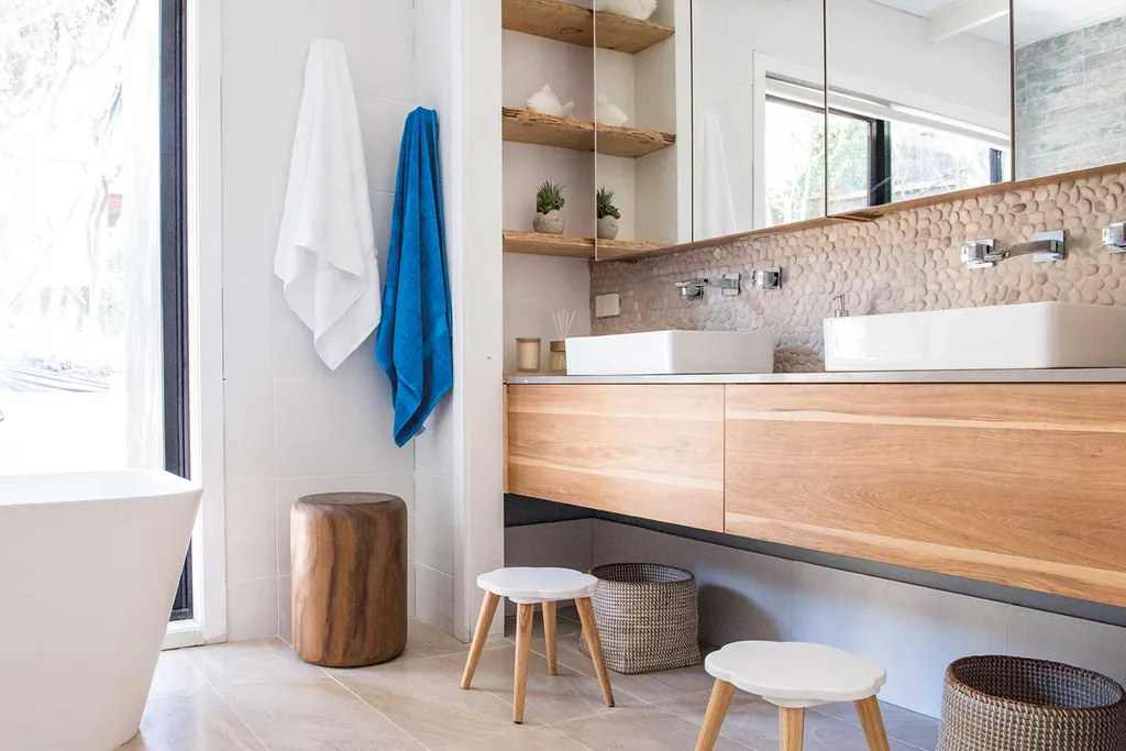
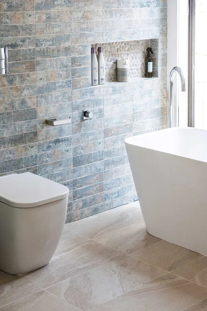
In the bathroom they redeemed themselves however, getting the layout right and hitting the House Rule of “Get earthy with copper, timber, limestone and concrete” with a clever use of timber cabinetry, a textured stone splashback, washed out blue- and timber-look wall tiles and a “genius” basin nook with rustic timber shelving. The judges were impressed with the storage and practicality of the design, LLB describing it as having a, “Wonderful boutique hotel sexiness to it.”
“They’ve worked out that neutral doesn’t necessarily mean boring”
Laurence Llewelyn-Bowen
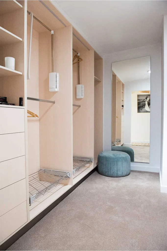
Their walk-in wardrobe, whilst functional and neat was, Wendy said, “Missing the beauty,” they were looking for.
Toad & Mandy: (Laundry & The Den)
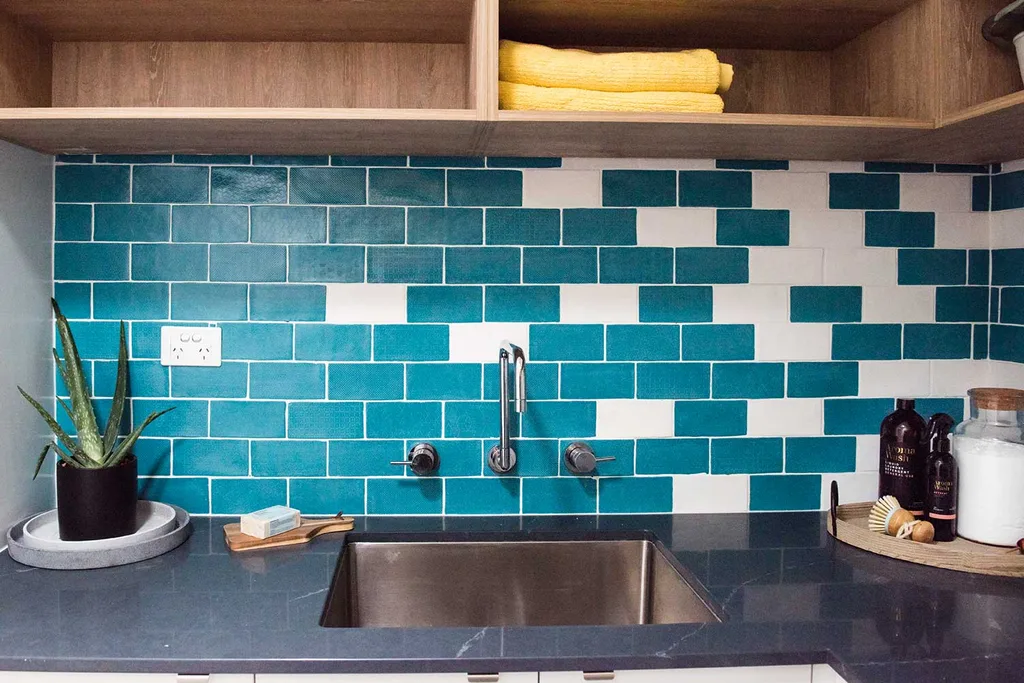
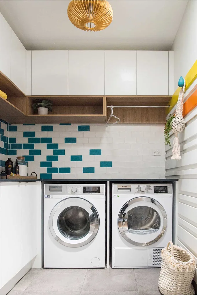
Toad’s idea of using a concrete style finish in the benchtop laundry was a success with Wendy, who found the laundry “super functional,” for its, “Great storage ideas,” and pops of colour in the splashback tiles and wall hooks. LLB felt Mandy’s design had, “Too much going on.”
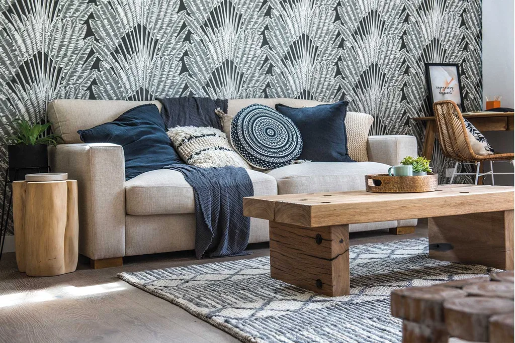
In the Den Toad’s handmade a chunky little timber coffee table statement piece was a hit with Wendy but didn’t wow Drew and Laurence. With their choice of high-end block-printed wallpaper LLB said, “I love the way they’ve ticked the off California Cool look, kind of into boutique LA hotel.”
They received a total of 22/30 from the judges.
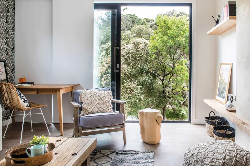
Jess & Jared: (Kitchen & Kobe’s room)
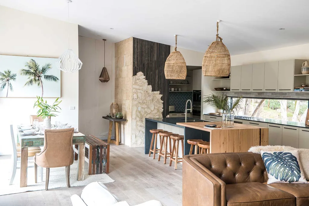
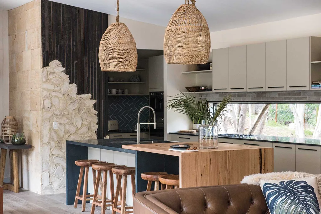
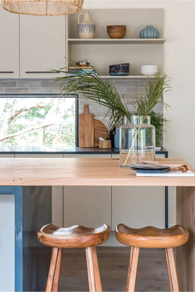
In the kitchen Jared created a bespoke feature wall using limestone found on site and it seemed his efforts were wasted as it failed to strike a chord with the judges, who loved the intention but not the finished result. Elsewhere in the kitchen ticked the “California Cool” rule with the clever use of mixed textures, lighting and design. Architect Drew was excited by the addition of a floating timber bench over the fixed stone kitchen island, both in answering the house rules and the concept of a raw textured being placed on top of sleek stone finished joinery. ” I love that space that floats underneath. “I just think this is a beautiful kitchen,” said Wendy.
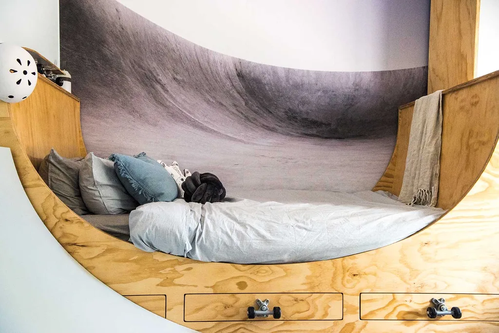
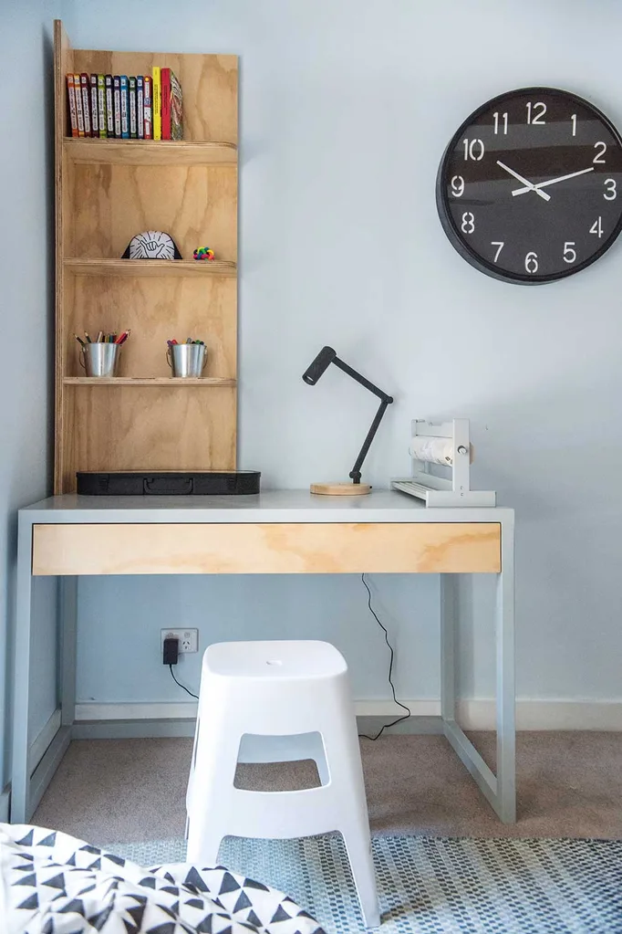
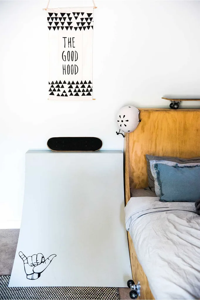
Kobe’s request for his room to “look like a skate park” was beautifully executed with a sweeping timber plywood bedframe referencing the curve of a skate ramp and placed in front of a wave mural across the wall. LLB called it “very clever decorating,” saying. “Jess and Jared have taken the essence of what skateboarding is all about and used it as design.”
Wendy felt that six-year-old Kobe would love the room for years and Laurence said it was memorable and thought he might steal the idea for his own grandson’s room!
Jess and Jared scored a total of 23/30 from the judges.
Chiara & David: (Dining room & Master Bedroom)
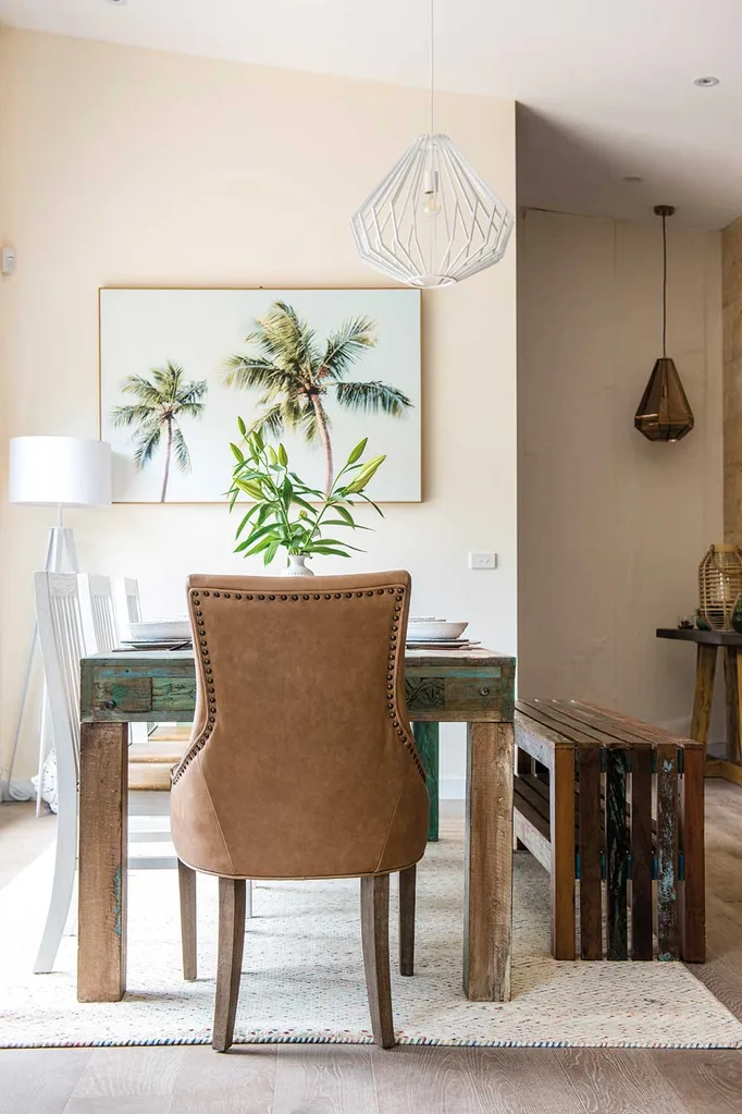
The hot-headed couple pushed themselves to breaking point this week with an eclectic, beautifully styled dining room featuring a mixture of upholstered and bench seating which the judges would have preferred to surround a larger dining table.
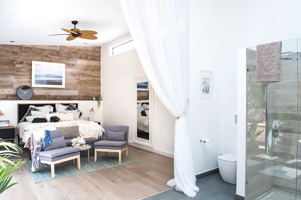
In the master bedroom Chiara and David used real timber for the feature wall behind the bedroom, upcycled from the front of the house and given a colour wash and it was appreciated by the judges.
“There’s a kind of a can-do, “Why not?” attitude to the way that they decorate which I find very exciting”
Laurence Llewelyn-Bowen
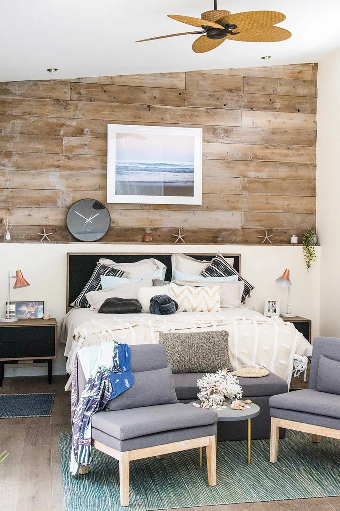
They created an intimate room in a large space with a pair of upholstered chairs at the end of the bed and layering of beautifully textured bedlinens, cushions and throws. Chiara and David scored a total of 22/30 from the judges.
Mel & Dave: (Ensuite, Billie’s room and Bonus room)
Mel and Dave were challenged with being given the bonus room this week by top-of-the-leaderboard team Chiara and David adding it to their workload.
Their statement piece of a handcrafted timber surfboard won them professional painters for their entire zone and took an enormous amount of pressure off their time and the finished result.
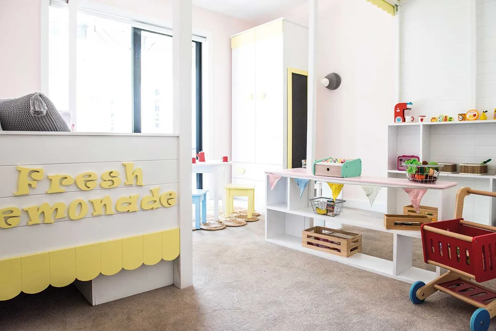
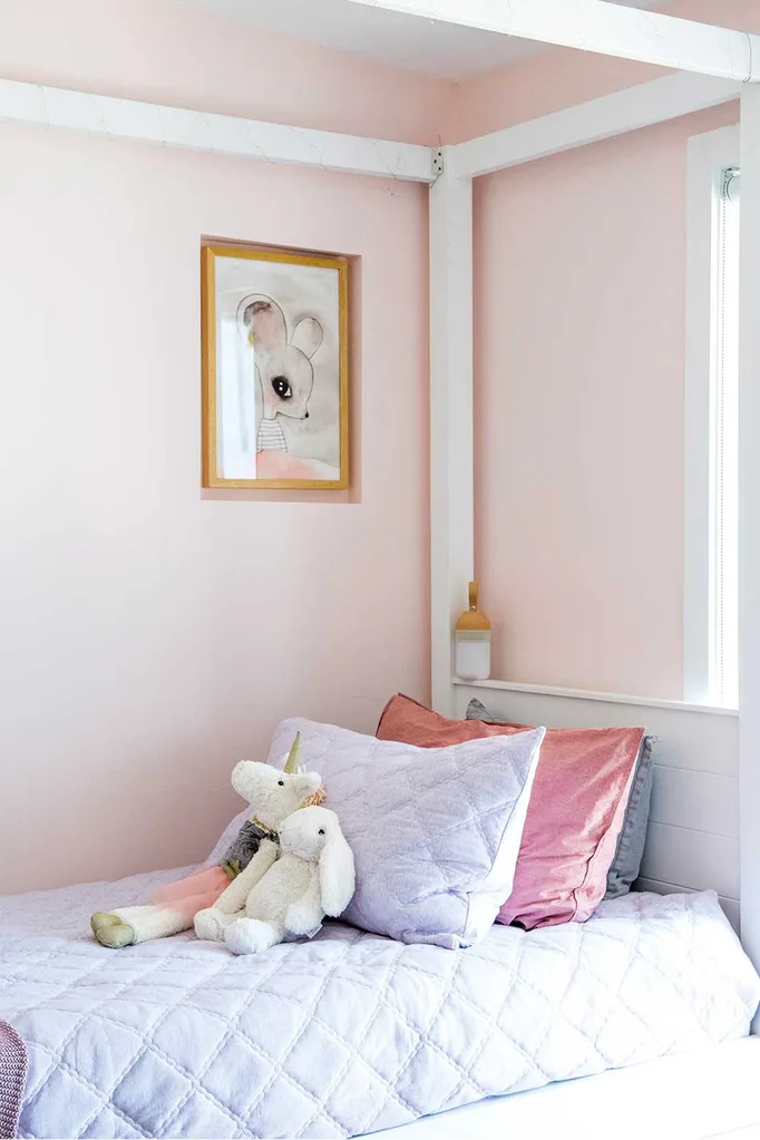
Daughter Billie’s bedroom delighted Wendy with Mel’s sweet custom-designed and made lemonade stand/shop furnishing the entire space.
“Let’s create spaces that are perfectly designed in which children can play”
Laurence Llewelyn-Bowen
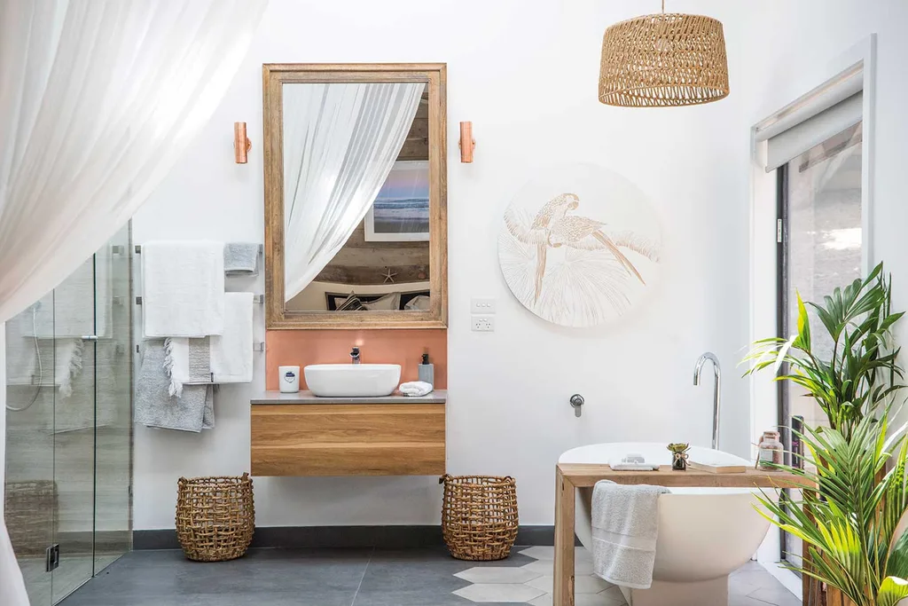
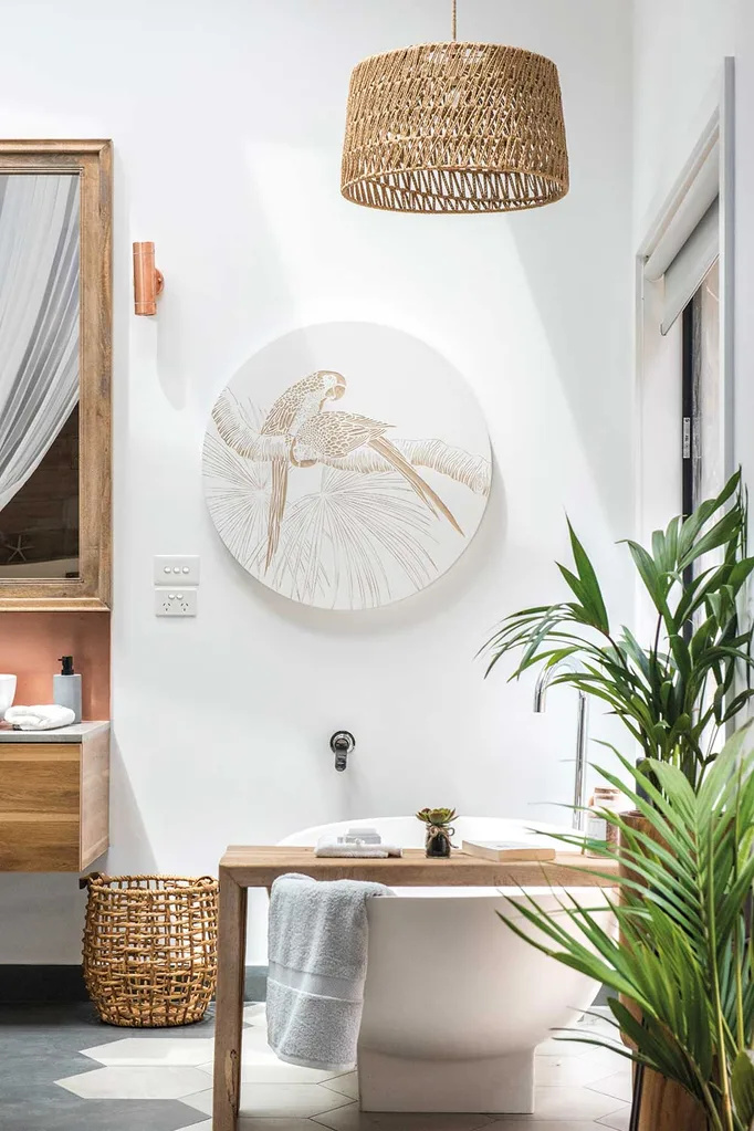
The ensuite caused tension for Mel and Dave all week as it formed part of the mastersuite, along with Chiara and David’s master bedroom. In the end the results of their decorating and design efforts were breathtaking, with Wendy described the room as “genius,” Mixed finishes of pale timbers in the vanity, mirror and shelving echoed the blush copper tones in wall lighting and artwork. A statement freestanding bath was positioned effectively in front of the floor-to-ceiling window to take in the bushland view outside.
“Seamless, flowing, light-bright California chic is proved here to be dramatic and glamourous and show-stopping,” said LLB, describing it as, “One of the most exciting bathrooms we’ve seen.”
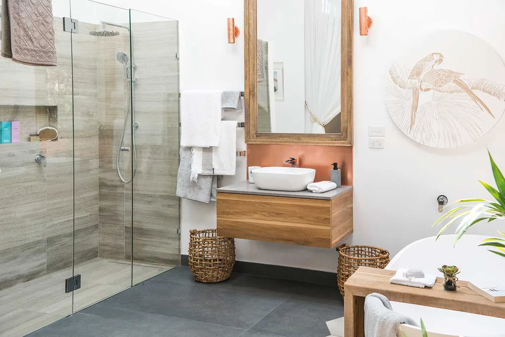
The position of the toilet was controversial however as Drew felt it needed to be more private than the “Hollywood” curtain allowed.
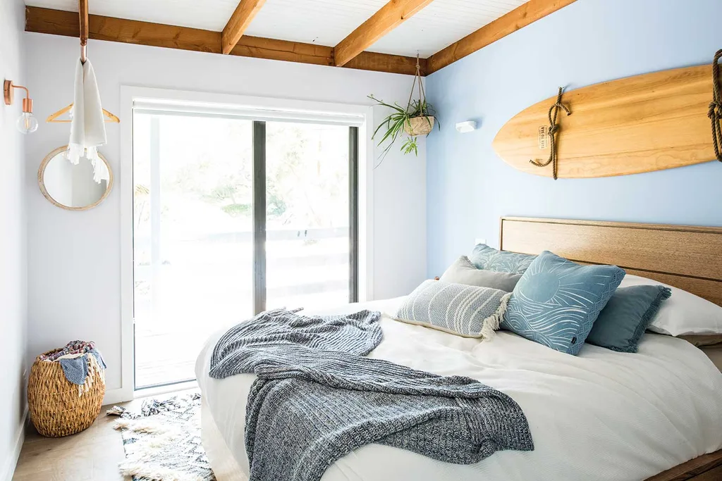
In the bonus room, the “luxe surfie crash pad” look was spearheaded by the statement piece surfboard hung above the bed to great effect but the judges had expected more, describing the pale blues and earthy textures of the room as having a “subtle and safe,” Scandi surf feel to it, but felt it lacked creative energy. Wendy said they had done an exceptional job with great quality ideas and finishes.
Mel and Dave scored a total of /30 from the judges, including a 9/10 from both Wendy and Laurence.
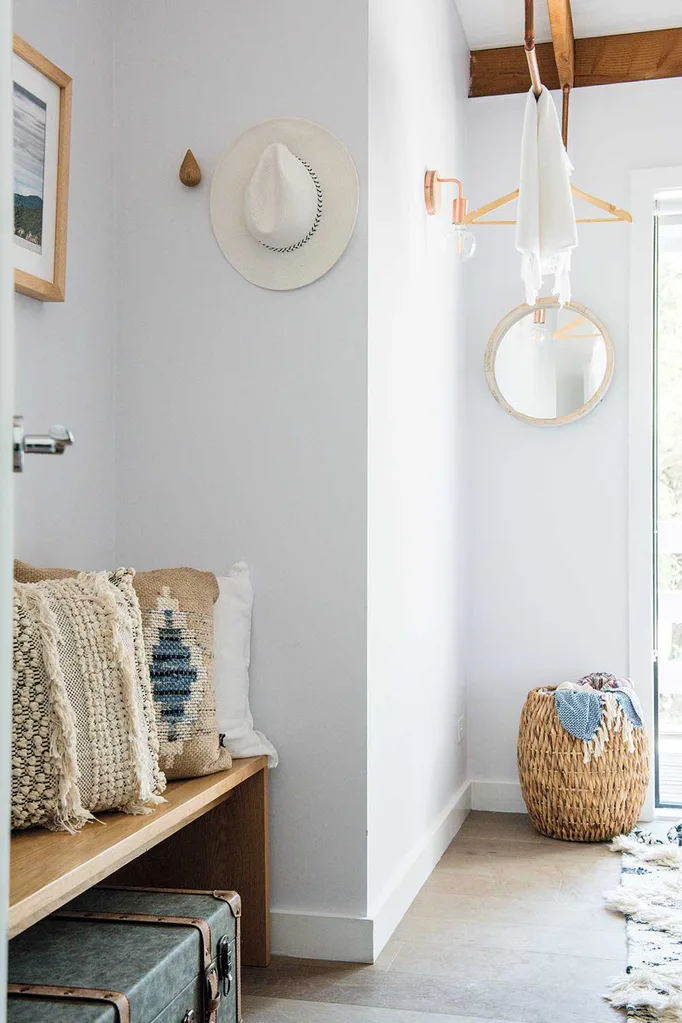
Josh and Brandon are currently sitting at the top of the leaderboard but the teams now await feedback and scores from home-owners Leigh and Kristie, who are expected to be harsh judges and to provide scores strategically, and with the competition in mind.
You might also like:
House Rules reveal: Kim and Michelle’s Tweed Heads home makeover
House Rules: Three design ideas for your bathroom renovation
House Rules QLD reveal: Hamptons style wins over judges

