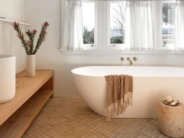
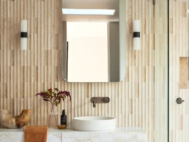
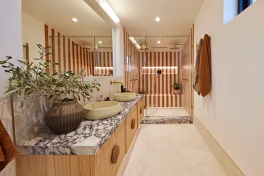
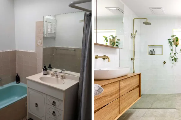
There was no question that wide and sweeping changes were needed for Interiors Addict blogger Jen Bishop’s “nanna” bathroom.
WATCH: FIRST LOOK at House Rules High Stakes
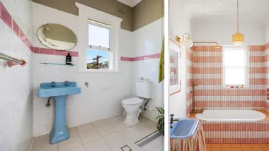
With a separate toilet, it was way too small to function as the main bathroom of a four-bedroom family home, and it was dated with beige tiles and a turquoise bath.
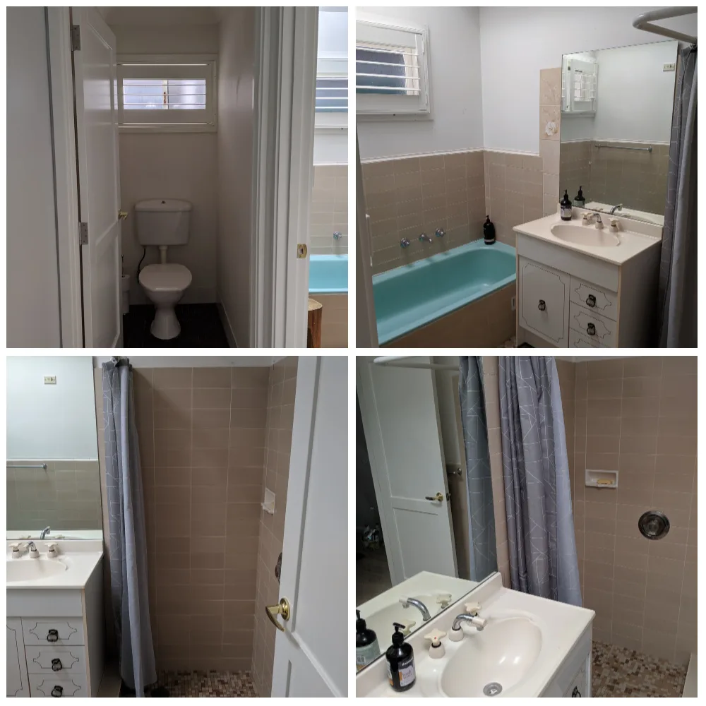
“As the rest of our house was renovated and transformed around it, it really did stick out like a sore thumb!” explained Jen.
“I really wanted something elegant and classic, in keeping with the rest of the house and not in danger of dating.
“I think bathrooms and kitchens are very expensive rooms to renovate so you have to consider them still looking good in five or 10 years’ time,” she said.
The biggest challenge for the renovation?
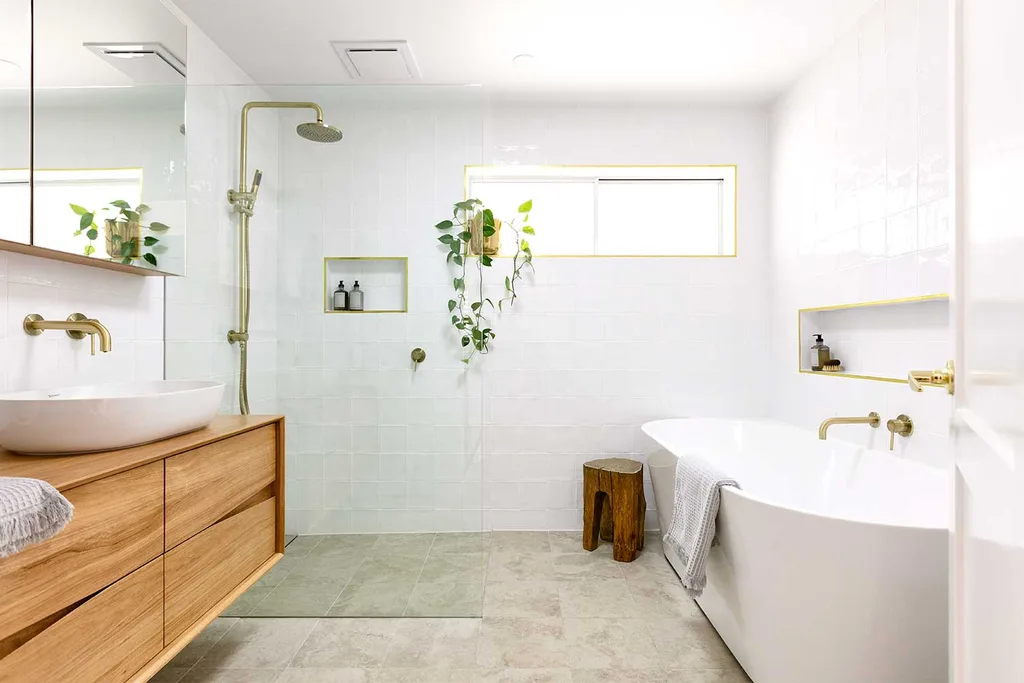
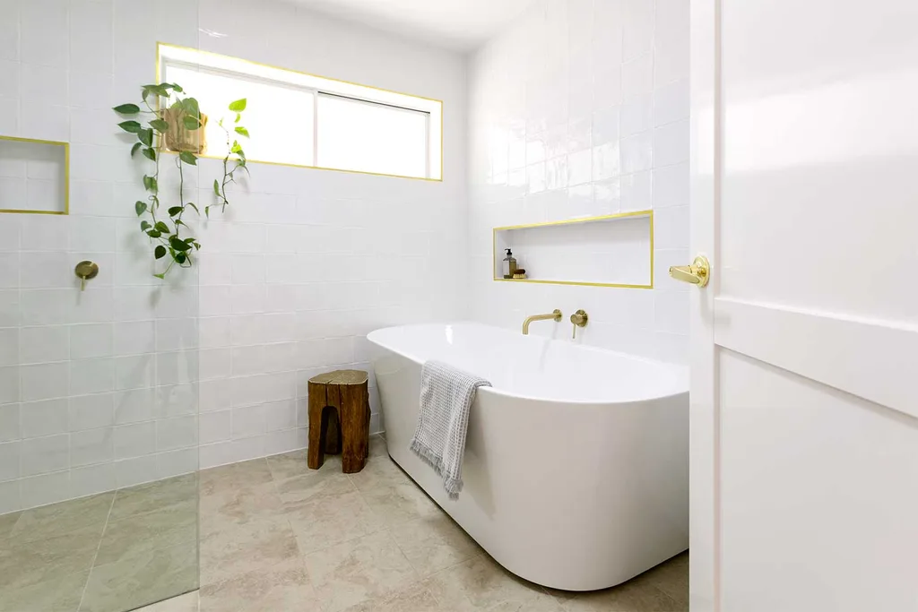
“The floor plan was the biggest challenge, specifically fitting in a bath and a separate shower without it looking cramped,” said Jen.
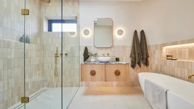
“We went through at least 10 versions of the floor plan but I’m so happy with what we chose and how it turned out. Opting for a shower without a door made all the difference to how spacious it feels and meant we could also comfortably fit a large bath. As someone who has a bath every night, this was really important to me!”
Let’s take an in-depth look around Jen’s new bathroom.
Tiles
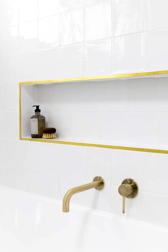
“The tiles couldn’t have turned out any better. I knew I wanted an organic looking, handmade tile and something a little different to the ever popular subway (did them in my last bathroom reno) so I went for a square and white grout.
“I was visualising walls of white with texture and light bouncing off the gloss finish, and that’s exactly what I got! Keeping the floor tile simple has definitely added to the sense of space.
“The design of this bathroom was a lot about restraint, like choosing not to have a feature tile in the niches, but instead going for a brass tile trim.”
Jen used:
Floor tile: Noosa Matt Travertine Look Grey tile from TileCloud
Wall tile: Avalon Gloss Large Square White Tile from TileCloud
Tile trim
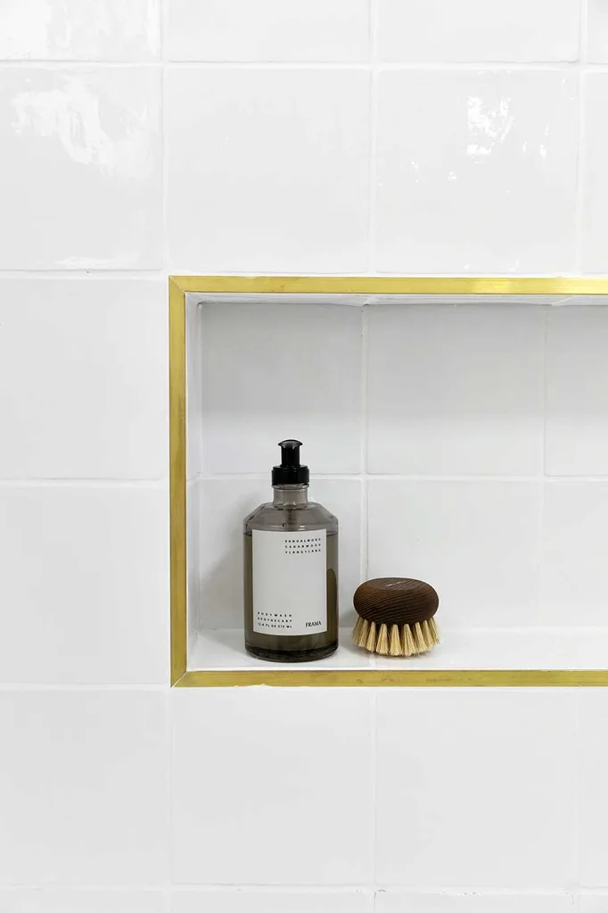
“Probably one of the cheapest things in the bathroom, but one that gets a heap of comments and compliments, is the brass tile trim, which I found online.
“It caused me a fair bit of angst because although chrome would never have worked, it was quite a brave choice and I knew it wouldn’t match perfectly with the tapware.
“But white wouldn’t have looked half as good! And without a feature tile in the niches, they needed this little je ne sais quoi!”
Jen used: L Angle brass trim from Tile Stone Paver
Bath
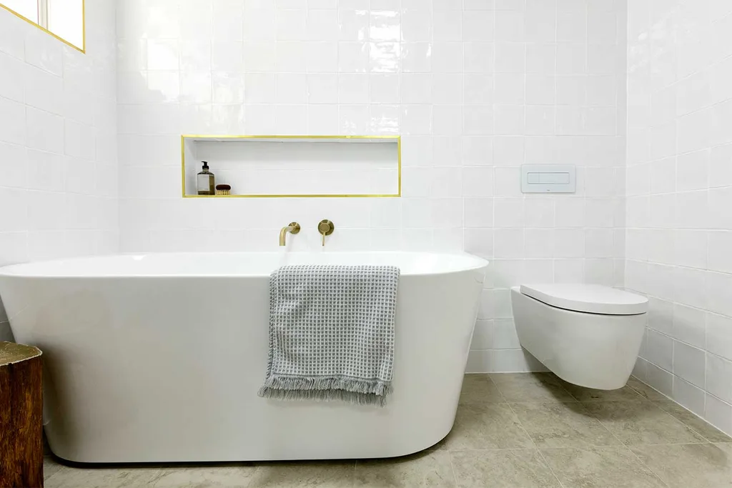
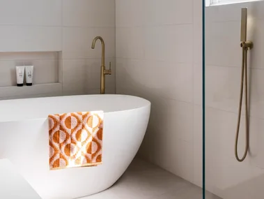
“I cannot rave enough about this bath! I have always been against squashing a freestanding bath into a small space because I don’t think it looks great visually, not to mention the issue of cleaning behind it.
“So when I started to see a few of these back-to-wall or D-shape baths on the market I knew straightaway this was my perfect solution! So while it is technically freestanding, it is right up against the wall on one side.”
Jen used: Eden Freestanding 1700mm Bath from Highgrove Bathrooms
Vanity
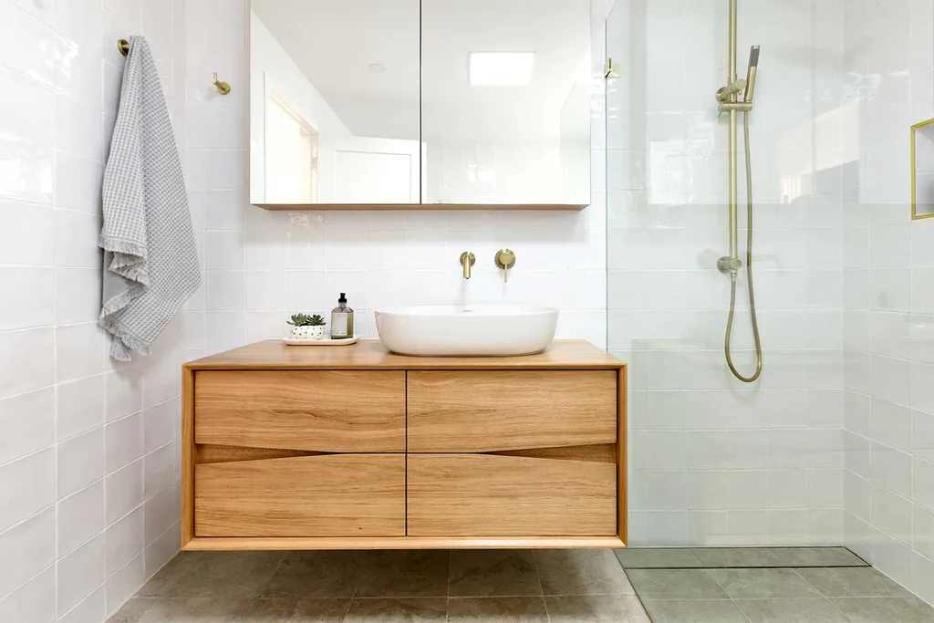
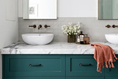
“After getting custom blackbutt solid timber vanities from Ingrain Designs in our last bathroom, I didn’t even consider getting the vanity for this room from anywhere else!
“But while blackbutt is quite a statement, knotty timber, I wanted something more subtle here so we went for reclaimed Tassie oak.”
Jen used:
Vanity: V1 Bathroom Vanity from Ingrain Designs (available in a choice of timbers and sizes)
Mirror cabinet: Mirror Mirror from Ingrain Designs
Tapware and shower
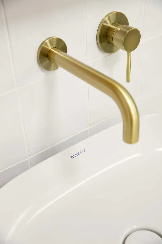
“This was one of the easier choices because I’d already used a Meir tiger bronze tap in my kitchen and I love it!
“And as well as wanting to make the bathroom somewhat consistent with the kitchen, I was always going to choose gold! If you’ve seen the rest of our home, that will be obvious!”
Jen used:
Meir Tiger Bronze round wall mixers, round combination shower rail, round curved spouts, round toilet roll holder, bath popup waste, square floor grate and robe hooks (instead of towel rails).
Toilet
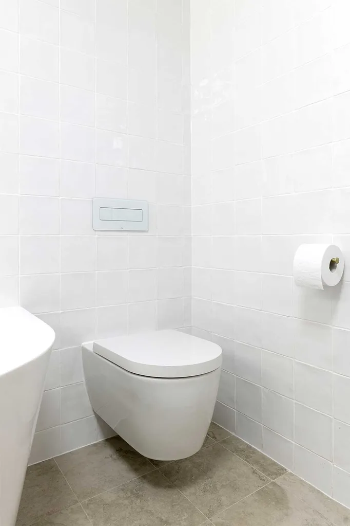
“I’ve never cared much for fancy toilets or putting much thought into which one I’d like, but that changed with this bathroom.
“This wall-hung one not only adds to the sense of space, but it is so simple and compact, it just blends in.”
Jen used:
Duravit ME by Starck Wall Mounted Toilet from Bathe
Viega Visign white glass flush plate from Bathe
Viega Eco Plus in wall cistern from Bathe
Basin
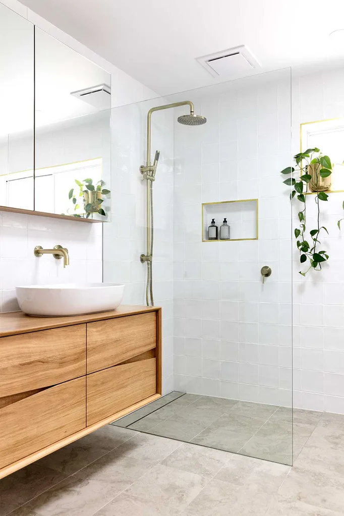
“I love a lot about this basin, from its generous size to its white ceramic waste (so sleek) to its beautiful and simple curved shape.
“I also learnt from my last bathroom reno that it would be best to right align rather than centre it, giving more useable space to the left side. It’s a large sink (600mm wide) but it works perfectly on the 1200mm vanity.
“You can’t go wrong with an established brand like Duravit and once I told the staff at Bathe what I was after, they helpfully shortlisted a few for me and it was love at first sight!”
Jen used: Duravit Luv Washbowl 600x400mm from Bathe
Love Jen’s bathroom renovation? Click here to see what she’s done with the rest of the house.
You might also like:
Three ways to keep your bathroom renovation costs down
Before and after: small and savvy bathroom renovation
 Jacqui Turk
