By analysing the bathrooms contestants produce during an entire season of The Block, you can really track the evolution of their design and renovating prowess. After all, they’re thrown into the deep end early on, tasked with designing and building entire bathrooms from scratch as early as Week 1. Because there are so many trades and decisions involved with a bathroom renovation, it’s very easy to make mistakes, especially if you’ve never renovated before.
It’s an experience Block alumni, expert renovators and Reece ambassadors Alisa and Lysandra (aka the kitchen and bathroom queens) know all too well. “The Block showcases projects with incredibly tight schedules, which is a stark contrast to the reality of bathroom projects that typically extend over 3 to 4 months,” says Alisa, adding, “The planning phase alone is significantly more complex than what is portrayed on television.” So what does it really take to create a winning bathroom? We sat down with Alisa and Lysandra to unpack this year’s Block bathrooms and uncover their insider tips for making a dream bathroom a reality.

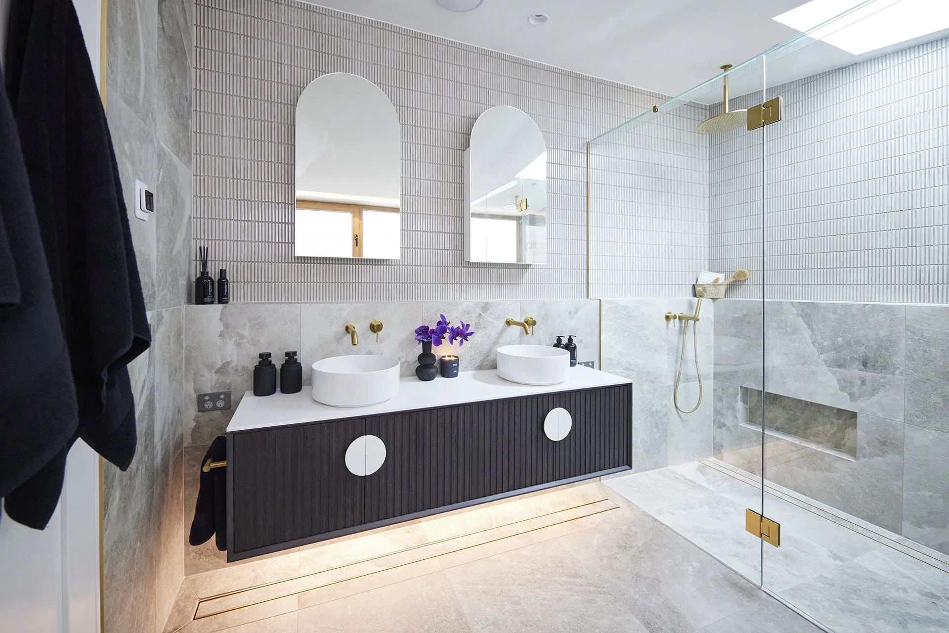
1. Lovely layout
Every great bathroom starts with a carefully considered layout. “In our experience, the biggest mistake people make when designing their bathroom is inadequate attention to the layout,” says Lysandra. “Examples of this include positioning the toilet as the first element you see or failing to optimise the available space, leading to ineffcicent and less-than-ideal bathroom arrangements.”
In week 4, Steph and Gian unveiled a gorgeous downstairs powder room complete with a custom vanity, but sadly, all the judges could see was the toilet – placed right in front of the door. “The impact halts for me because I walk in, and all I see is a dunny,” said Darren.

Likewise, Kyle and Leslie’s ensuite bathroom over in House 1 received mixed feedback after their elegant design choices were weighed down by a poor layout resulting in a cramped double shower. “I’m frustrated because it looks and feels luxurious but it doesn’t work,” said Shaynna.

What would The Design Duo do?
“When we approach bathroom planning, our first step is deeply understand the users’ needs, allowing us to optimise the layout accordingly,” says Alisa.
2. Visual consistency
Visual consistency is what separates good bathrooms from great bathrooms. “Consistency in design is crucial for creating a harmonious and visually pleasing bathroom environment,” says Lysandra, who recommends deciding on a specific design style early on. “Take, for instance, a coastal-themed bathroom. Here we’d opt for lighter timbers and natural elements like travertine to evoke a beachy feel. In an urban, modern bathroom, we might introduce the drama of striking marble paired with darker timber accents,” she says.
When Kristy and Brett unveiled their first bathroom for House 3 in week 1, they received mixed feedback from the judges. And most of it related to their attempt to unite three different design styles: Moroccan, contemporary and industrial. Darren said the styles just didn’t work well together in the space.

But, by the time ensuite bathroom week came around, Kristy and Brett had well and truly found their groove in the bathroom. Darren desscribed the ensuite as “Clean, crisp, contemporary.” They also nailed the layout, “Everything is just in the perfect spot,” declared Marty.
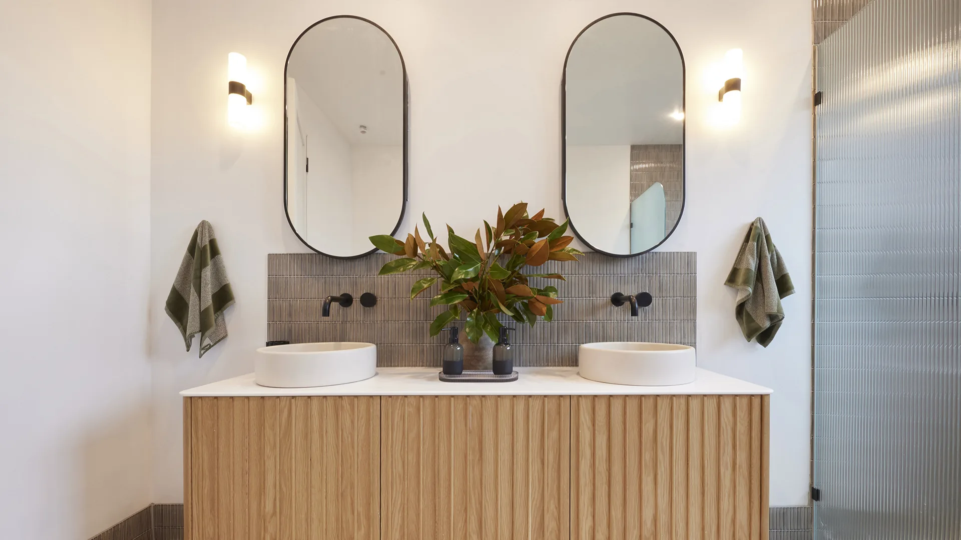
What would The Design Duo do?
Alisa and Lysandra say the best way to achieve a visually consistent look in the bathroom is to first, select a style, and secondly, to get physical samples of everything. “Getting the samples to see in person really is key!” says Lysandra. “We source physical samples of all of our chosen materials as seeing and feeling the materials in person provides the truest representation.”
3. Beautiful materials palette
The secret to creating a bathroom that feels organic and luxurious, rather than cold and sterile, is natural materials, says Lysandra. And while Eliza and Liberty took this quite literally, installing a moss wall in House 5’s downstairs bathroom, that’s not exactly what The Design Duo mean. “We love using natural stone such as marble, travertine and limestone,” she says.
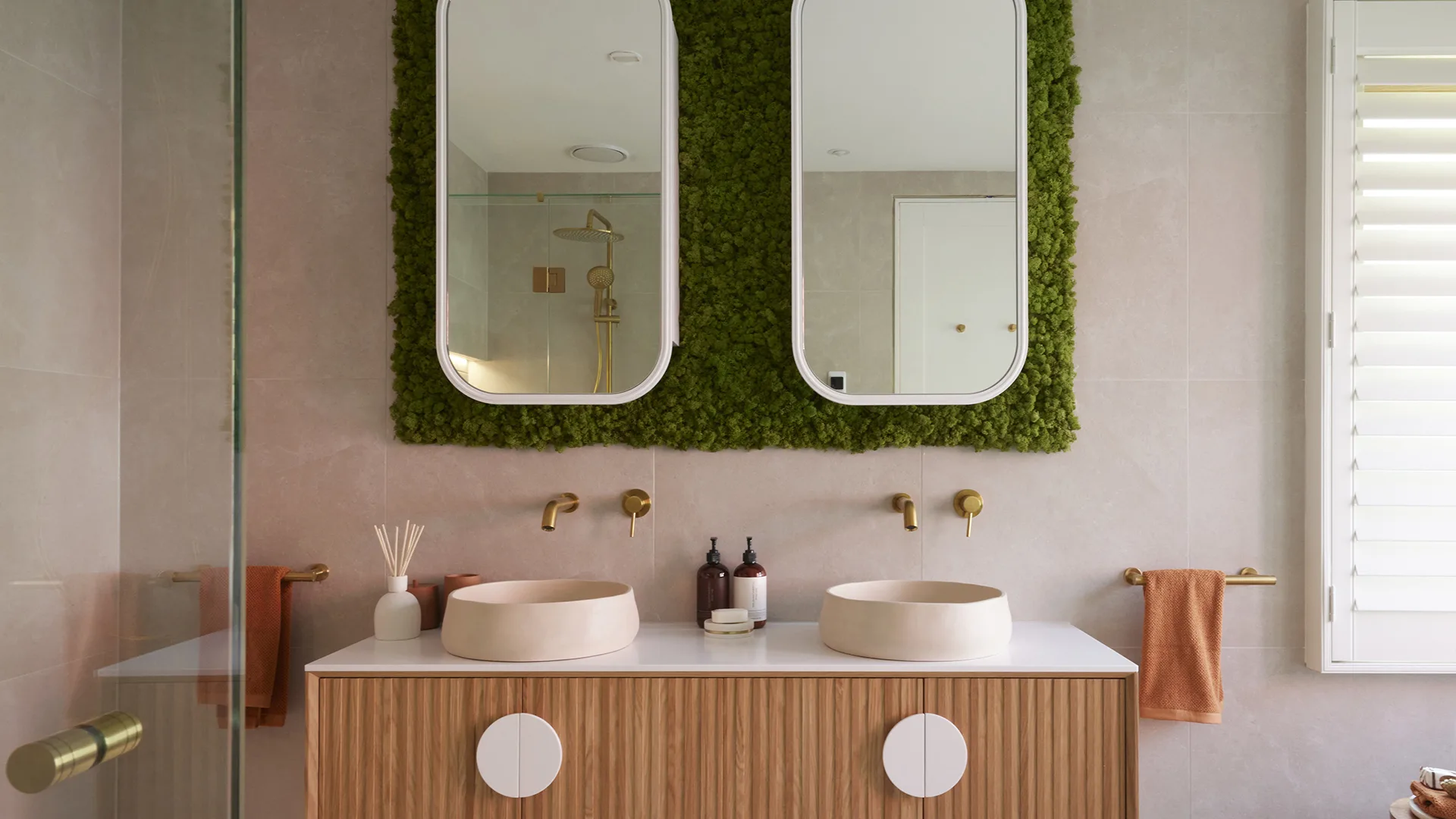
The next step is to bring in the bling. To do this well, be consistent with the choice of metals selected for taps and towel rails and by selecting pieces that complement, rather than compete with, the room’s standout features.
Leah and Ash’s winning downstairs bathroom featured a highly consistent materials palette, which ultimately gave them the edge over the other contestants. The pair created interest by continuing the same floor tiles up the wall and laying marble tiles on the wall’s upper half in a herringbone pattern. “Large, continuous tiles on the floors and walls create a seamless look,” says Lysandra.

What would The Design Duo do?
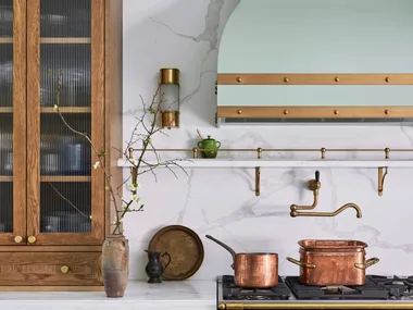
Once natural materials have been factored into the room’s design, The Design Duo complete the look by bringing in warmth and bling. “We find ourselves drawn to brass accents in bathrooms – whether it be through the tapware or accent light fixtures – brass is such a great way to add warmth.”
4. Storage, storage, storage
“It is essential to prioritise ample bathroom storage,” says Alisa. “Recessed shelving and niches are great for storage without sacrificing room, and we love a mirrored recessed shaving cabinet to offer both storage and light reflection.”
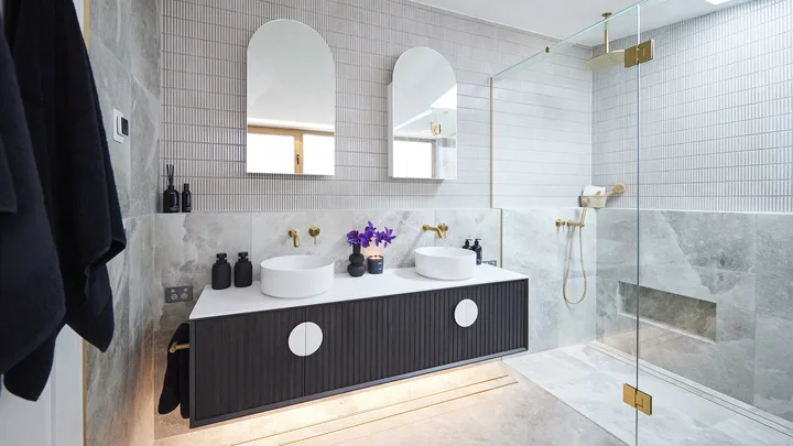
Storage is one element The Block contestants are constantly getting pulled up on, particularly during bathroom weeks. While Kyle and Leslie included double vanities in their ensuite bathroom, the judges felt that the storage in each vanity was not quite enough for a practical main bedroom suite.
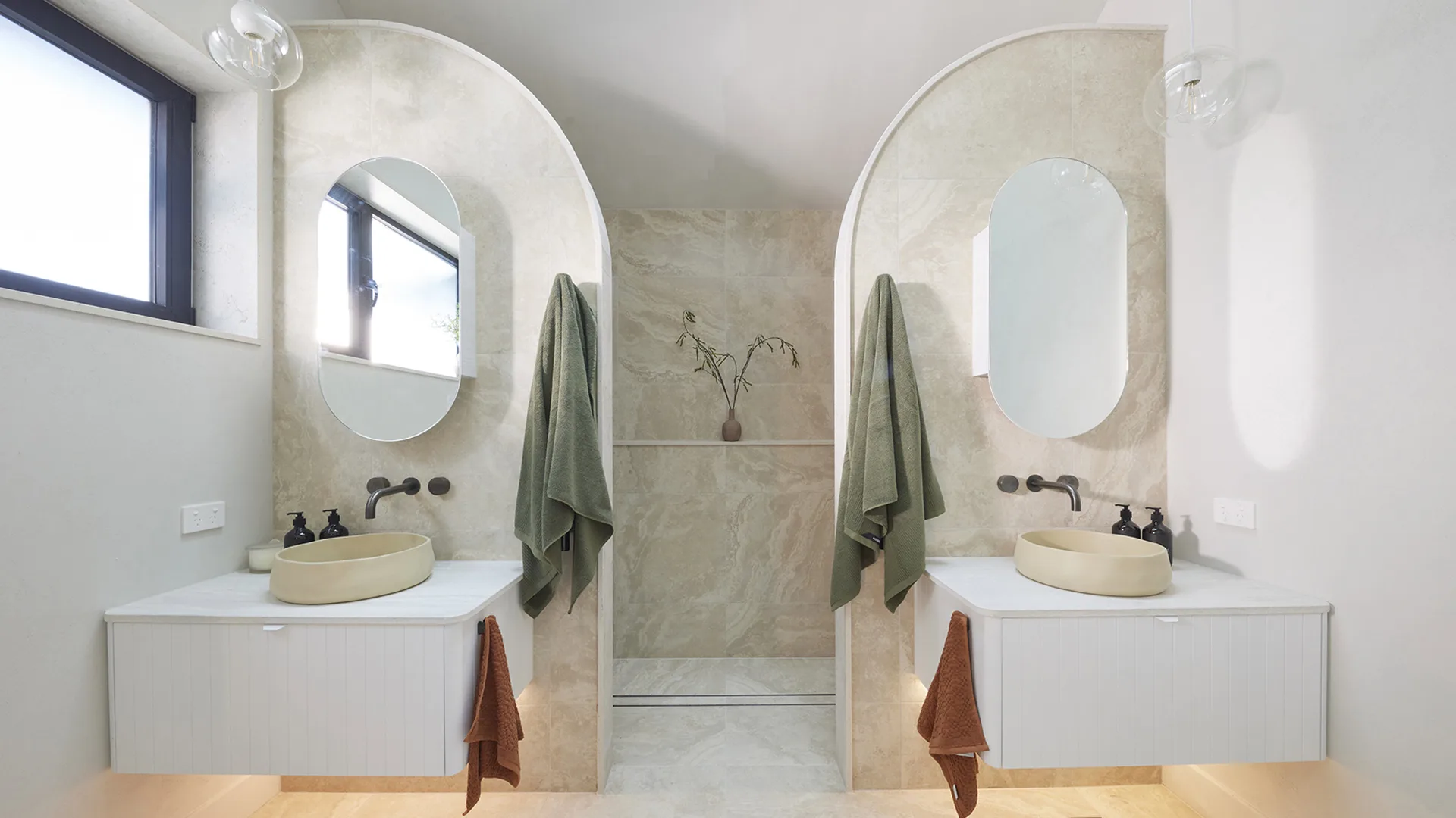
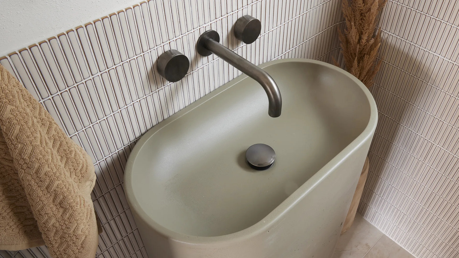
On the flipside, there are some instances where you can get away with less storage. During downstairs bathroom week both Kyle and Leslie and Steph and Gian in House 4 delivered powder rooms. Kyle and Leslie’s was even nicknamed SRIBH aka the “smallest room in Block history”. While the vanity they chose (The ‘Molli’ freestanding vanity in Olive) had zero storage, a powder room doesn’t have quite the same storage demands as a full-sized family bathroom or ensuite.
What would The Design Duo do?
Great storage is what keeps a bathroom looking consistently neat and tidy, rather than cluttered with products, soaps, candles, spare towels, toothbrushes, etc. So in a way, it’s inextricably linked with two other very important bathroom design ideas: maximising space and creating a wet room that’s easy to clean.
“Wall-mounted fixtures, such as vanities and toilets, save space and simplify cleaning,” says Alisa, adding, “You do have to be clever with your choices to optimise the space.”
5. Lighting design
A comprehensive lighting design is what really separates rookie bathroom renovators from the pros. “Creating the perfect task and functional lighting in a bathroom is essential for both practicality and ambiance,” says Lysandra.
When Leah and Ash unveiled their bold, dark and moody studio bathroom in week 1, the judges didn’t exactly love the styling, but they were unanimous in the fact that the couple had nailed their lighting design. LED strip lighting even highlighted the room’s Venetian-plastered, curved ceiling.

During ensuite week, Steph and Gian missed the mark by blocking natural light from the room’s windows by poorly placed vanity mirrors. “I’ve been on the Steph and Gian train for a long time, and I’m jumping off at this stop,” said Marty who declared the layout was all wrong.

What would The Design Duo do?
“We both have a few must-haves that we always consider,” says Lysandra. “First, ensure your overhead lighting is placed correctly so you have the light diffused nicely over the face of the mirror, ensuring you can see everything without glare or shadow. It’s important that the light isn’t coming from behind your head. We then love to combine this with wall sconces or pendant lights to add a layer of visual interest to the bathroom. We also consider natural light when designing bathrooms and, if possible, include windows and skylights strategically.
 Nine
Nine
