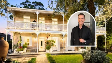
Interior decorator Liz took a leap into the property market, purchasing this adorable terrace in Sydney’s inner-west, seduced by both the area and irresistible charm of the home itself. And while the house was perfectly liveable as it was, crumbling foundations, a tack-on extension and a lack of structural support for the upper storey were a ticking timebomb that meant a small home renovation was always on the cards.
“I just loved that the house had character,” says Liz, who shares the home with husband Rob and children. “I’ve always loved older homes and their period details. A square box doesn’t have the same appeal to me.” The pair spent four years dreaming and scheming on how to make the most of the home’s assets. “Over that time, I would tear things out of magazines and collect ideas from different sources,” recalls Liz. “I had quite the wish list by the time we came to renovate. Of course renovation budgets needed to be kept, so some of the wish list was put to the side for future dream homes, but everything else was the result of years of planning.”

Who lives here?
Liz, an interior decorator; Rob, an analyst and their two children.
Tips for having a beautiful home with children? Liz: “Storage – you can never have enough. The smaller the child, the more ‘accessories’ they seem to have. If you can manage to hide all the coloured plastic away at the end of the day, you can enjoy your home as an adult.”
What is your favourite part of the home? “I love our open-plan kitchen/dining/lounge because of the natural light and the view to our backyard. The bedroom, as it is such a relaxing and calming space. I also love our children’s rooms as they are the special little spaces.”
What would you bring to the next house? “If and when we move, I would love to take our pendant lights in the hallway. They are the first thing I see and I still love them every day.”

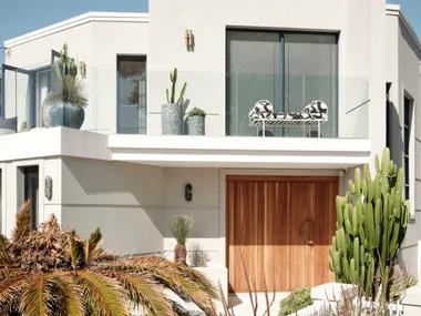
“Before we renovated, the house was a lot more colourful; the front door was red and we had a lot of red accents throughout. Then my husband said he wanted a black door like 10 Downing Street, and that started it – we decided to carry the black elements all the way through.”
Liz
The renovation proceeded with all the joys and perils you would expect of a period home. “As is so often the case with old homes, we hit a lot of curve balls along the way with the renovation,” says Liz.
“The foundations all needed to be redone and there was absolutely no structural support for the upstairs – it was a complete tack-on in the ’50s, so it was lucky it lasted that long. Sadly, a lot of the budget went into things you can’t see.”

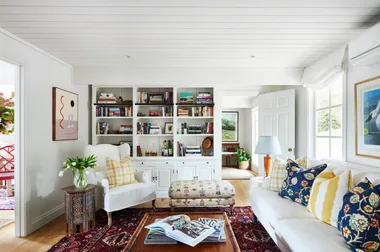
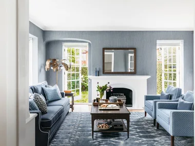
Renovation complete, Liz has kitted out the home in contemporary classic furnishings, pieced together over the years. Designer splurges (as the budget allowed) are matched with high-street steals and quirky objects.
Although Liz, through her work, has an eye for the perfect piece, the house is far from a show home; the overwhelming feeling is one of warmth and welcome. “This is where we live – we have friends and their children here all the time,” she says. “We were never going to have a house where you can’t wear shoes inside or eat on the sofa. This is a house to live in, not to look at.”

Living room
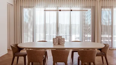
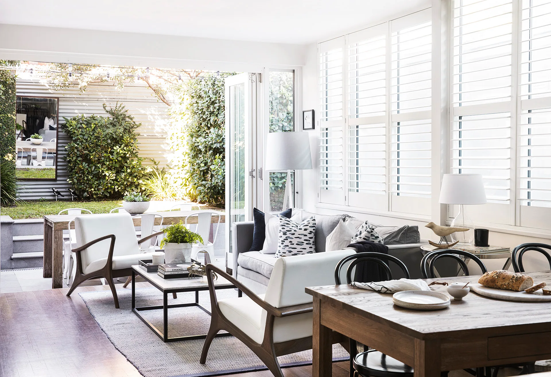
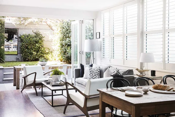
The chief focus of the renovation was to replace the existing configuration at the rear – a separate 1950s kitchen, a brick wall and a single door opening to the backyard – with a more modern floor plan, to create an airy and open space for entertaining and where their two young children could play.
As an interior decorator, Liz is well versed in emphasising a room’s best attributes; here, she included plantation shutters, which bounce light around the room to enhance classic furnishings, including a pair of Coco Republic chairs and a coffee table from Temple & Webster.

Kitchen
With structural issues draining the budget, Liz and Rob had little left to spend on their dream space when their builder told them about a solid but dated kitchen he was pulling out elsewhere.
“It had gold hardware and a black benchtop and didn’t fit in at all with the design I had envisaged,” says Liz. “We put on silver hardware and new Caesarstone benchtops with a nice wide profile, and it has worked out perfectly.” Try Gumtree or eBay for similar bargains.


Subway tiles and Shaker-profile cabinets give the kitchen a Hamptonsesque vibe. “I’d describe my design style as timeless,” says Liz. “I don’t like interior fads and things that date quickly.
While I might throw in some new decor pieces here and there, I haven’t really changed anything in six years.” With lots of storage and spacious worktops in Caesarstone Organic White, the kitchen is wonderfully functional. But for the couple, who love to entertain, the most important aspect is its openness to the rest of the space.


 Photographer: Chris Warnes | Styling: Sami Simper

