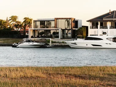
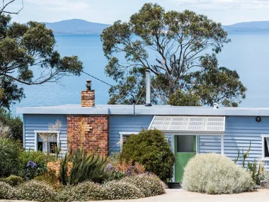
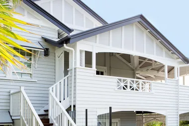
Teams worked together against the clock to create a love-filled sanctuary in the home Mikaela & Eliza share with their Mum in Yallingup WA to create an elegant beach style sanctuary where House Rules judge Wendy Moore said she’d be happy to live.
With the early room reveal resulting in a tranquil haven in Eliza’s bedroom and a dining room worthy of it was time to pour hearts and souls into the rest of the renovation – ultimately creating a
Mikaela & Eliza’s House Rules:
1. Give the house a coastal heart
2. Think beach for your colour scheme
3. Bring nature in to nurture
4. Create a cool, tropical resort for Eliza
5. Celebrate Mikaela’s adventurous soul
Tim & Mat: Master bedroom, laundry and dressing room
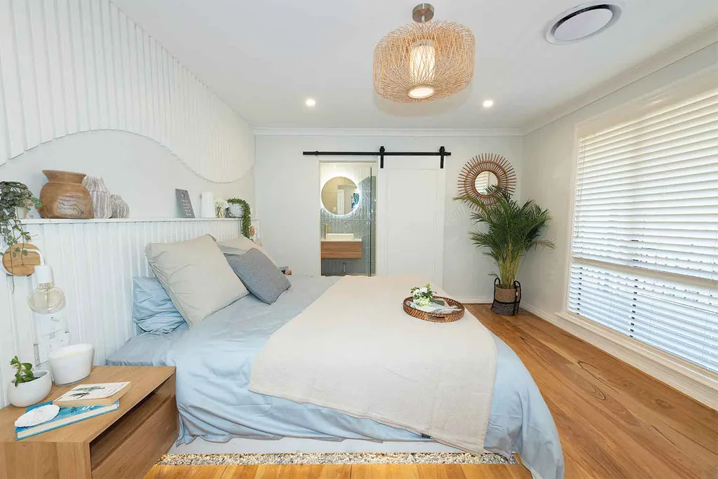
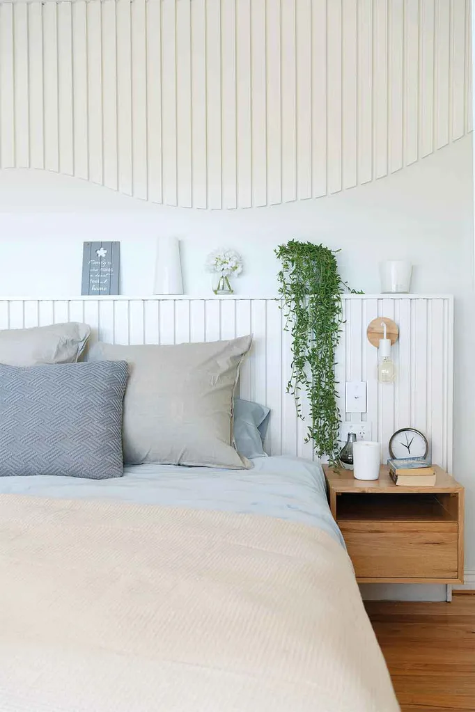
Loads of storage in the dressing room impressed the judges and LLB was “Blown away by how romantic,” the chippie brothers managed to make the master bedroom feel with their wave-inspired feature wall above the bed.
The pebbles were a miss in terms of practicality, but the boys’ styling generally impressed the judges.
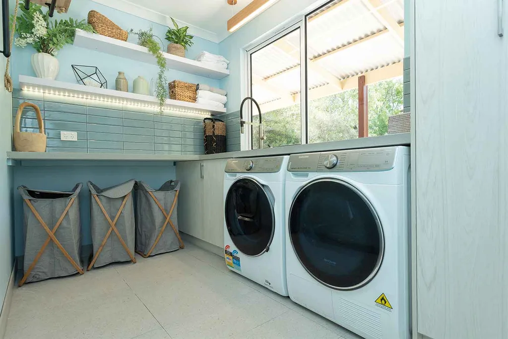
The calming colours and generous storage, benchtops and layout in the laundry made a terrific impression on the judges.
The movable rack was, “A huge waste of space,” according to Wendy, but she said that in general Tim & Mat are creating really lovely rooms, and that their styling continues to improve. A total score of 23/30 was awarded.
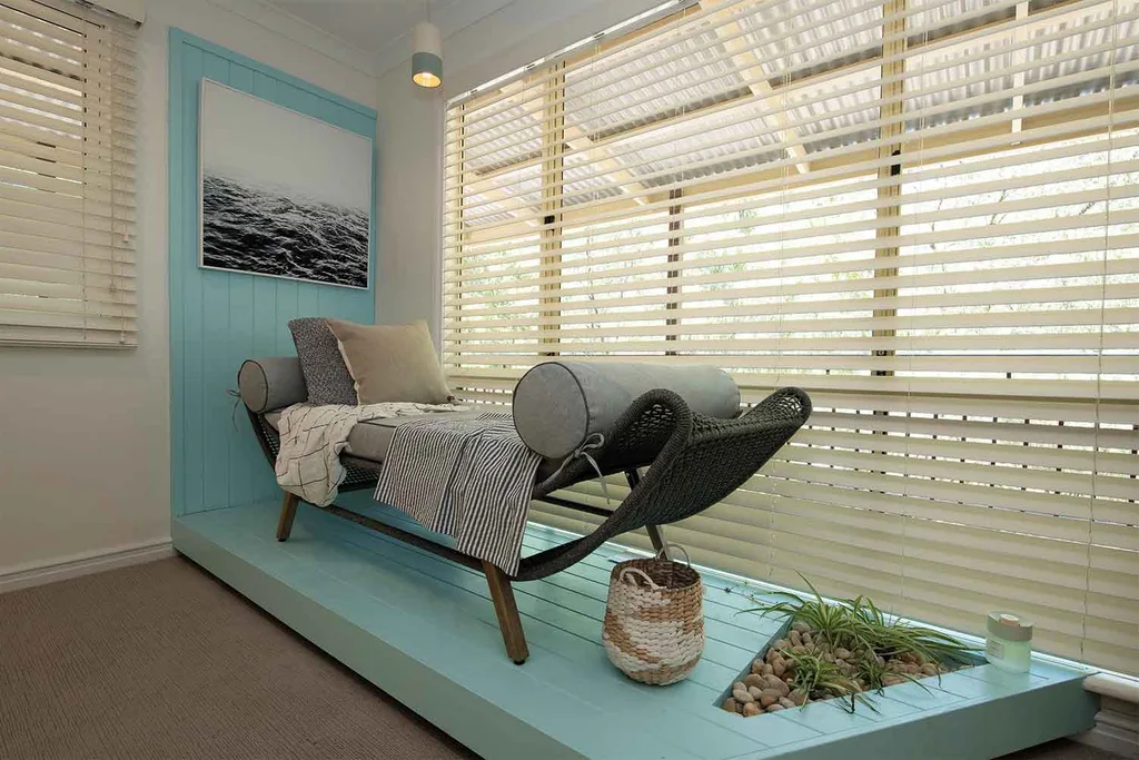
Shayn & Carly: Kitchen and Eliza’s room
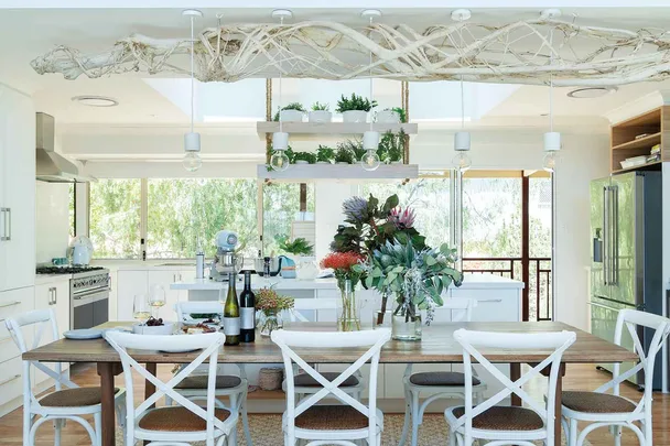
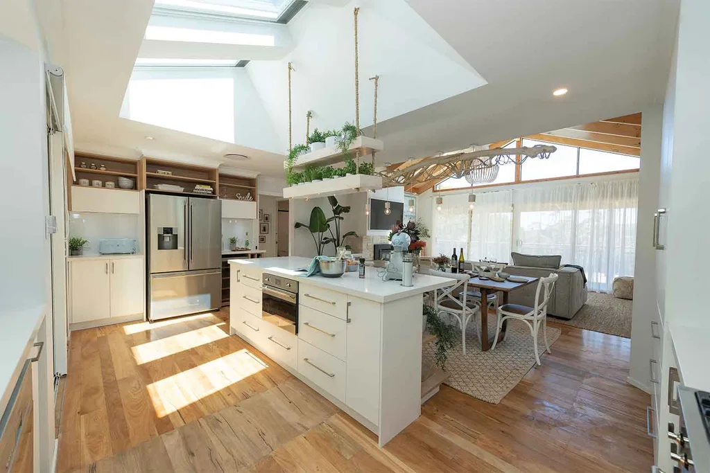
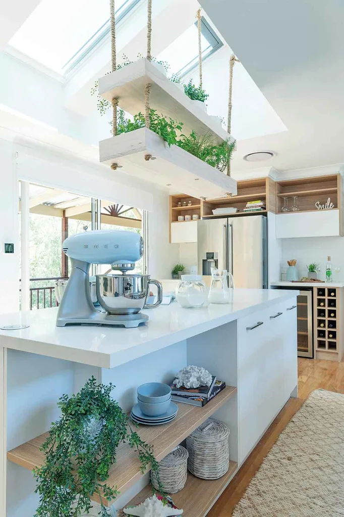
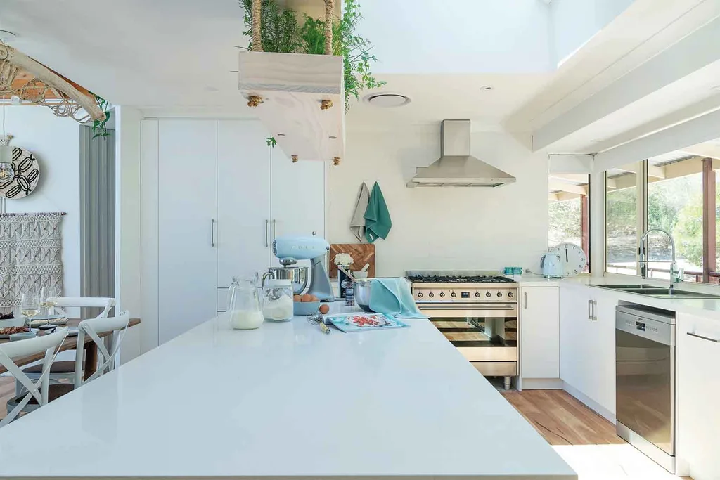
In the enormous kitchen, Shayn & Carly put their heart and soul into creating a welcoming hub where Mikaela & Eliza’s family could gather in style. Judge Jamie Durie was impressed by the fresh herbs over the island bench and directly under the massive skylight.
The French doors opening onto the verandah was a hit, as was the generous kitchen island, with all of its storage and perfect positioning.
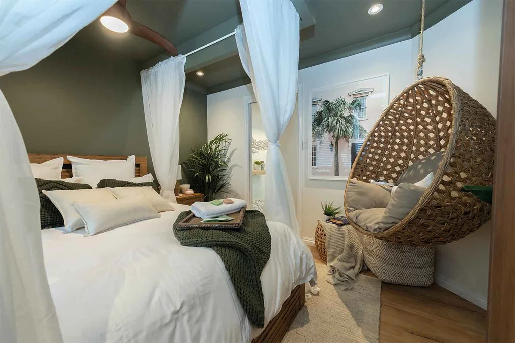
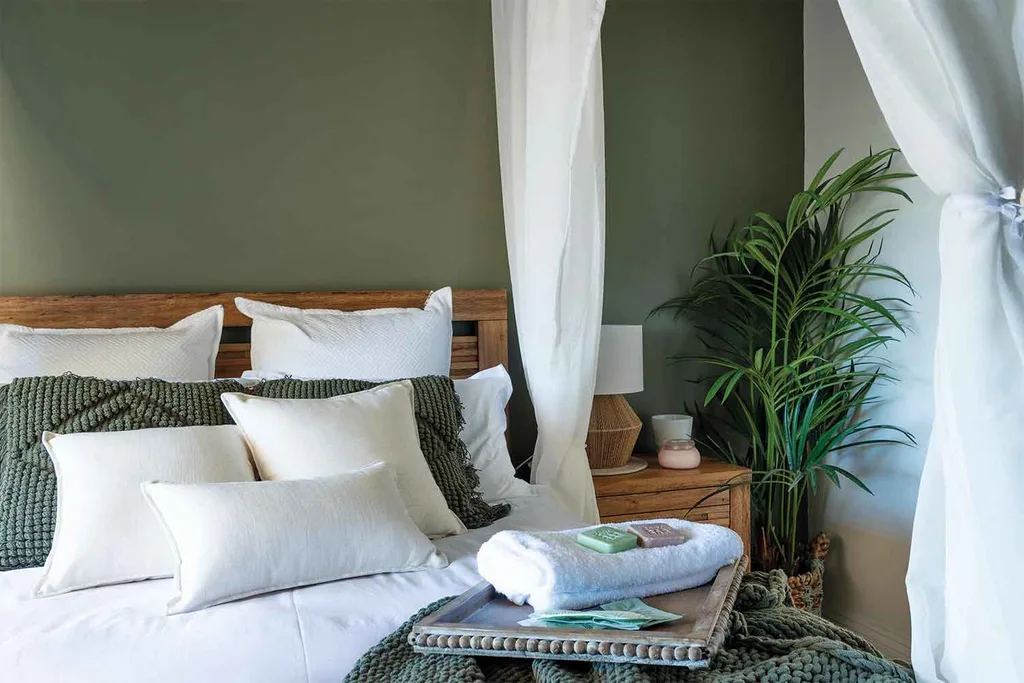
After winning the early-reveal challenge from Mikaela & Eliza with their execution of Eliza’s bedroom earlier in the week, Shayn & Carly were happy that the judges agreed. Jamie loved the resort-style bulkhead above the bed, from which the billowing curtains hung around it and Wendy was a fan of the olive green colour they chose. LLB felt they were clever to evoke a tropical feeling, without resorting to cliche’s in their design.
The judges think Shayn and Carly are beginning to show what they can do, scoring a total of 21/30.
Pete & Courtney: Lounge, ensuite and hallway
In the hallway, the vertical timber slats impressed the judges in concept, but Wendy wasn’t impressed with the finish. LLB said that it was interesting design and that, “This is the first time Pete & Courtney are beginning to show us that they are a little bit more than jazz hands.”
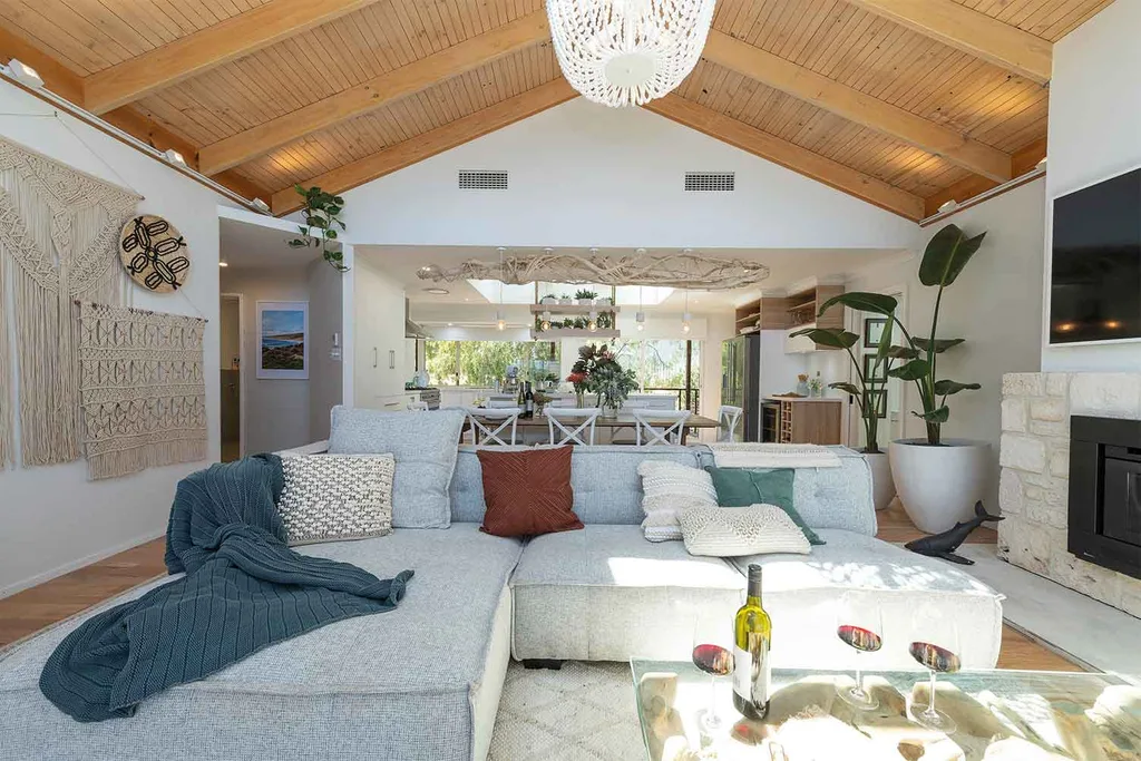
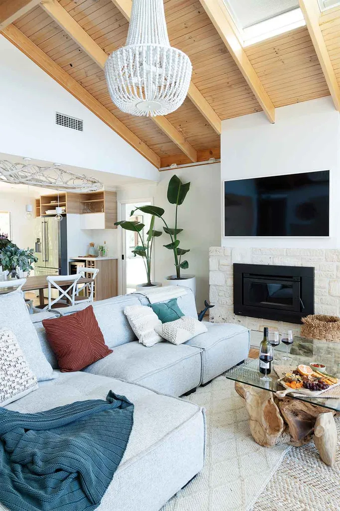
Pete & Courtney loved their lounge room and the judges were equally thrilled with the result, with Wendy loved the fireplace and that Pete & Courtney had created a false mantlepiece and said that, “with a few tweaks and a little more colour, this would be somewhere I would be very happy to live in.” Jamie would have liked more colour and less macrame.
The ensuite
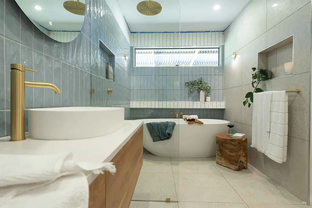
Despite being disappointed with their time management, resulting in a lack of grouting in the tiles, the new confidence with design wasn’t lost on the judges. The crisp freestanding bath and basin against the handmade tiles, together with the brass insert dividing the two tones impressed Wendy and LLB. Pete & Courtney scored 21/30 from the judges.
Katie & Alex: Dining room, study and walk-in wardrobe
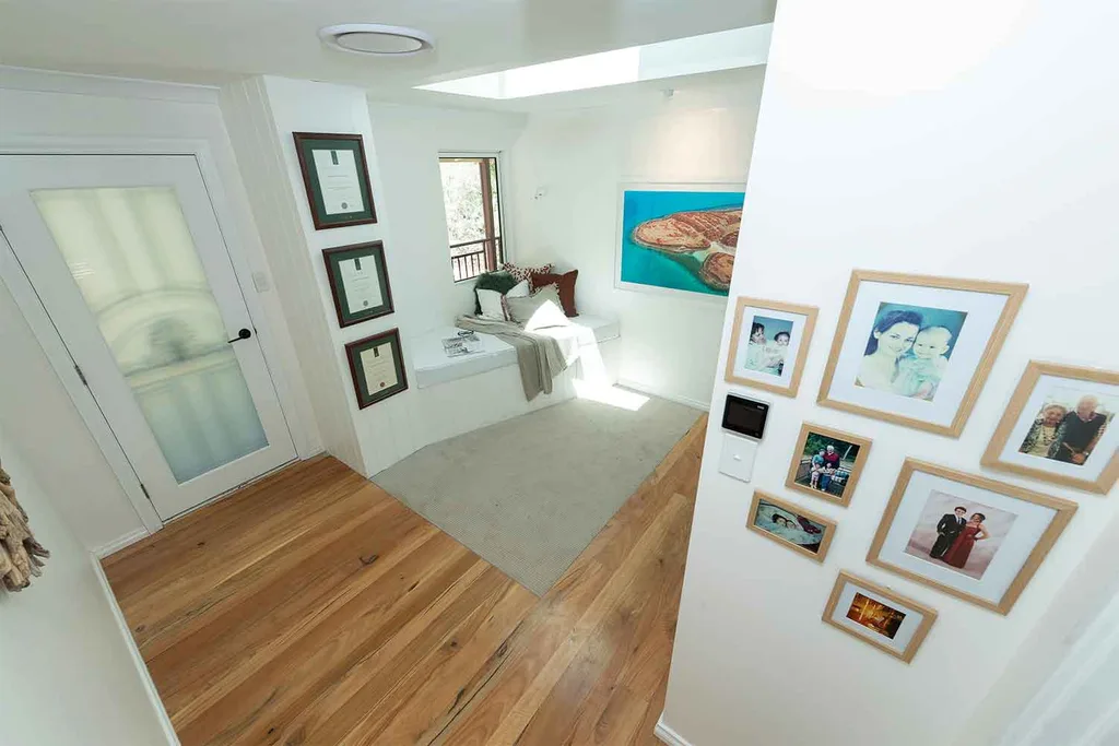
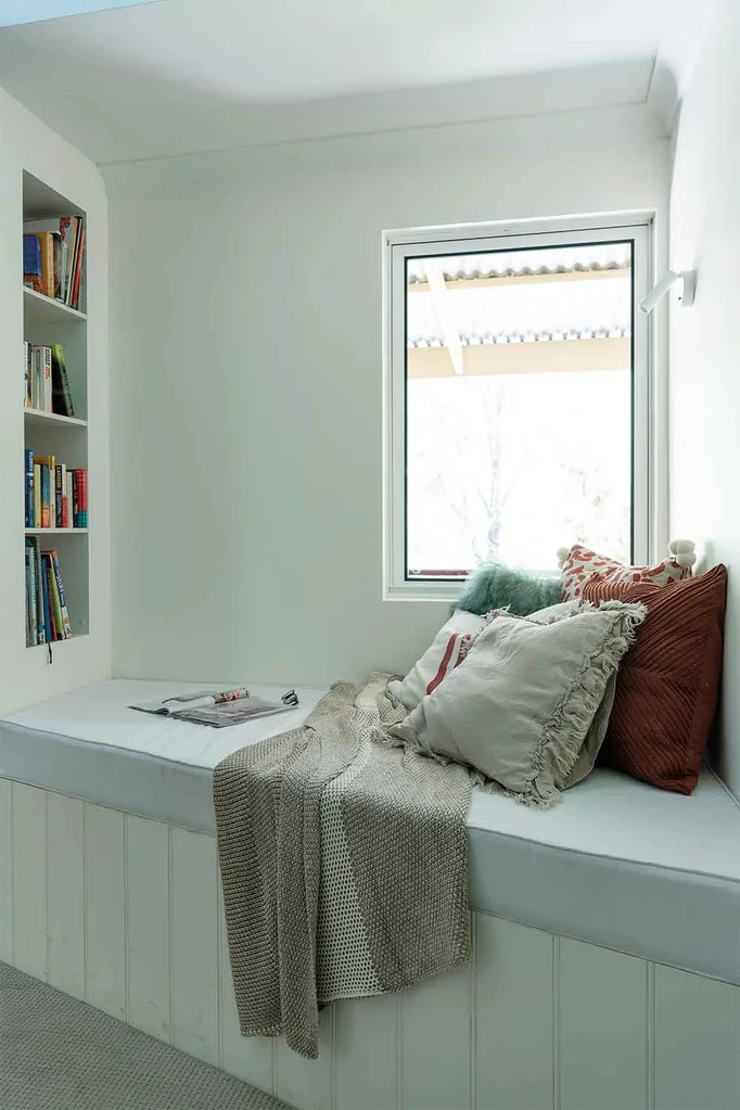
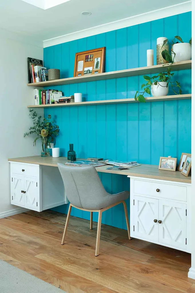
The reading nook in the “nice, open” study was “a lovely place to be,” said Wendy. The wall colour wasn’t right however in the eyes of the judges.
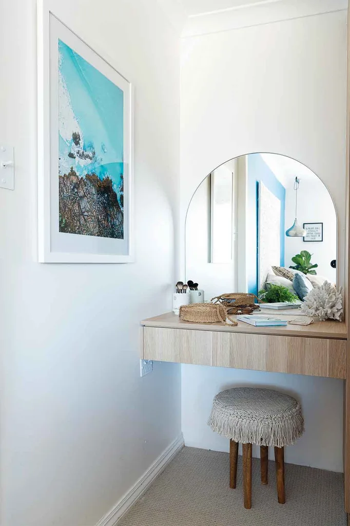
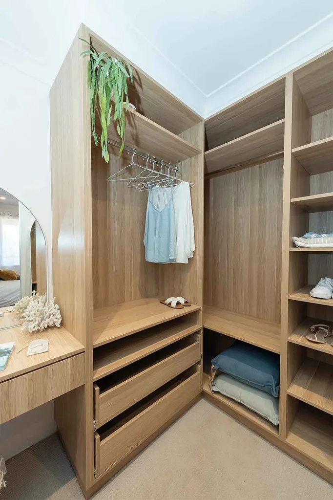
The walk-in wardrobe gave up much-needed wardrobe storage space to an ‘old-fashioned’ makeup table that the judges felt Mikaela wouldn’t really use.
Dining room
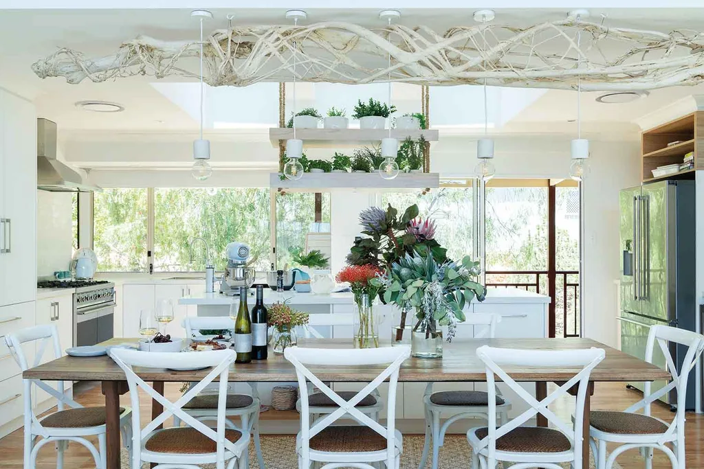
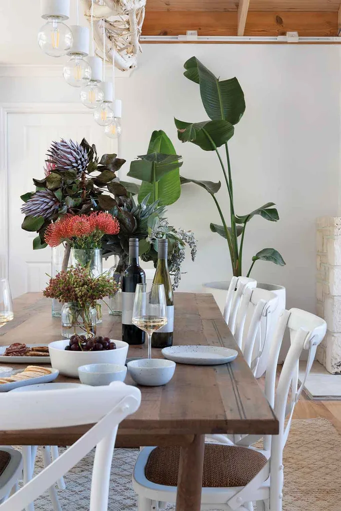
Katie & Alex redeemed themselves in the eyes of the judges with their fabulous dining room. The recycled timber table and driftwood pendant light stretching along the length of the table overhead wowed LLB, who said of the space, “This is absolutely all of those House Rules in one beautifully stylish statement.” They scored a total of 20/30.
Lisa & Andy: Entry, bathroom & Mikaela’s room
The natural tones and driftwood wall art were a hit in the entry with the judges. “I love being drawn into a hallway,” said LLB on walking in the front door, adding that, “being sucked in and catapulted into the rest of the space,” hit the mark for him. Wendy and LLB both loved the formal floor tiling and Jamie called the bespoke natural limestone shelf, “An engineering triumph.”

Bathroom
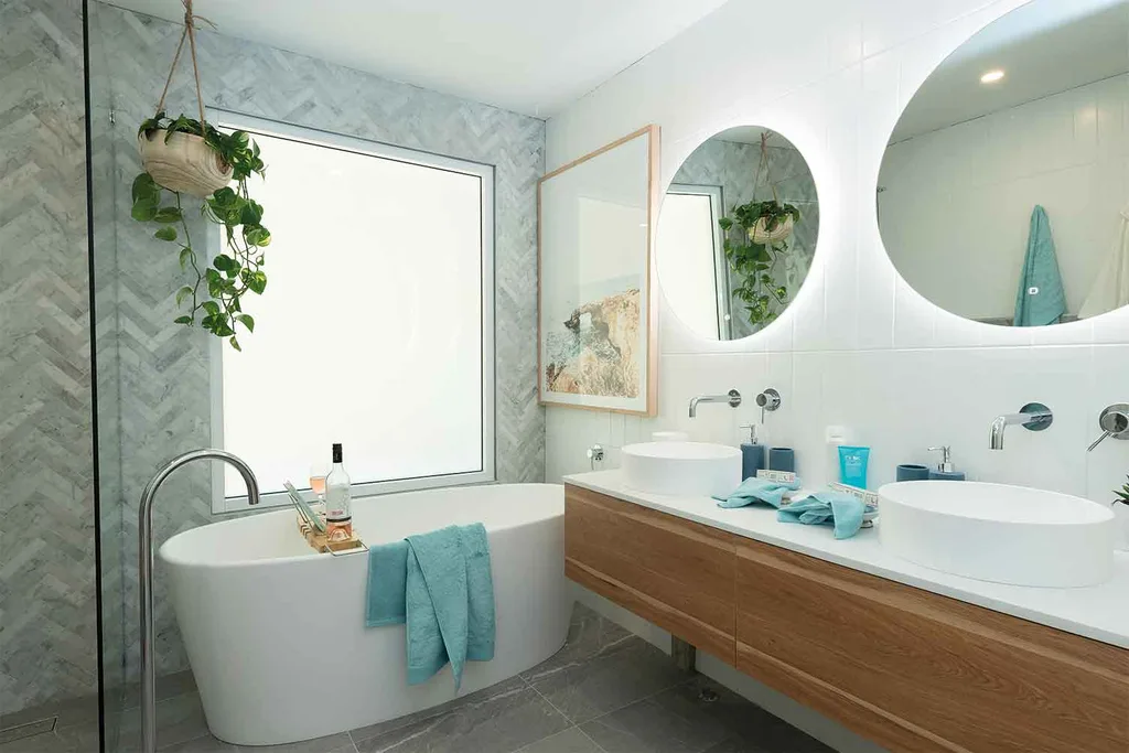
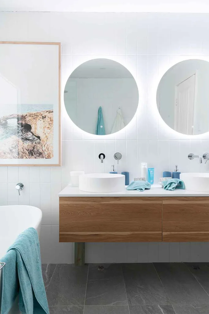
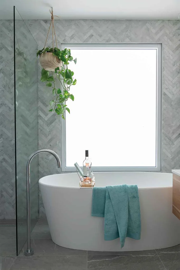
“I absolutely love that,” LLB of the initial impression – feeling the choice of cool tones of white tiles and grey marble herringbone tiles in the shower made for, “a very seductive space.” With touches of timber in the wall-hung vanity and a clever “switch glass” in the front window by the bath, Lisa & Andy not only hit the House Rules, but impressed the judges with their overall design. “What makes this bathroom instantly feel good is the floor plan,” said Wendy. “It’s actually not that big a room but how they’ve fit everything in is really clever.”
Mikaela’s room
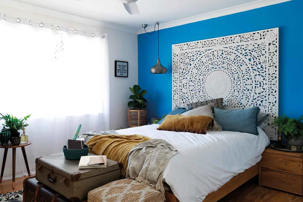
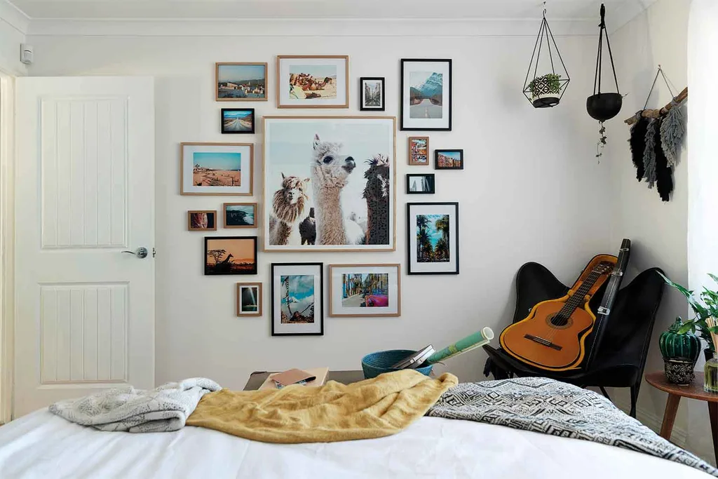
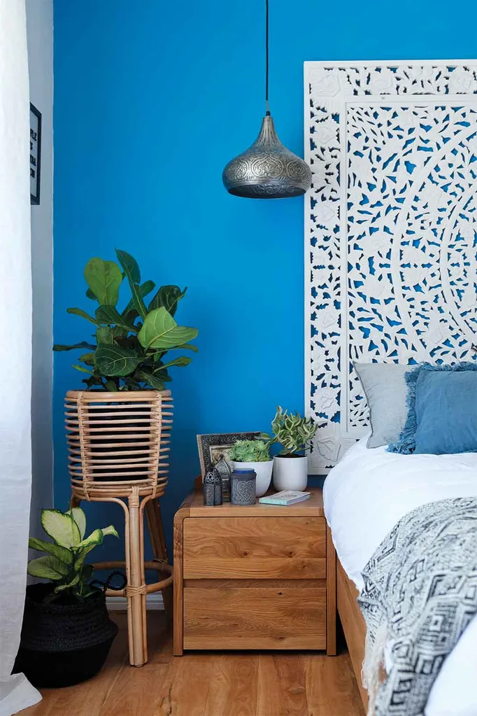
Mikaela’s bedroom had its own House Rule: To celebrate Mikaela’s adventurous soul and both Wendy and Jamie felt the photo gallery wall hit the right tone. LLB was less impressed, feeling the use of the bedhead to evoke faraway lands was closer to the mark in terms of styling but that the room was over-styled.
Lisa & Andy received a total of 19/30 from the judges.
Mikaela and Eliza will come home with their Mum to see the full reveal and deliver their scores when we’ll find out who sits at the top of the leaderboard.
You might also like:
Why we love herringbone floors
Style Rules Episode 2: Pete and Courtney’s reno reveal
House Rules warehouse reveal: why Mikaela & Eliza won
Catch the latest episode of our new Style Rules podcast, where we talk all things House Rules and get a behind-the-scenes view with judge Wendy Moore.
