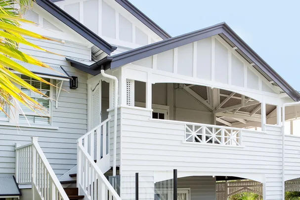
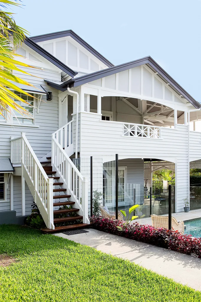
This clever Queenslander has been carved up to create spaces to be together, seek peaceful solitude, and entertain – both inside and outside the house.
During the four-and-a-half years, they’ve lived in this fine Queenslander, which dates back to 1925, interior designer Hayley and her family have given the home a fresh sense of purpose.
The ground level is the domain of Hayley and her husband Lance’s three children, who revel in the casual living space that leads out to the newly installed pool. Meanwhile, Mum and Dad can survey the Brisbane cityscape from their deep, first-floor wraparound balcony where they have created a stunning retreat with knockout city views – a favourite part of the home.
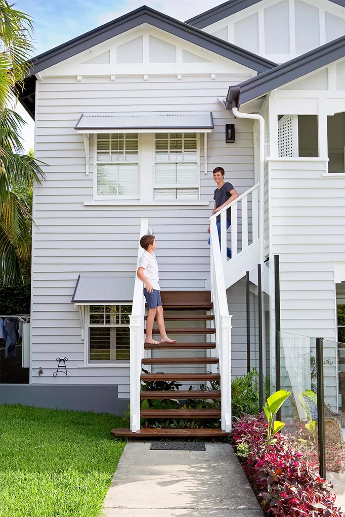
Who lives here? Hayley, co-director of Porchlight Interiors, her surveyor husband, Lance, and children Kelsey, 23, a graduate architect, Zak, 16, and Abbey, 14.
How would you describe your style? Hayley: “Home. It’s an important word to me – a place where people feel welcome.”
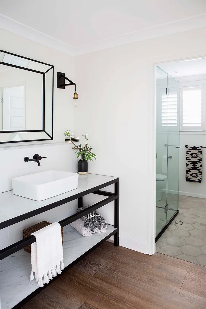
You pushed the envelope with… “The vanity downstairs [page 102] – I had it custom-made locally. It’s so heavy it took two men to get it in!”
What’s your colour crush? “Blue, because it’s very peaceful and calming. We love beach holidays and sunny skies.”
What do you love experimenting with? “With a basic foundation of whites, neutrals and timber, I can layer it with new things – touches of industrial, or an Indian or African piece.”
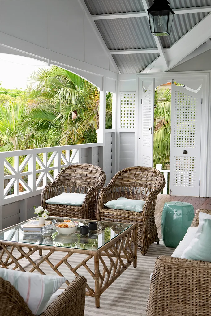
“When you have teenagers, it’s really great to have two living areas, upstairs and downstairs, that are separated,” says homeowner Hayley, an interior designer, who shares her house with her husband, Lance, and their children Kelsey, Zak, and Abbey. “It’s important that they can have their friends in one area while you have yours in another. If they want to watch movies or play games downstairs, it doesn’t interrupt us spending time with friends upstairs.”
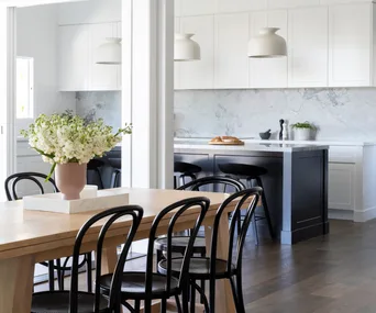
Coming together is just as crucial for the family of five, and it’s in the kitchen that the members of this household invariably meet. When Hayley and Lance bought the home, this was the first space they tackled, ripping out ill-fitting cabinetry and replacing the awkward layout with an open, dynamic design.
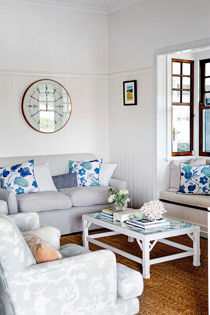
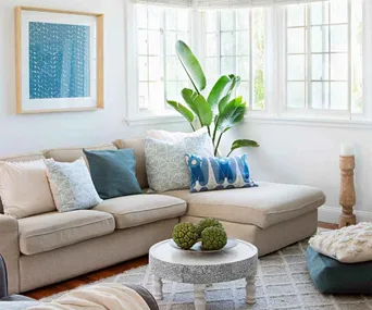
Main lounge room
Gentle blues and greens create a serene feel in this zone. All textiles, including the Schumacher fabric used to upholster the armchairs and Westbury linen on the sofa, are sourced through Porchlight Interiors, set off with an oversized copper-rimmed clock from Meizai. On the cushions, a vibrant botanical print by Raoul Textiles of Santa Barbara, US, creates more visual interest, while the herringbone-weave sisal rug provides texture and warmth underfoot.
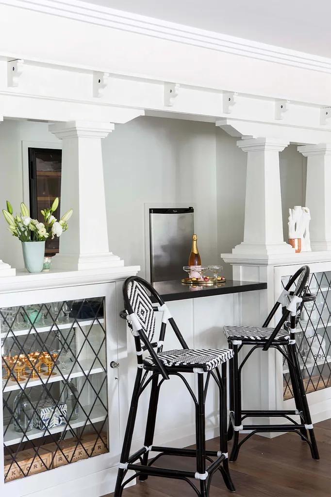
Home bar area
As with many Queenslanders, previous owners had raised the house to utilise the ground level, and during this refit installed a bar salvaged from another home of similar heritage. In keeping with the glamorous Californian air of the new pool area it looks onto, the bar received the same treatment as the rest of the interior, painted in Dulux Whisper White for a lighter and fresher feel. The structure was also updated with a high-impact Nero Marquina marble benchtop.
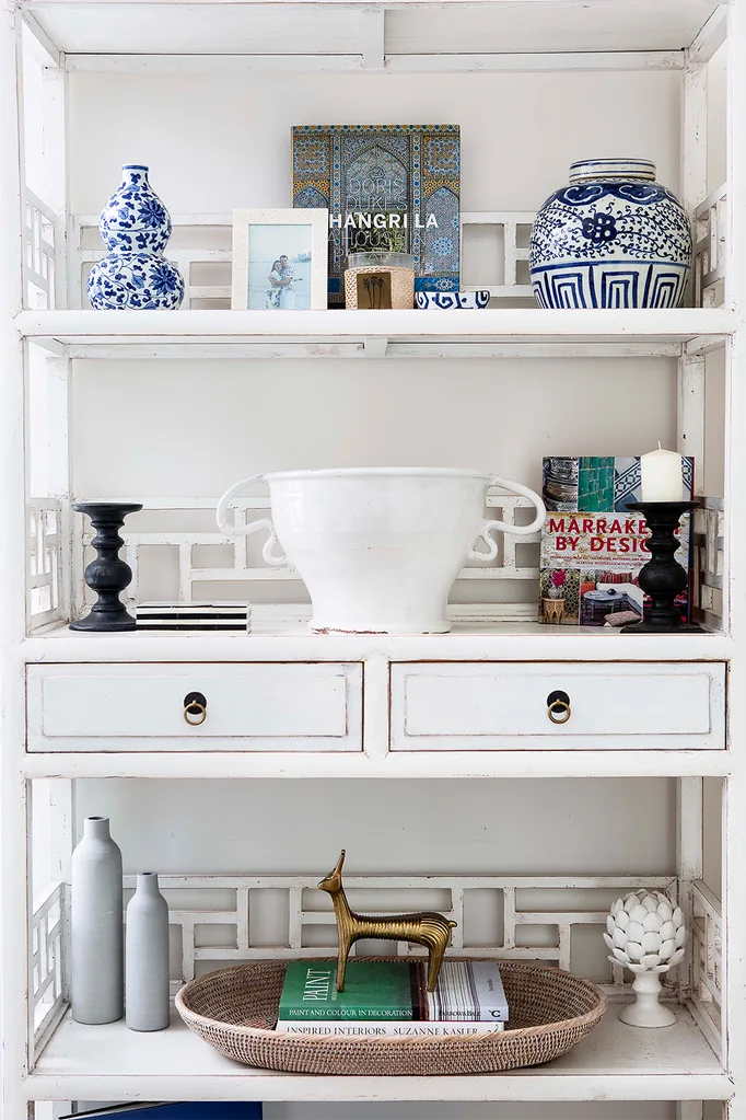
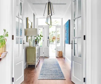
Along with the kitchen/dining room overhaul, Hayley had the home’s interiors painted in fresh Dulux Whisper White and layered textiles and furniture that caught her designer eye. “I typically start with a light, neutral base and add depth into the room with dark accents that anchor the space well,” explains Hayley. “I have a passion for using a lot of sea-foam blue colours for their peaceful quality. I like simple – it’s the way it’s put together that gives it interest.”
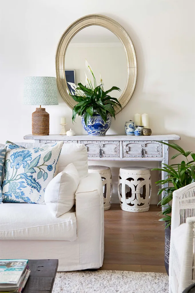
Family room
Replacing cream gloss floor tiles with wide engineered French oak boards has made the world of difference to the downstairs living area. This teen chill zone is decidedly grown-up, but the layers of texture keep it feeling relaxed: plump linen-covered sofas and a tactile wool rug do the trick nicely. Furniture, all in chalky whites, includes an Indian hall table, with antique Chinese drum stools from Orient House below. In contrast, a solid Naga coffee table (for similar pieces, browse the range at Stone Pony) floats in the middle to centre the space.
“We raised a beam that was making the kitchen really small and built right out to the space they had used as a dining room,” reveals Hayley, who also enlarged the room by taking the cabinetry right to the 3.1-metre ceiling. “It has made a very small kitchen quite grand.”
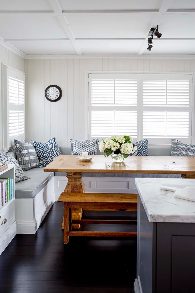
Bookending the space is an integrated study area that fuses the living and kitchen areas, and a built-in seating nook for dining that has the bonus of hidden storage. “Built-in seating is a great way to make a room feel bigger,” comments the interior designer. “We have a lot of different groups of friends who come through this space, and we can sit there for hours. Once you put the food on the table, there’s no need to get up. You can just sit there and enjoy.”
“It was a very small space but with city views, this was the right place for dining. We can now fit 12 people comfortably around the table, and often do!”
Hayley
Dining area
For a stylish dining nook, make sure the built-in seating is standard dining chair height to fit under the table. This includes the finished height once the foam cushions go on top. The backrest cushion needs to be on an angle for added comfort. Romo fabric was chosen to cover the bench seating – which contains discreet storage – offset by Walter G cushions. Throughout this upper level, existing timber floors were given a sultry Black Japan stain.
Kitchen
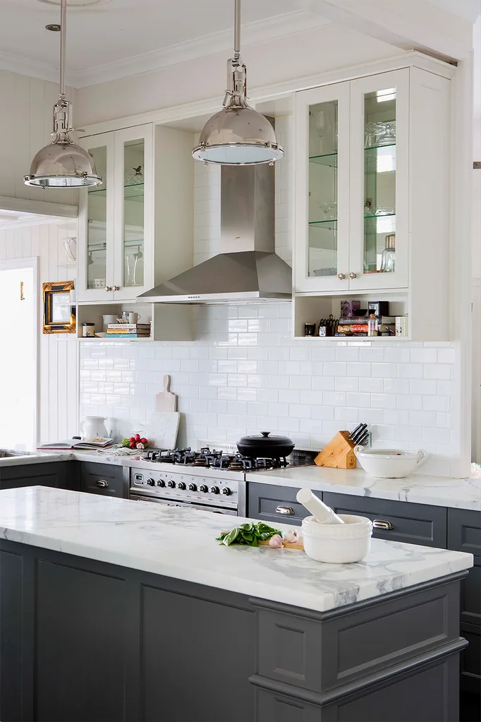
A mix of cabinetry not only makes the kitchen feel more relaxed, but responds to key needs in the area. The cooking zone’s high-end brasserie look reflects the family’s passion for food and entertaining. Constructed by Maytain Cabinets, the generous island is painted in Dulux Maraetai Grey and topped with luxe Statuario Venato marble. This striking hub of the home is finished with polished nickel lighting and cabinet pulls from Restoration Hardware in the US (available through Porchlight Interiors).
Bathroom
The downstairs bathroom is the domain of the eldest children, and introduces a hip, industrial vibe. A steel-framed vanity topped with honed Carrara marble sets the scene. Phoenix ‘Vivid Slimline’ tapware in matt black Onix finish, a trough-like ‘Cielo’ basin from Highgrove Bathrooms, ‘Enhance’ wall light brackets from Beacon Lighting and a black-framed mirror complete the look.
“Home is filled with love – somewhere you feel yourself, and enjoy being with family and friends. That’s probably the core of what my interior design is about”
Hayley
Interior designer: Hayley Hayes, Porchlight Interiors, 0423 806 007, porchlightinteriors.com.au
SOURCE BOOK
Flooring: Timber Flooring Unlimited, 0414 733 342, timberflooringunlimited.com.au
Kitchen: Maytain Cabinets, (07) 3216 7601, maytain.com.au
