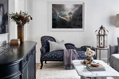
The original Federation features of this home on Sydney’s Lower North Shore offered cues for its stunningly refreshed interiors – but they weren’t the main attraction in the first instance. Years of admiring its secluded location and picturesque harbour views meant the owner, a retired gentleman with an adult daughter, knew its potential when he spotted it for sale online. He purchased the property three days later, enamoured with the lifestyle inherent in the location and the opportunity to create a multi-generational home.
Who lives here? A retired property developer.
Best part of the renovation? Homeowner: “It’s a big house, but because each floor is self-contained it doesn’t feel too big for me when I am alone.”
Favourite feature? “The courtyard off my bedroom, it’s beautifully quiet and relaxing to look out on all the greenery.”
Best renovating tip? “Timing the renovation so that I didn’t have to move out. We converted the lower ground floor into a self-contained flat, so that I could live downstairs while the rest of the house was reworked.”
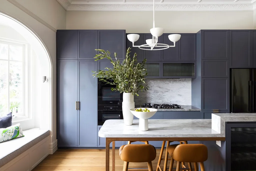
Ground-floor kitchen
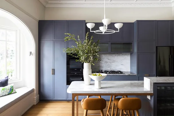
Leanne Smeallie of Ampersand Interiors designed the kitchen bench to double as a dining table, so it feels quite cosy when the owner is home alone. “The prettier features of the room, such as the heritage cornices and bay window, are secondary to the strong custom joinery in Dulux Hat Stand,” she says. The Anna Charlesworth 4 Bowl Circle pendant light references a traditional chandelier using modern materials. The contemporary joinery juxtaposes the heritage-listed cornices and bay windows in Dulux Natural White, while the grey Atlantic Stone benchtops from SNB Stone ties everything together.
“When I’m entertaining, I love the view from the kitchen, or the new outdoor courtyard.”
Homeowner
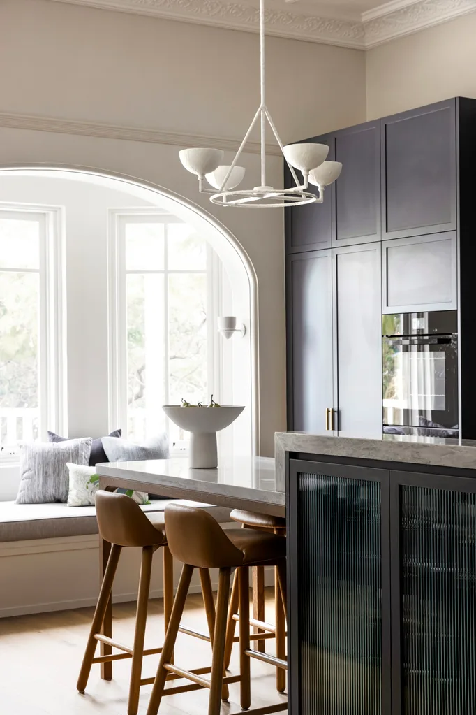
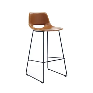
“Colour was used extensively in Federation homes, so we reintroduced it to help differentiate between floors and express each room’s purpose,” says Leanne. The ground floor – the main living level – needed to feel appropriate for a single male, hence the use of dark, strong hues. The ‘Boomerang’ bar stools from Satara meet the owner’s brief for masculine finishes and understated quality.
SHOP THE LOOK
Ground-floor living room
In the living room on the ground floor, an artwork by Meg Walters hangs above a Real Flame ‘Heatseeker’ fireplace with a fire surround made from Atlantic Stone from SNB Stone. “In winter, we’ll turn on the fireplace in the afternoon and it heats the house,” says the owner. Leanne designed the arched bookshelves in this living room to reference the original arches seen throughout the home in the windows and doorways. The shape of the shelves also helps to soften the straight lines of the marble fire surround and acts as a mirror image of the elegant Moooi ‘Meshmatics’ pendant light from Space.
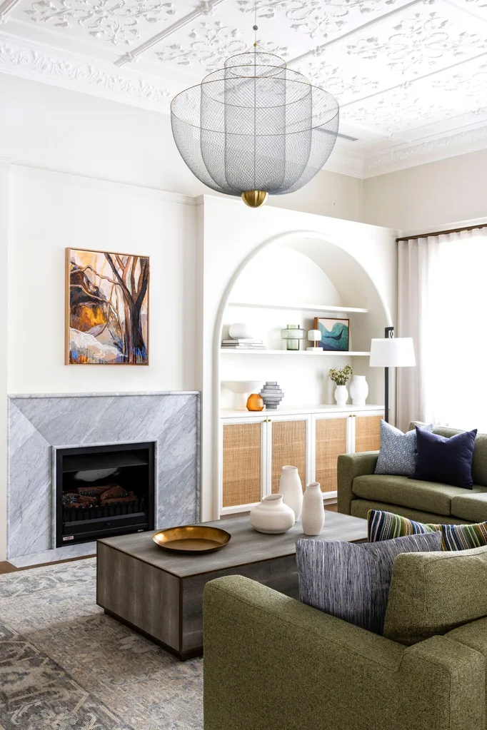
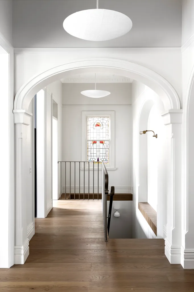
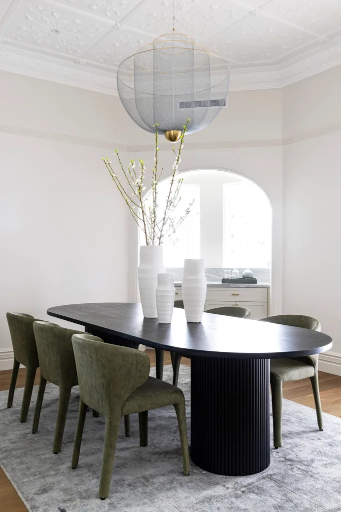
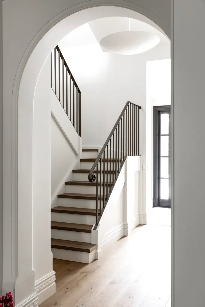
Since council regulations dictated certain features of the heritage-listed property be retained, Leanne took those original features, as well as the home’s spectacular natural surrounds, as cues for the interior scheme. The arched entry hall, for example, provided a motif for the new joinery, as seen in the curved bookcases in each of the living rooms. Throughout the house, the lighting and flooring choices are chic and modern, yet reference the Federation era of the home.
Sunroom
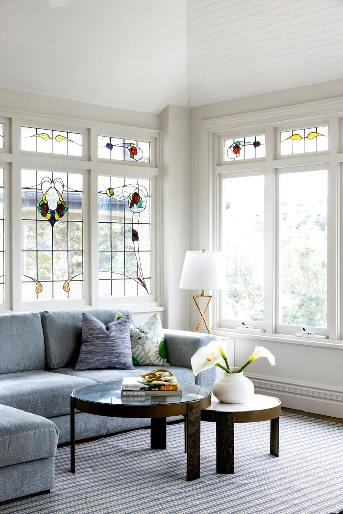
It was the location that first drew the owner of this home in Sydney and the renovation takes full advantage of it. Here, an enclosed balcony has been converted into a sunroom. Referencing the view, Leanne chose calming blues and greens for the custom sofa from H+J Furniture, soft furnishings in Christopher Farr fabrics and rug from Winton House. “It’s a lovely spot to sit and relax, the boats on the harbour can be mesmerising,” says the homeowner. “The palette also works with the original leadlight windows,” says Leanne.
“Depending on which floor you are on, you get a different perspective of the harbour.”
Homeowner
Main bedroom
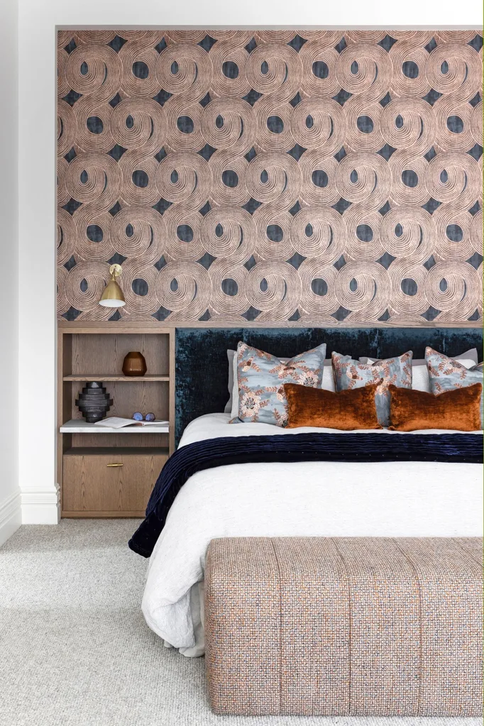
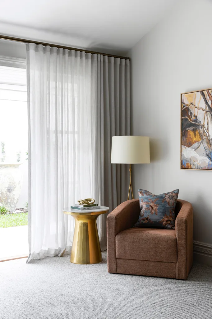
Sumptuous layers of texture and pattern make the owner’s bedroom a true sanctuary, where Kroma ‘Ohin’ wallpaper from Ascraft marries perfectly with the accent cushions from Tigger Hall Design. The sitting area in the main bedroom overlooks a courtyard. Custom armchair from H+J Furniture, lamp from Bloomingdales Lighting and side table from Horgans.
The owner engaged architect Ian Poole to reconfigure the three-storey home’s layout, introducing kitchenettes and bathrooms to both the lower ground and first floors so that each of the levels could be self-contained. For the interiors, the owner’s daughter recommended Leanne Smeallie of Ampersand Interiors, having been impressed by her previous work. The brief was simple. “Dad left creative licence to Leanne and me,” shares the owner’s daughter. “He didn’t want a glitzy showcase, rather, quality finishes and a mix of spaces; some to encourage being together and others for quiet relaxation.”
Main ensuite
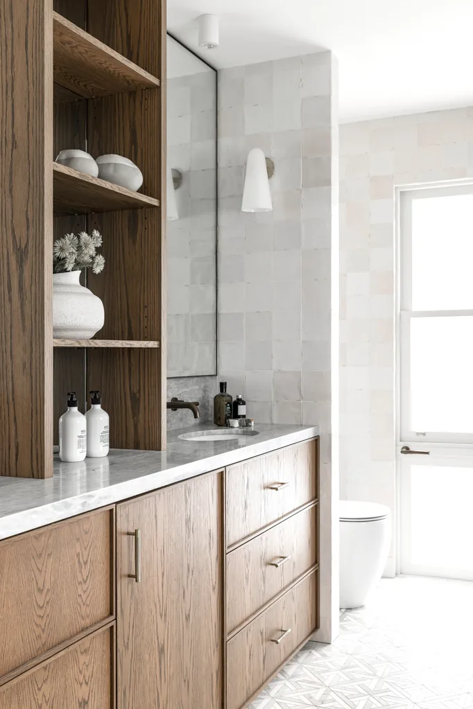
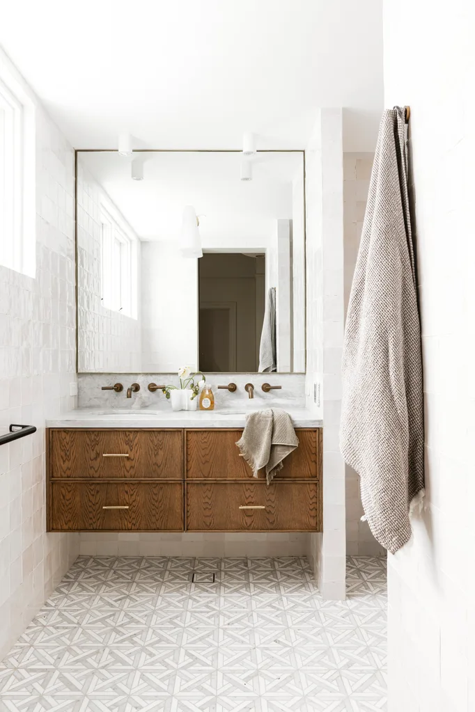
The elegance of the main bedroom extends into the ensuite with custom joinery, floor tiles from Surface Gallery and tapware from Astra Walker.
Guest bathroom
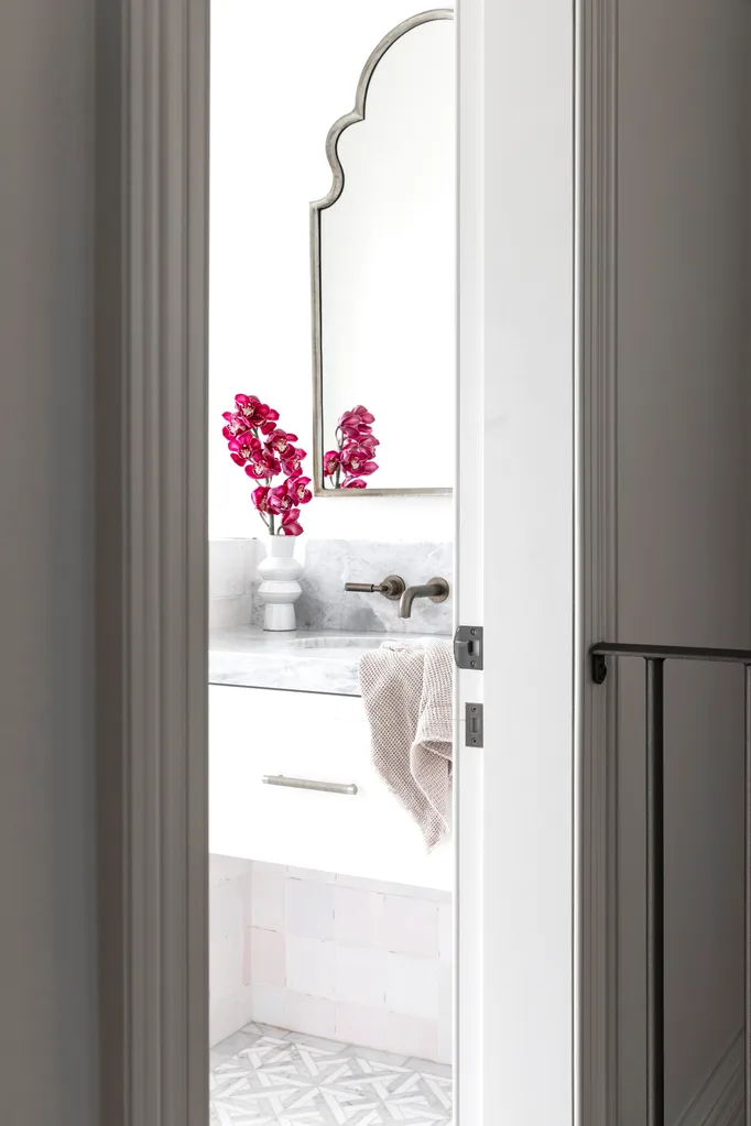
The mirror from Warranbrooke in the ground-floor guest bathroom reflects the curves seen throughout the home. Tapware from Astra Walker and custom joinery.
Laundry
There’s a place for everything in the space-efficient custom joinery in the laundry, which is painted in Dulux Koyla. Atlantic Stone benchtops and splashback from SNB Stone. The Sierra tiles, laid in herringbone pattern, are from Surface Gallery. Tapware from Astra Walker and Shaws butler sink.
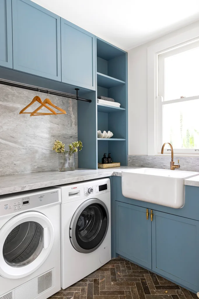
Colour was essential to the success of the project. “The three-metre ceilings and scale of the rooms had the potential to feel cold and cavernous, so we used colour to add character and evoke different moods,” she says. On the ground floor, which is the main living level, strong hues and layers of texture have been used in the main bedroom and kitchen to create a warm, yet masculine, atmosphere. The blues and greens used in communal living spaces reference the harbour and bring the outside in.
First-floor apartment
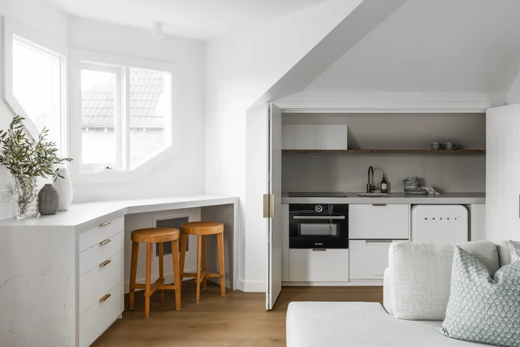
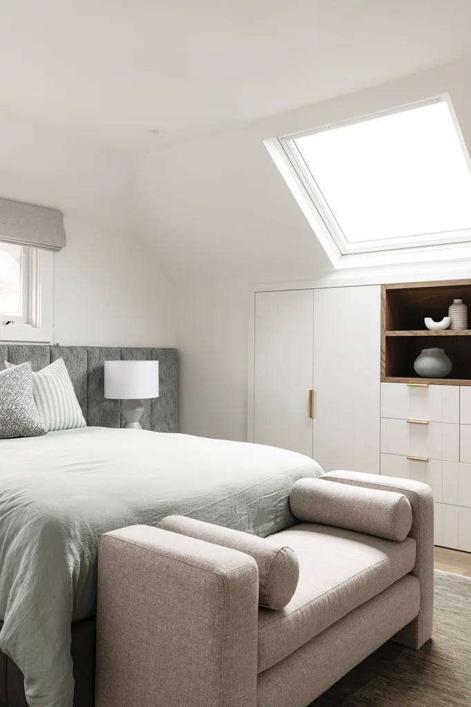
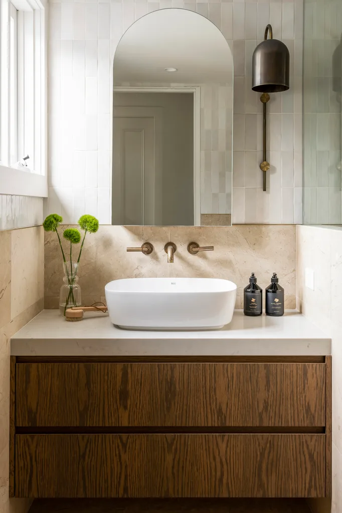
The self-contained first floor apartment is a luxurious guest retreat. “I wanted each floor to be a home within a home,” says the owner. “It means guests can have privacy and make themselves a coffee or toast whenever they want.” In the living room, custom joinery means the kitchenette can be hidden behind bi-fold doors. The bar stools from Cafe Lighting & Living and flooring add a natural touch to the otherwise white and grey scheme. The guest bathroom carries on the timeless appeal thanks to limestone wall tiles from Surface Gallery and the ‘Duomo’ light from Anaesthetic Design. In the bedroom, thoughtfully designed joinery gives guests ample wardrobe space, while crisp linens from Cultiver and a padded bedhead add to the sense of refined elegance.
First-floor living area
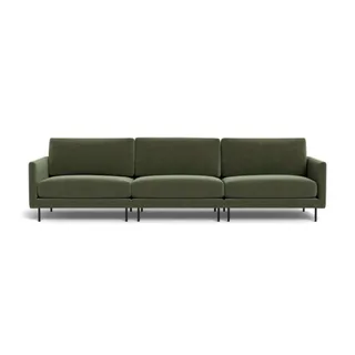
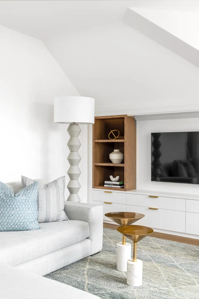
Luxe combines with relaxation in the guest living area. A sublime sofa, upholstered in pale grey Belgian linen and topped with pale blue patterned scatter cushions from Walter G, invites guests to unwind. The sculptural side tables from Horgans and standing lamp from MRD Home add visual interest without overcrowding the cosy space. Custom joinery designed by Leanne provides additional storage.
“Guests can have privacy and make themselves a coffee or toast whenever they want.”
Homeowner
Outdoor areas
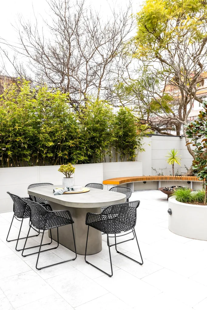
The sheltered courtyard gives the owner an extra alfresco entertaining area. Leanne worked with a landscape designer to design this new entertaining area for the front of the house. The existing deck overlooks the harbour and, while the view is spectacular, it is exposed to the elements. “The view is the natural drawcard when entertaining, but I wanted a plan B for windy days,” says the owner. “The new level entrance is also easy for me as I get older, as there is only one step to navigate.”
The owner couldn’t be happier with the final result, saying the interiors and garden perfectly meet the brief: elegant, but not overly precious. “This is a warm, open-hearted home for sharing, but at the same time there are intimate areas for all,” says Leanne. And the owner hopes that not only will it be his forever home but will also be his daughter’s and, maybe even his grandchildren’s.
 Photography: Simon Whitbread / Styling: Jamee Deaves
