Sometimes a home just needs the right owner to reawaken its inner beauty. That was the case with this gracious family abode on Sydney’s north shore.
Drawn to its location on a quiet, tree-lined street, architect Nerida and her husband James purchased the Californian bungalow with initial plans to replace it with a contemporary home for themselves and their sons Hugo, now 16, and Ethan, now 14.
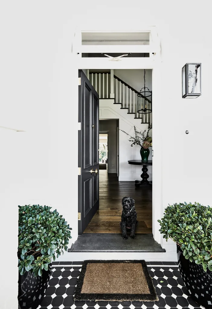
This spacious abode on Sydney’s upper north shore was reworked by homeowner Nerida, whose vision paved the way for a serene home for herself, husband James and their two teenage sons Hugo and Ethan. Maggie greets visitors at the home’s newly created front door.
“It was a really confusing house,” recalls Nerida. “There was no central corridor and no airflow. You had to go through one room to get to another – for example, to get to one bedroom, you had to go through the kitchen.
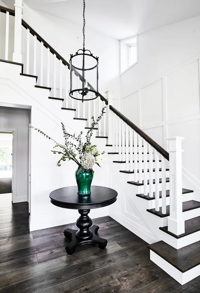
What used to be Hugo’s bedroom was reconfigured to create a spacious entry.
That’s why, when I first saw it, I instinctively thought, ‘We’ve got to demolish this house and just start again.'” Instead, the home began to cast its spell on the family.
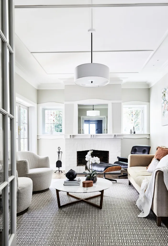
In the formal living area, pieces including a Jardan sofa, Eames lounge chair and matching ottoman from Living Edge and ‘Milou Swivel’ armchairs from Coco Republic lend a fresh feel. A rug from The Rug Collection anchors a restful scene that also includes a ‘Fineline’ coffee table from Spence & Lyda, a ‘Reed’ pendant light from The Montauk Lighting Co, cushions from Papaya and Provincial Home Living, and a Country Road throw.
“The more we lived here, the more we fell in love with the windows, the detailing, the double-brick walls and the soul of the house,”says Nerida.
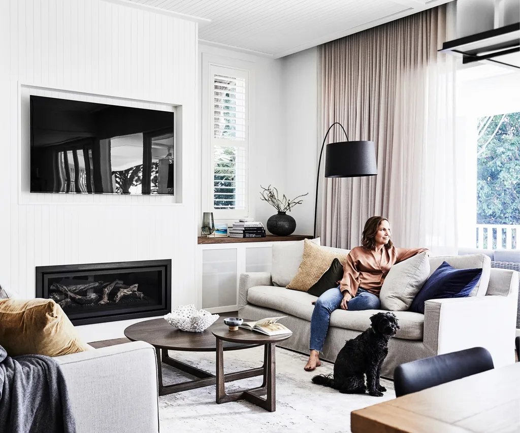
The renovation produced a room full of pieces that continue the gentle tones. They include ‘Scarlett’ sofas and a ‘Sky’ coffee table from Fanuli and an ‘Orion’ rug from Designer Rugs, while a Foscarini ‘Twiggy’ lamp from Space lends sculptural appeal. Nerida chose VJ wall panelling in Dulux Whisper White to infuse the newer parts of the house with character. “I tried to be consistent with all the details, so that it felt like an extension that complemented the older part of the house,” she says.
After four years, she came up with a vision to re-work the floor plan and retain the heritage elements they had come to love. “I really wanted to pay homage to the original cottage and the streetscape,” she says.
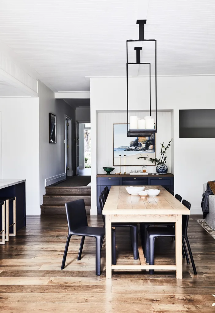
An ‘Altar’ pendant light by Kevin Reilly is the hero here. Nerida and James had coveted it but felt it was out of their budget – until they discovered it at Home Furniture On Consignment, which specialises in second-hand designer furniture. Builder James Tulloch of JTB Building had his welder reduce its height to suit the room, while Nerida commissioned the Amanda Tye artwork of nearby Freshwater headland.
Built in 1916, amid a time of austerity measures because of World War I, the home has the pared-back elements that set the Californian bungalow apart from its Victorian-era predecessor.
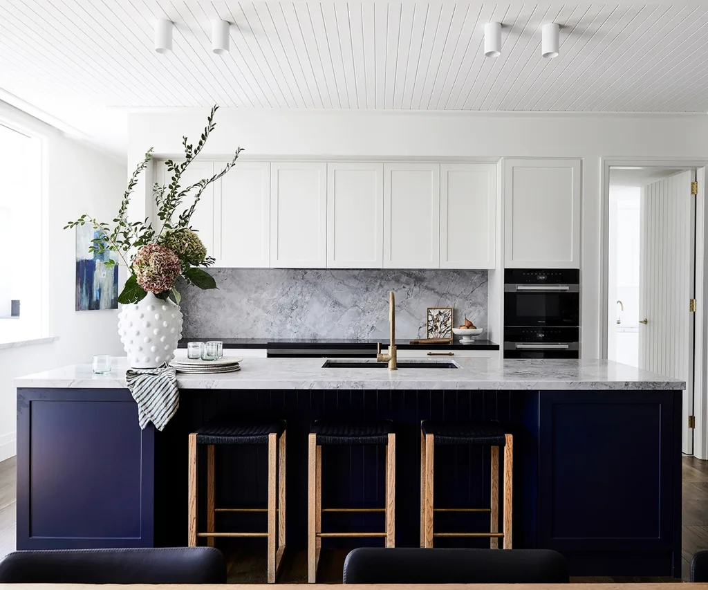
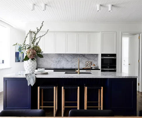
An oversized island bench topped with honed dolomite stone makes a dark, dramatic statement in Dulux Oolong, with ‘Wovenest’ bar stools from Modanest tucked underneath. Shaker-style cupboards were custom-made by All Aspects Joinery and painted in Dulux Whisper White. Of her Miele appliances, Nerida is particularly fond of the steam oven. “The steamer is amazing!” she says. “It’s on twice a day and we love it.” A ‘Sovereign’ urn from Provincial Home Living housing a beautiful bunch of flowers is among the home’s chic styling touches, as is a Katie Wyatt artwork on the rear bench – Nerida found the other artwork about 15 years ago at a market on the Sunshine Coast.
“That’s what I liked about it – that kind of pureness of design,” says Nerida. “There wasn’t too much busyness or too much fussiness.”
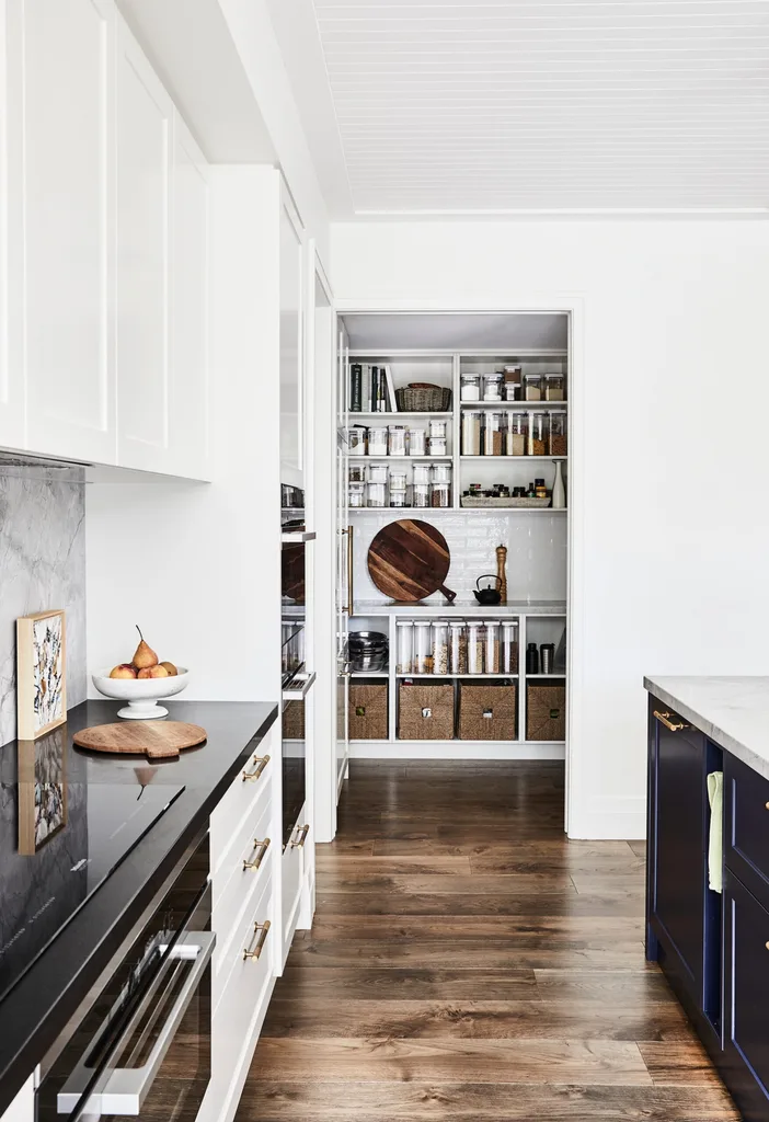
A butler’s pantry leads off the kitchen. “I love how the grey tones of the benchtop contrast with the organic brass tapware and the indigo joinery.” ~ Nerida
The layout was a different story. “I decided to move the entry to the front and keep it all looking as traditional as possible,” says Nerida, whose redesign of the floor plan created a new front door and a huge entry foyer and portico to replace the old side entrance.
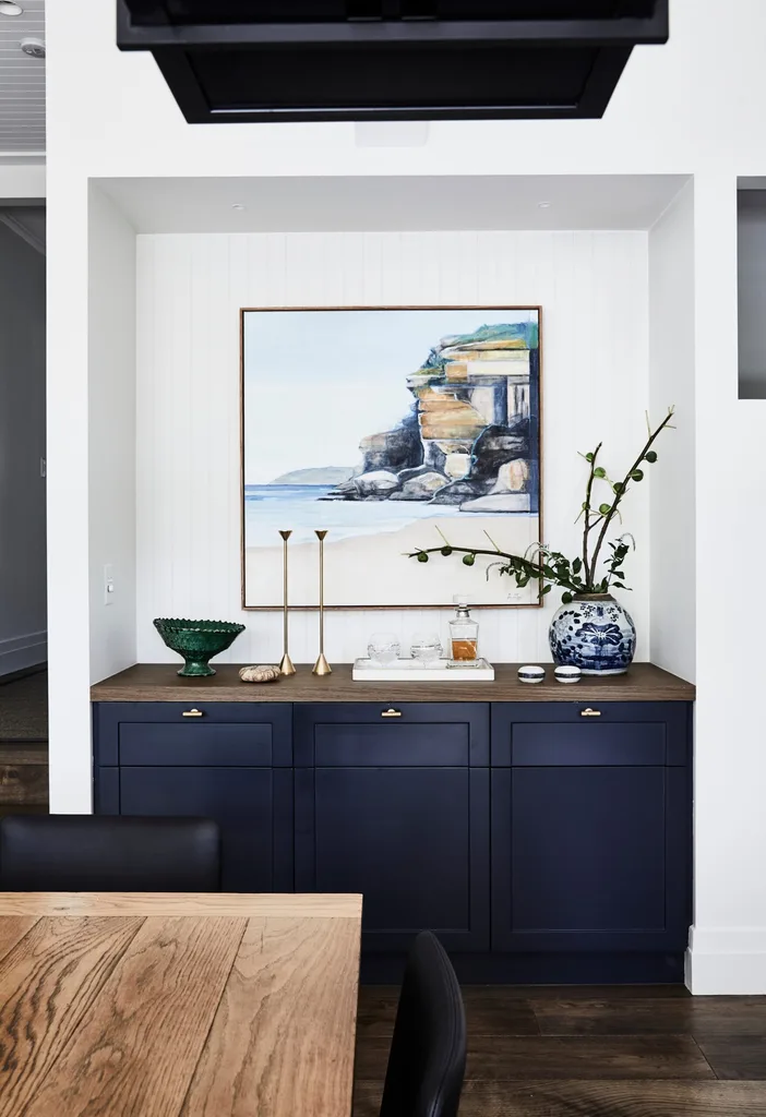
Honey-hued engineered oak floors from Preference Flooring add warmth throughout.
It worked. Council approved it in an incredibly short six weeks and loved that they were reviving the old house and keeping the heritage of the area.
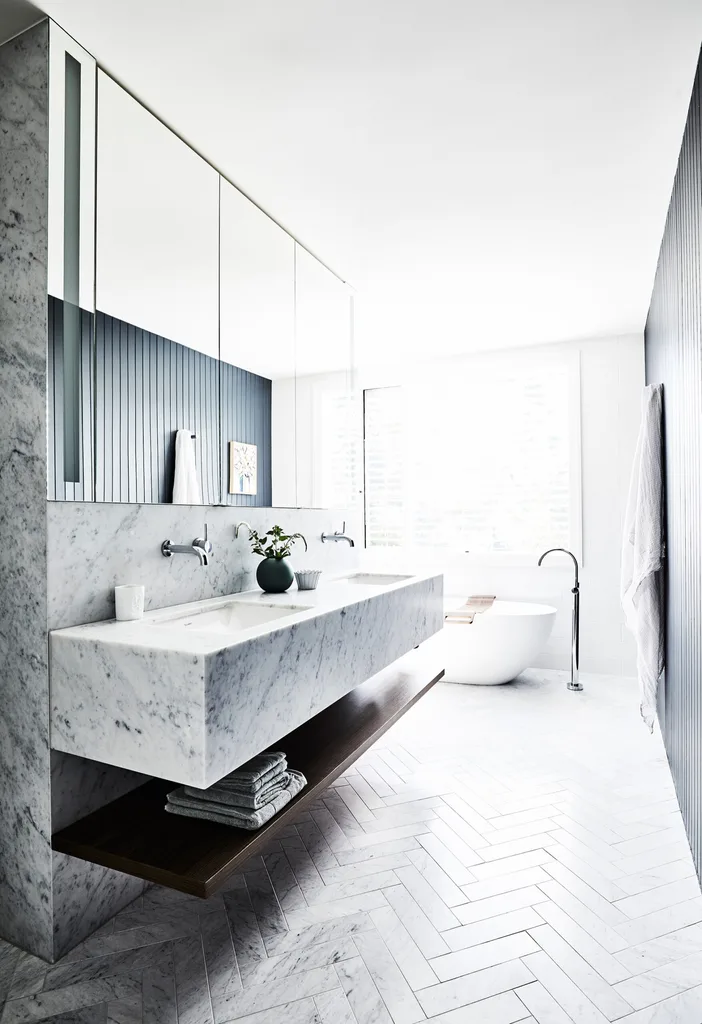
Encased in Carrara marble, the vanity was custom-made by joiner David Fox of All Aspects Joinery in the ensuite. Nerida designed the ensuite so the shower (around the corner) and bath enjoy the leafy outlook. The mirror has built-in lighting, while exterior Venetian blinds from SCS Blinds ensure privacy and northern- sun control, and Carrara marble herringbone floor tiles from Teranova amplify the wow factor.
Doing such a traditional entry was a new experience, because often I like extensions to have a contemporary feel,” says Nerida, referencing the second-storey addition that allowed for a main suite, kids’ study and family bathroom.” However, with this project, it just seemed like the right thing to do.”
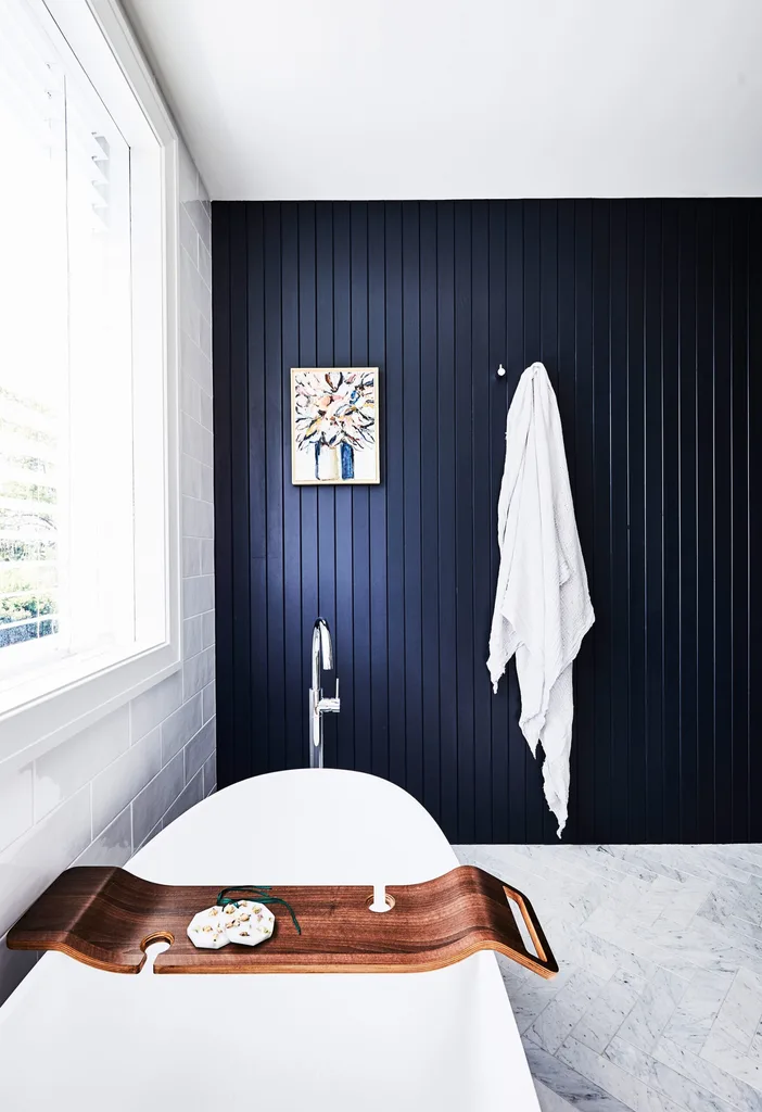
A feature wall of VJ panelling references other rooms to create a cohesive design palette.
The result is an elegant home that sits nicely in the neighbourhood, as if it has always been there.” People walk by and say they wouldn’t know it’s a new house,” says Nerida. “I consider that a compliment.”
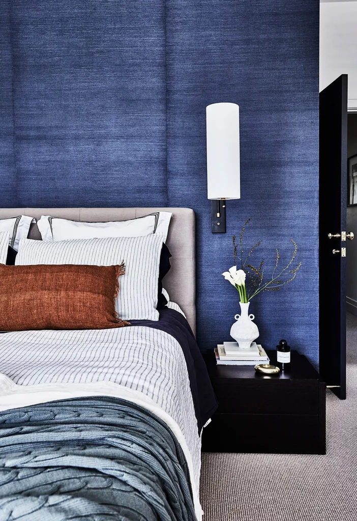
A wall of navy grasscloth wallpaper from Porter’s Paints delivers no-fuss texture and sets the couple’s bedroom apart. “It’s a classic, which is why I chose it,” says Nerida. “That was the idea with this house – to select timeless fixtures and finishes that would allow the charm of the old parts to fuse with the new parts.” A ‘Frankfort’ wall light from The Montauk Lighting Co is another classic contemporary touch.
“The master bedroom is so tranquil when we wake up. It’s the calming blue tones and tree-filled view of the backyard.” ~ Nerida
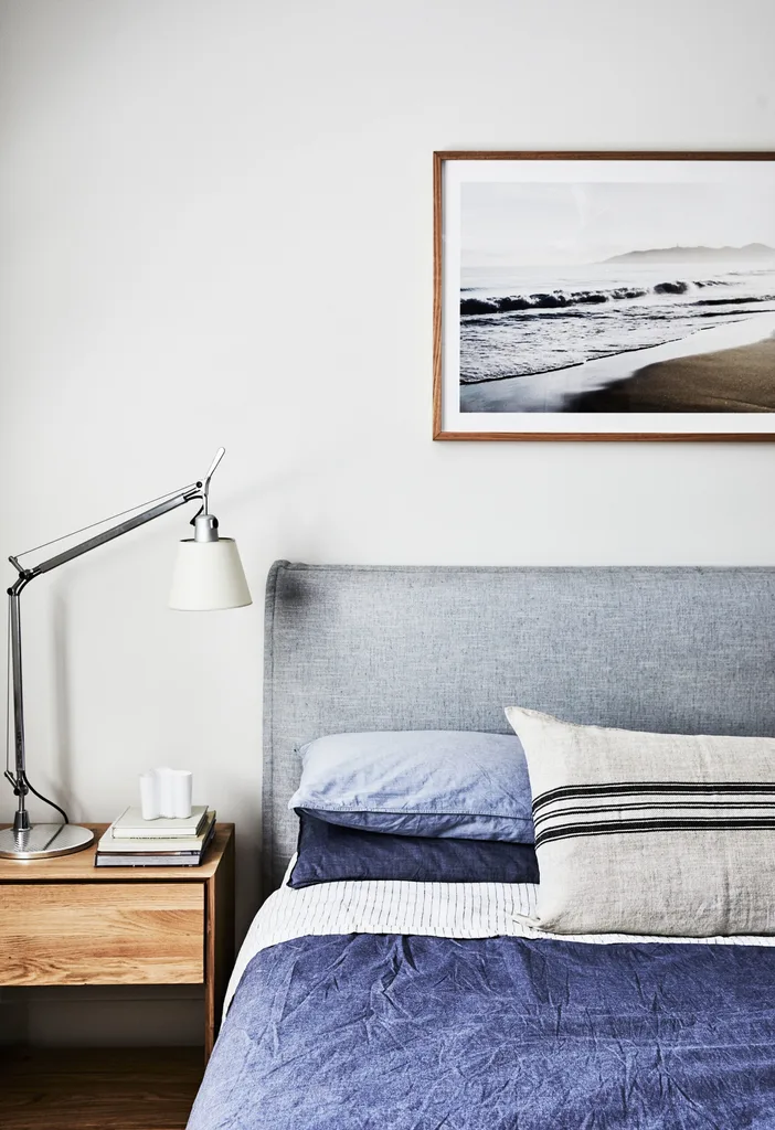
An Ethnicraft bedside table, In Bed linen and Camilla Q’s ‘Misty Morning Belongil’ print are a stylish vignette in Hugo’s room.
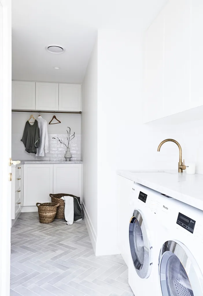
Joinery in Dulux Whisper White and a Carrara marble benchtop get the job done in the hard-working laundry.
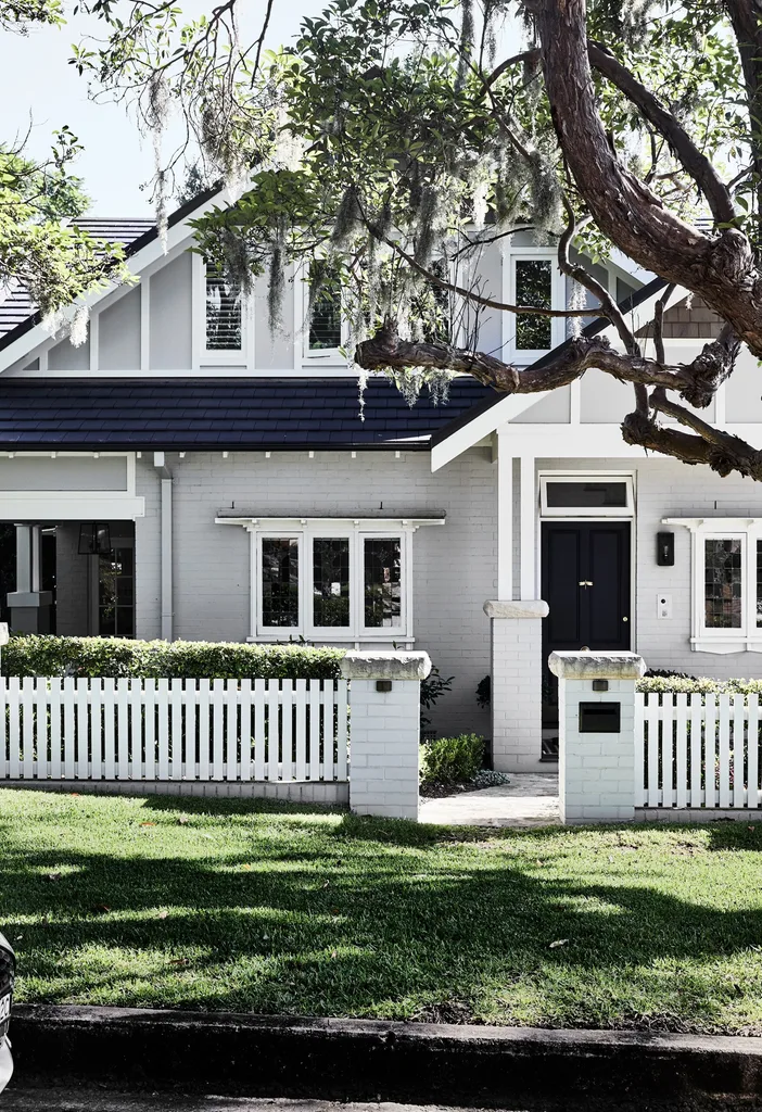
Painted in Dulux Silkwort, with crisp trims in Whisper White, Nerida and James’ home exemplifies classic kerbside appeal. To retain a more traditional aesthetic in honour of the Californian Bungalow’s heritage, architect Nerida moved the entrance from the side of the home to the front, and designed a new front portico with a matching gable. The result turns heads and draws compliments from passers by.
