Pink is not for everyone. It’s the colour of a sunset, the brand new skin of a baby, the nose on a tiny kitten and the ever-loving flamingo. Pink is a colour associated with love and, unlike its fiery counterpart red, is said to stimulate the senses to provide a calming influence.
If you find yourself gravitating towards the pinks on the colour chart, you may be craving a refuge from the busy life you lead, or a sanctuary to relax within.
If the concept of colour therapy – where colours are used to elicit an emotional response – is to be believed, the whole world needs to take an emotional break. The good news is that pink continues to feature on trend forecasts – perhaps as an antidote to the frantic, digitally-driven pace that persists in our lives.
But if you’re someone who still thinks of pink as a ‘little girl’ shade, it might be time to reintroduce you to the grown-up version of the colour. Rather than choosing a hue with blue tones, which may render it a little too ‘lolly pink’, opt for a tone with a warm base tending towards yellows. Those who prefer a more coastal or rustic aesthetic may also appreciate earthier shades of the colours, such as calming clays and dusty sunset hues.
- Pink Clay, Dulux
- Pink Dust, Dulux
- Pashmina, Porter’s Paints
- Majolica, Porter’s Paints
- Ballet Slipper, Porter’s Paints
- Pink Ground, Farrow & Ball
The best pink paint colours
How to decorate with pink in 2025
Opt for more muted shades of pink
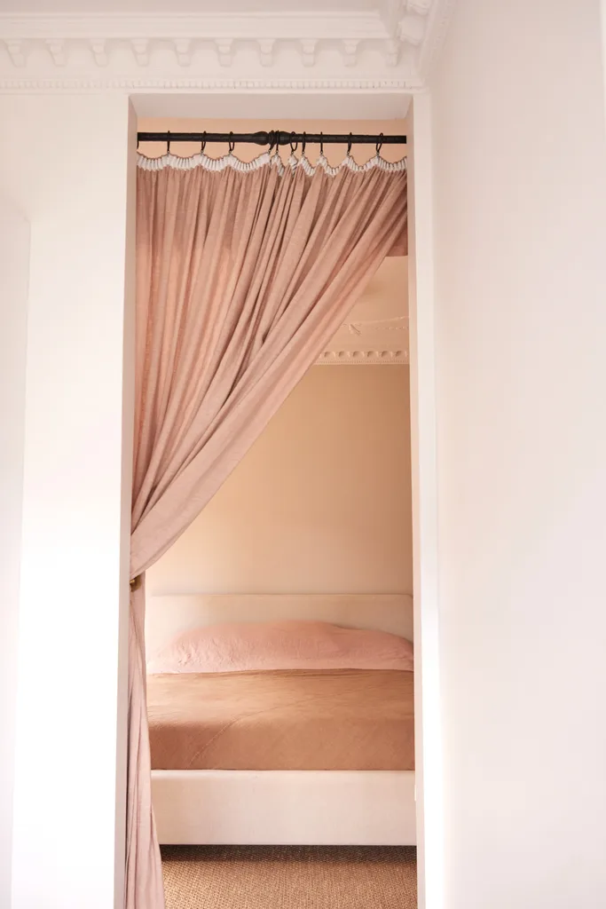
Olli Ella co-founder Chloe Brookman makes pink a grown-up colour in her home by opting for more muted shades in the main bedroom. Although the wall, curtain, bed linen and even carpet retain more than a hint of the colour, the pink doesn’t overwhelm the room. In fact, the earthier shade of the pink chosen by Chloe actually does the opposite, bringing a clay-inspired calm into the bedroom. The minimal decor also keeps things more calm than chaotic.
Add a pop of pink to a neutral room
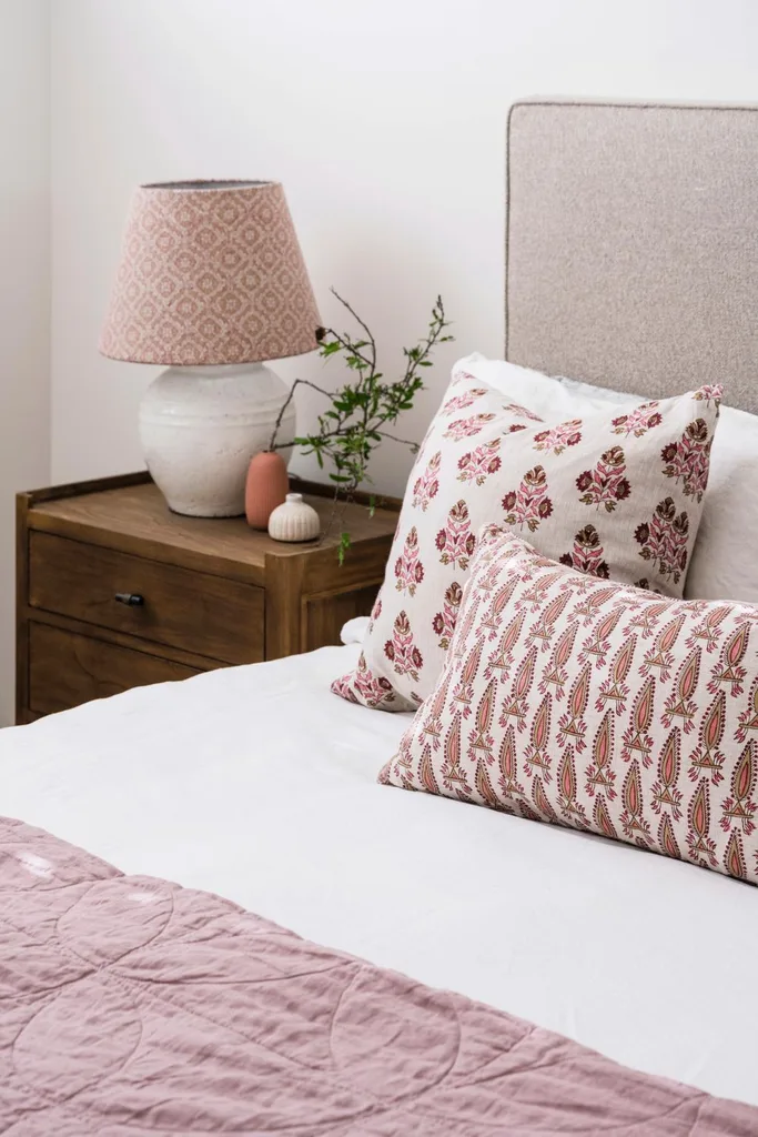
The dominating nature of pink can make it a trickier colour to decorate with. If you don’t want pink to be the first thing you see in a room, you might find more success with adding a couple of pops of pink to an otherwise neutral room.
This is masterfully demonstrated within the bedroom of 20-year-old Molly, the daughter of the owners of this modern farmhouse in Toowoomba. In Molly’s bedroom, the pink-patterned pillows, lampshade and quilt keep things pretty without leaning into a younger territory.
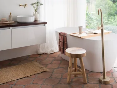
Embrace natural materials
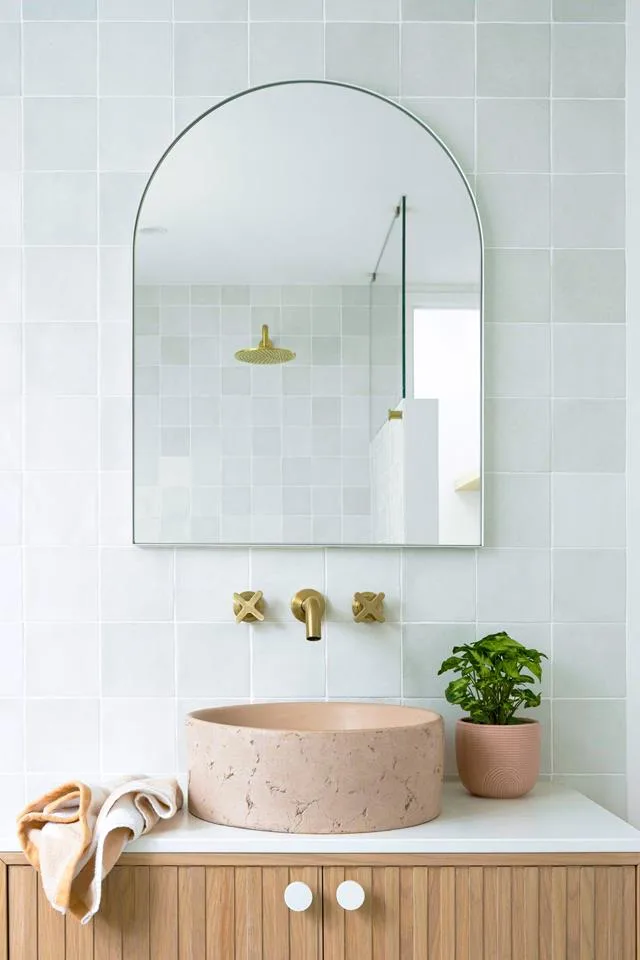
To avoid the bows and ribbons association with pink, lean into materials where the colour is naturally found, such as stone materials like travertine, marble and granite, as well as clay materials like terracotta.
The pink clay basin of a bathroom on the Gold Coast is a good example of this, where the natural materials and textures help pink to lean into the home’s laidback coastal aesthetic, rather than a fussier feminine one.
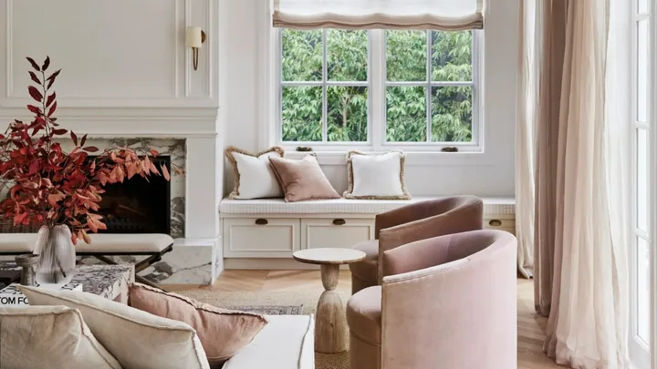
Go luxe with your furnishings
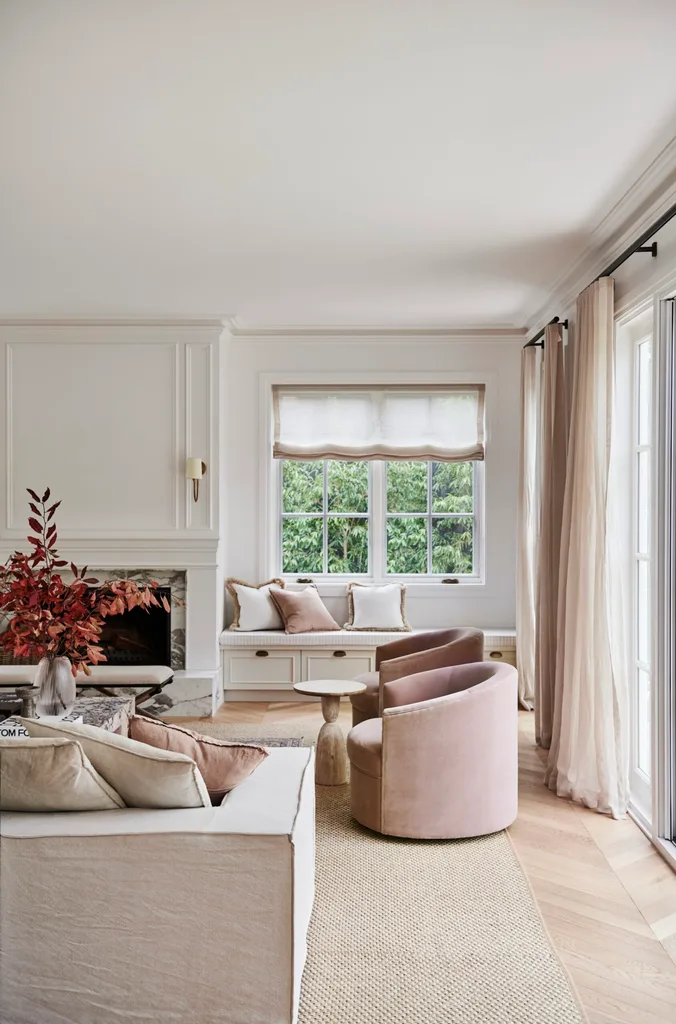
Luxury furnishings can take pink from girlish to grown-up, as seen within the grand living room inside a family home on the Mornington Peninsula, where plump cushions, opulent occasional chairs and floor-to-ceiling length curtains elevate the pink palette.
Let pink be a statement

Bright pink decor will always make a statement, and sometimes it’s better to simply let it. Being intentional about the positioning of your bright pink items, such as the central location of this bright pink rug in this Canberra cottage, can help the shade sing.
Use florals
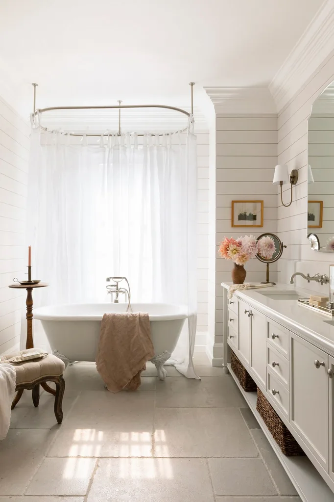
If you’re not ready to make pink a permanent colour in your home, you can test out the colour and its various shades with your floral choices, as is delicately done in the bathroom of this family home in Vancouver.
Related stories
Native ad body.
Native ad body.
Summer at home: The art of the seasonal refresh
Native ad body.