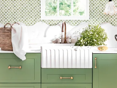
Ever heard the design rule that states large furniture can’t be used in small rooms? Or that patterns and prints shouldn’t be mixed? The world of decorating is full of myths and misconceptions, often setting such rigid expectations that there’s little room for creativity.
Navigating these no-go zones can be frustrating and disheartening but that doesn’t have to be the way. Allow us to poke holes in some of the more outdated notions so you can be free to create a home that represents your style, and most of all, makes you happy.
1. Blinds trump curtains
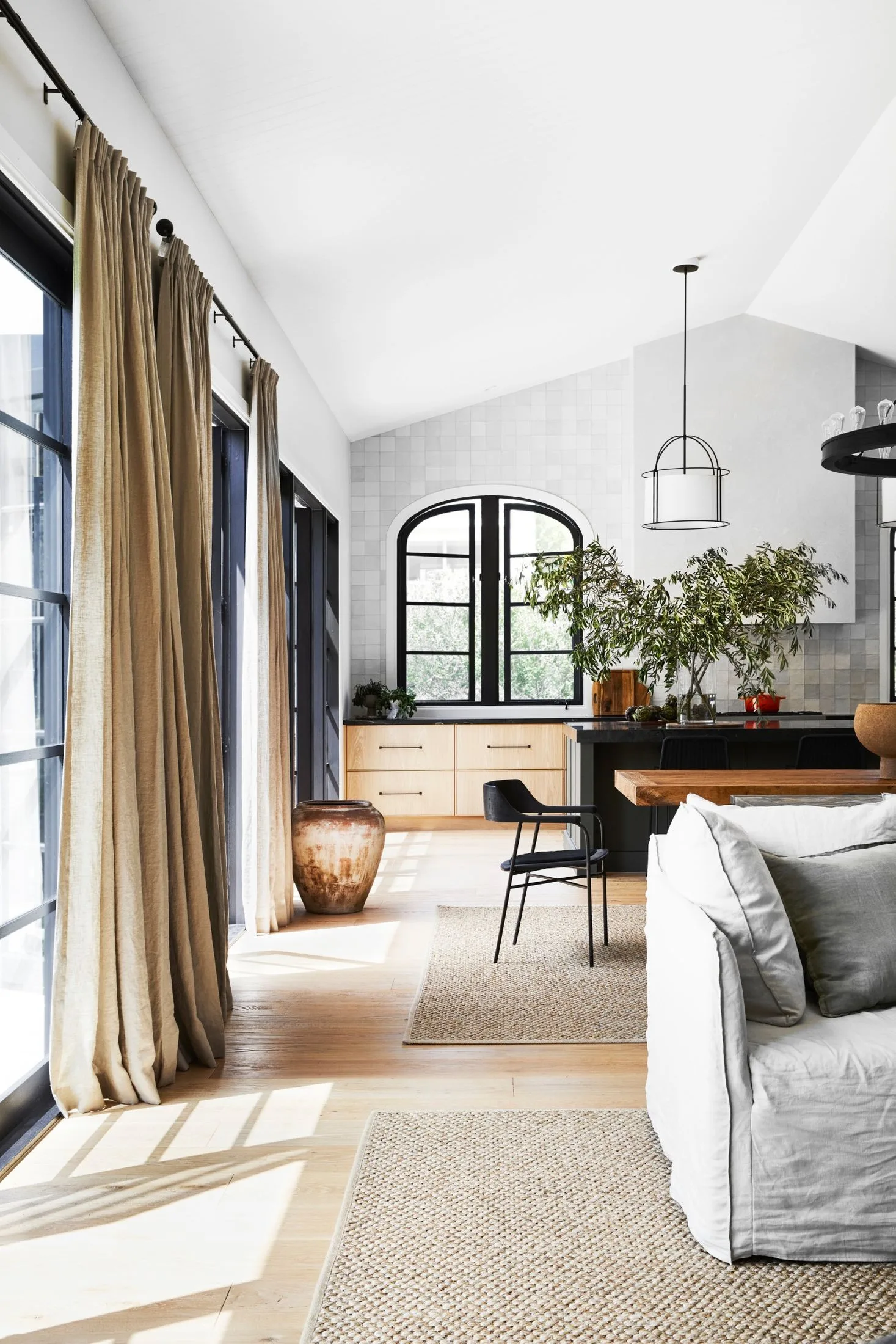
Myth busted: When it comes to window treatments, there is no one-size-fits-all approach, however, if Gabrielle Reinhardt of Berkeley Interiors had to choose one option, curtains would win hands down. “Custom curtains are not only functional, either defusing or blocking the light, they also add softness to a room,” she says. “Curtains provide warmth and insulation in winter and help block out the sun and heat in summer.” Gabrielle likes to specify sheer curtains with partial or blockout lining on a separate track: “The sheers are ethereal and soft and the lining is for functionality.”
2. Wallpaper is a big commitment
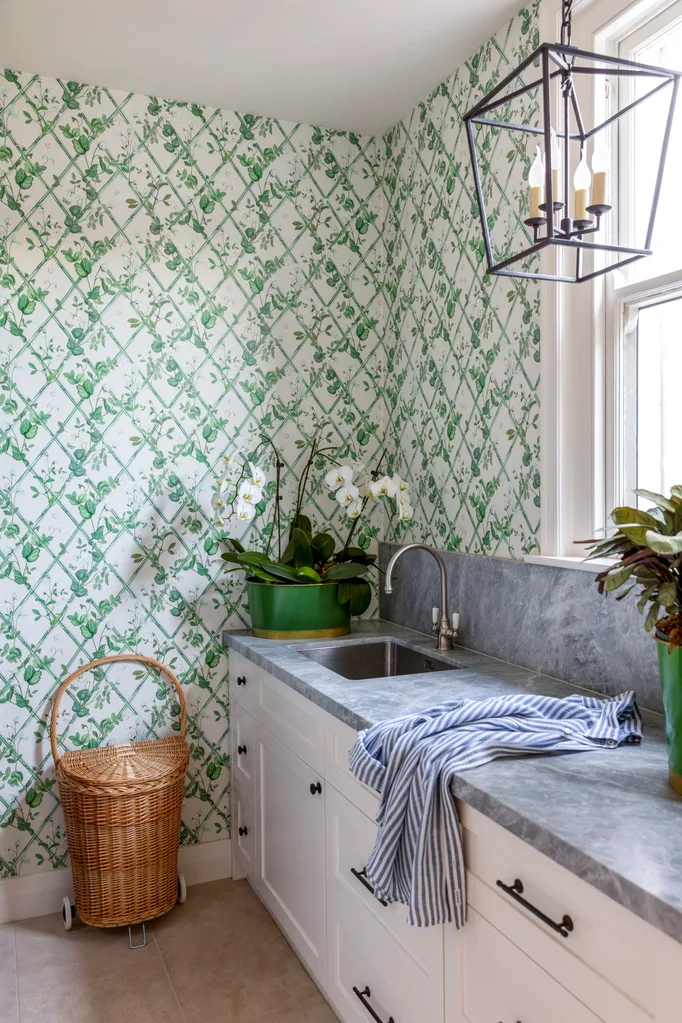
Myth busted: For our parents and grandparents, this was certainly true, with copious amounts of glue and patience required to apply wallpaper, and expensive steamers needed to remove it. But today’s wallpapers are much easier to apply and remove, with a huge variety of textures, patterns, colours and finishes. “I love using wallpaper in studies, bedrooms, lounge rooms, dining rooms and even in laundries and bathrooms,” says Nerida Thorburn of Nerida Thorburn Design. “A study nook, pantry or a powder room can be a great place to ease your way into this look.”
3. You can’t have nice things if you have kids or pets
Myth busted: That white linen sofa, leather armchair or shag pile rug that you’ve always wanted but didn’t trust your kids and fur babies around? Buy it now, says Gabrielle. “If you wait until your kids grow up to have nice things, you’ll miss out on creating a beautiful home for you and your family to enjoy together.” If there were studies into these things, they’d probably show that children and pets who are exposed to precious items from a young age grow up to be more mindful of their surroundings. And in the meantime, Gabrielle suggests using washable fabrics, coasters, placemats and some firm ground rules to protect your belongings.
4. Natural light is best
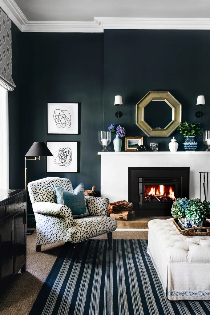
Blue walls, similar to Dulux Stream, create a cocooning effect in the snug room.
(Credit: Photography: Abbie Melle | Styling: Lisa Burden)Myth busted: While natural light is an eco-friendly, efficient way to light and warm a home, in some situations artificial light may be preferable for visibility and functionality, says interior designer Kate Walker of KWD. “Artificial light can be a useful tool in situations where natural light is limited or unavailable, or when a specific mood is desired,” she says. “It’s ideal for highlighting specific elements in a room, like artworks or architectural features, and can also control and manipulate the ambience and mood, with dimmers adjusting the intensity of light.”
5. Symmetry is key
Myth busted: Using symmetry in decorating stems from a more traditional style, where rooms were split in two and each half designed to mirror the other. But if you’re after a more relaxed mood for your home, “Feel free to forgo the symmetry in favour of less structured arrangements with more variety”, says Nerida. She keeps disparate elements cohesive by incorporating a common thread, such as a consistent colour palette or repetition of forms, while also ensuring there are moments for the eye to rest. “Negative space plays an important role in asymmetrical design,” Nerida explains.
6. Don’t mix patterns and prints
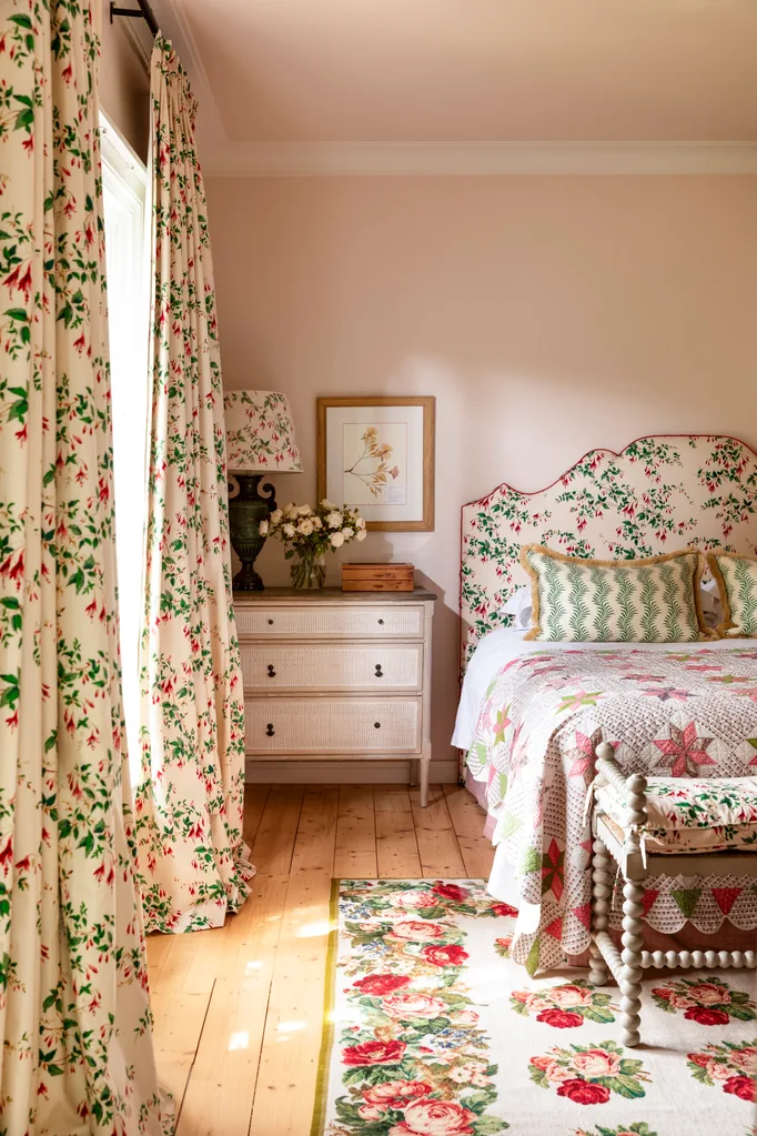
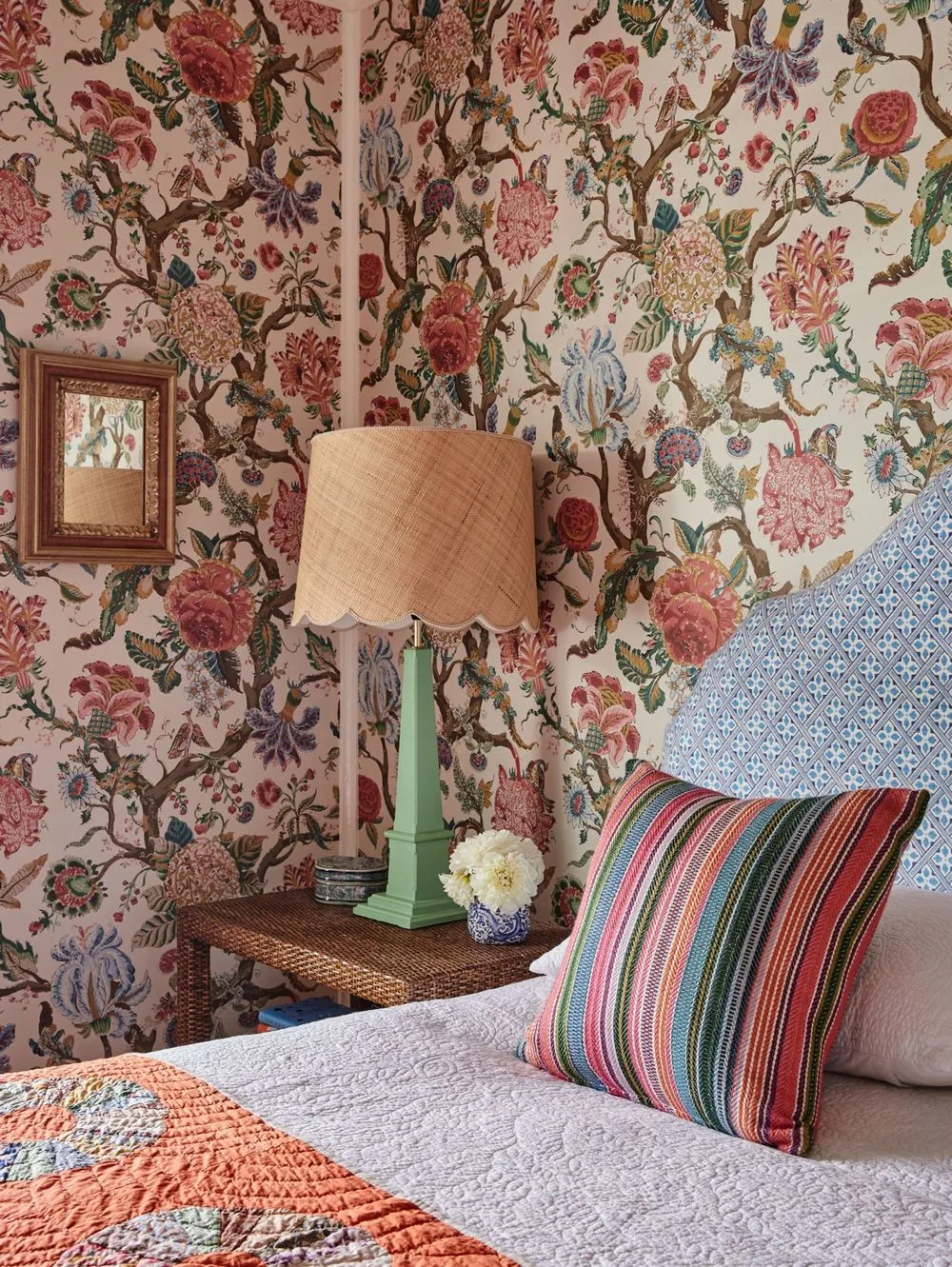
Myth busted: There is no better way to add character to a room than by layering it with a mix of prints, colours and textures. “If everything is too coordinated or matching, it just looks flat or overly prescribed,” says Gabrielle. Her top tip: “When designing a room, I choose a hero fabric or large-scale print with a number of colours in it and then combine this with other colours and smaller scale prints. If the scheme is looking too ‘samey’, I’ll throw in the colour pink as I find pink just makes everything work.”
7. Hamptons homes must be white
Myth busted: While white is synonymous with the classic elegance of Hamptons style, Kate Walker argues that the success of this aesthetic lies in its balanced blend of hues. “Incorporating different tones and textures will add depth and interest to the overall design, while still maintaining a sophisticated elegance. Try timber and wicker furniture set on dark timber floors with highlights of soft blue, sage green and sandy beige.”
8. Books belong on bookshelves
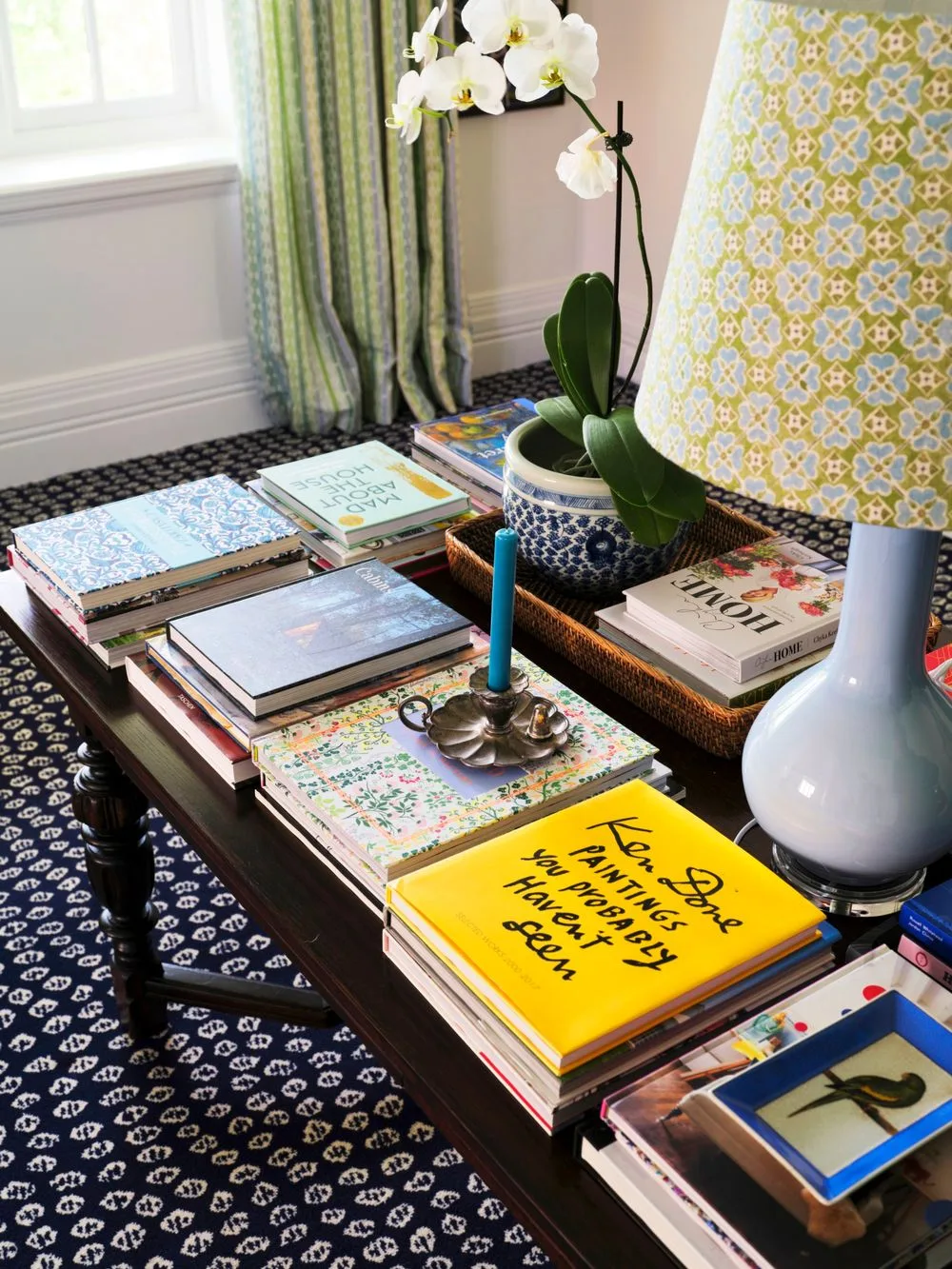
Myth busted: Your favourite coffee table tomes and page turners don’t have to be relegated to a shelf to gather dust. Stack them on the floor, on a fireplace mantel, in the kitchen or on your office desk. “Books are always an arm length away in my home,” says Chloe Tozer, founder and creative director of Clo Studios. “They are one of my greatest sources of inspiration and there is no place they don’t belong. It would be sad if they all lived on a bookshelf.”
9. Decorate for resale
Myth busted: It’s often suggested that design and decorating decisions should be made with future buyers in mind – think all-white kitchens, neutral palettes and universal lighting schemes – but there is little value in this, says interior designer Kate Hardy of Cloth + Stone Designs. “I tell my clients – including those who are not in their forever home – to style spaces with their own personal preferences and needs in mind,” she says. “The next owner might be completely different to them in age, preferred aesthetic and number, so there is no way of knowing what they will require in terms of style, finishes and colours. However, what is appealing to any buyer is an interior that’s well designed with good flow, functionality and elegance.”
10. Art is an expensive investment
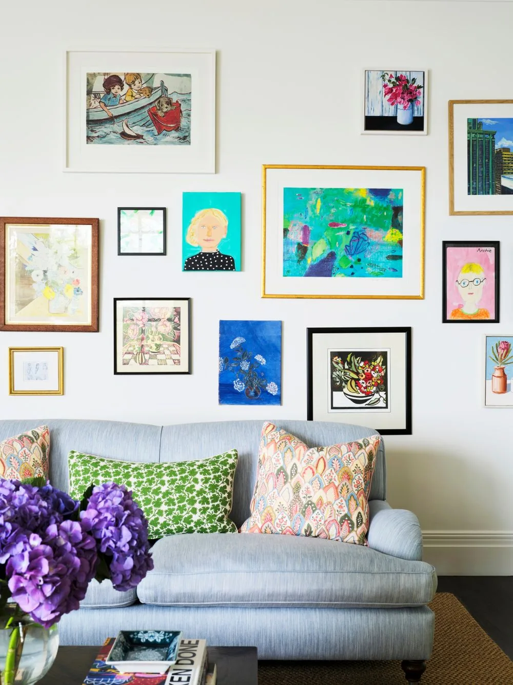
Myth busted: Sure, an original Van Gogh may not be in your budget, but beauty is in the eye of the beholder and art comes in all shapes and styles. “My recommendation for selecting art is to spend time sourcing as widely as possible, from local art galleries and artists, to country fairs or markets,” says Kate Hardy. For her, it’s about the feeling that the piece provokes, not its price tag. “My particular favourites are small still life pieces, which often capture a delicious, serendipitous moment in time.”
11. Dark colours don’t belong in small spaces
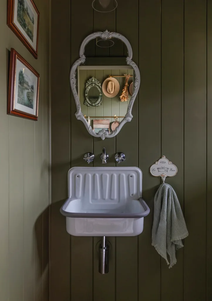
Myth busted: The general consensus is that white walls will make a small room feel larger, but Nerida argues that small spaces need a “wow” moment even more than larger rooms. “Colour is one of the easiest ways to deliver this,” she says. “In small bathrooms and powder rooms, limit the number of finishes so the room doesn’t feel busy and instead choose one amazing colour for the walls for high impact.” Nerida’s favourite dark hues for small spaces: Dulux Domino, Dulux Five Fingers Peninsula and Porter’s Paints Bayleaf.
12. Small room = small furniture
Myth busted: Getting the scale of furniture right in a room is so important, but as Nerida explains, “Lots of small furniture in a small room can make it feel even smaller and cluttered”. Instead, she likes to choose a larger statement or hero piece, such as a deep sofa or oversized floor lamp, and play around with different scales. “For a really small room, consider built-in furniture that makes use of all available space and also serves a dual purpose, such as a built-in sofa with storage underneath,” she says.
13. Renting restricts creativity
Myth busted: Not so, says Chloe. Just because you’re a renter, you don’t have to put up with a bland interior or your landlord’s design decisions. “Go bold with colour choices in your bedding, furniture and accessories,” she says. “Make your rug the artwork rather than having to use the walls or invest in feature lighting to create cosiness; lighting can truly transform a space into a home.”
14. Bedrooms are just for sleeping
Myth busted: While we are firm advocates for getting our eight hours of shut-eye each night, bedrooms are now becoming multi-purpose spaces for work, relaxation and play. “In a busy household with young children, the parents’ retreat is just that – a place to escape and take a break from the busyness of life,” says Gabrielle. “For small children, a bedroom is where they play and retreat into their own creative worlds. And a teenager’s bedroom is where they can have time to themselves.” While selecting the right bed is important, there are certainly other elements to consider, too.
15. Country homes should be rustic
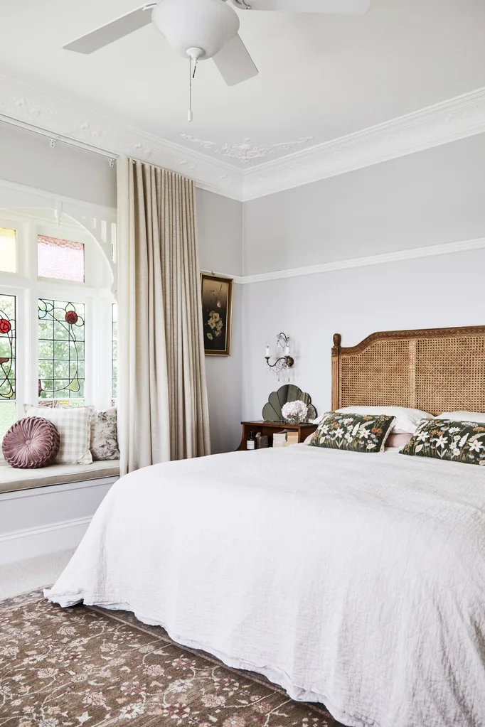
Myth busted: “Country homes ideally reflect their surroundings and are also inspired by the textures and tones of nature,” says Louise Spicer of One Four Interiors. While traditional country cottages tend to favour eclectic homewares and chintzy fabrics, today’s more modern interpretations are pared-back in style and form. By leaning in to organic and earthy materials and finishes, they complement the natural surroundings. “Modern homes with clean lines and a material palette of timbers and textures ooze relaxed country without the need to be ‘rustic’,” she adds.
16. New homes deserve new furniture
Myth busted: If you’re building from scratch or moving into a new home, it can be tempting to sell everything you own and start afresh. But Chloe cautions against this. “It’s really nice to have pieces that stay with you for a lifetime,” she says. “By all means, add some new pieces into the mix, but hang onto those old treasures, too. That’s what makes a house a home.” Not only is this approach more economical but it’s sustainable as well. And if those benefits aren’t enough to convince you, consider that you might end up with a few family heirlooms to pass on to grown children.
17. It’s better to decorate all in one go
Myth busted: While it’s good to have a clear plan and idea of the look and feel you’d like for your home, decorating is a gradual process, says Gabrielle. “As time marches on and families grow, your needs will change, so I believe in changing and adding pieces to suit your lifestyle and situation.” Lighting, accessories, books and art are all good ways to add personality, comfort and interest to an evolving interior.
18. Laundries don’t need to be beautiful
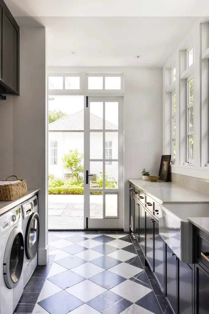
Myth busted: Typically considered to be functional, rudimentary and utilitarian spaces, laundries often don’t get a look-in when it comes to decorating. But Kate Walker is keen to change this. “A well-designed laundry can be both functional and aesthetically pleasing,” she says. Materials, storage and lighting can all be chosen for their look as well as function. “Then add decorative elements, such as an appealing colour scheme that matches your home’s decor, some feature tiles or wallpaper,” says Kate. “Don’t be afraid to feature artwork to bring the space to life.”
19. DIY is cheaper
Myth busted: Many small jobs like repainting the front door, changing a light fitting or putting together a flat-pack bookshelf can be tackled by anyone with the right tools and know-how, but if you’re renovating on a larger scale, engaging a good interior designer or decorator could be the most cost-effective decision you make. “An interior designer has professional expertise and experience to help you avoid costly errors, can save you time and stress and can manage the budget, planning and coordination of your project for you,” says Kate Walker. They might also be able to pass on some trade discounts not available to the general public – ca-ching!
20. Style over comfort
Myth busted: While a pleasing aesthetic is an important part of any home design, extended time spent at home during Covid lockdowns and ever since has seen a big shift towards cosy spaces that breed relaxation. “The need to be able to walk into our homes and relax into our favourite chair or sofa is a must in our busy lives,” says Louise.
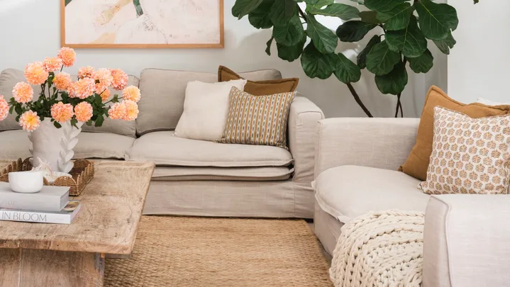 (Photography: Hannah Puechmarin / Styling: Hayley Jenkin)
