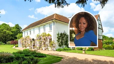
Already living nearby and fans of the peaceful harbourside locality, Hugh, a barrister, Susie, a school counsellor, and their children Darcy and Olivia were drawn to this lovely home on Sydney’s lower north shore. “We loved the quirky feel of it and its ‘Hacienda’ look,” says Susie of the Spanish mission-style four-bedroom abode.
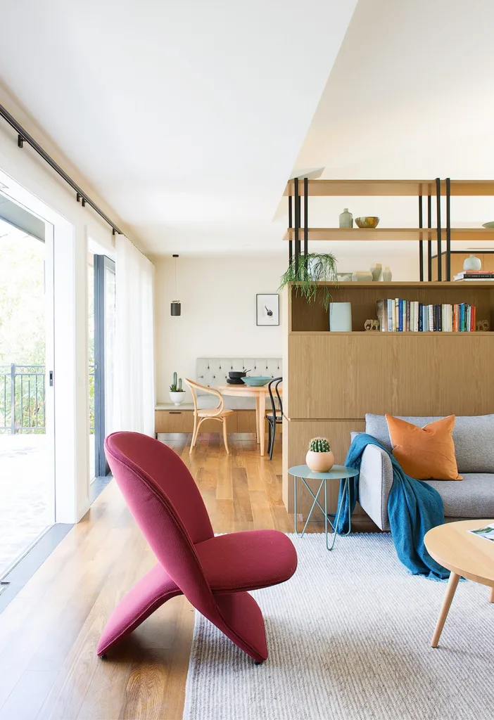
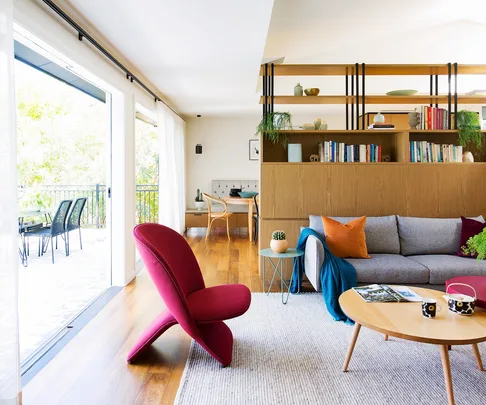
The headline act of Susie and Hugh’s stunningly renovated home on Sydney’s lower north shore is the hard-working custom joinery that acts as a room divider, storage hero and design detail all at once. “The traditional open-plan living area just didn’t work for us,” says Susie. “The joinery creates nooks and spaces which aren’t separate rooms, but at the same time provide privacy and cosiness.” It’s perfect when you’re living with teenage children. The ‘Nook’ sofa from Jardan and the ‘Niloo’ chair from Kezu create a cosy area for relaxation.
When the home was purchased, an existing tenancy arrangement was already in place, so it took a little while before the new owners were able to start renovating.
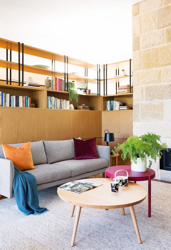
Basking in the lovely warmth of the ‘Mezzo 1300’ double-sided fireplace from Jetmaster, the formal living zone is a place for reflection and reading. A ‘Nook’ sofa from Jardan is equal parts practical comfort and style statement, and the perfect perch to admire the feature wall of hand-picked ‘Barrimah’ sandstone blocks, sourced from Eco Outdoor. “It’s one of our favourite rooms,” says Susie. “It’s tucked away and there’s no TV, just the fire and view.
The original property was a bit boxy,” says Susie, who enlisted the help of Castlepeake Architects to make her family’s dream a reality. “We wanted more natural light, a better flow, and a chance to use the balcony and enjoy the views.”
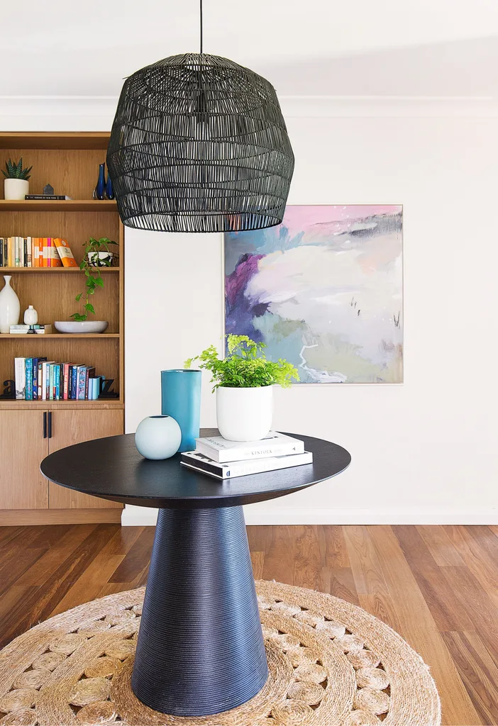
By adjusting the entrance to the main bedroom, extra space was created within the landing area, facilitating a better flow through the home. Custom joinery offers a handy showcase for decorative pieces, while a striking Ay Illuminate ‘Nama 3’ pendant from Spence & Lyda hovers over the table to create an eye-catching centrepiece. This also circulates foot traffic into the home’s different zones. An artwork by Sharon Candy from Art2Muse lifts the colour quota of this thoroughfare in an elegant fashion.
With two teenage children in the home, Susie and Hugh also wanted a living area that created spaces that were separate, but not apart. The solution was to remove internal walls to create an open space that now accommodates the new kitchen, dining area and two living areas.
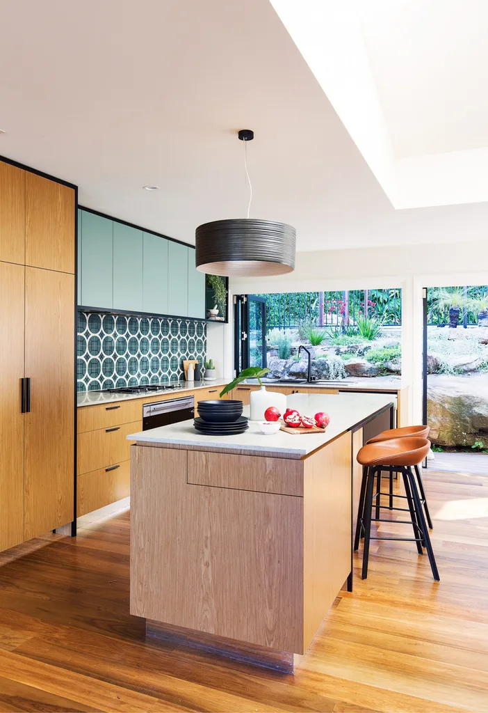
Designer Sonia Warner of Woods & Warner took colour cues from a variety of sources. “The warmth of timber came from Hugh’s love of mid-century modern furniture,” says Sonia. “We complemented this with tranquil eucalyptus tones and deeper petrol greens from the home’s water views.” The splashback was made with custom ‘Fretwork On Four’ tiles from Onsite Supply & Design, while black metal detailing – an existing exterior feature of the home – was used in cabinet handles and joinery. A pair of Hay ‘About A Stool’ kitchen stools from Cult sits with the colour scheme and Smeg appliances make cooking a dream.
The renovation also included higher ceilings, an extension of the balcony, a laundry overhaul and new bathrooms. “It was a lot of work, but the building team were here intensely and often worked on weekends, so it happened so quickly,” says Susie of the experience.
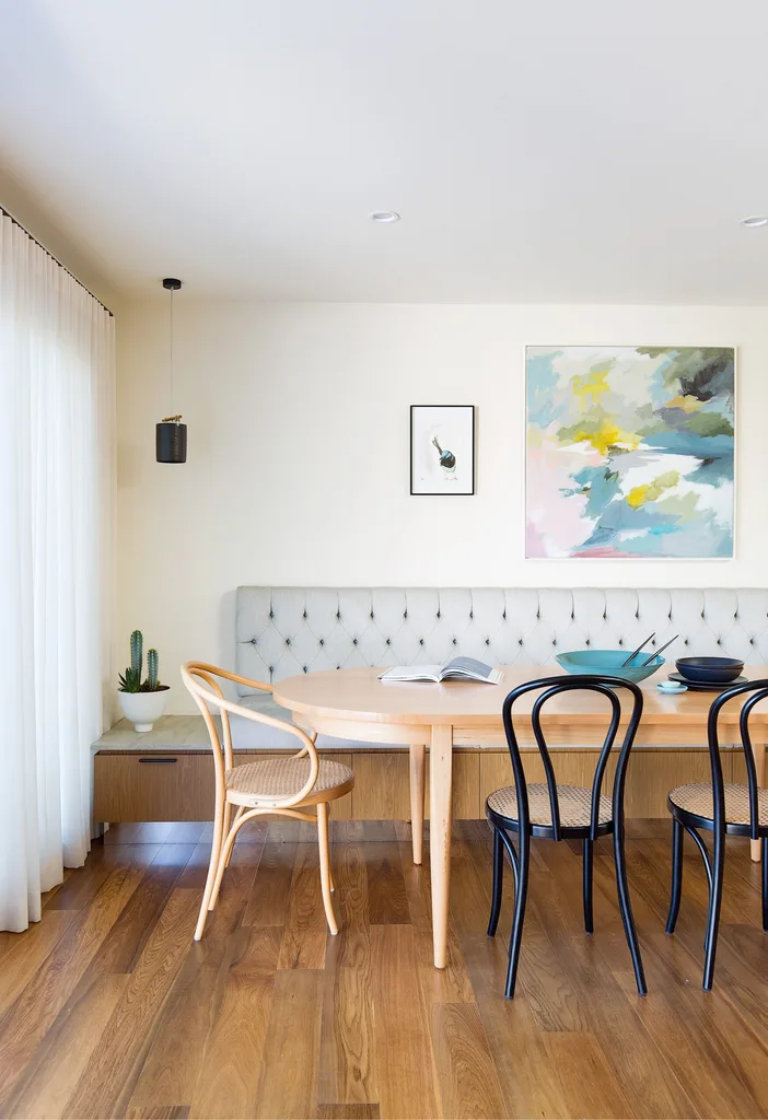
Two windows – complete with views of next door’s brick wall – were enclosed and new raised ceilings with a huge skylight now deliver abundant natural light into the living spaces. In place of the old windows, the solid wall became a feature showcasing a bluebird artwork painted in watercolour by artistic homeowner Hugh and the ‘Passing Through’ painting by Sharon Candy from Art2Muse Gallery. Bespoke bench seating designed by Woods & Warner is underpinned by handy storage, with button detailing lending a refined air to family meals around the oval ‘Olivia’ dining table from Arthur G.
“We wanted to use sandstone in keeping with the local area to maximise natural light.” ~ Susie
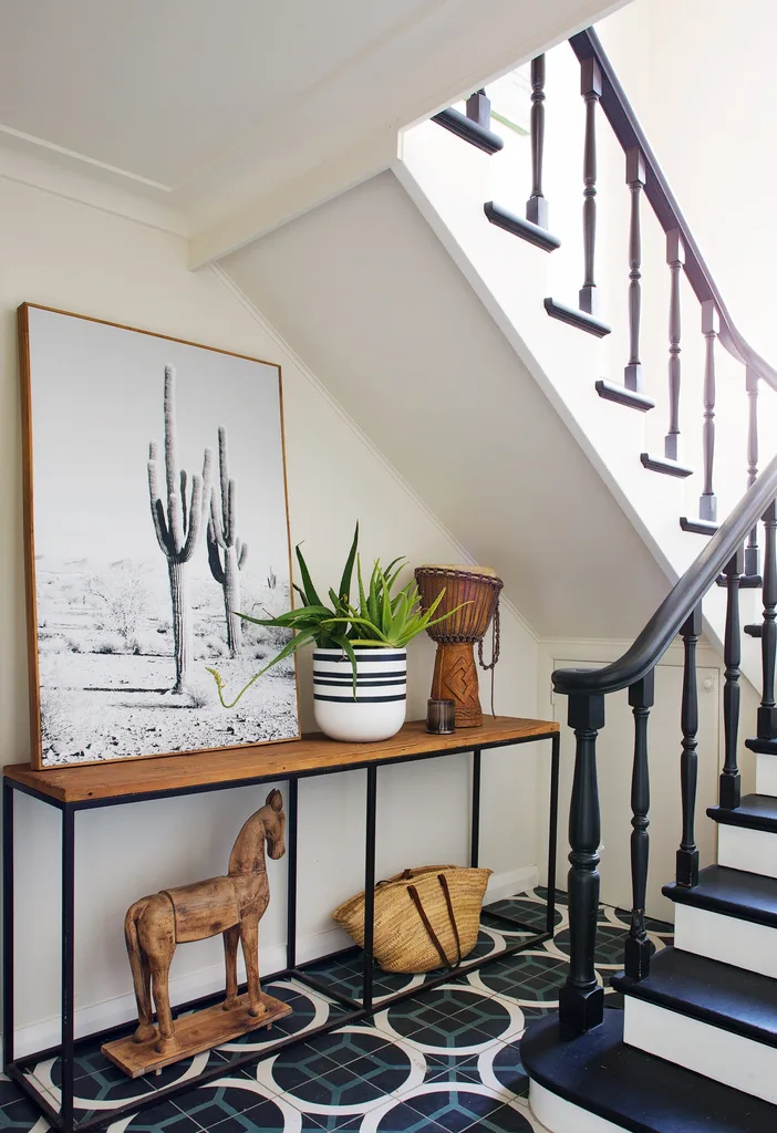
There were certain features of the home that Susie was insistent on maintaining – and the stairs were firmly on the list. The custom encaustic tiles seen in the kitchen appear again here, working with the freshly painted stairs, leaving the colour palette simple so architecture can take the limelight. The ‘Cacti’ canvas print by Warranbrooke from Freedom adds interest to the space.
“The tiles create a lovely link and flow between inside and out. They are a gorgeous geometric feature.” ~ Susie
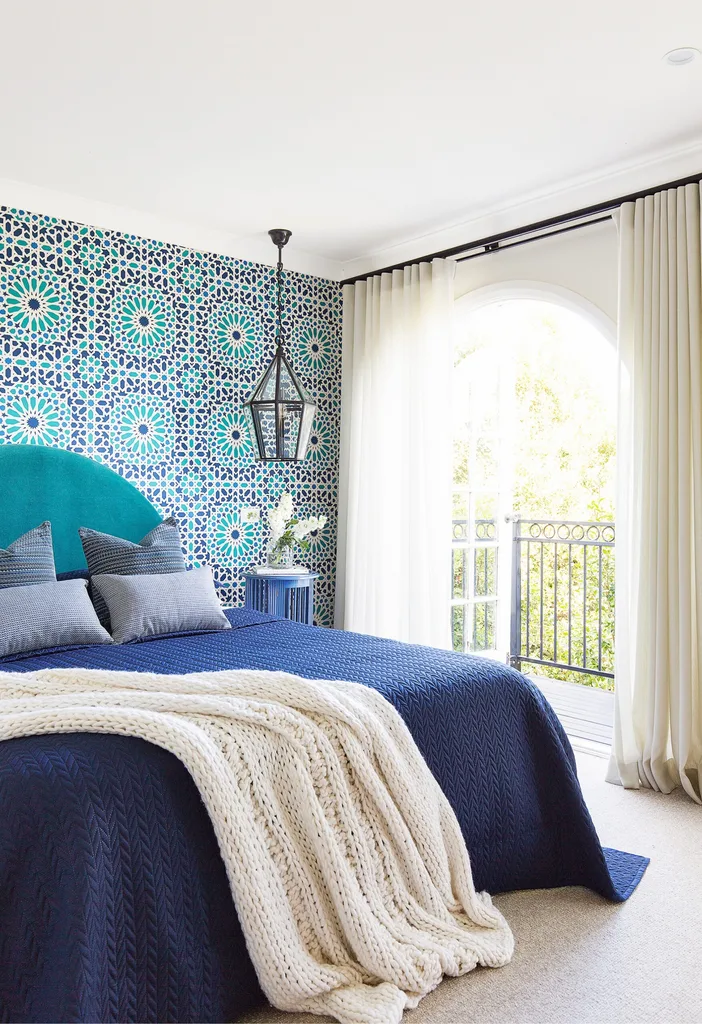
The last room to be completed in the renovation project, Hugh and Susie’s bedroom shines in vibrant jewel tones. ‘Nasrid Palace Mosaic’ wallpaper in Aegean from Orient House combined with ‘Belmont’ lanterns from Emac & Lawton honours the Mediterranean influences of the home. A bedhead upholstered in luxurious Schumacher velvet in Teal from Orient House was designed by Woods & Warner and built by H&J Furniture, while velvet cushions take the pattern game up a notch. “We had worried initially that the vibrancy of colour may not be conducive to a relaxing room, but it turned out to be really peaceful,” says Susie.
“We love how the colours and patterns in the bedroom tie in with the rest of the house.” ~ Susie
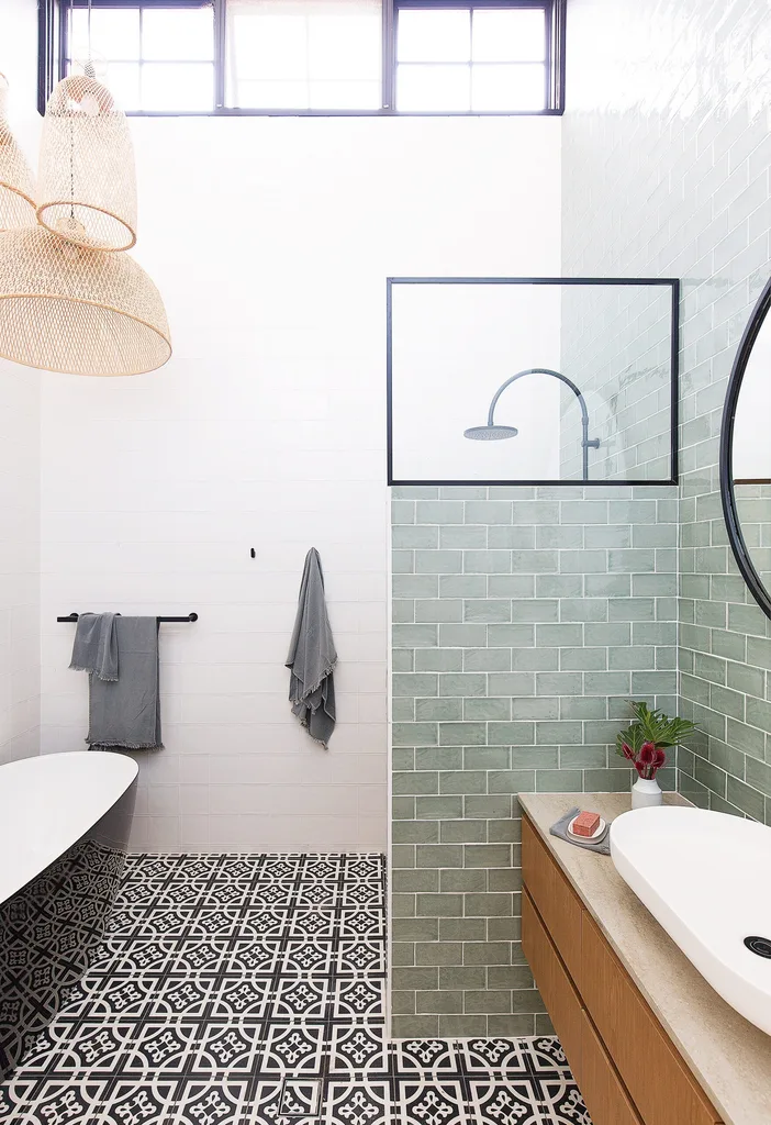
The glossy Kado ‘Lure Petite’ freestanding bath and black and white ‘Zaragoza’ encaustic floor tiles from Teranova Tiles anchor the bathroom in bold monochromatic fashion, while black accessories and tapware and an ‘Onyx’ mirror from Warranbrooke punctuate the scene.
“The home’s basic bones were good, but the changes have made a huge difference to the way it feels.” ~ Susie
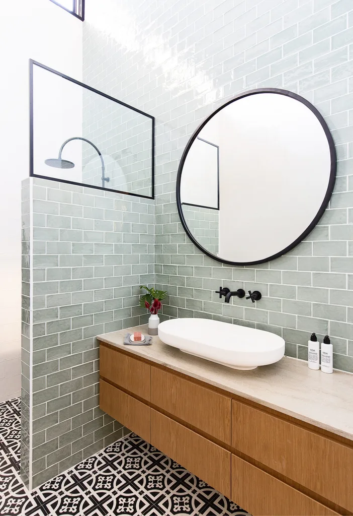
Family storage needs are met with a custom vanity, made with Eveneer in ‘Almond’ from Elton Group, a Corian bench in Sage Brush and an Omvivo ‘Venice’ basin from Reece. A cluster of Ay Illuminate pendant lights from Spence & Lyda pick up the tones of the vanity. Subtle greens and timber hues visually link to the rest of the home and its penchant for colour.
“The house flows in a way that makes it very easy to live in. We feel so lucky to be here.” ~ Susie
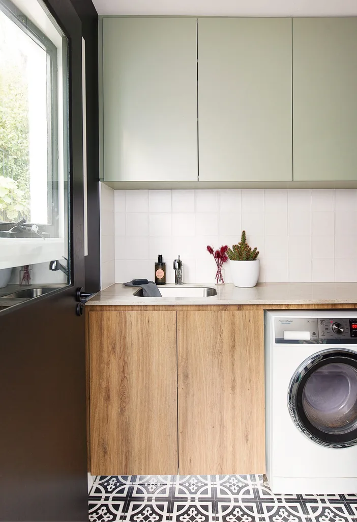
Colour consistency is the strategy throughout the home, with even the laundry being treated to the beautiful palette. Cabinets in Laminex ‘Bayleaf’ and Lamicolor ‘Chalet Oak Tabac’ soften the bold monochrome features in this utility space.
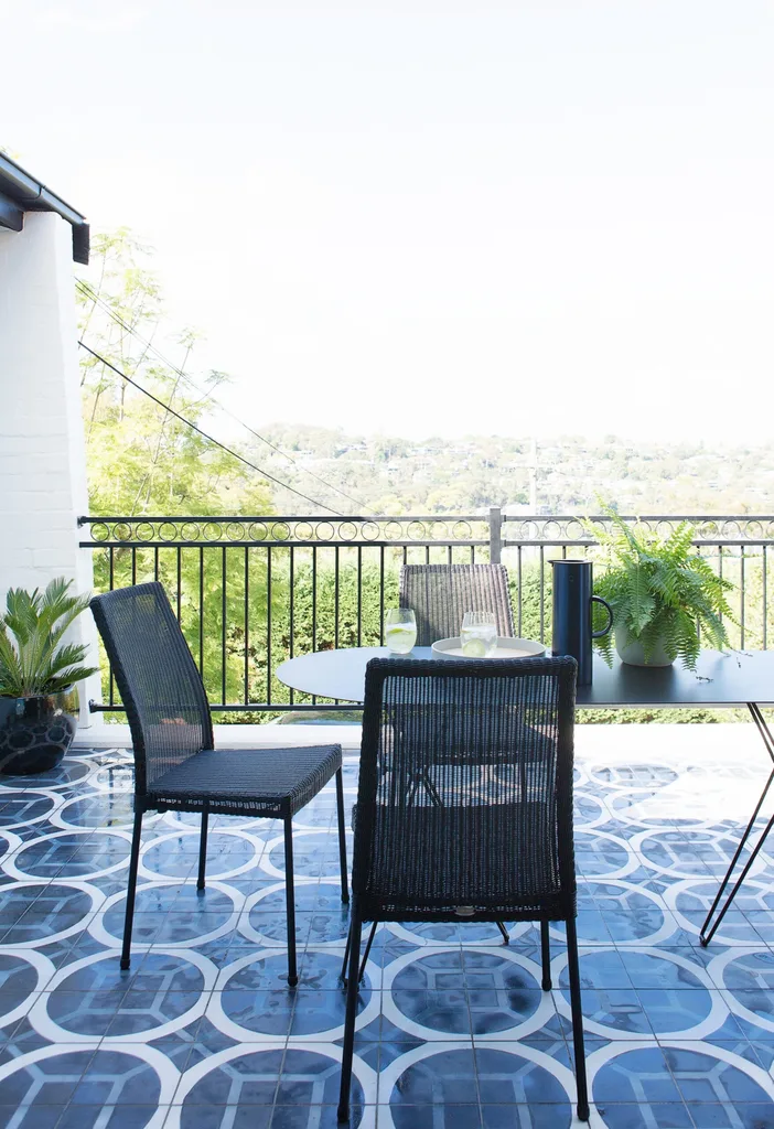
Darcy, Olivia and Banjo enjoy the extra living space the balcony extension creates, with valley views providing an attractive backdrop. Custom encaustic tiles from Onsite Supply & Design reference those used in the kitchen splashback and the home’s entrance, creating a cohesive subplot to the colour and pattern story of the home. “The original black balustrade was one of the starting points for our conversations about colour and design,” remembers Susie. It was kept and reinstalled after the balcony extension was finished, with a new section custom-matched to accommodate the increased area.
