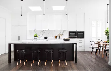
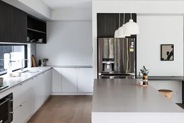
Getting the kitchen layout right is one of the most important considerations for homeowners when renovating a kitchen. Even with an abundance of space it can be a challenge to work the layout and proportions fully for optimum functionality and style.
Here’s how to get the look of The Block kitchens in your own home.
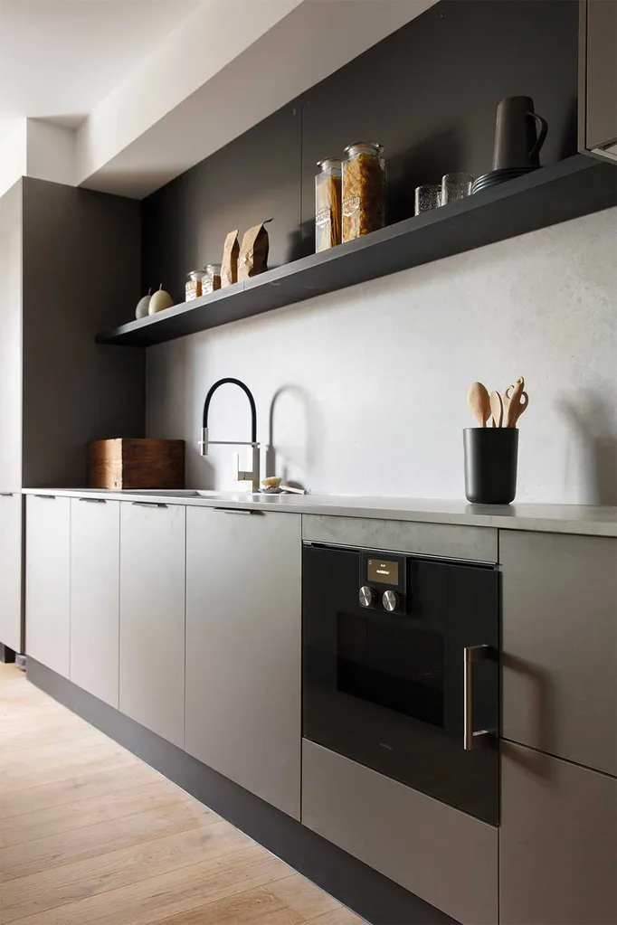
Apartment 1: Kerrie & Spence
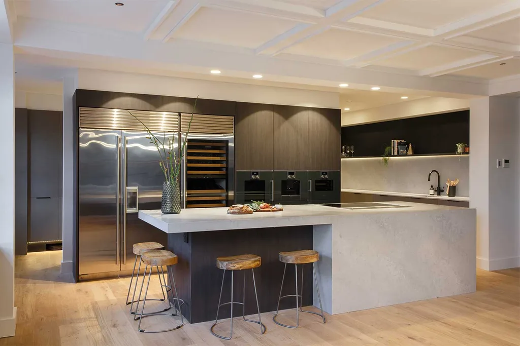
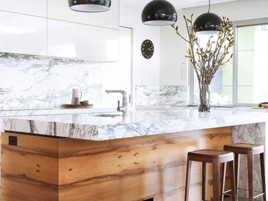
Think earthy tones and timber with generous expanses of stone in your benchtop choice. A waterfall effect where the benchtop cascades to the ground gives a focal point to the space and invites family and guests to gather around the central cooking hub.
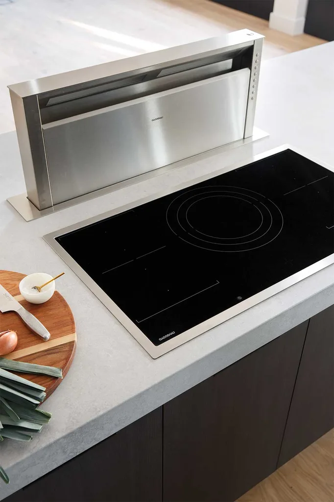
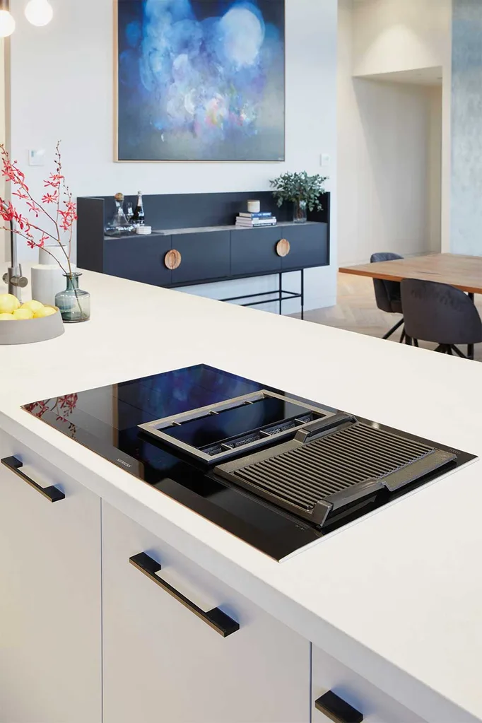
Include high-end appliances, such as the flex induction cooktop with the telescopic table ventilation (that lowers when not in use) for maximum flexibility in your food prep area – all can disappear when guests arrive. Free up more space by taking appliances off the benchtops and mounting them into the cabinetry. This versatile approach makes great sense, both in terms of space and efficiency.
During the building phase, look to making the most of your space by installing a coffered ceiling for extra height and a dramatic effect. This also serves to demarcate cooking and dining zones.
Apartment 2: Hans & Courtney
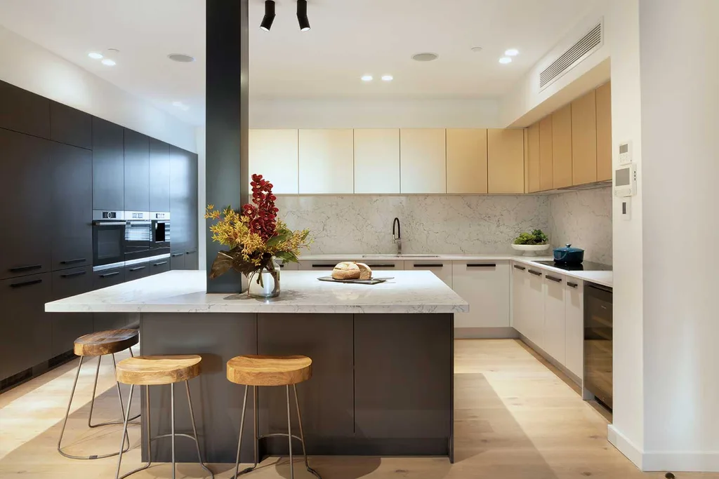
Large format surfaces were put to clever use in the glamour-packed kitchen delivered by Hans and Courtney. The marble-look splashback and benchtops allow the eye to travel freely around the expansive area, with the luxurious touch of metallic champagne overhead cabinets bringing a luxurious touch to the entire space (this would work equally well in a small kitchen). More integrated cabinetry all the way along the side wall hides oodles of storage and a fully integrated fridge behind another sleek and streamlined surface, but it pays to ensure appliances are positioned within easy reach of the bench preparation areas.
The inclusion of a built-in coffee machine gives a high-end feel.
Task lighting overhead and strip lighting over benchtops makes for practical workspaces and an over-sized island bench is surrounded by stools for dining any time of day.

Apartment 3: Hayden & Sara
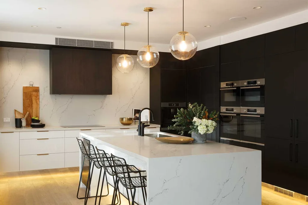
Hayden and Sara designed a beautiful eat-in kitchen and delivered on style and functionality. The ‘golden triangle’ workspace sees the layout work beautifully between stove top, ovens and sink, with an integrated dishwasher beneath the kitchen island. More large-format marble stone is taken right up the wall behind the stove and above crisp white cabinetry, which echoes the waterfall island bench and draws the eye up to the ceiling – this trick would work beautifully in a smaller kitchen to create the illusion of space. Highly contrasting dark feature cabinetry surrounding the built-in appliances, including a coffee machine better situated near sink and benchtops.
Pendant lighting with brass accents tie in nicely drawer pulls and golden-hued strip lighting beneath the cabinetry.
Apartment 4: Norm & Jess
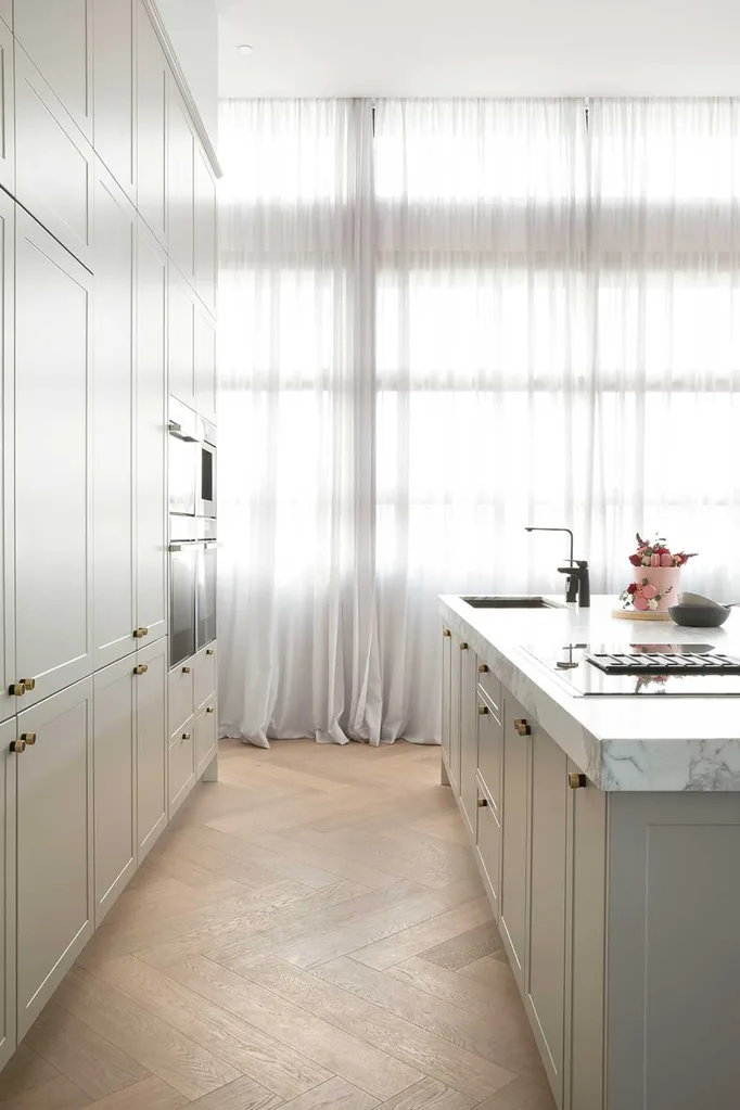
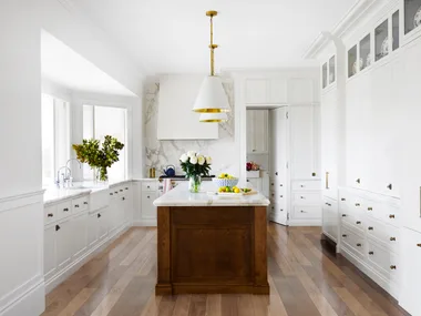
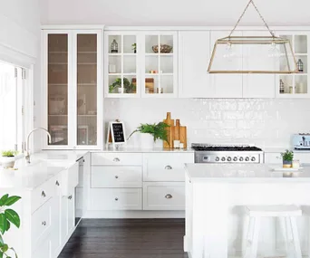
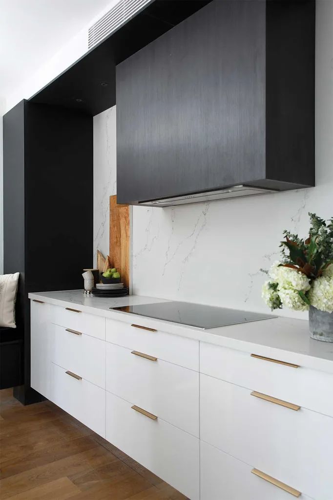
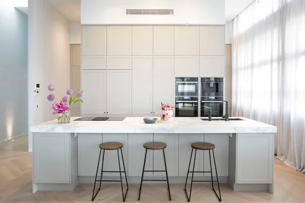
Norm and Jess showed how to imbue a large, light- filled with elegance and character, with flowing floor-to-ceiling sheer curtains, shaker-style cabinetry in neutral tones and detailed timber herringbone parquetry flooring.
Still working with marble finishes – this time the real thing with a Calacatta marble bench top, the colour palette was whisper-soft and graceful, creating a gentleness to the overall look and feel of the cavernous space. Accents of brass in trim round door handles and understated tapware and electric cooktop set into the island bench, this kitchen delivers warmth and character with just a touch of the feminine.
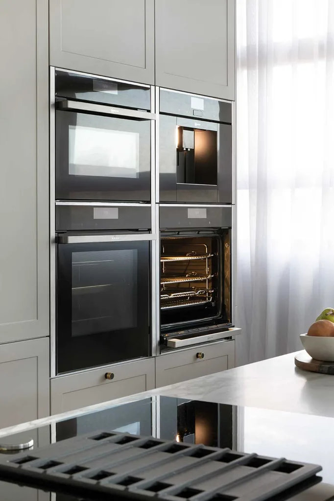
With the work triangle again planned carefully for accessible use of dishwasher under bench, oven and coffee machine nestled close at hand behind in floor-to-ceiling cabinetry.
Apartment 5: Bianca & Carla
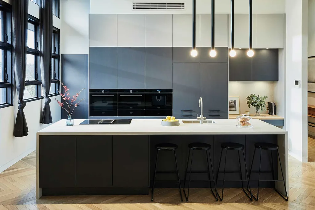
Bianca and Carla’s kitchen is a great example of using design to design a space with both style and functionality in mind.
The hero of the space is the dramatic line of four pendant lights suspended above the over-sized island bench, serving both as task lighting and strong décor focus. Echoing their design in shape, the shiny black finish and in number are the bar stools below. These stools also serve to anchor the colour palette in its darkest hue, seen in the cabinetry beneath the island, which then graduates upwards through tones of grey to eventually meet the white ceiling.
Super functional and compact, appliances are close at hand and the graduation of colour draws the eye upwards to make use of the high ceilings and abundant light streaming in through the bank of black-framed warehouse-style windows, softened by gossamer-sheer charcoal curtains.
A touch of timber in the study nook ties in nicely with the herringbone parquetry flooring and adds a natural depth to the scheme.
You might also like:
How to choose the right kitchen layout for your space
House to Home Beautiful: The Kitchen Design
5 essential planning tips to renovate your kitchen right
 Freedom Kitchens
