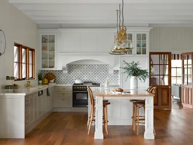
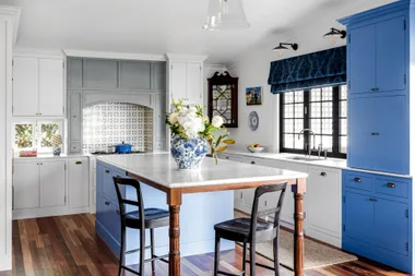
Interior designer and architect Melanie of Meme Design was always going to live in an Edwardian-era semi with period features and an open-plan cooking and entertaining space.You can only imagine the excitement when Melanie finally found her dream home. One thing, however, was clear, the existing kitchen, with its dated layout, lack of storage, orange-toned floorboards and non-structural midwalls, had to go.
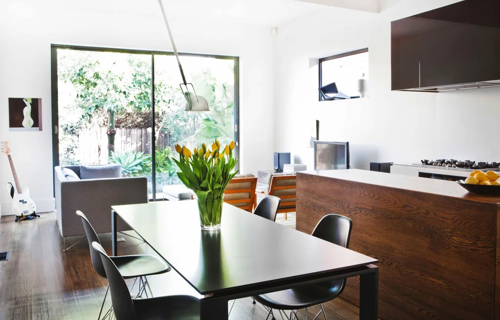
A walnut stain was used to tone down the bright floors and the midwalls removed. Then, with a more liveable look in place, the next four years were spent refining the renovation. The kitchen, dining and living zones were composed as a united whole with repetitious proportions and continuous lines, resulting in a synchronised space. Melanie managed the project herself – a constant juggle of tradespeople – but this meant the budget could be stretched to include a few covetable furniture pieces.
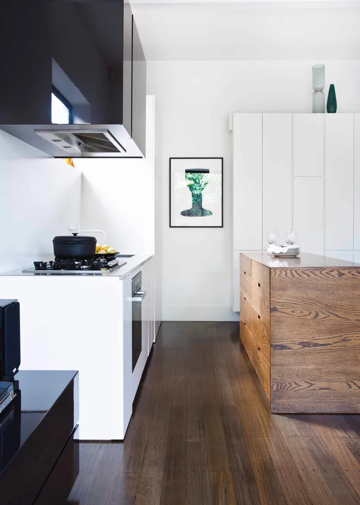
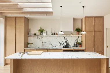
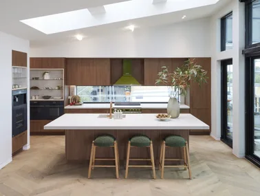
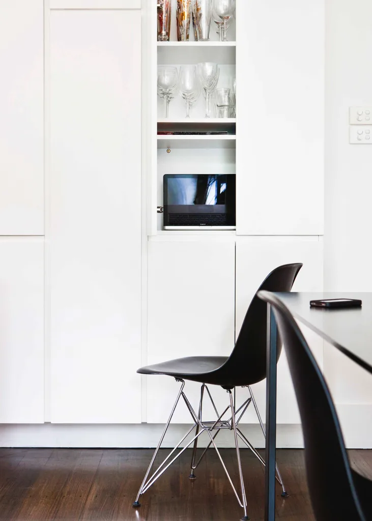
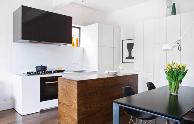
The kitchen almost fades into the adjacent living zone. The solid Tasmanian oak island was stained walnut to match the floors and the wall cabinetry has been finished in Wattyl Orchid 2-pac, the same colour as the walls. The tall cabinets are only as deep as a dinner plate, but they can still fit in piles of crockery, the coffee machine and a hidden desk with the laptop and sound system.
Two wide clearways running either side of the island bench allow for more than enough room for people to flow in and out. The perfectly balanced composition features a walnut-stained Tasmanian oak island bench that replicates the proportions of the Kartell dining table.
For more kitchen inspiration, take a peek at this revamped heritage kitchen.
 GORTA YUUKI
