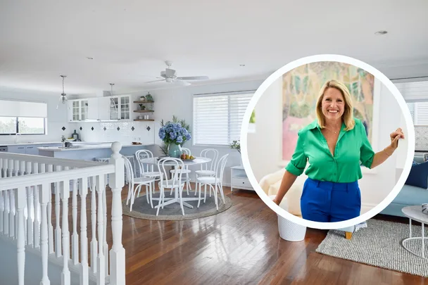
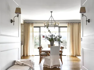
With two seasons of Selling Houses Australia wrapped up and a bevy of breathtaking makeovers under her belt, interior designer, homes expert and host Wendy Moore shares her philosophy of home renovation and why the changes she makes to these hard-to-sell homes are so profound.
Did over twelve years at the helm of Home Beautiful play a part in the success of these renovations? We asked Wendy just that and to share her secrets for renovating on a budget.
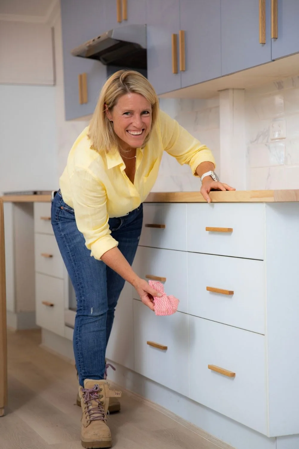
How does a real-life TV renovation compare to creating a magazine filled with ideas?
There’s more to preparing a home for sale than a quick lick of paint and styling up some hired furniture. Wendy has worked with fellow interior designer and ex HB Creative Director, Melissa Heath to design each home from scratch and is having “great fun” being on the tools herself to create the homes she’s been dreaming up for years. The difference, says Wendy, is how a home feels to prospective buyers.
“I think definitely the magazine years has been absolutely key to what I’m doing on Selling Houses,” says Wendy. “Melissa and I created a lot of sets and did trend forecasts and inspirational stories together. Every cover that we did at Home Beautiful was different, so you knew immediately when you saw it on the stands that it was a new issue – it had a different look, a different colour scheme, a different feel.”
For Selling Houses Australia, Wendy set out to inspire the same level of inspiration. “I want every episode to feel like a new issue. That’s what was so inspiring about it – when you looked at the magazine you knew that you had different ideas coming to you and it was never bland or predictable.”
Wendy wanted Selling Houses to be the same powerhouse of design inspiration. “I think that what we all want as viewers is inspiration and ideas and different colour schemes and styles and we want to learn what makes them work and we want to see them come together,” she says. “It’s the same as with the magazine but this time we’re doing it for real!”
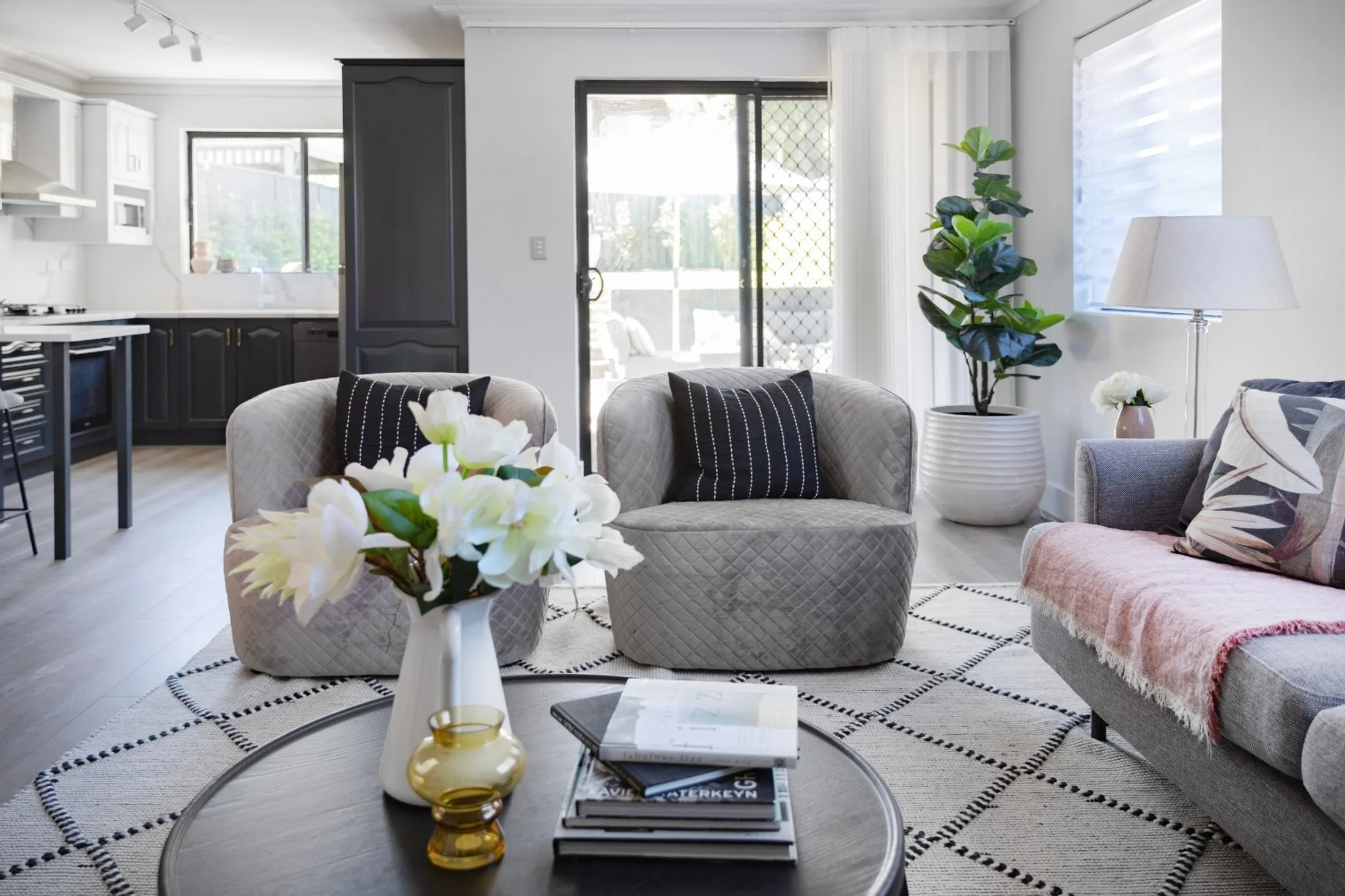
Should you use colour when decorating a home?
To see the changes Wendy can make to real homes before our eyes is the difference between mere voyeurism and practical inspiration. “Some magazines are kind-of looking at how the other half lives,” says Wendy, “but if you had the money, it’s not what you would do. With Home Beautiful and now with Selling Houses, I wanted to reflect how we actually live. All of the spaces have to be liveable.”
“Real Estate agents will always say, ‘Don’t put too much personality into a space, keep it neutral,’ but I completely disagree with that. I think people fall in love with homes because of how they feel. Creating a happy, comfortable, welcoming home is absolutely done through decorating.”
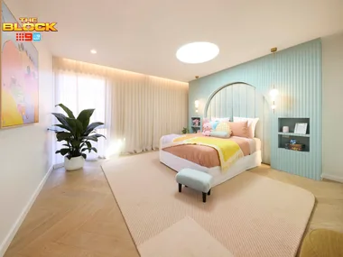
Staying true to the heart of a home has been a common theme this season for Wendy, whose theory is that when buying a home, women make emotional decisions, then look for tools to rationalise that decision. The use of colour in the Selling Houses Australia renovations is a marked difference in the way Wendy and Melissa design. “People say they’re afraid of colour, but they’re not,” says Wendy. “They’re afraid of making the wrong decision. But if they walk into a room and they love the colour, they will love that house. And that emotional connection is more powerful than anything.”
By tackling daunting renovation tasks, reworking old-fashioned layouts and clearing years of indecision from homes all over the country, Wendy has transformed ten homes on Selling Houses Australia this year and is already looking to the challenges of next season.
40 design ideas from Selling Houses Australia:
Episode 1 – Clermont
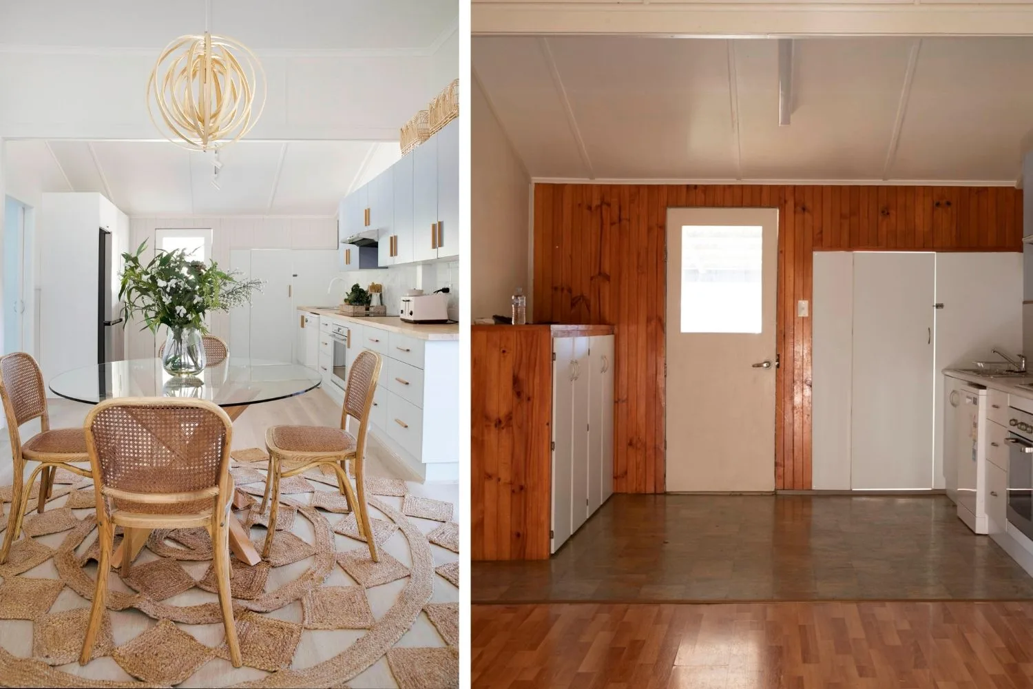
After ten years on the market, this empty house was bereft of heart and soul and desperately needed to be sold. With four different types of flooring and no furniture, it was difficult for prospective buyers to imagine a life within the disjointed layout.
Ideas to steal:
- Lay consistent flooring all the way through the house
- Light a dark timber interior with a light and bright colour scheme that works the with flooring
- Style each room with furniture and homewares to celebrate its purpose
- Use inexpensive tiling over the existing splashback or laid fresh for a modern feel
Episode 2 – Greystanes
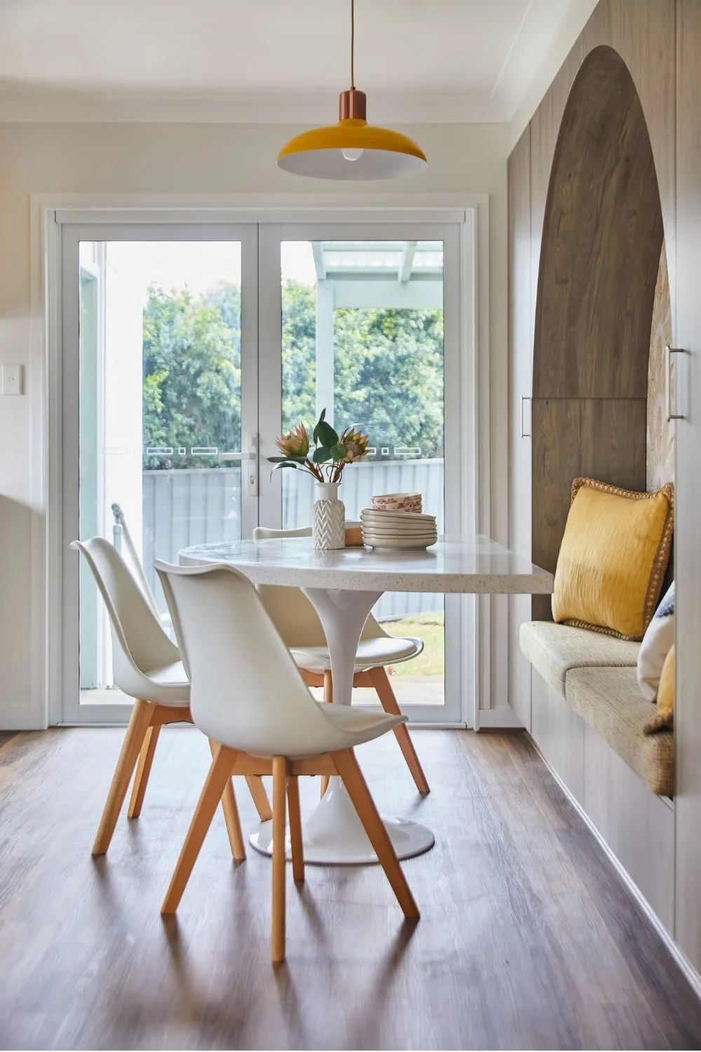
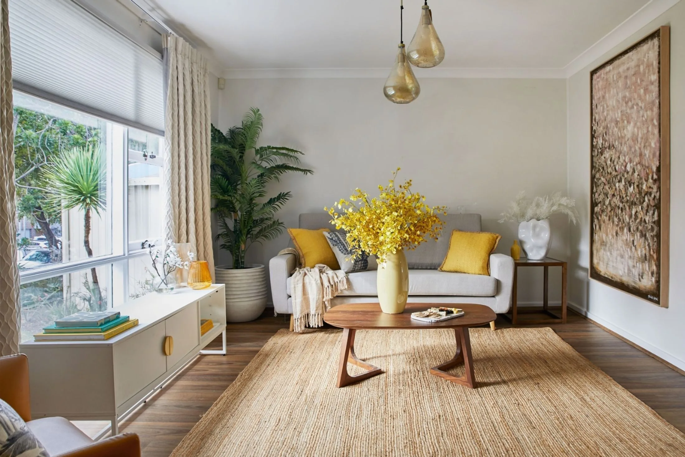
Wendy felt particularly connected to the home in Greystanes, which had been sitting on the market in its original 1960s condition – including a pastel pink and blue bathroom and outside toilet – and was in serious need of an update to appeal to contemporary families. For Wendy, it held “a lifetime of happy memories” and reminded her of the neighbourhood she grew up in suburban Sydney. “I wanted to protect that feeling in the new design and use it as inspiration,” she says.
Ideas to steal:
- Rather than fight the heritage of this home, Wendy embraced its mid-century style to create a clever arched kitchen nook with custom cabinetry, punctuated by a bold wallpaper choice
- Wendy chose some standout features – the bright yellow hue, pendant lights and curves – and worked them into the design
- Create open-plan access into the living room by knocking down part of the dividing walls
- Keep the original layout in the kitchen to save money
- Repeat elements such as arches through the home – bathroom, kitchen and dining nook – to create a deliberate, decorated feel
Episode 3 – Redland Bay
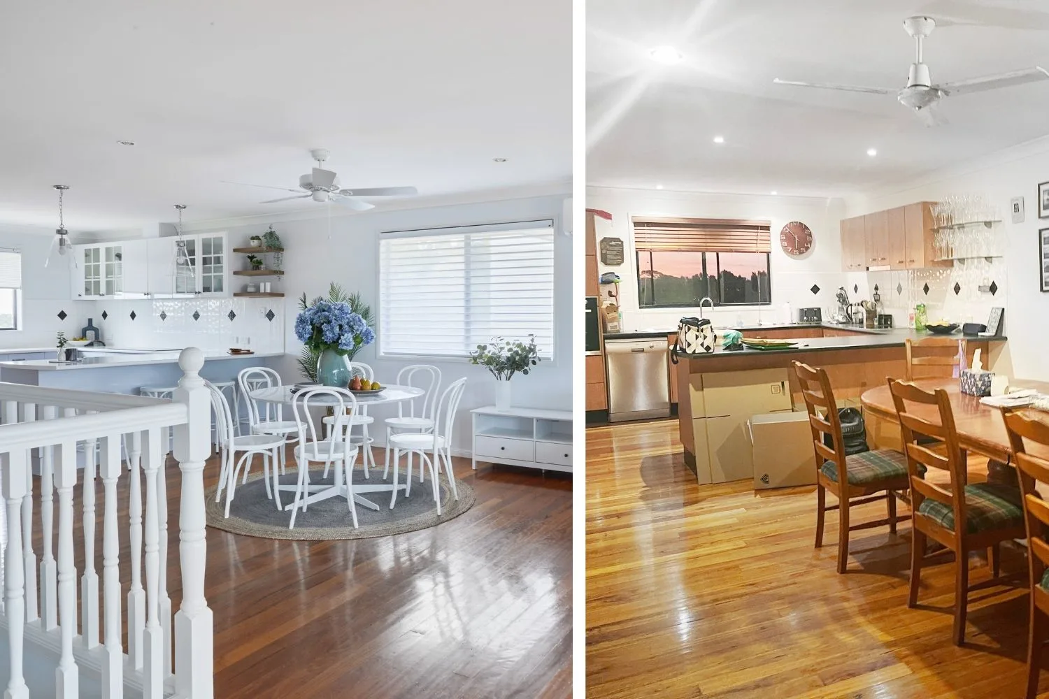
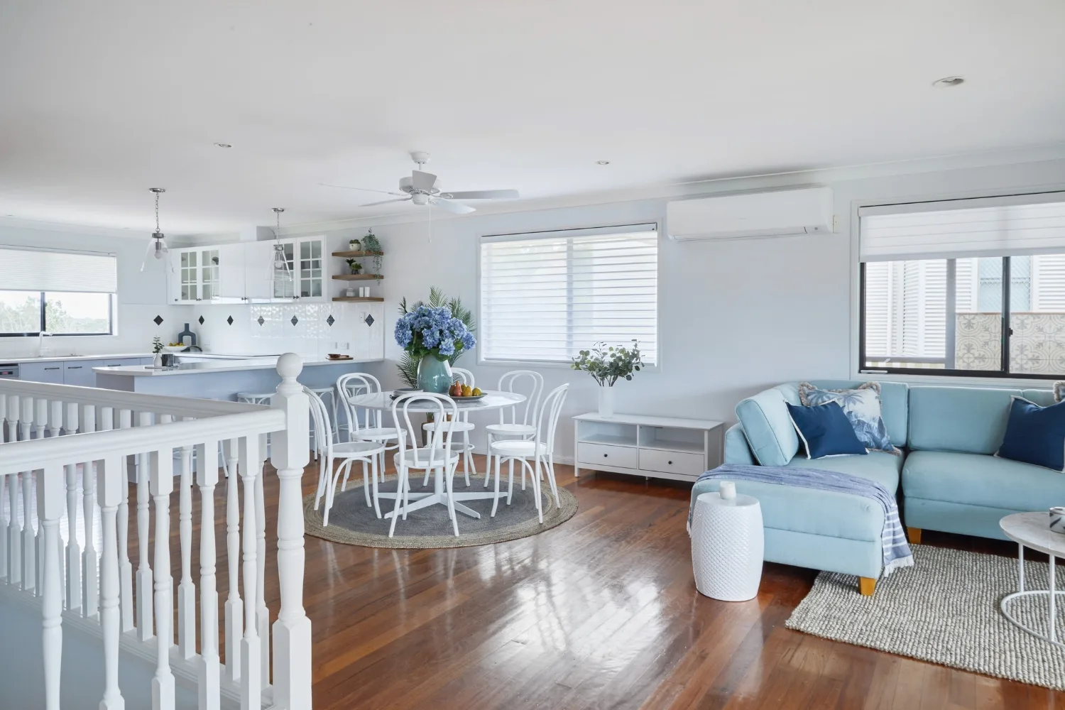
With a failing business and the threat of potential bankruptcy hanging in the air, this home had to sell for at least $1 million to get the homeowners our of trouble. However, the cavernous living space was, “beyond open plan,” had no purpose and didn’t feel usable, so Wendy split it in half to create two separate living zones, building a wall to create a separate media room and using a colour palette that “leaned into the coastal lifestyle” of the area. The results changed the feel of the entire home.
Ideas to steal:
- play up the positive when the budget is limited
- decorate a home to reflect the lifestyle within
- create separate living areas for kids and adults in a family home
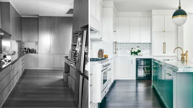
- if the kitchen layout and condition are sound but aesthetically tired, engage a professional to resurface kitchen cabinetry and benchtops for a dramatic effect on a tight budget
- update hardware and lighting for a fresh look
- flow indoor spaces outside with matching finishes such as tiles and paint
Episode 4 – Sunshine West
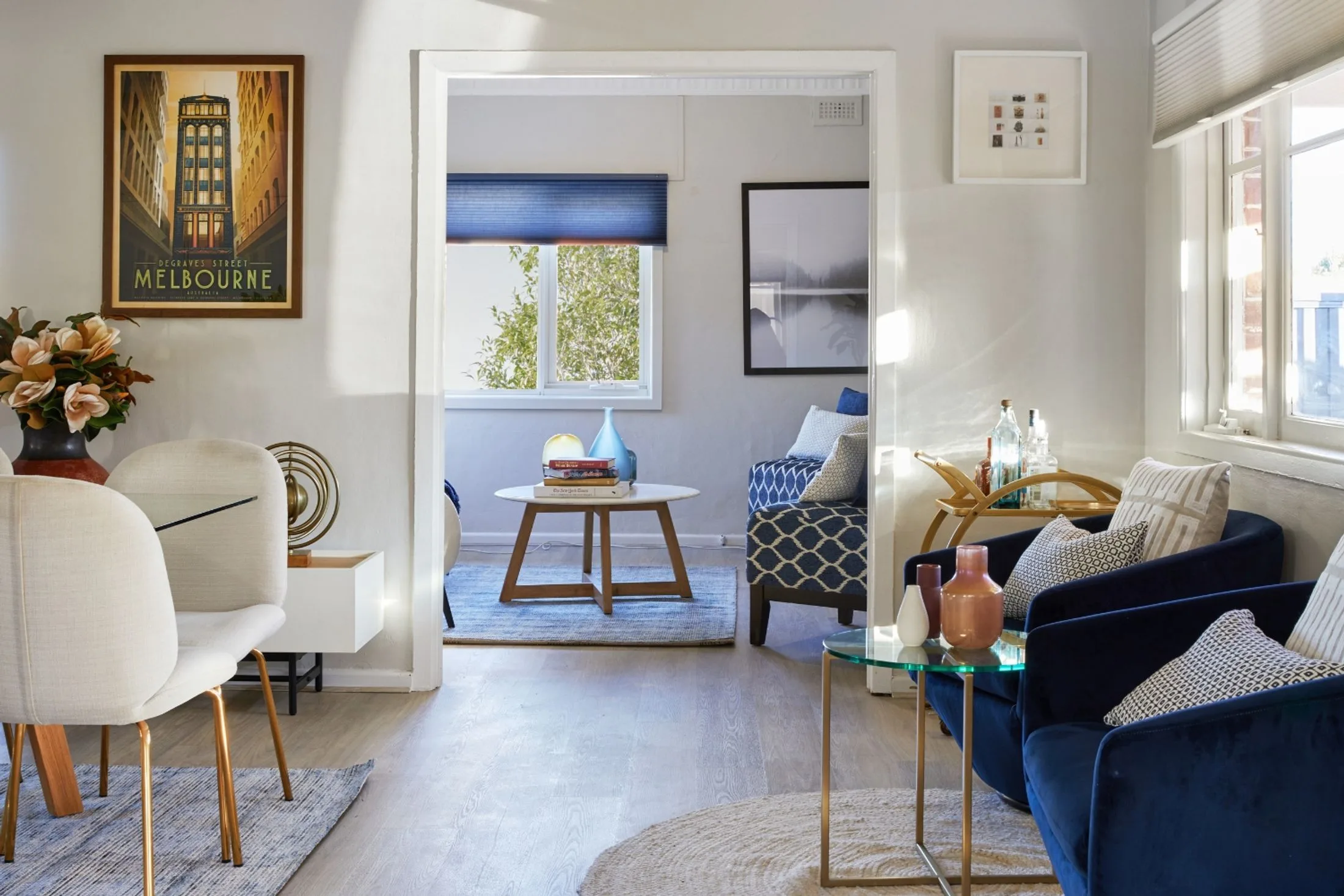
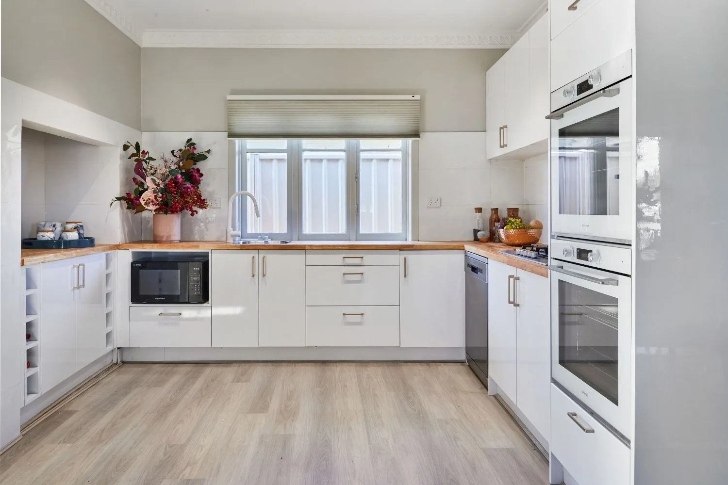
This home was literally a building site, so it’s unsurprising it didn’t sell after three months on the market. Uninhabitable and with a long list of “frightening” renovations still to be completed, Wendy resolved to work with what the house offered, rather than against it to save money. Using the existing floor plan, she tackled the areas that would overwhelm buyers and inspired by the art deco style of the home, she replaced the original fireplace, matched the damaged ornate ceiling roses and cornices with new ones and used a palette of deep yellows, greens and blues paired with softer creams, greys and beiges.
Ideas to steal:
- Laying a hybrid floor throughout the living and kitchen areas brought a cohesive look to the home
- Build custom cabinets to house a fridge, freezer and pantry close to the kitchen
- Using the placement of rugs and furniture, Wendy defined the entrance and created living and dining zones to give each space a sense of purpose
Episode 5 – Elanora
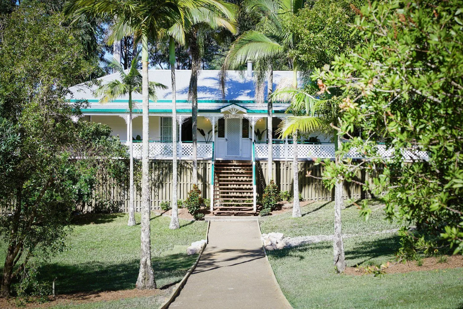
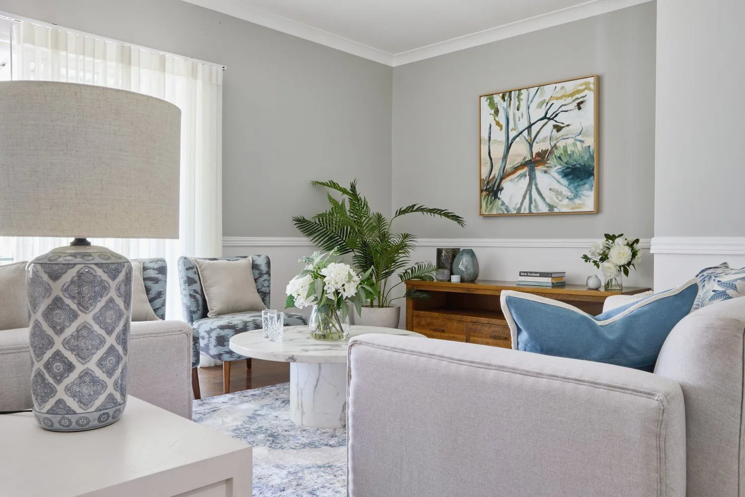
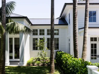
In a case of extreme hoarding, Wendy’s challenge was to clear this lovely home of many years of stress and negativity. Working with care and sensitivity, Wendy focused on the positive attributes of this Queenslander and chose colonial styling to make the most of its great bones.
Ideas to steal:
- Wendy revealed the great layout of this home by clearing the clutter to open up the spaces
- while retaining the original floorboards for most of the home, they were difficult to match so Wendy chose a contrasting herringbone floorboard to replace old vinyl and define the kitchen
- remove half walls to make lounge room and hallway feel bigger
Episode 6 – Maroubra
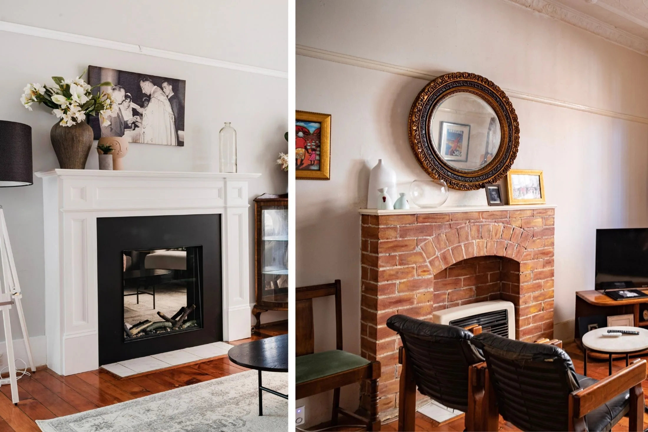
This dark, dated home held no appeal for potential buyers and a lack of functionality. Wendy addressed the difficult kitchen layout with a brand new, affordable flatpack kitchen and feature lighting. A new fireplace surround replaced an old brick one and a selection of rugs warmed up the welcome factor.
Ideas to steal:
- install skylights to bring natural light into dark spaces
- opt for a flatpack kitchen to allow for a bigger spend on benchtops and splashback for a bigger impact when your budget is tight
- sometimes adding walls makes more sense – Wendy closed off the door to the bedroom next to the kitchen for privacy and more options for placing furniture
- use wallpaper and statement furniture such as an upholstered bedhead to make an impact in the bedroom
- a new fireplace modernised the entire living room
Episode 7 – Ipswich
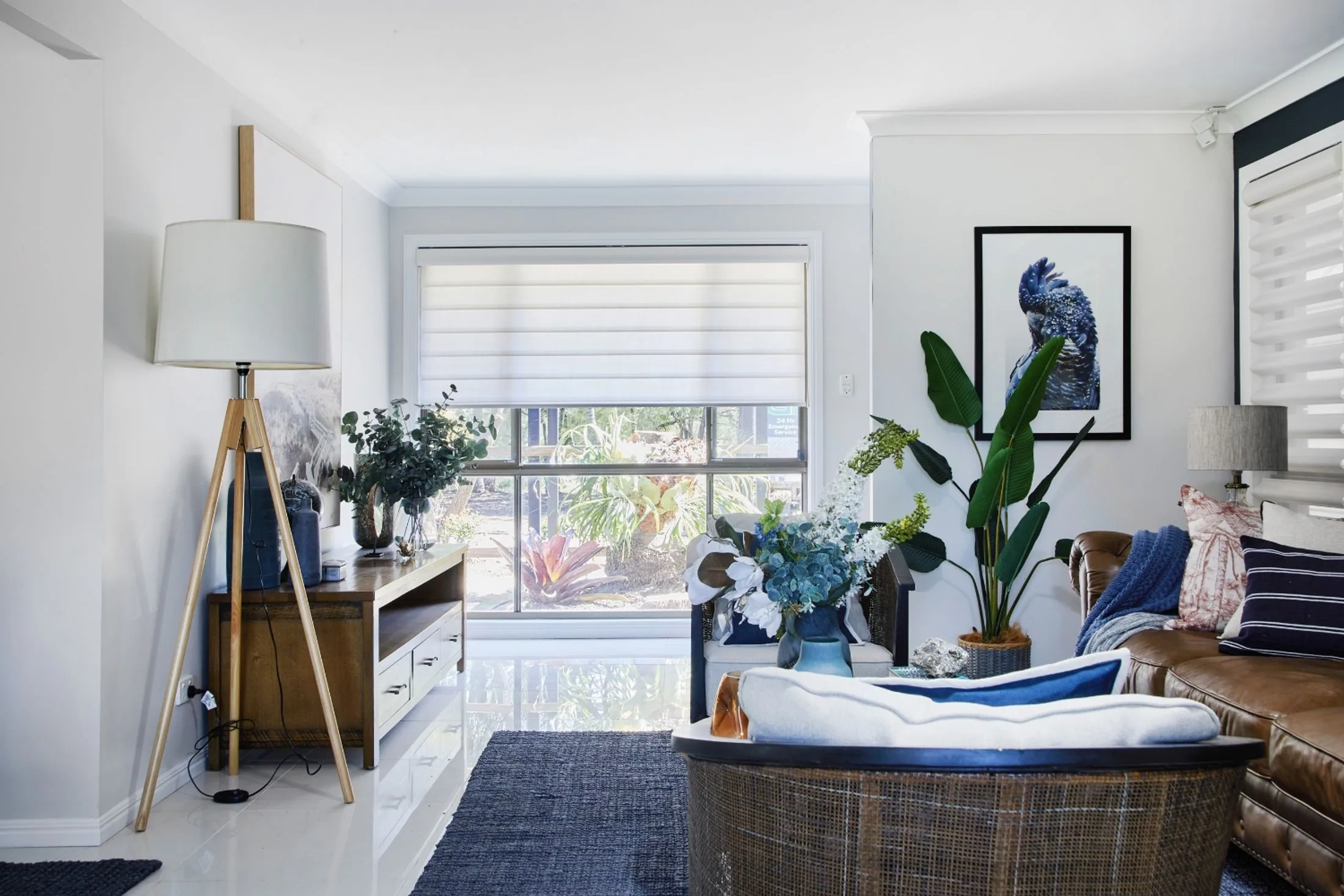
A messy divorce had left this home in a neglected state. Despite its beautiful location, the property was littered with rubbish and the interiors lacking style and care. Critically, there was no connection between the indoor and outdoor areas to appeal to buyers looking for a modern rural lifestyle.
Ideas to steal:
- removing vegetation crowding the home from the garden increased the amount of natural light entering the rooms
- installing solar tubes in the kitchen and living room allowed additional light to flow inside
- Wendy’s “Ralph Lauren” styling was evocative of a modern country farmhouse in such a setting
Episode 8 – Como
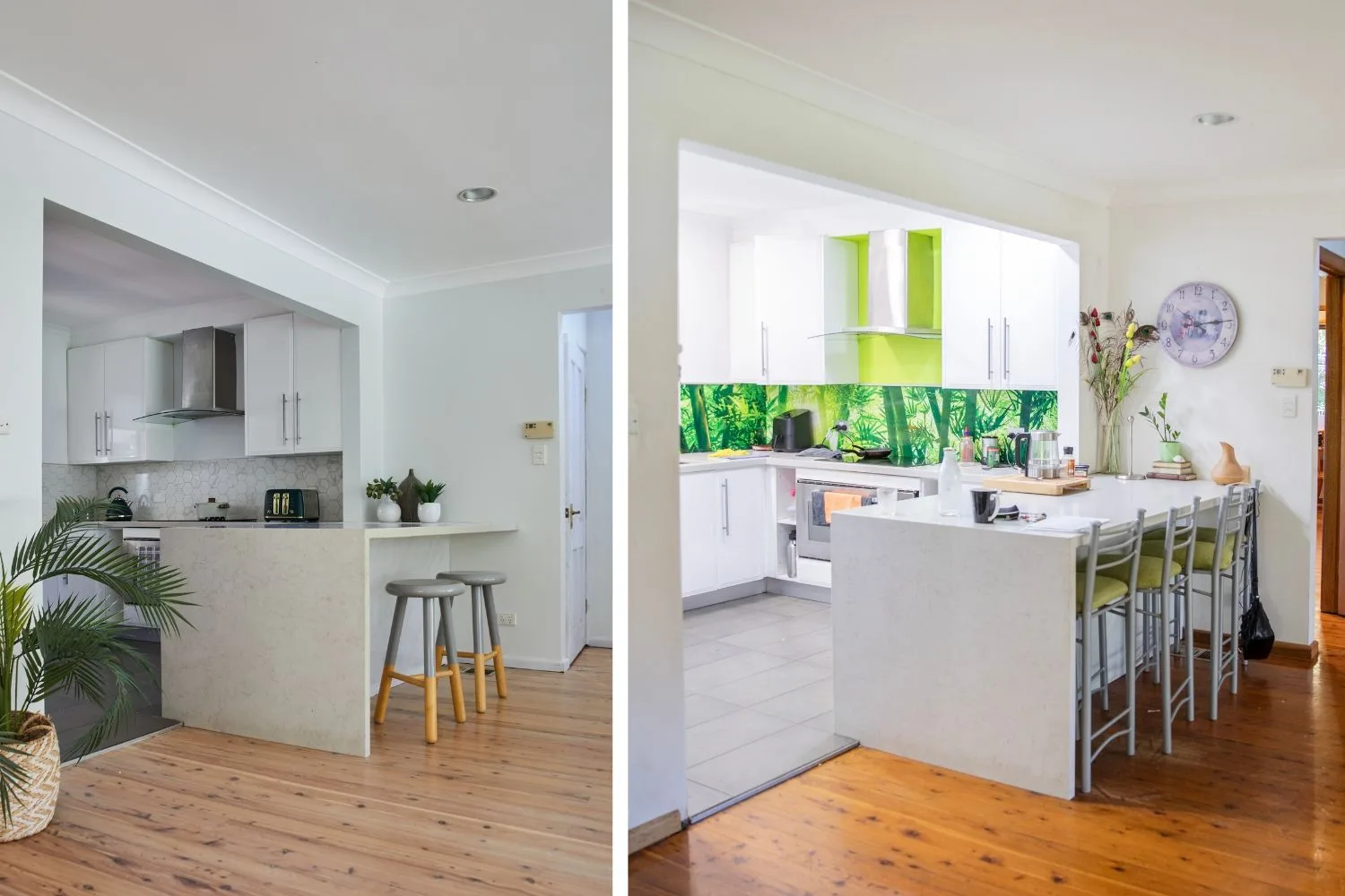
Proof that not all colour makes for beautiful decor, this enormous, yet worn-out home was in desperate need of a makeover. On a shoestring budget, Wendy designed a cohesive decorating scheme including sanding tired floorboards to a light finish and replacing the outdated tropical splashback with marble-look tiles. The home lacked a gathering space to live and relax, and adequate amenities for the eight bedrooms, so Wendy sacrificed a bedroom to create a and kept the colours toned tone….
Ideas to steal:
- In a large home, a neutral wall colour helps to unify the spaces
- Replacing the bold tropical splashback and lime green and red feature walls calmed the colour scheme
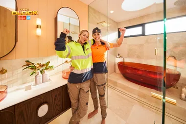
- Decide which rooms will make the biggest lifestyle impact and invest accordingly. Wendy chose to fully renovate the family bathroom to create a generous space with a luxurious freestanding bath and twin basins
Episode 9 – Terrigal
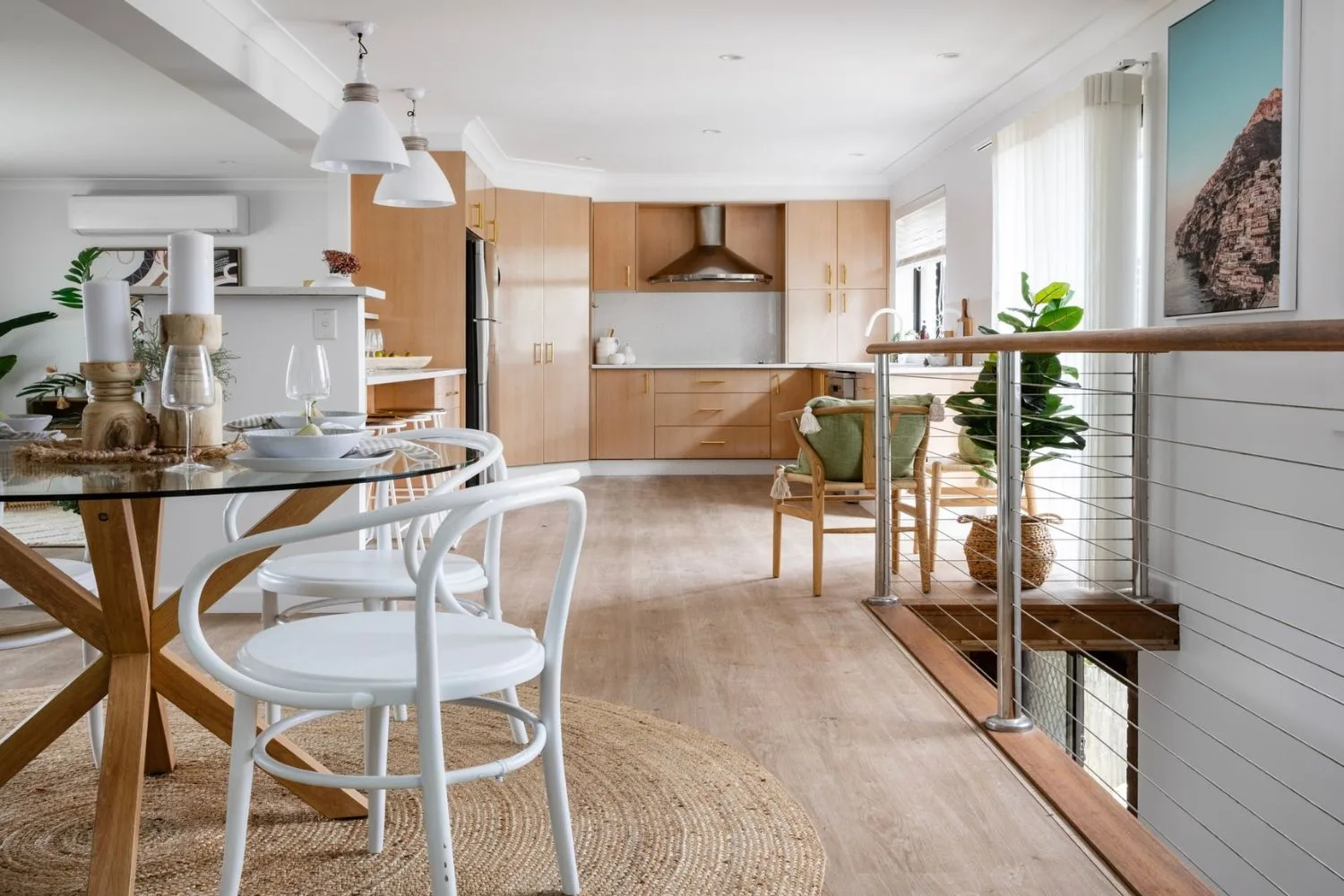
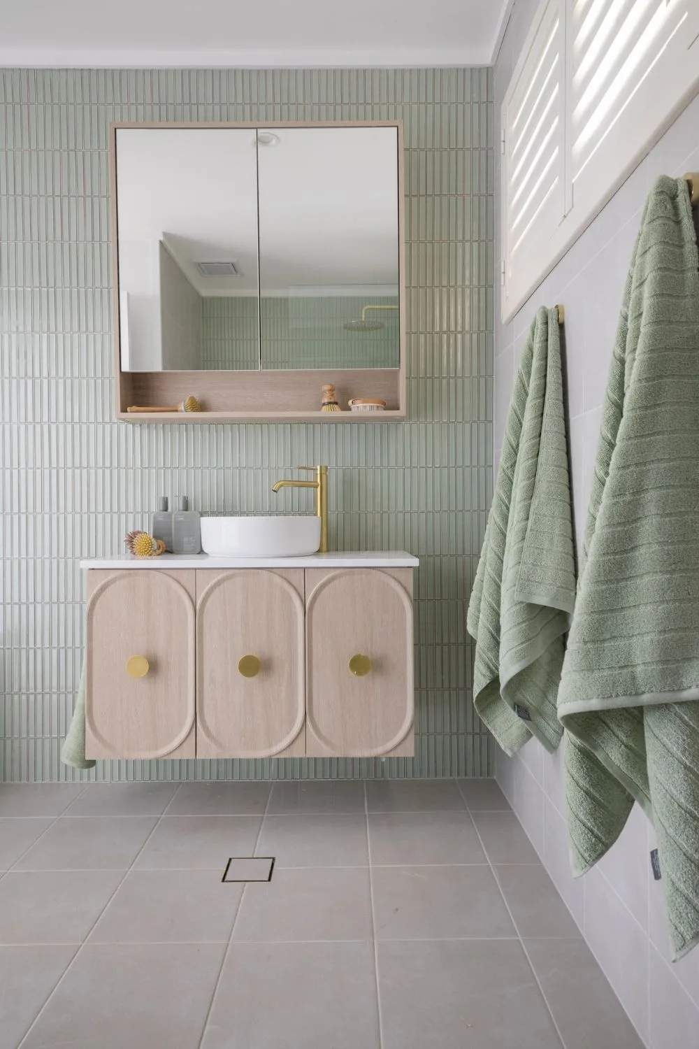
Stalled renovation efforts and a lack of available trades saw this home stuck in a perpetual state of construction, scaring off buyers. Wendy finished many half-done jobs like painting and wall repairs and made cosmetic improvements to the kitchen and living room.
Ideas to steal:
- Retain original kitchen cabinetry but replace handles for a fresh new look
- Remove potential fear for future buyers by finishing half-started reno jobs
- Consistent flooring throughout the entire home ties everything together
Episode 10 – Roselands
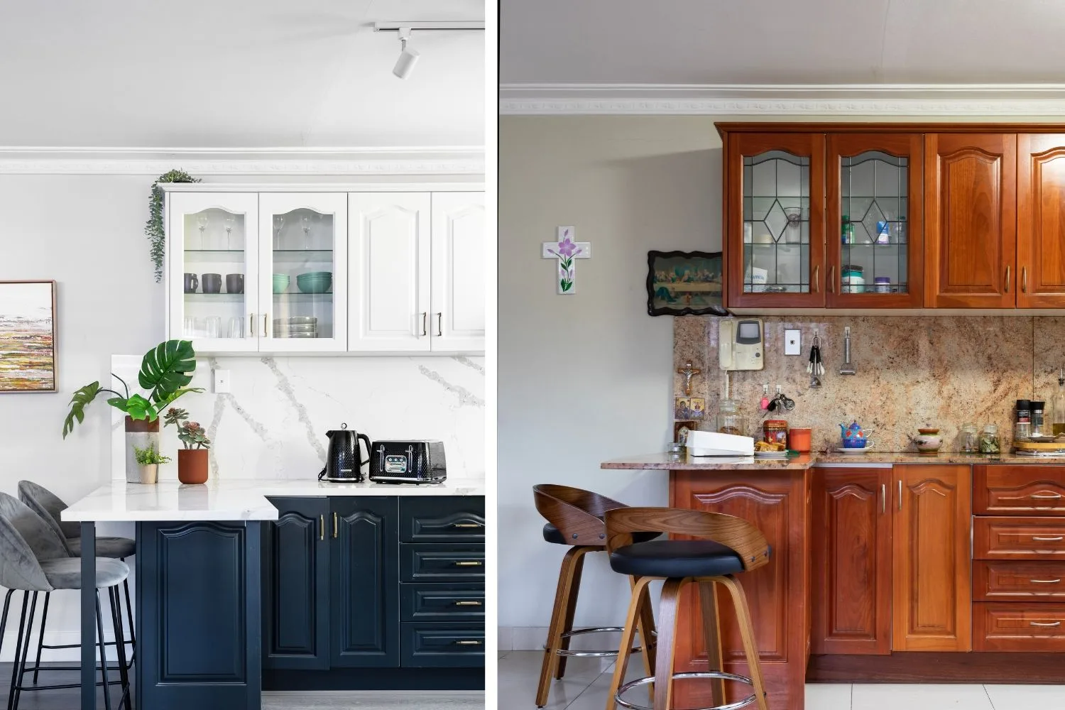
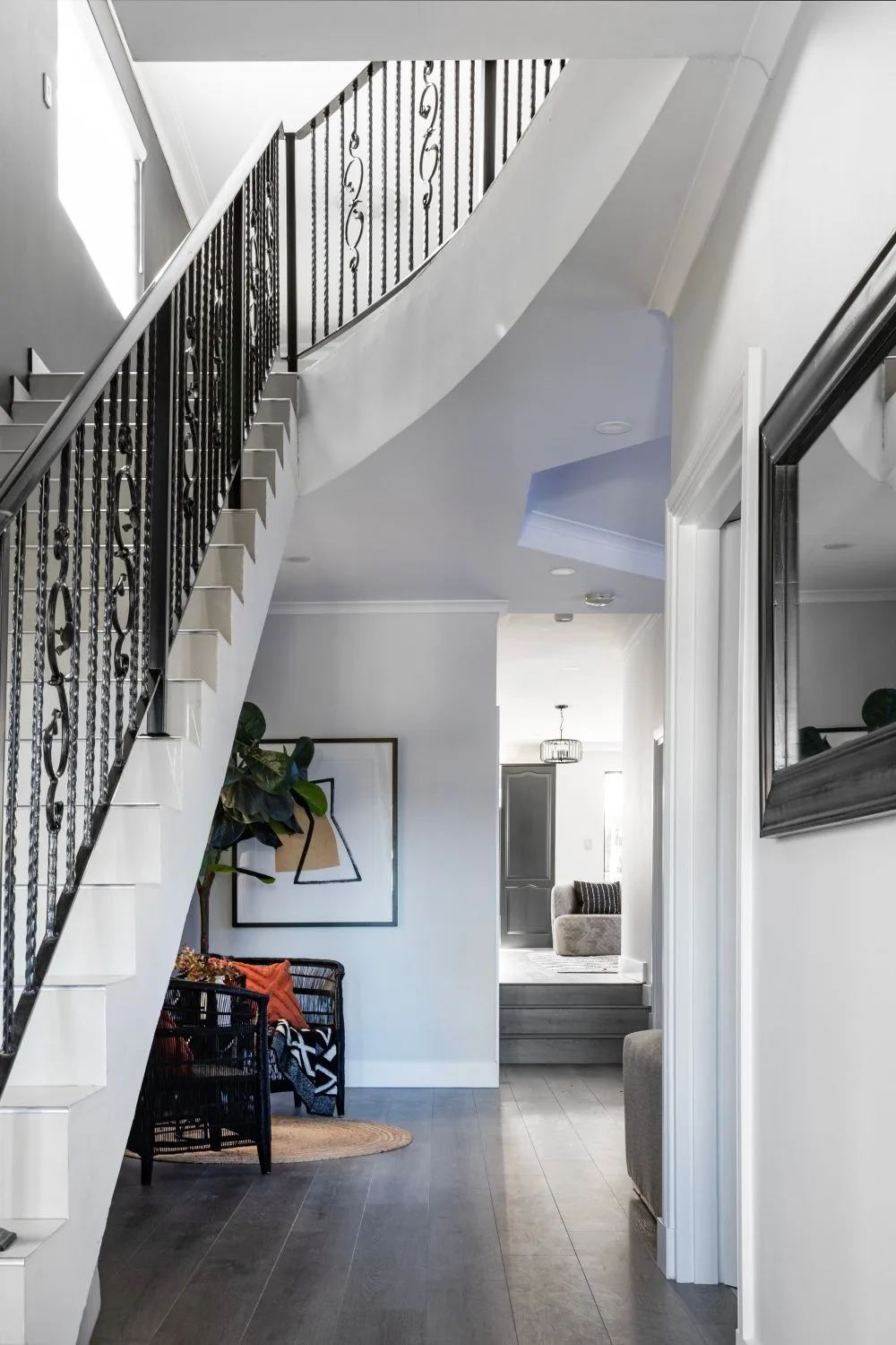
Well-built but dated, this home needed a cosmetic makeover on a tight budget. Rather than ripping things out, Wendy amplified the European flavour of the decor to create a sophisticated, modern monochrome palette with moody dark walls and elegant marble-look benchtops.
Ideas to steal:
- Engineered stone veneer can be laid straight on top of outdated, heavy stone benchtops and splashback to bring a kitchen up to date
- A small extension to a benchtop can double the breakfast bar seating area
- Lean into the style of a home with bold colour choices
- Celebrate a well-built home with high-end aesthetic choices in decor
Take a closer look at Wendy’s work at The Interiors Edit and watch Selling Houses Australia on Foxtel Now with a 10-day FREE trial. Subscribe here.
