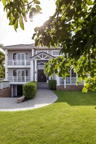
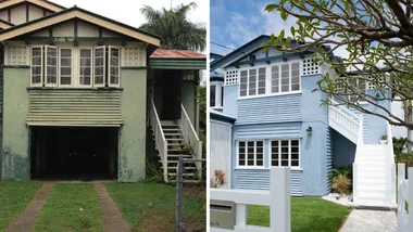
A far cry from its dated origins, this family home has been given a Hamptons-style makeover that embraces its owners’ laid-back lifestyle. We show you why it works so well.
Connect with trusted tradies. Receive instant quotes for your next job with hipages.

The interiors of this house featured terracotta tiles, a rainbow of coloured walls and an abundance of archways when the homeowners bought it. “The house itself was a bit overwhelming,” recalls Carly. “It was grand and beautifully spacious, but the ground floor was a rabbit warren of rooms, and not many of them had natural light. I knew from the outset we would need help to transform it.”
Enter Leanne Smeallie of Ampersand Interiors, who was engaged to help lighten and modernise the building. “We thought we just needed to update the interiors, but Leanne really helped us identify how we wanted to live in the home,” says homeowner Gary. “She opened our eyes to how we could connect the house to the garden.”
Here are 10 lessons to learn from Leanne’s interior design:
1. Reconfigure the ground floor
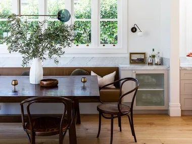
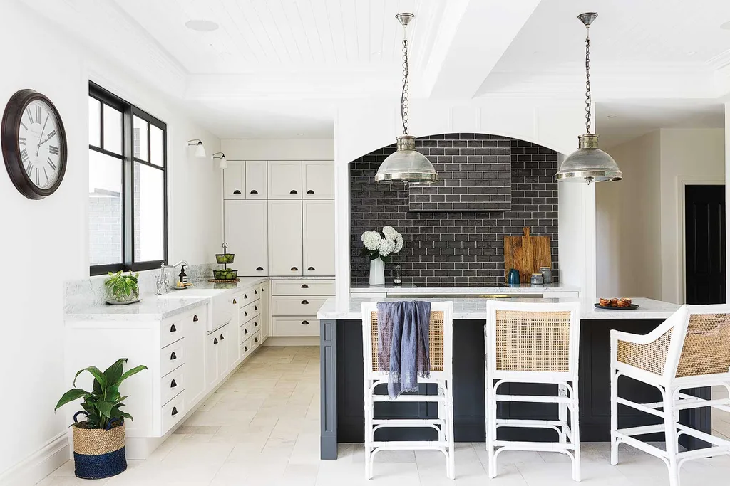
Leaving the formal rooms at the front of the house, Leanne combined the five rooms at the rear into one airy open-plan kitchen and dining zone.
2. Extending the roof over the back deck to create an all-weather outdoor room
Of all the renovated spaces, the family say the back deck, with its new tongue-and-groove ceiling and beautiful outlook, delivers just the relaxed, indoor-outdoor lifestyle they craved.

3. Bring in a lighter palette
Key to creating the easy, laid-back vibe was a new, lighter palette Leanne created. “Every floor was resurfaced or re-stained, every wall repainted in a palette of white or grey for a Hamptons feel,” she explains.
4. Continue finishes throughout the entire home
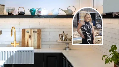
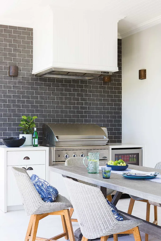
For continuity, both the kitchen and dining areas have the same sandblasted marble tile on the floor, while the handmade cement gloss subway tile from Surface Gallery has been repeated as the feature for both the internal kitchen and external barbecue area.
Classic wicker and cane furniture, from Lincoln Brooks, was selected for both spaces, with a woven basket from Style My Home sitting easily in the textural palette.
5. Extend the indoors outside
Decorate your outdoors as you would an interior space. Overlooking the abundant garden and pool area, the pale grey of the furniture – a ‘Stamford’ table from Horgans and chic ‘Skal’ chairs from Satara – blends beautifully into the space and make it a comfort magnet, all year round . [Below] An L&M ‘Lagoon’ table runner, Bison Home dinner plates in Cornflower and a serving bowl in Midnight from Berry Jam Sweet Living bring in fresh colour.
6. Allow for plenty of natural light
Light from the back deck floods the open-plan kitchen and dining area. “Gary and Carly’s inspiration images highlighted their preference for the Hamptons look,” says Leanne. “Thankfully, many of the original features could be updated in this way.” A classic Hamptons palette of white and grey with blue accents unifies the ground floor.
7. Create zones with decorating choices
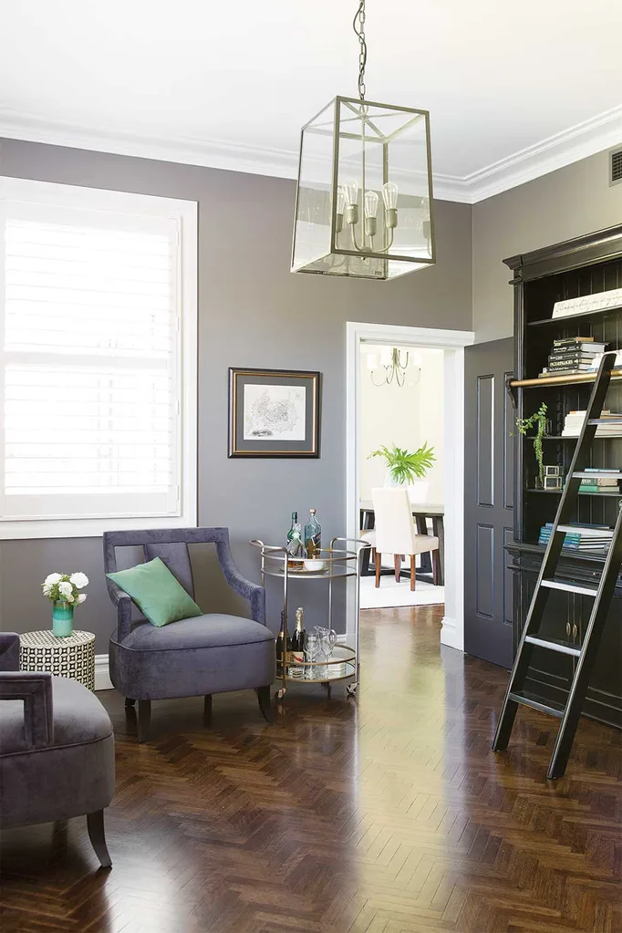
The darker hues of the piano room create a sense of formality at the front of the house. Original features were given a modern makeover, with the parquetry floorboards stained a rich walnut and timber joinery painted black. “The heritage of the home is showcased here, but the consistent use of grey as an accent means there is a strong visual connection to the rest of the home,” explains Leanne.
8. Flexibility in furniture
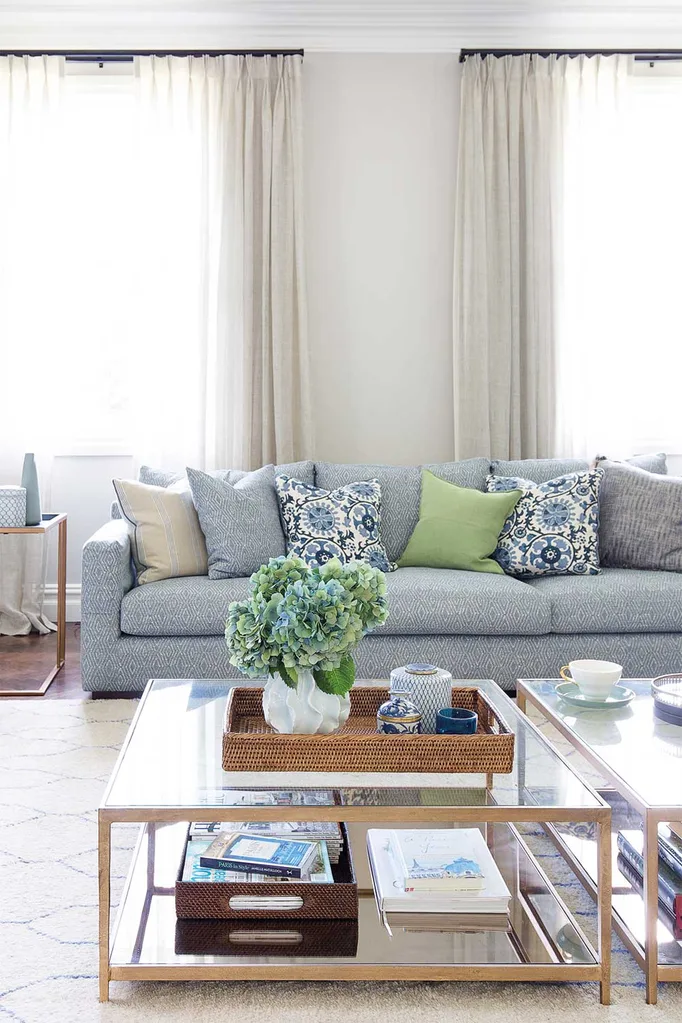
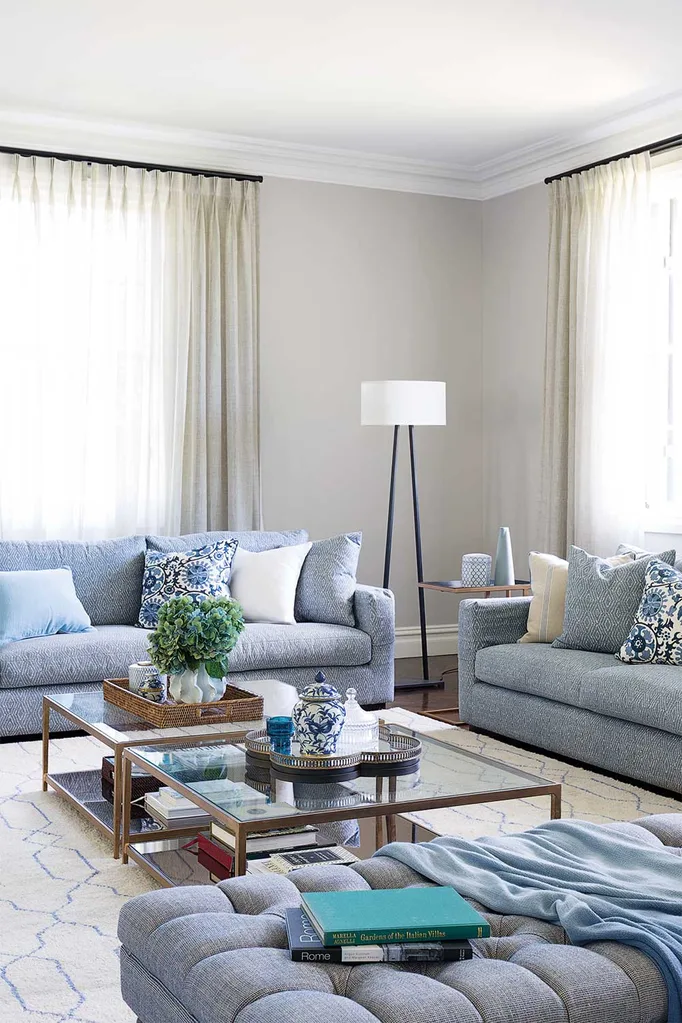
Two coffee tables and oversized couches give the expansive media room a more intimate feel when required. “When it’s just the four of us we can snuggle on the couch to watch a family movie, but when the kids have a gang of mates over they can turn it into a cinema,” explains Carly. The mix of blue-hued fabrics on the sofa and cushions, paired with Dulux Vanilla Quake on the walls, provides added cosiness.
9. Take a risk with colour
Still adhering to Hamptons style, the grey subway tiles in the kitchen and outdoor room are now one of Carly’s favourite features – but it wasn’t always so. “I really had to be convinced that the grey would work,” she says. “I wanted the space to be really fresh and bright, and thought all-white was the way to go. Now I love the grey as it showcases the texture of the tile and adds a bit of interest.”
10. Get cosy in the bedrooms
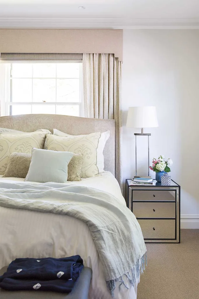
A soft palette creates a cocoonlike effect in Carly and Gary’s room. “We moved away from the cooler grey tones used on the ground floor to bring a real sense of retreat,” says designer Leanne. Other luxurious ingredients include a linen throw from Berry Jam Sweet Living.
You might also like:
10 easy ways to Hamptons style
One of our all-time favourite Hamptons homes is for sale
How to get Hamptons style outside
 Simon Whitbread
