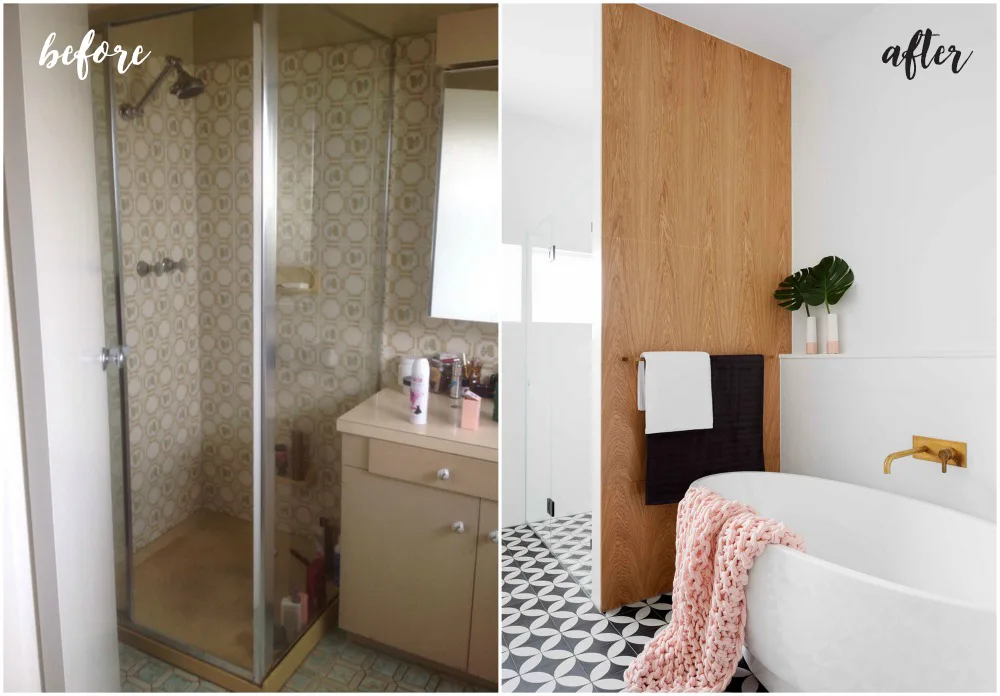
This underused 1960s master suite was given a beautiful new lease of life.
Time frame
Two months for design and eight weeks for the build.
The works
A whole new look and layout for the space. Storage was also added to both the bathing areas and the shower thanks to a new half-height wall, which also hides much of the plumbing.
Major changes
Carmel and her team removed the walls that divided up the existing walk-in robe and ensuite and installed double doors into the robe and bedroom to work with the scale of the rooms.
Budget savers
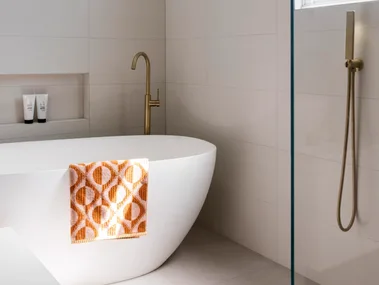
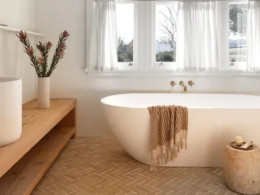
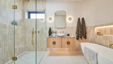
With the owner’s love of colour driving the design, simple white 600mm x 600mm wall tiles complement both the palette and the bottom line. And while still luxurious, the choice of freestanding bath shaved $4000 off the budget, being an acrylic Kado ‘Cirque’ model from Reece, instead of a stone or cast-iron option. “It was the perfect size at 1650mm and we really liked the soft, curved shape,” says Carmel.
Vanity
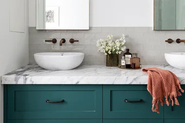
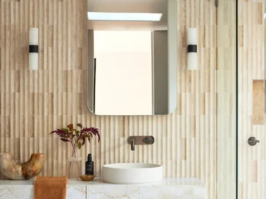
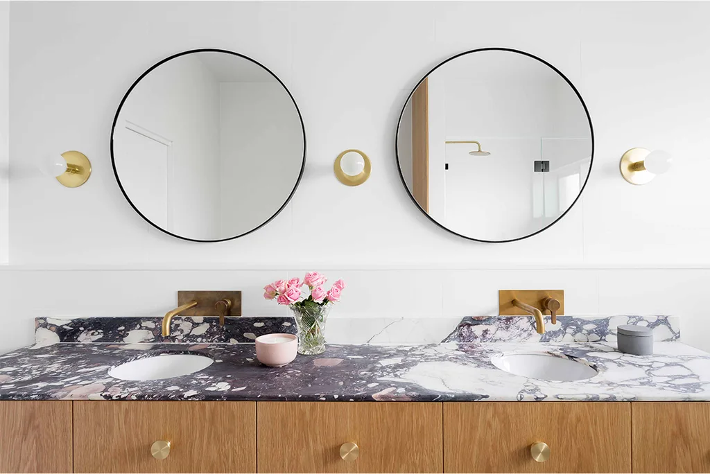
This beautiful floating vanity feels like a furniture piece. The secret to its elegance, says Carmel, is striking just the right level of detail, with thin benchtops, under-mounted and understated basins and ‘Humble’ brass handles found at Auhaus Architects.
Motifs
Between the Shelley Panton mirror and Dowel Jones ‘Lord Sconce’ lights, the recurrent circle motifs nod to the home’s retro roots in decadent fashion.
Chandelier
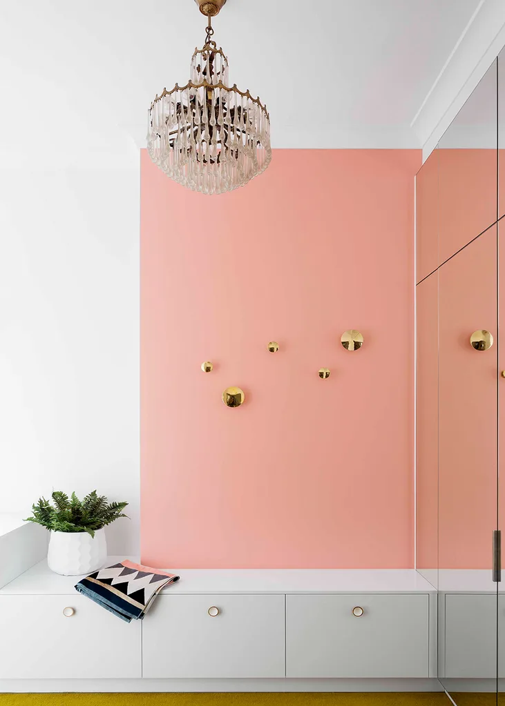
The stunning light-fitting belonged to the owner’s grandmother, so Carmel knew it was important to re-use the chandelier in the new robe. She deftly doubled its impact by using a mirror at the end of the space. The mirror also reflects light and houses storage on the flip side.
Dressing room
Seating is often the one missed element from a dressing room. “Seeing as the robe was so big, I wanted the owners to be able to get dressed comfortably,” says Carmel of the low-slung bench and clever shoe storage, which is finished in white semi-gloss 2-pac.
Layout
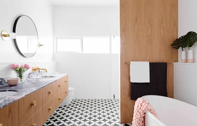
The shower is privately located behind the American oak veneer and brass feature wall. Hiding away the more functional areas allows the bath and vanity in the front half of the bathroom to be the show-stoppers.
Interior designer: Carmel Wylie, GIA Bathrooms & Kitchens, 1300 442 736.
 Martina Gemmola

