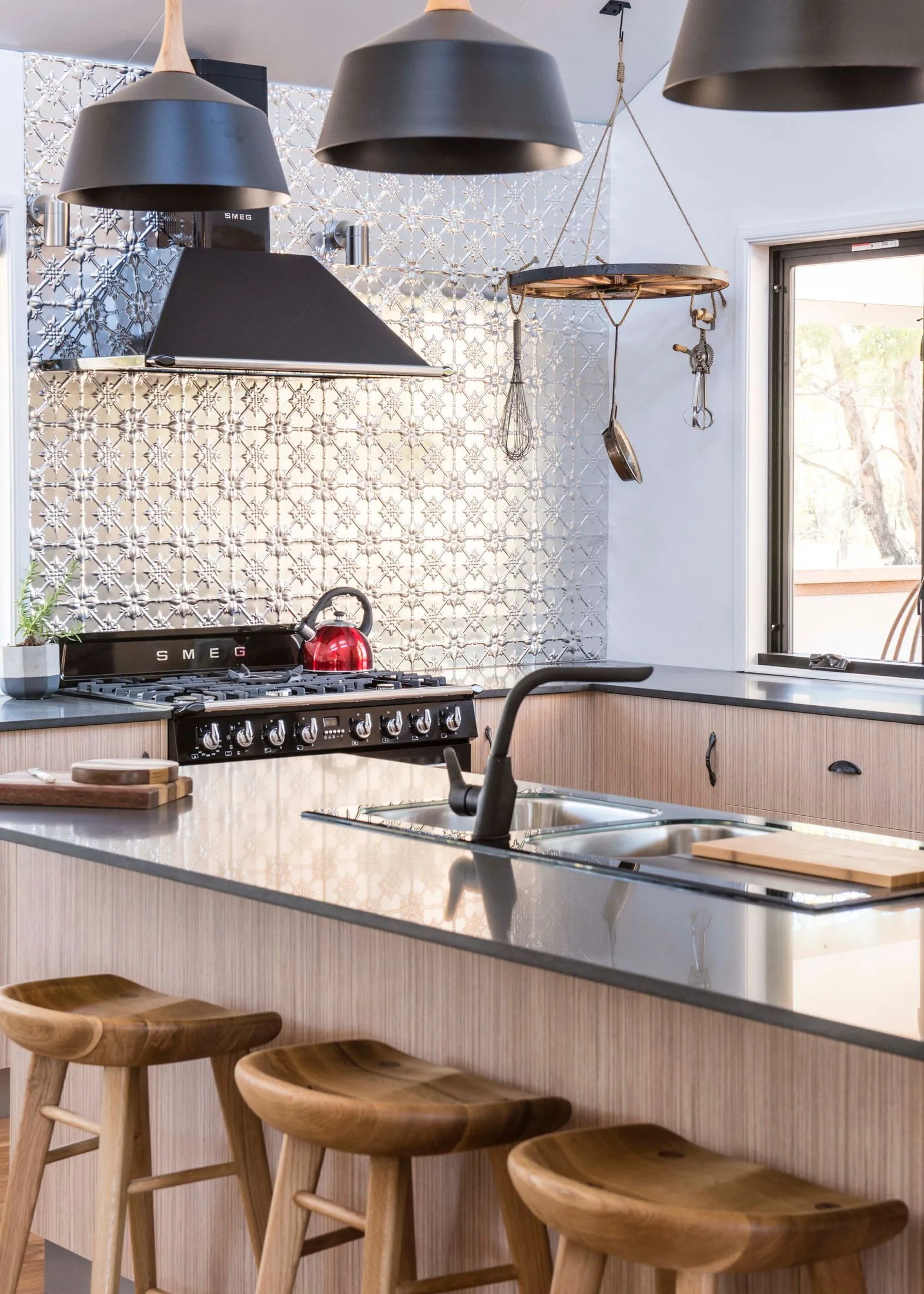
Kitchen
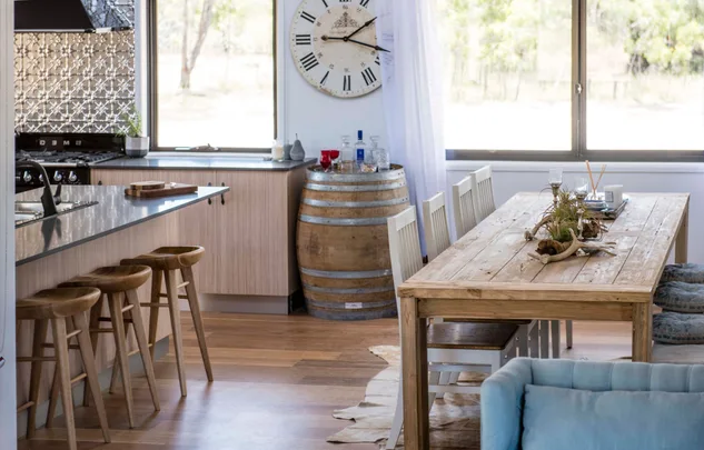
Asked to deliver a contemporary country home, the renovation duo’s on House Rules got to work. The kitchen features an earthy mix of timber, black and white with a textured silver splashback (from Fleur Installation). House Rules judge Wendy Moore felt the pendants and sink, as well as the gloss black added a sophisticated glamour and suited the space but felt the teams could have chosen a better cabinetry finish. Try SMEG for the kitchen appliances.
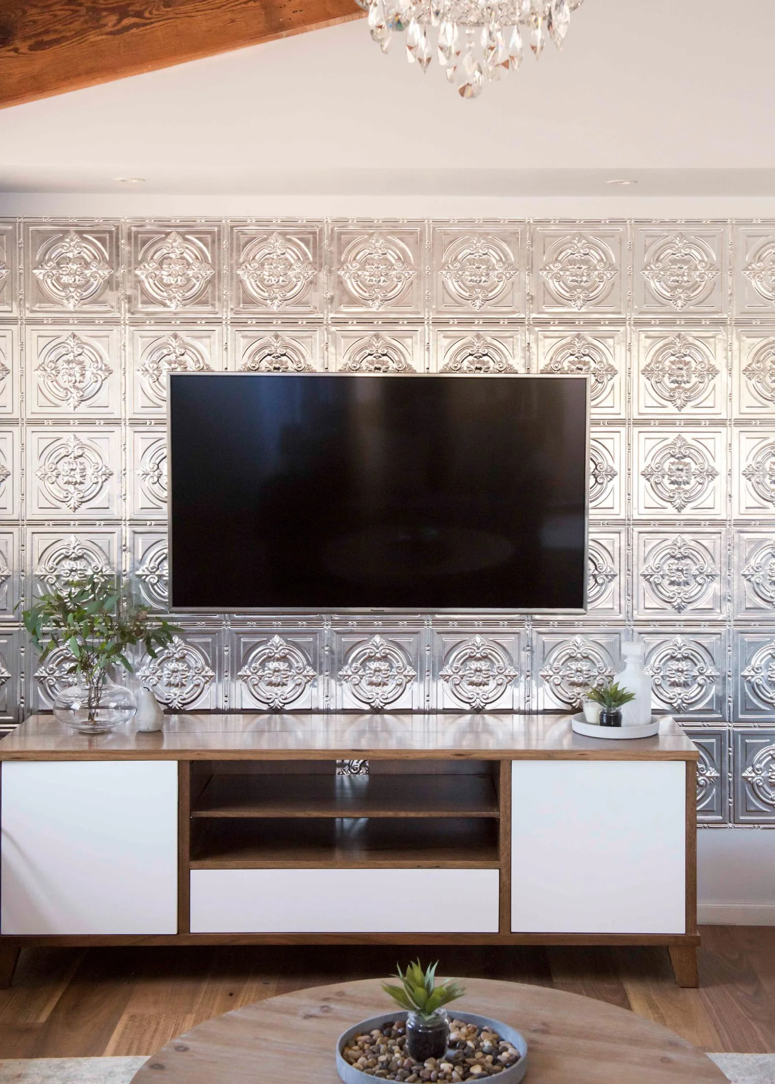
Living room
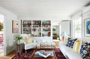
Simple furnishings and a pressed metal TV niche (Try ‘Dudley pressed metal’ from Australian Pressed Metal) make up one side of the open-plan kitchen, dining and living space. Rug is from Miss Amara.
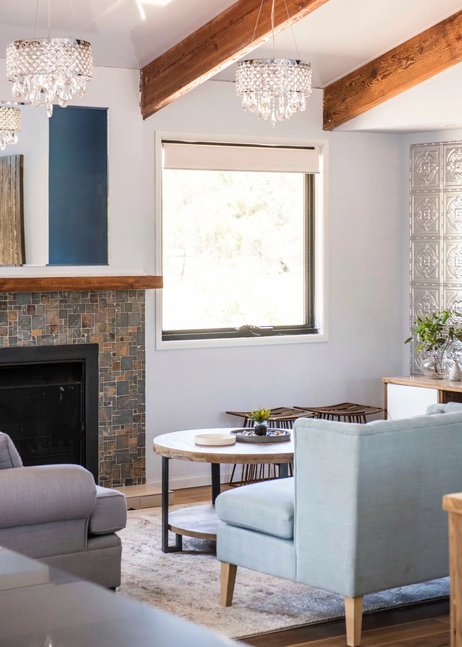
Living room
Judge Wendy felt the thick ceiling rafters was a strong start but the rest of the room was a little lost. Try Brosa for the furniture such as ‘William Armchair Porcelain Blue’, ‘Mila 2 Seater Sofa Stone Grey’, ‘Elementary Cushion Ocean Blue & Blush Pink’.
For details on where to shop products used in this renovation, download the House Rules, powered by Home Beautiful App free from the App Store or Google Play.
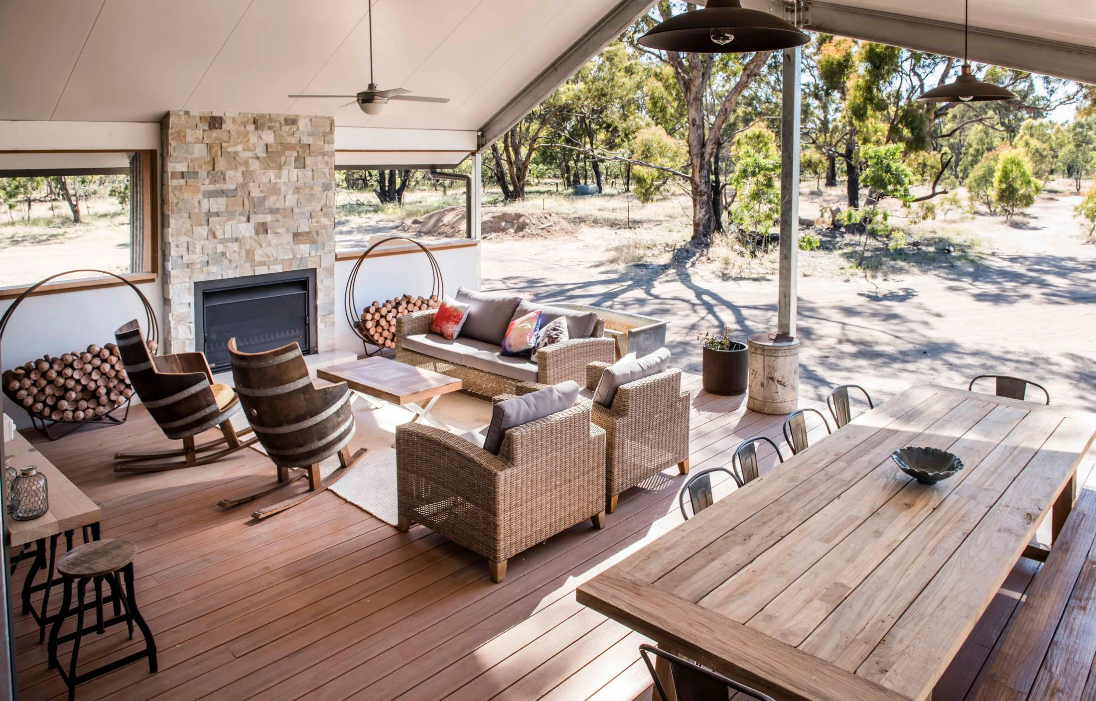
Outdoor room
The surprise extra room was given to Andrew and Jono who did a beautiful job of creating an outdoor living zone. The natural wooden floorboards were the right material choice and the stone fireplace was a great textured focal point. Try Early Settler for the furniture. Fireplace from Jetmaster.
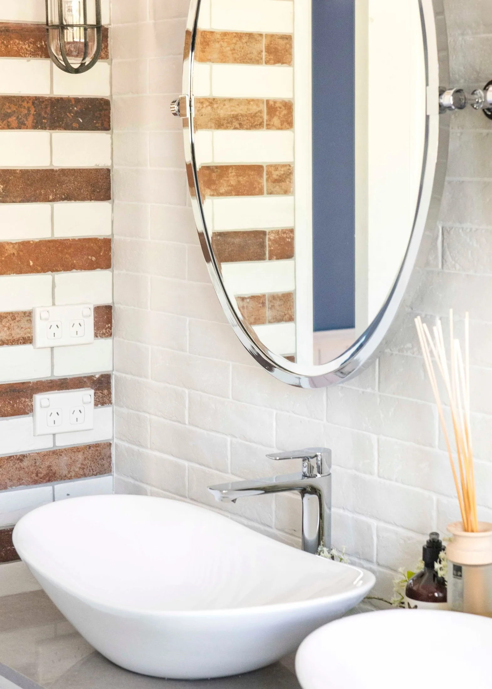
Bathroom
With a rule to include stripes, the teams had a tough job but judge Wendy felt they executed it wonderfully as the stripes were in line with the home and its surrounds. furnishings from Highgrove bathrooms.
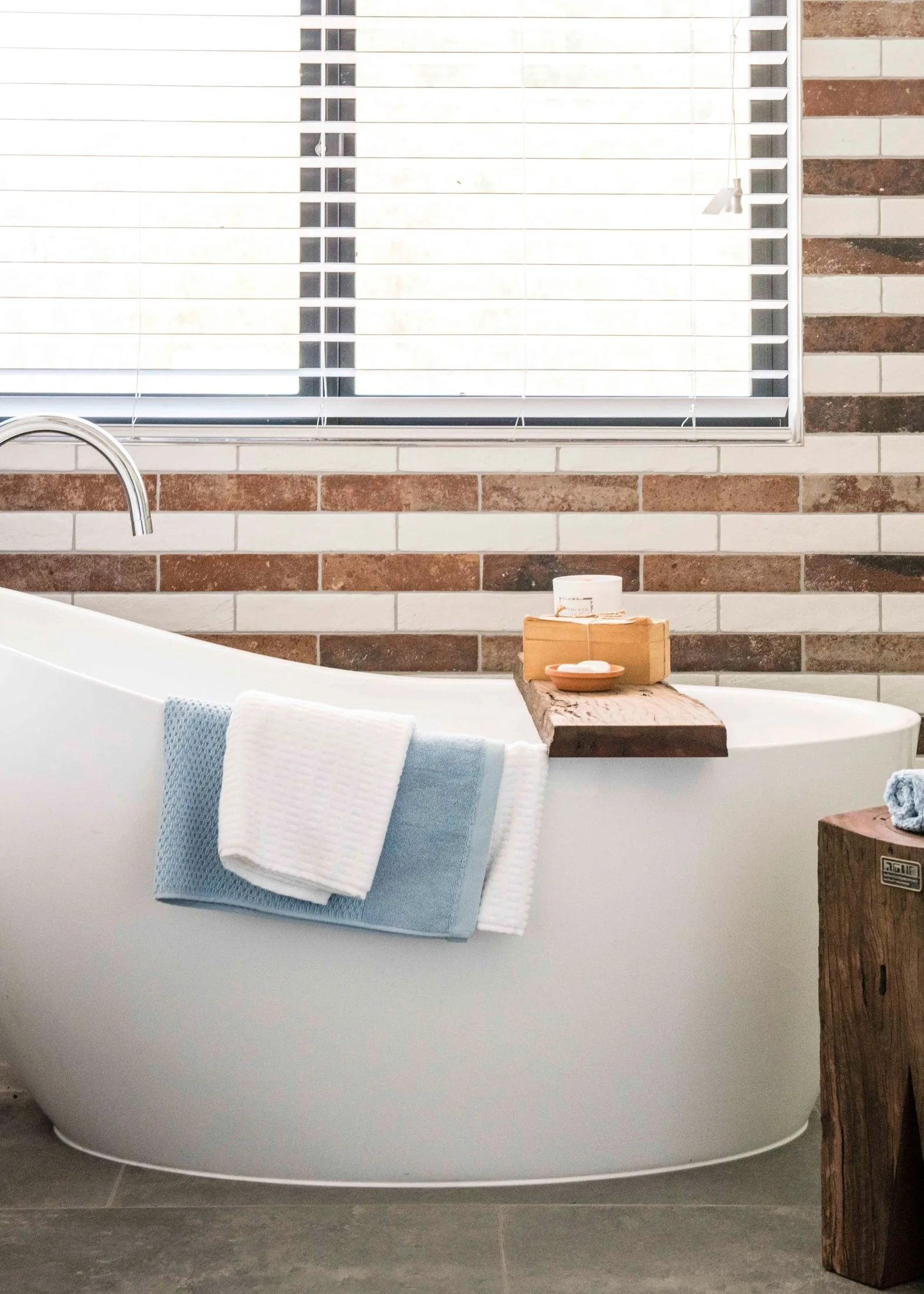
Bathroom
The space reserved for the shower was nice and big and the bathtub perfectly positioned to soak in the views.
For details on where to shop products used in this renovation, download the House Rules, powered by Home Beautiful App free from the App Store or Google Play
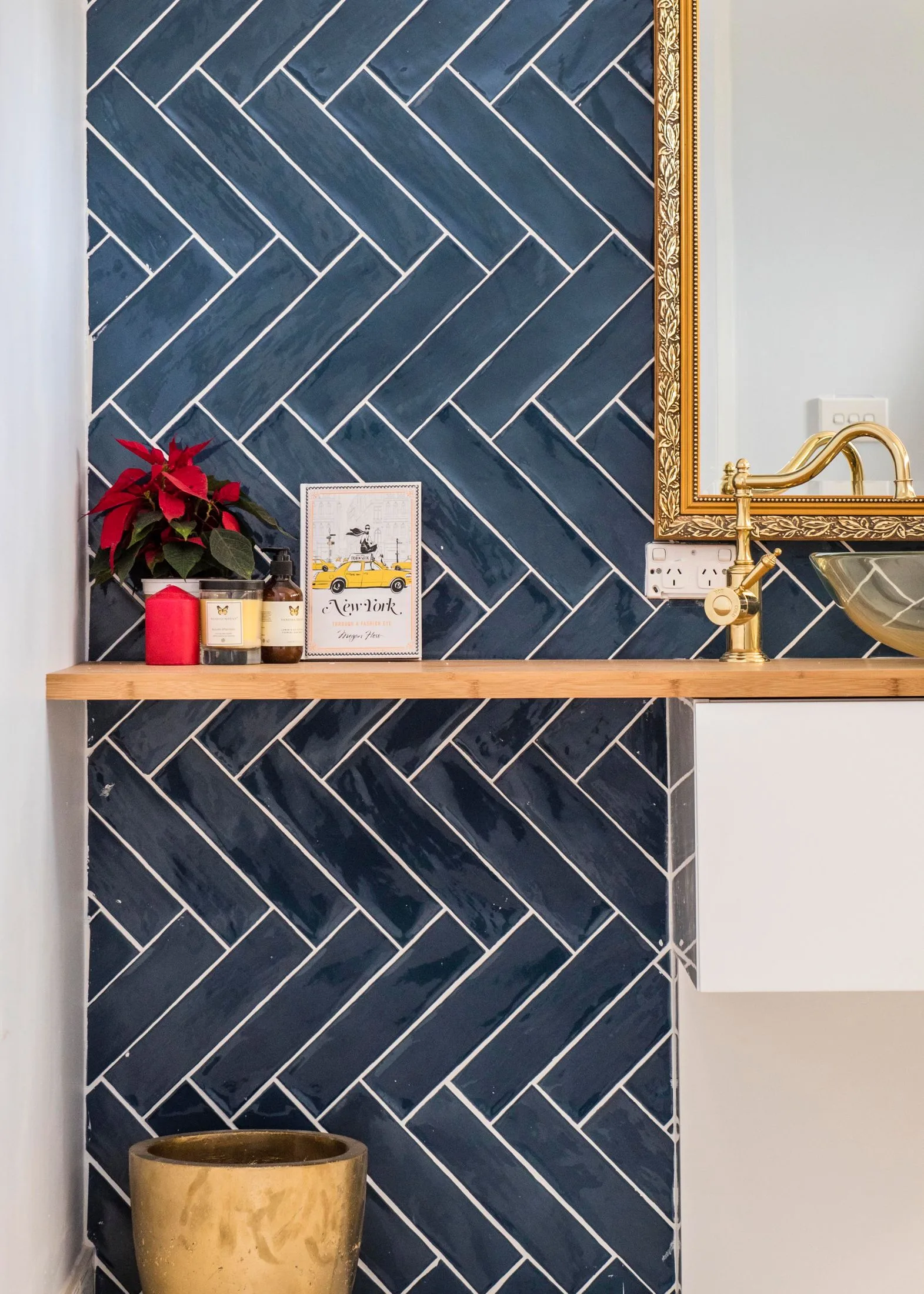
Ensuite
The herringbone patterned feature wall (tiles from Beaumont Tiles) adds a sense of glamour and luxe. While Wendy commented on the great use of space and layout, she felt the vanity and tiles weren’t right for the space.
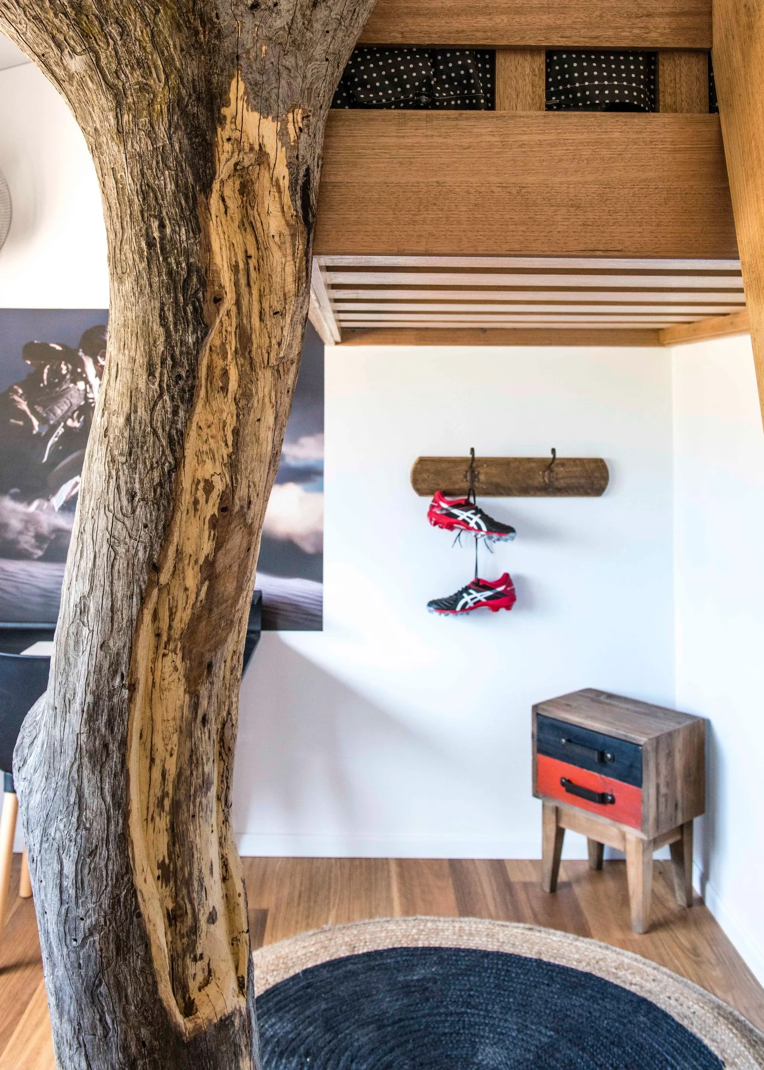
Boys’ room
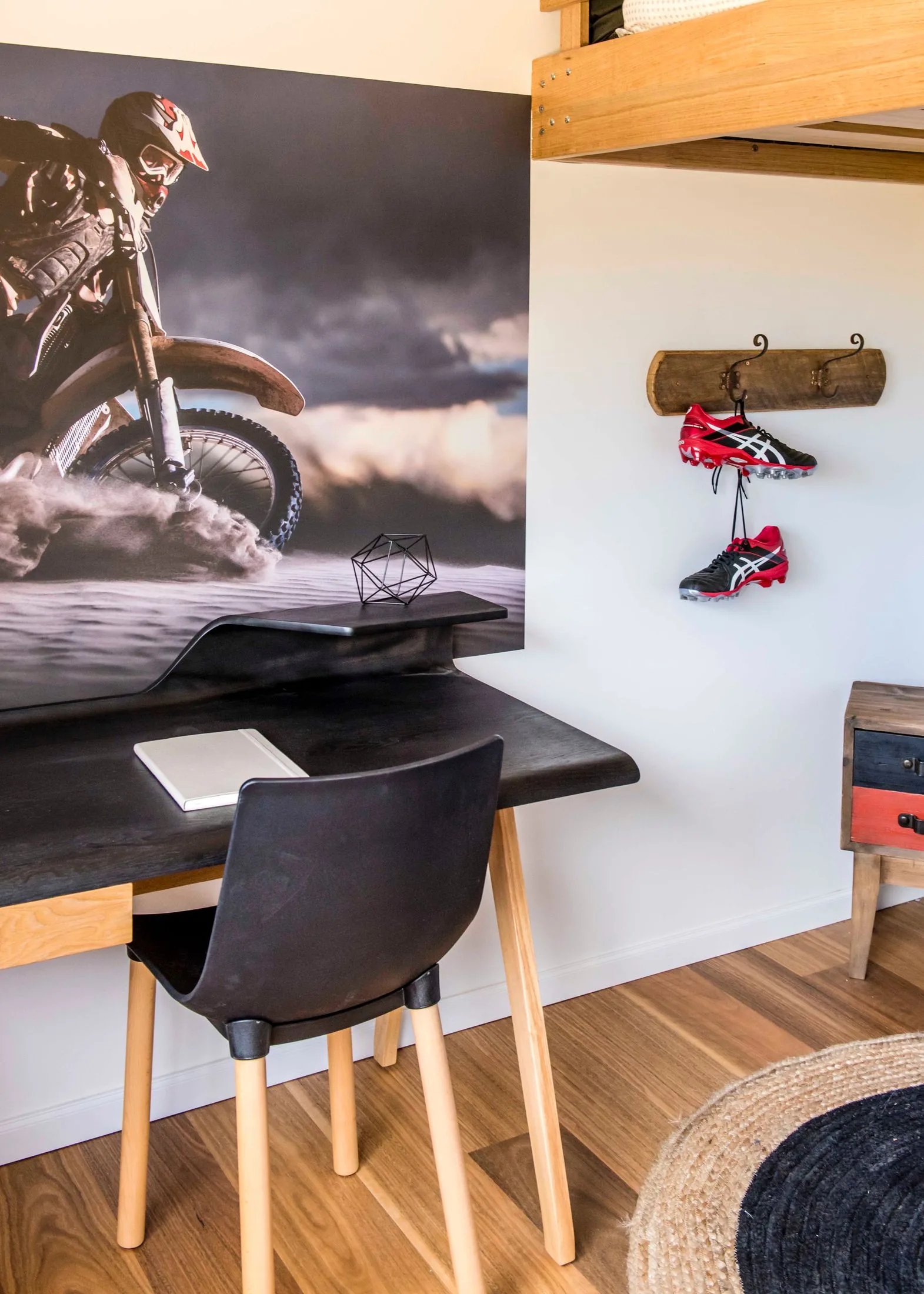
With a feature tree in the middle of the room, a loft bed and touches of black Wendy felt the room hit the mark and it was a great room.
Boys’ room
The wall art was a nice touch to add personality to the space and the simple colour palette worked together to create a well-thought out zone.
Main hallway
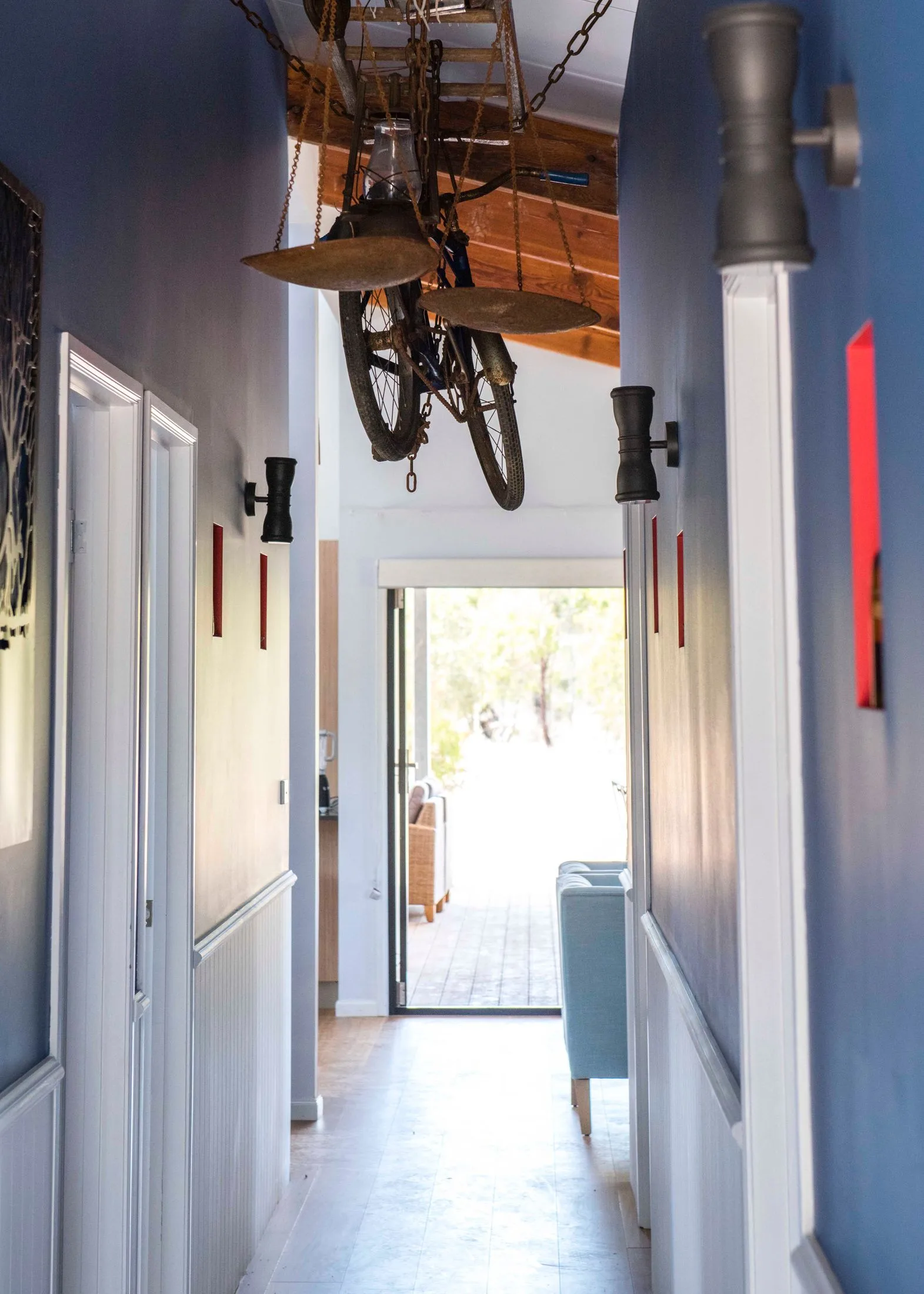
The cobalt walls with touches of red met the rules for the home and also pleased the judges. The hanging bike was a miss however for judge Wendy as it felt over the top and dusty. Mirror is from Amazing Hill Market.
