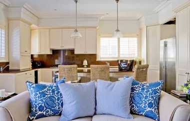
Charmed by the waterside location and 1920s building, Philippa and Simon bought this compact three-bedroom apartment north of Sydney knowing it needed reinventing to accommodate family life with their teenagers, Maya and Finn. For help, the couple approached designer Amanda Monnet-Demarbre of Antipodes Design. “Our clients wanted to create an open, light-filled home that felt more like a house than an apartment,” says Amanda. To achieve this, the living, kitchen and dining spaces have been reworked with a flowing layout that makes the most of the ground-floor apartment’s outdoor area.
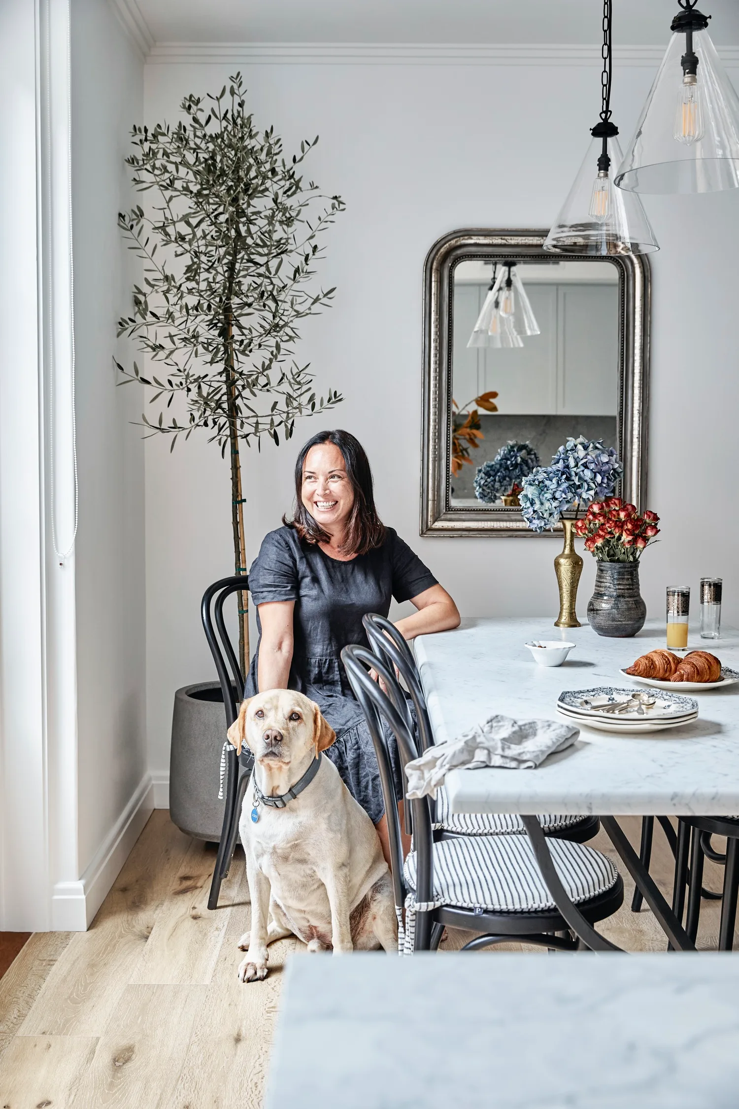
With the new layout locked in, Philippa approached interior designer Alexandra Gourlay-Craig of Vellum Interiors for guidance on the finishing details. “It’s a seamless blend of Art Deco and contemporary styles combined with Philippa’s personal style, which is influenced by a Parisian aesthetic,” Alexandra notes. Striking custom cabinetry also captures all the storage opportunities and enhances daily life. “We had initial concerns about moving a family of four, plus our labrador Jackson, into an apartment,” reflects Philippa. “But once I saw how the finished rooms were so functional and lovely, it felt like home as soon as we moved in.”
Designer tip
Change the layout to suit your needs. “The clients saw the kitchen as the central hub of family life so it was relocated to provide connections to the living, dining and patio area, visually and physically,” says Amanda.
SHOP THE LOOK
Invite the outdoors in
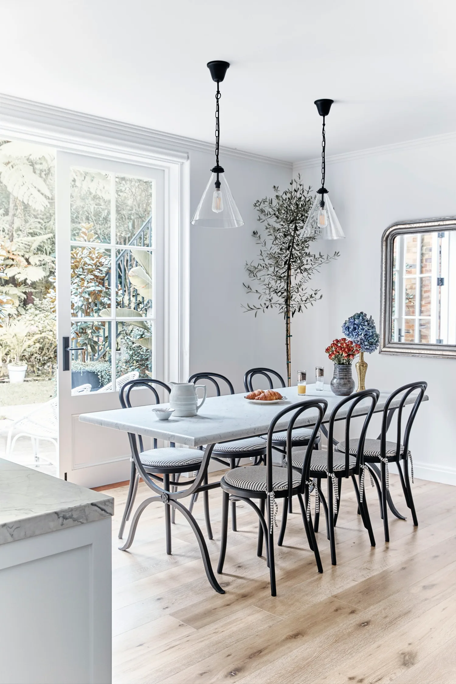
A row of custom French doors opening onto the patio ensure the dining area, formerly the kitchen, is spacious and airy. “By replacing the old kitchen window with another pair of glass doors, the garden was further invited into the house,” says Amanda. “The perfect northern orientation provides abundant natural light and warmth, and gives the space a relaxed, comfortable feel.” The bespoke table with a Carrara marble top and a custom iron base by Ornamental Ironwork is visually lightweight, as are the glass pendants from Fat Shack Vintage, while an antique French mirror from Philippa’s online store @vintageantiquetrader bounces daylight around.
Designer tip
“Maximising the natural light and connection with the outdoors is the priority to make even the smallest spaces feel big,” says Amanda.
Keep it simple
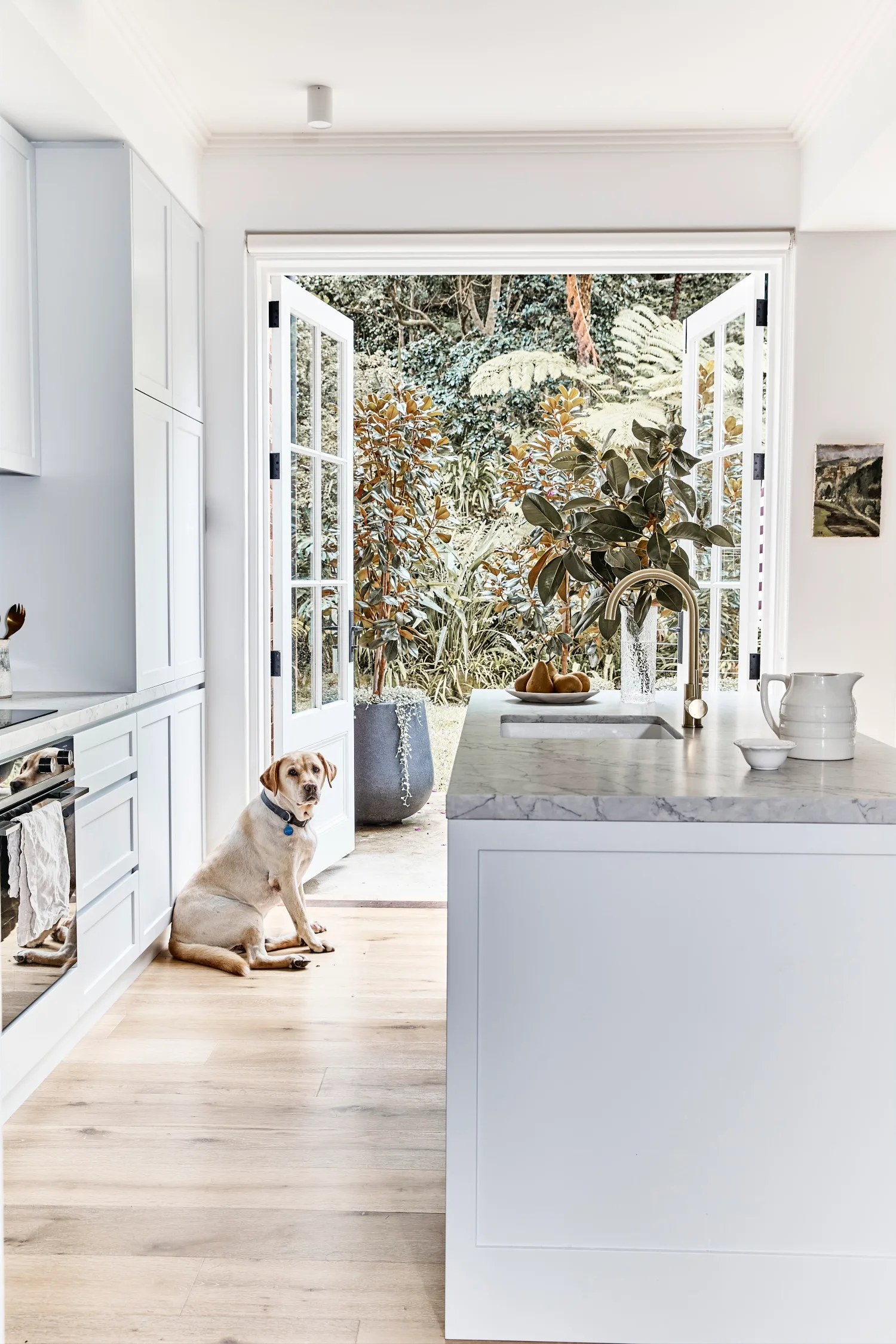
Every decision counts in a compact kitchen, especially when it’s also a highly visible, open space. Integrated appliances, unfussy hardware from Linear Standard and Shaker-style cabinetry painted in the soft, muted tone of Dulux Paramount create a serene and functional zone for cooking and gatherings in this kitchen. “The Abi Interiors ‘Elysian’ mixer in Brushed Brass on the island bench was intended to provide a beautiful focal point, like a piece of jewellery that can be seen from other areas of the home,” explains Alexandra. Talostone Super White from Central Coast Granite echoes from the bench to the splashback, and the Oak ‘White Sands’ engineered flooring from Preference Floors that’s used throughout the home adds warmth.
Make a statement
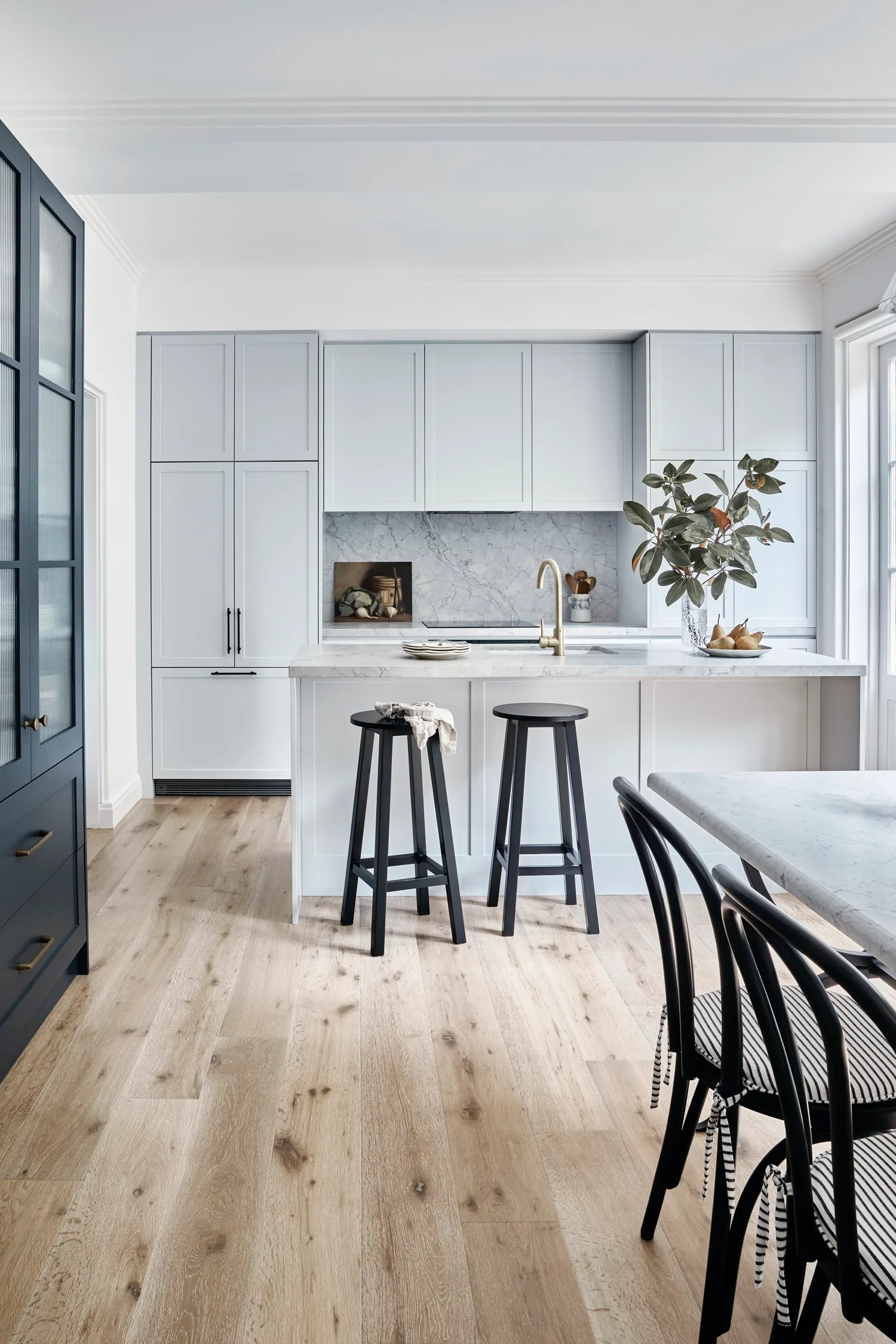
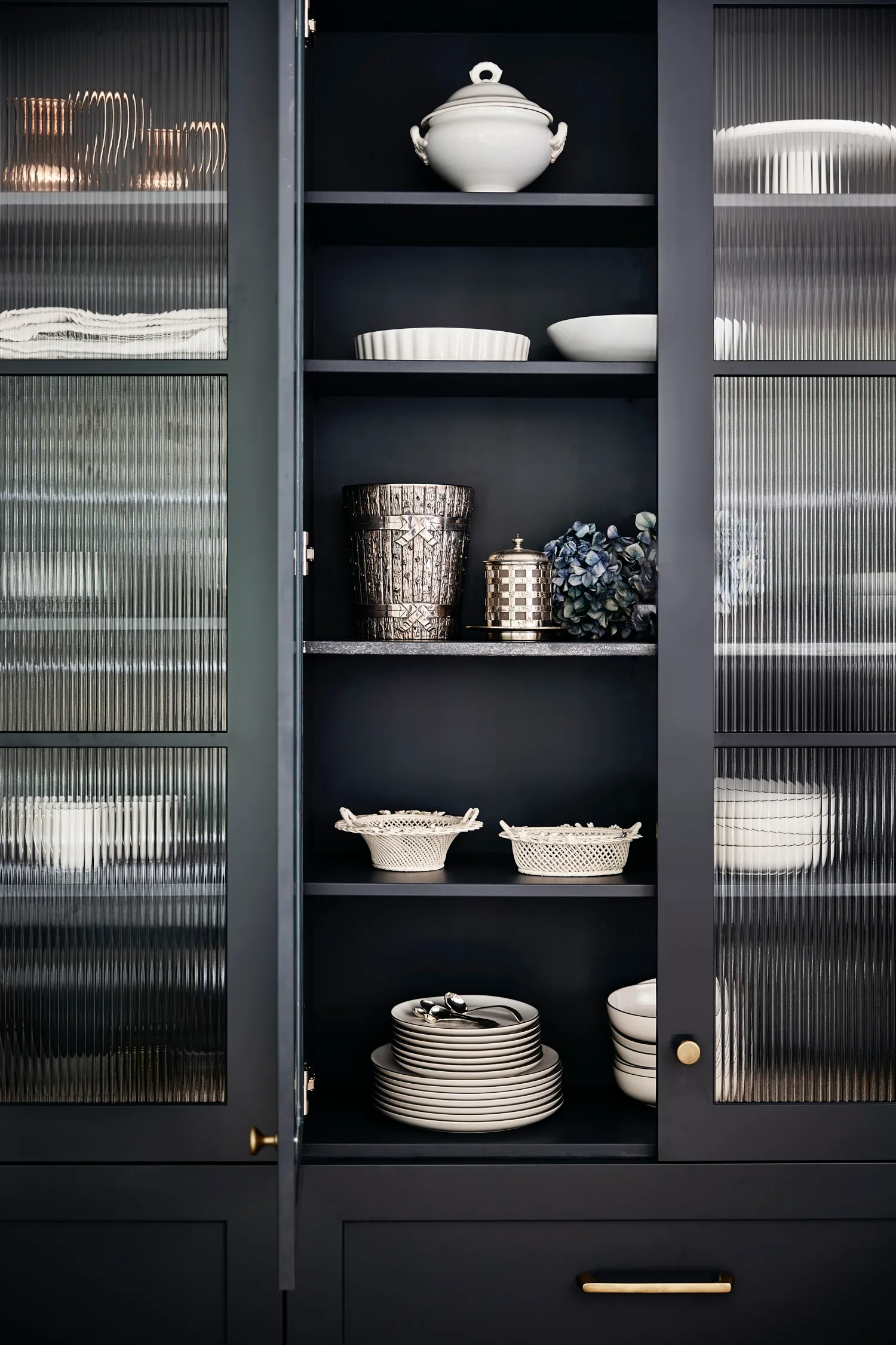
The custom-designed cabinet finished with fluted glass panels and coats of Porter’s Paints Squid Ink works as a visual anchor in the open-plan space beside the kitchen. “The aim was to provide practical storage, with the added goal for it to be a beautiful feature, almost like an old freestanding European-style larder,” says Alexandra. “Philippa has such a stunning collection of objects and crockery, so the glass front cabinet provides a beautiful ‘window’ for them, too.” As well as being a stunning addition to the space, it also has a timeless feel. “When you invest in custom storage, you want it to last and not look dated in five or 10 years’ time,” says Alexandra. The semi-opaque glass also works to lighten up the darker colour and add textural interest.
Designer tip
“If you’re wanting to try something bold in a small space, my advice is to choose a colour or pattern that really makes your heart leap,” says Alexandra. “This is your chance to do something fun – there’s no need to play it safe!”
Create a mood
“The multipurpose built-in shelving in the living room acts as storage, furniture and art,” says Amanda. “It allows the room to feel less confined and more spacious by maximising the available space.” The designer specified the built-ins and Alexandra finessed the detail. “They were designed with the apartment’s Art Deco heritage in mind and they look like they’re a part of the original layout, giving the room a cosier, more ‘house-like’ feel,” Alexandra says.
Designer tip
“In a small home, maximising every square metre is key,” explains Alexandra. “Designing practical, beautiful storage solutions are at the heart of this for me so each room can be free of clutter, which can make a space seem smaller.”
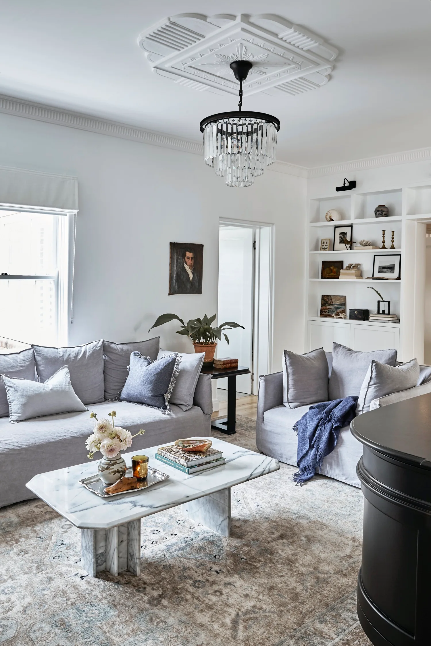
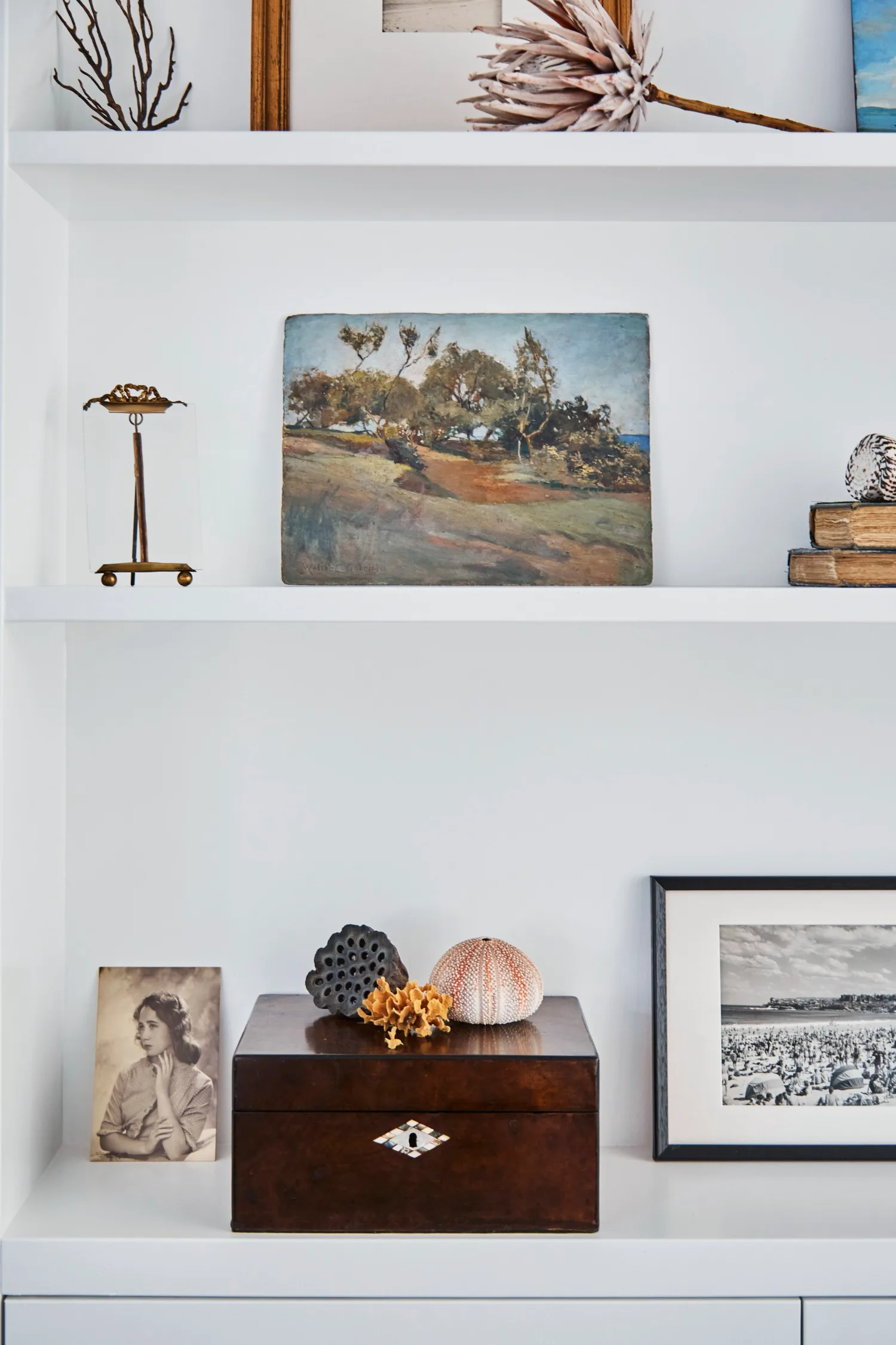
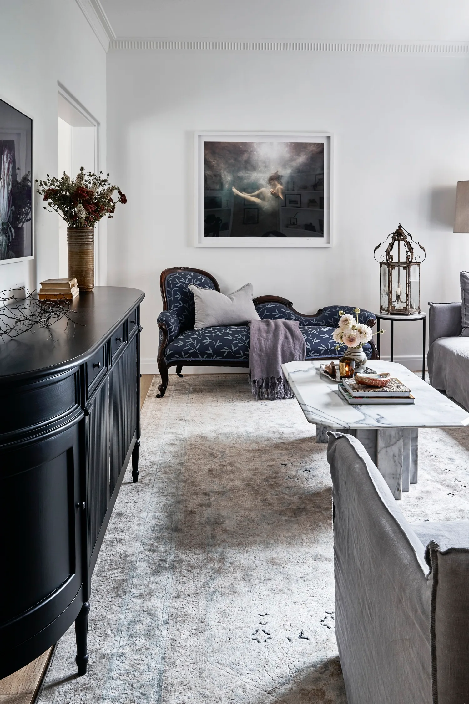
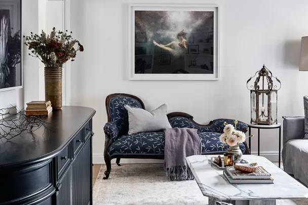
Philippa, who sells vintage decor through her two businesses, Vintage Art Emporium and @FindersKeepersTraders, displays collections throughout the home, such as this vignette that includes an oil painting from the early 1900s by Australian artist Walter C Gabriel on the top shelf and an antique 19th century walnut box. “The vintage objects and artworks add so much character to the space and help give the modern renovation a timeless, considered feel,” says Alexandra. Ornate ceiling roses, cornices and skirting boards, that were added by Alexandra, amplify the old-world charm, as do a marble coffee table from @FindersKeepersTraders and a black buffet from La Maison.
Designer tip
“Joinery is essential to define and organise a small space and keep it uncluttered and clean,” explains Amanda. “A well designed small space is compact, comfortable and convenient.”
“I love the character and the curation of objects and art in small spaces. The Parisians do it really well.”
Philippa, homeowner
Pare back furnishings
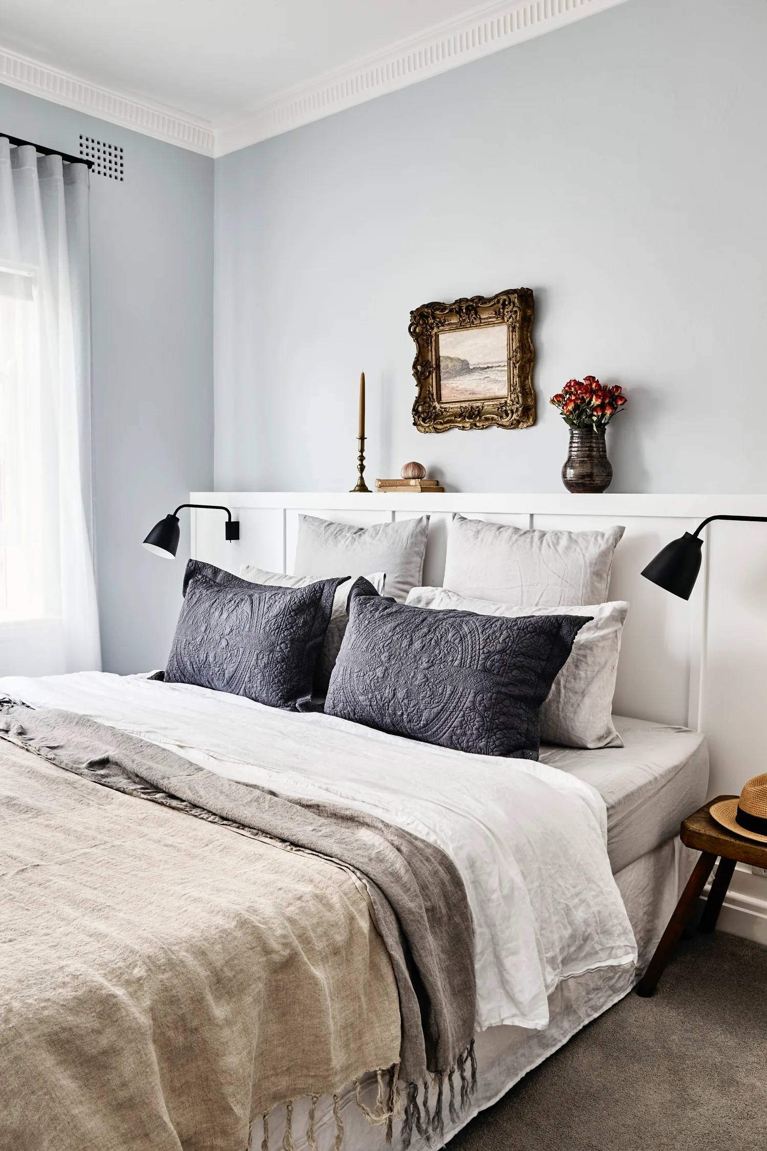
“Built-in joinery and minimal furniture allow the main bedroom to be simple, elegant and comfortable,” shares Amanda. Behind the bed, the headboard shelf with integrated ‘Caravaggio Read’ wall lights from Cult removes the need for bulky bedside tables in the room. “Calming blue and grey tones were used to create a peaceful and sophisticated sanctuary,” says Alexandra of the quietly decorated room with textured objects and a 19th century artwork from Vintage Art Emporium.
Designer tip
Open up the flow and light between spaces. “The bedrooms, living room and bathrooms remained in the same location but existing structural walls were opened up to create light-filled spaces with multiple connections,” says Amanda.
Make room for displays
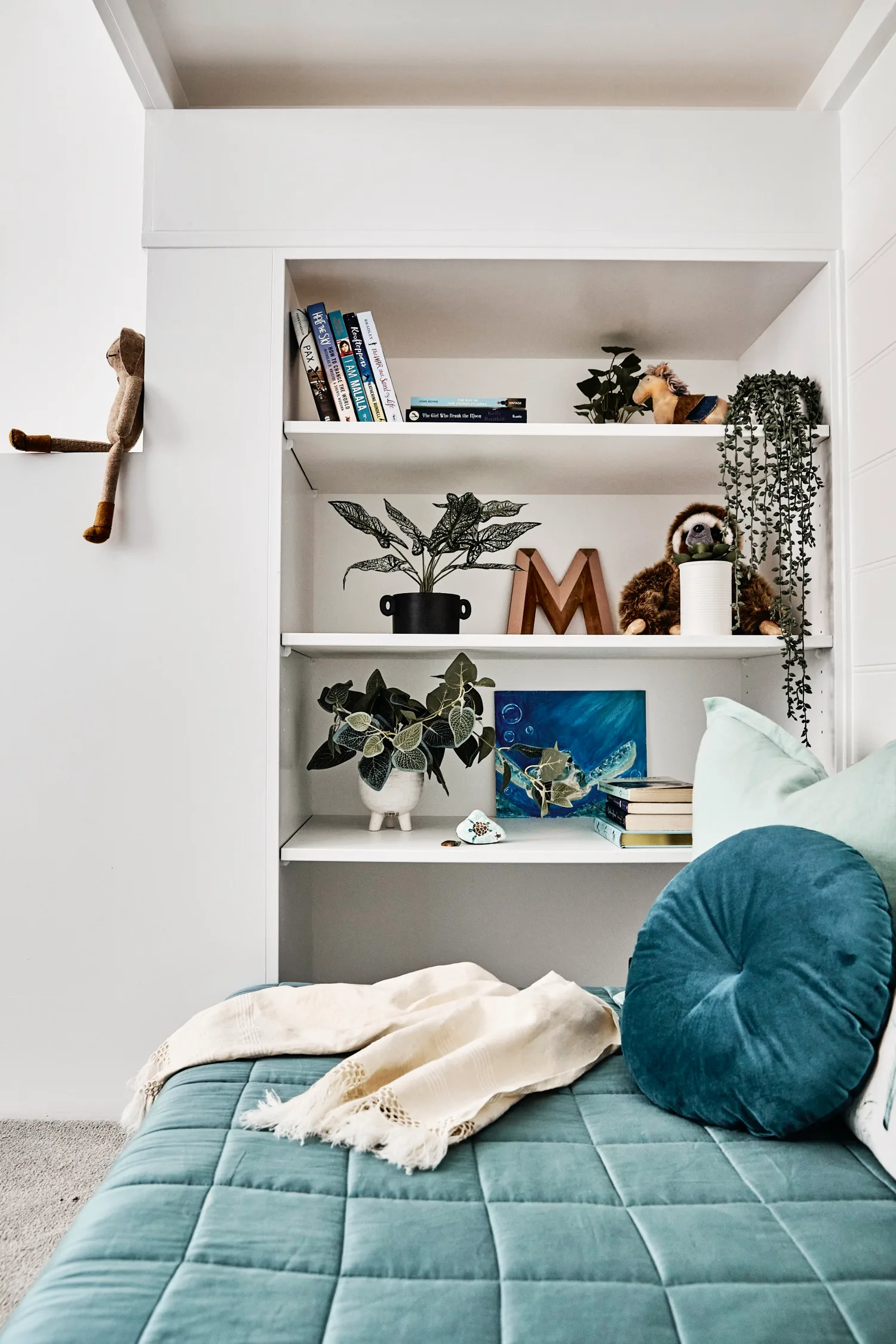
Maya’s room is pared back but incredibly functional. “The loft bed was designed to be a unique and complete piece of furniture for the small bedroom to maximise the amount of available floor space,” says Amanda. It provides the opportunity for storage and display, a chill-out zone and an elevated sleeping nook scaled to fit a king-single mattress. The unit is painted in Dulux Vivid White to match the walls, and a varied collection of cushions (try Maison by Rapee for similar) add plenty of colour and comfort to the space.
Install secret storage
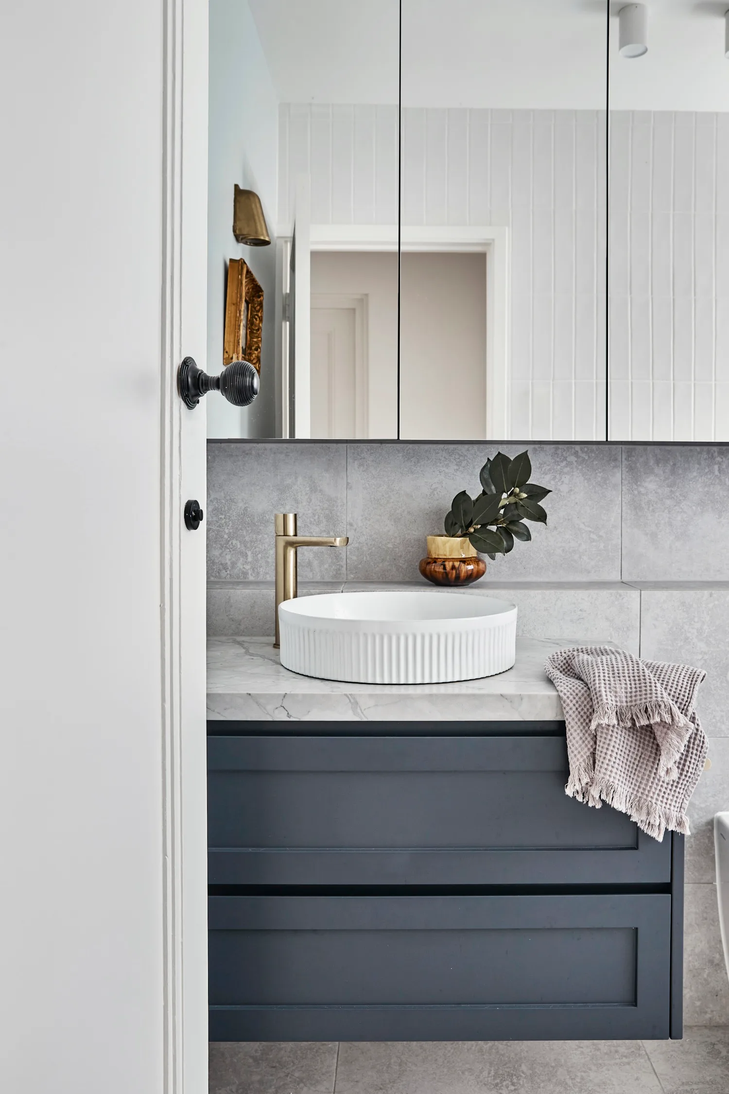
Removing the bathtub from the bathroom allowed the space for a second toilet and Amanda’s redesign incorporates a convenient shelf niche that runs the entire length of the room and has masses of storage hidden behind the bank of mirrored cabinets. Beneath these, an ADP fluted basin from Accent Bathrooms paired with a ‘Milani’ mixer from Abi Interiors catches the eye atop the custom vanity.
Designer tip
Create a sense of expansiveness with considered choices. “Soft grey, large-format tiles continue across the floor and wall and help create a more spacious feeling in the bathroom,” explains Alexandra.
Source book
Design: Amanda Monnet-Demarbre, (02) 9029 5454, antipodesdesign.com.au.
Interior design: Alexandra Gourlay-Craig, 0402 686 427, velluminteriors.com.au.
 Photography: Sue Stubbs / Styling: Jessica Bellef
