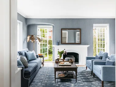
Sarah, who works in banking and her husband Matt, a sales director, live with their two boys in this beautiful family home in Melbourne inner’s east. However, it wasn’t always so beautiful. It was a dark, run-down home with awkward spaces and dated interiors when they bought it. “We loved that it was a solid, red-brick Edwardian house with original features and we could see its potential,” says Sarah, who also liked the street and its proximity to the train station.
With its dated interior, one toilet and squeezed living and dining areas, the house didn’t work for Sarah and Matt’s growing young family. Originally planning to build up, they instead extended the ground floor. “It was slightly more economical, we had the same number of bedrooms and I like being on one level,” she says. After two years of preparation and six months renovation they completely opened up the space and made room for far more natural light.
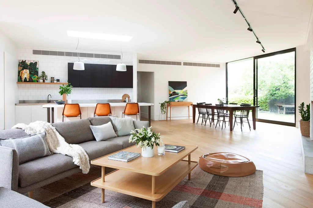
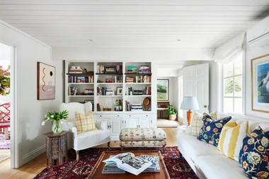
“Zoning this open space was challenging, due to the angled lines of the extension, which follows the site boundary,” explains designer Robbie Peirce of Studio Tom. “Our aim was to connect each area to natural light and the outdoors.” The ‘Nook’ sofas and ‘Ellis’ coffee table, all from Jardan, reflect Sarah’s Scandi-inspired style. “The Nook sofa has been on my wish list forever,” she says
A rear extension that capitalised on the under-utilised external space of the angular site. The project’s architect Eliza Blair says, “Unable to build anything over the easement on the garden side of the house, we built out towards the boundaries, allowing natural light and ventilation.” Extending out 2.5 metres allowed for a pantry, laundry, light- well, walk-in robe and ensuite. The family also gained new outdoor areas, as well as a bathroom, open-plan living area and a reconfigured kitchen.
Homeowner Sarah loves the way it’s zoned. “It can feel cosy or functional,” she says. The mix of timber with white, soft greys and black accents defines the colour palette throughout the home.
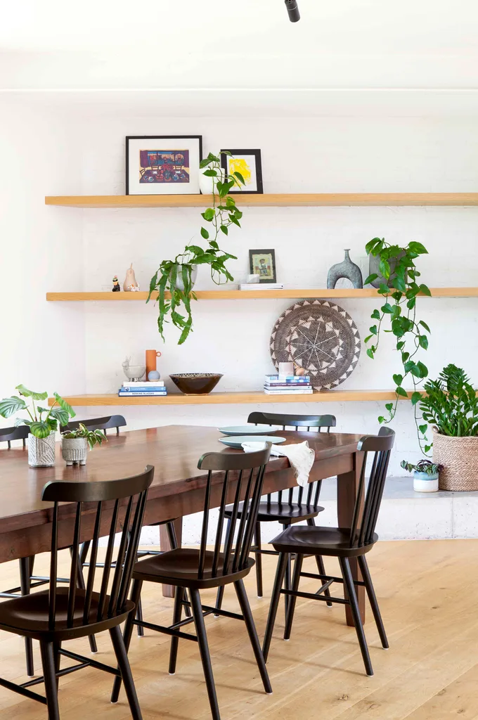
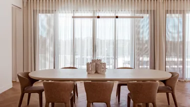
New open-plan living provides the space for an easy entertaining zone in this Melbourne home, where guests are well served by the 10-seater dining table, given to homeowners Sarah and Matt as a wedding present 17 years ago, and the Ton ‘Ironica’ dining chairs from Huset.
Sarah particularly loves her beautiful kitchen which is the epitome of restrained luxury. “Its footprint is slightly smaller than the jumble of cupboards we had before, but it tucks nicely into the space and is more usable, open and streamlined,” she says. Minimal overhead cupboards and open shelves lend a light feel to the kitchen and help to blend in with the living areas.
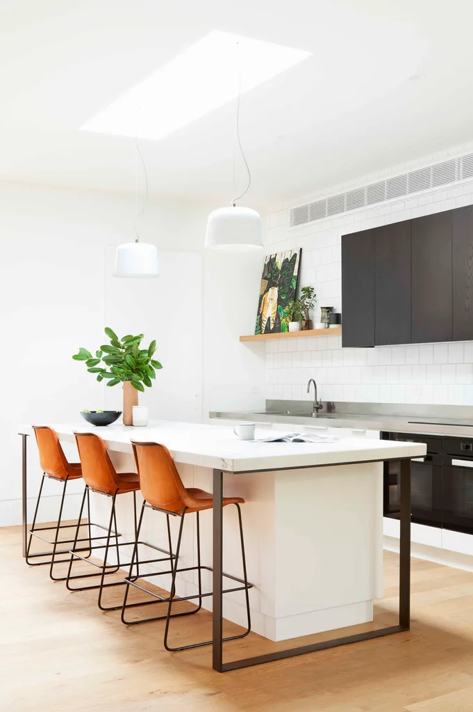
While lower cabinets in Dulux Lexicon Half match the walls, the overhead cupboards, in ‘Nero’ timber veneer from George Fethers & Co, add texture and a contrasting black accent. “We wanted somewhere to congregate, without a cooktop or sink to make it messy,” says Sarah of the kitchen island. “I love the Calacatta marble because it’s natural and I actually like how it wears over time.” She chose Coco Republic ‘Drexel’ barstools and Anchor Ceramics ‘Potter’ lights for their welcome warmth, curves and texture
“The house faces south, but having the expanse of glass at either end and the central skylight means the living space is light and airy.” ~ Sarah.
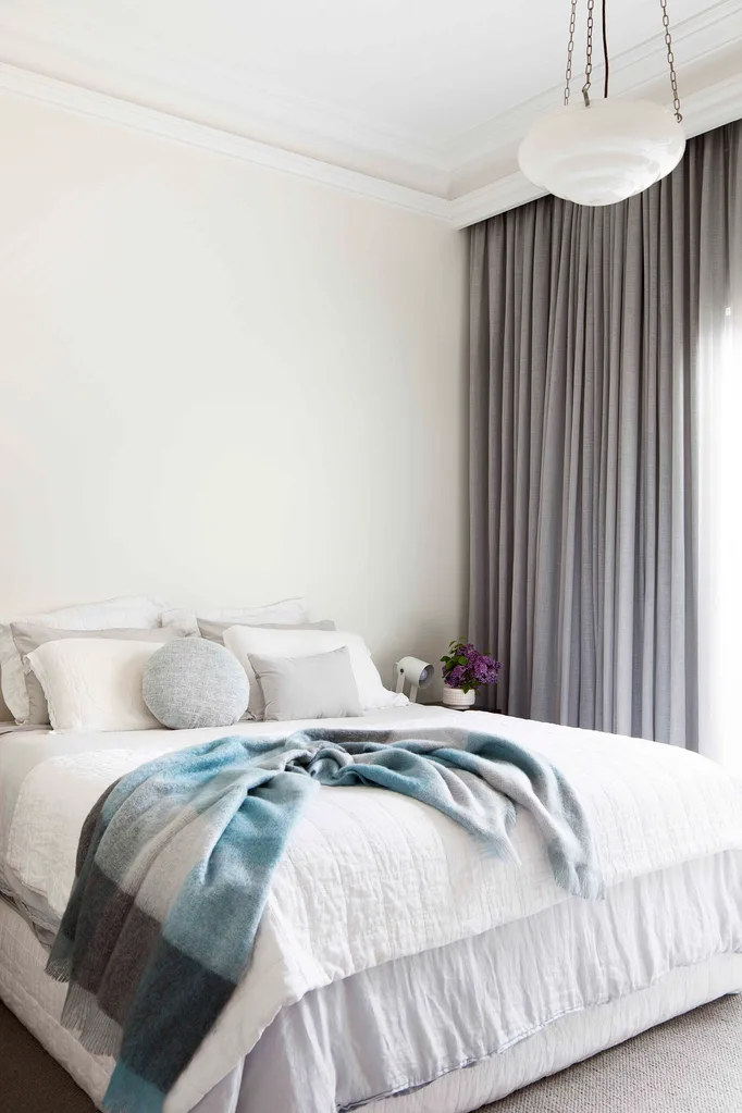
“We wanted the existing rooms in the house, including the master bedroom, to be warm, inviting and complement the period features,” says designer Robbie, who used warmer whites, loop pile wool carpet from RC&D’s Natural Collection and soft grey sheers in Warwick’s ‘Aesop’ fabric in Atlantic to create a grown-up yet relaxed aesthetic.
With a new ensuite to call their own, Matt and Sarah increased the footprint of the old bathroom to create this impressive monochrome space for the boys. “A second bathroom was a must and we also wanted a study/second living space. The butler’s pantry was essential to keep the kitchen clutter-free, considering how close it is to the lounge,” says Sarah.
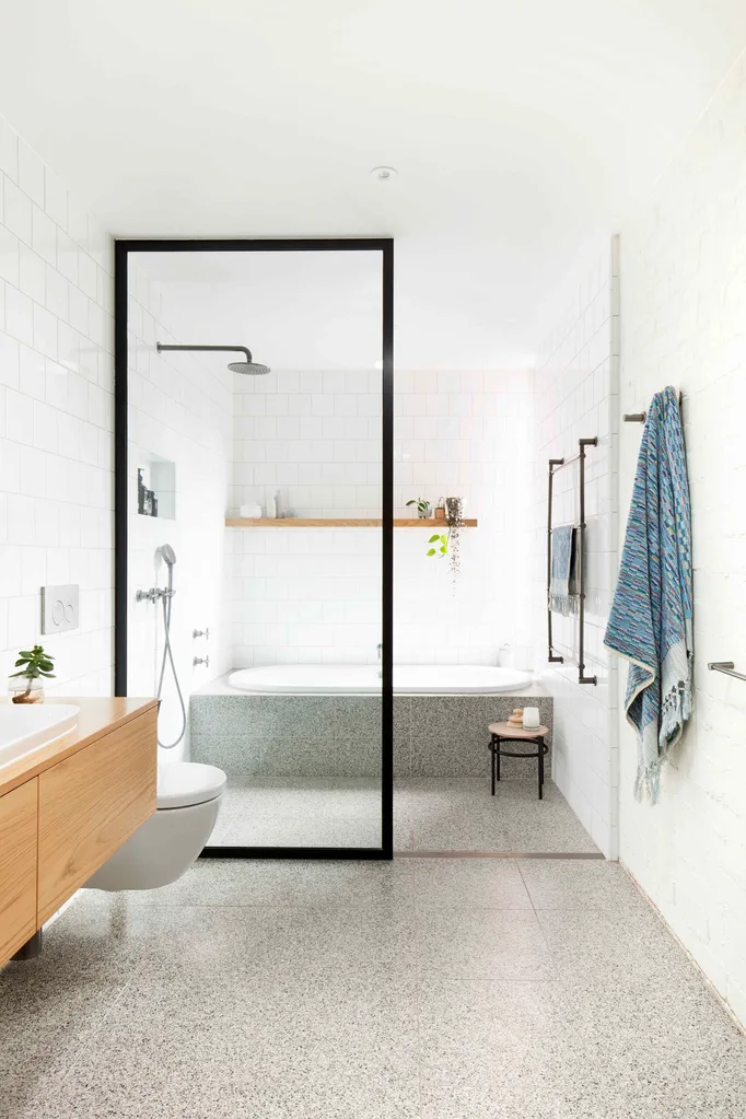
Taking centre-stage are Signorino terrazzo tiles that travel through the shower and up to meet the bath, a Duo ‘Comfort Oval’ 1800 from Rogerseller. “I love black tapware, but thought it might date, so instead we introduced black accents through the graphic picture shower frame,” says Sarah. Academy Tiles square subways adorn the walls, except on the right side of the entry: “We retained the original brick wall and painted it white to add texture and pay respect to the existing building,” says designer Robbie Peirce.
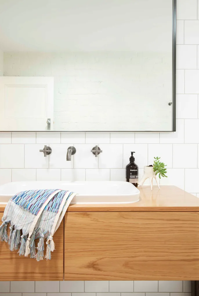
Dated pine cupboards made way for a custom timber shelf and oak veneer vanity, bringing in warmth. Completing the look are Studio Bagno’s ‘Soul 3’ inset basin and Astra Walker’s Icon+ wall tap set in Ice Grey.
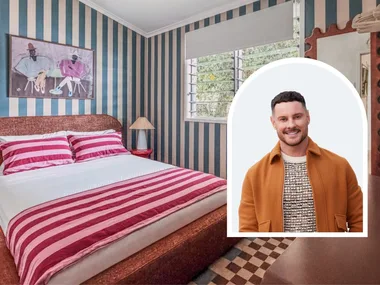
“In its previous life Jock’s bedroom was an open sitting room, which we closed off to form a third bedroom,” says Sarah. “The built-in robes and shelving made for lots of much-needed storage.”
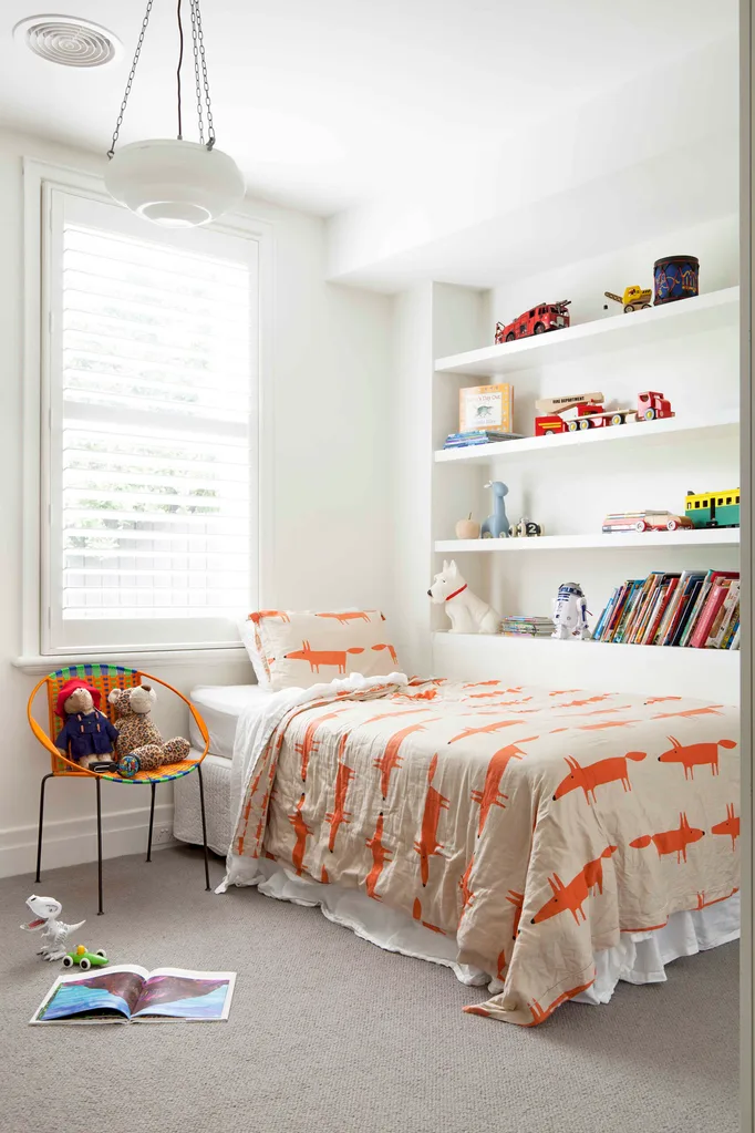
“We added personality to Jock’s white bedroom with a chair I found at a design market and the Mr Fox bedding from Bed Bath ‘n’ Table” said Sarah.
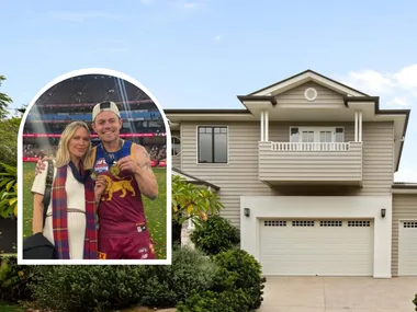
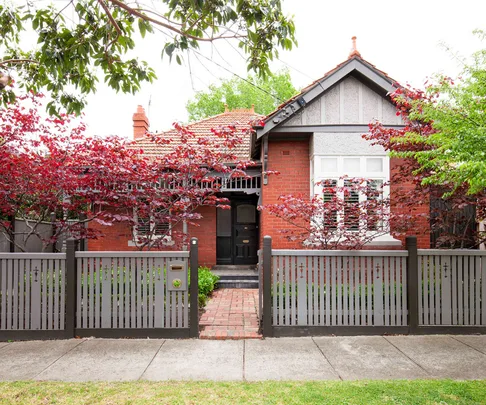
“The front of the house just needed a refresh,” says Sarah, who chose Porter’s Paints Grey Pepper for the fretwork, fence and eaves and Porter’s Paints Jaguar as a darker contrast. Minor repairs completed the work. Before the renovation, this south-facing property had minimal access to the outside space and made little use of the northern light.
Now, vast sliding doors with black aluminium frames open to the north-facing, sunny courtyard, with its iron and timber pergola. “We designed it as an extension of the living space and secondary outdoor room for dining and relaxing,” says architect Eliza Blair.
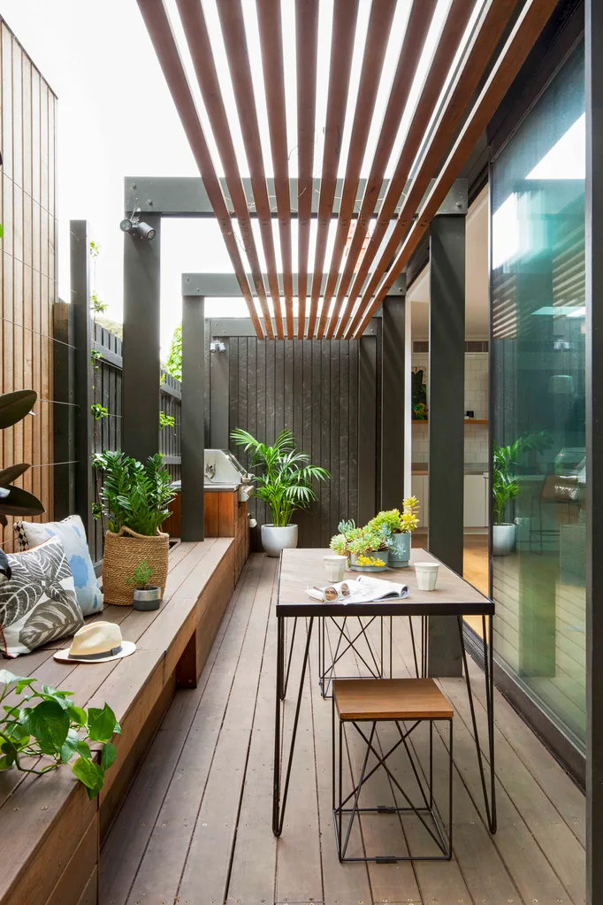
“The built-in benches and storage keep it clutter-free and, in time, the vines will grow up the fence to create a lovely green oasis, visible from the living room.” The simple design of the Redfox & Wilcox stools and table made them the perfect find for this space.
The total cost came to approximately $550,000. “We actually came in under budget!” says Sarah. “Our architect Eliza and interior designer Robbie Peirce planned everything so well and they, and our builder, were always transparent with the costs.”
 Shania Shegedyn
