Hot heads Chiara and David set some pretty tough rules for the teams to follow this week as they set to renovate the cluttered house the colourful couple share with their three children in Yangebup WA.
An emotional David said on handing over the keys to his family home that he just wanted a home he could be proud of. Chiara, on the other hand, was plain about her wishes: “Don’t mess up my kitchen!”
The pressure was on and with design rules that took all of the teams out of their comfort zones, despite this being the seventh reno they’ve tackled, teams struggled to execute David and Chiara’s unique style. Some teams rose to the challenge to hit the House Rules and impress the judges, others failed to impress.
Chiara & David’s rules:
1. Bring the bling with glam luxe style
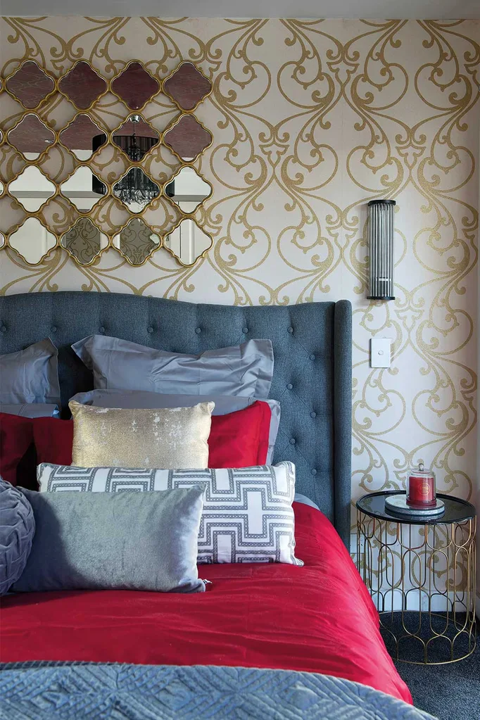
2. Be passionate with red, gold and silver
3. Turn the lounge room into a swanky cinema
4. Do something dramatic in a sparkly kitchen
5. Make the master suite like an OTT 6 star hotel
Bonus Room: Kid’s bedroom
Bonus Room Rule: Give us a slamming wrestling bedroom
Jess & Jared: (Entry & Master Bedroom)
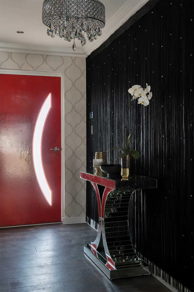
In the entry judges Laurence Llewelyn-Bowen, Wendy Moore and Drew Heath felt Jess and Jared’s decoration leaned closer to the tacky side, rather than the glam look Chiara and Dave had asked for. Whilst their statement piece console table impressed everyone, the judges were not a fan of the fringed wall.
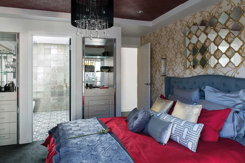
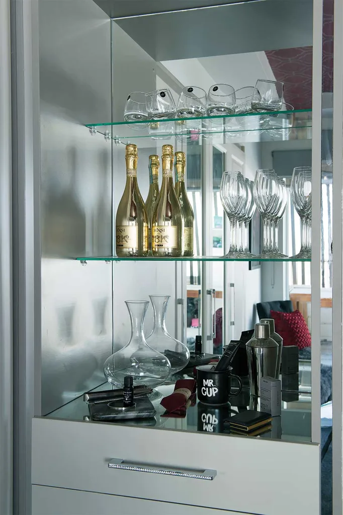
In the master bedroom the judges liked some elements, such as the shelving niche and coffered ceiling with dramatic wallpaper, but overall felt the room suffered from too heavy a hand with patterns competing and there being too much decorating applied in the one space.
They scored 17/20 from the judges.
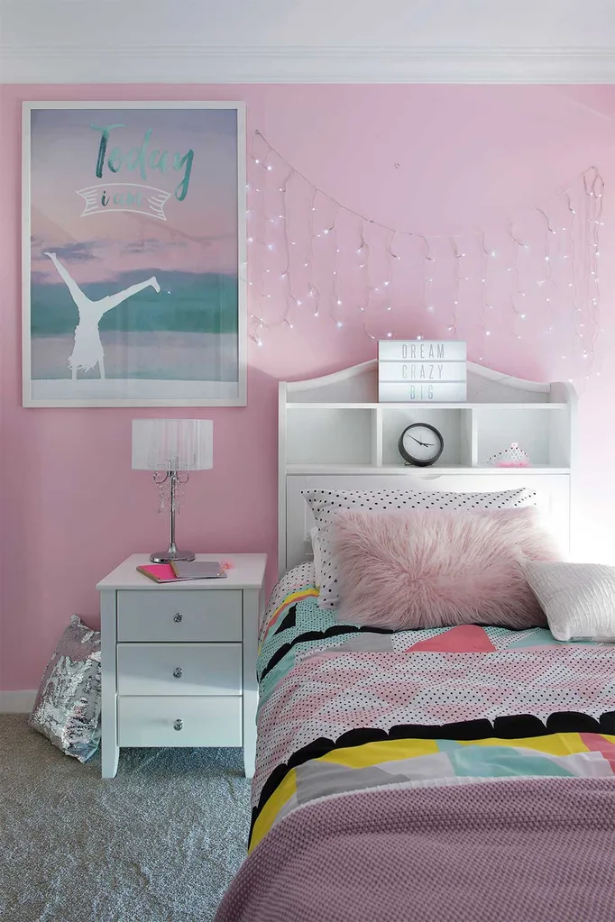
Josh & Brandon: (Taya’s bedroom and Laundry)
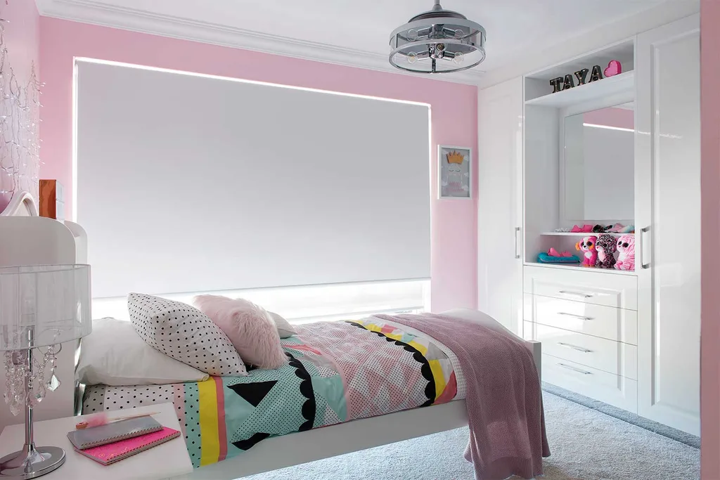
The chippy brothers struggled to fit in all that was needed to fulfil five-year-old Taya’s dreams to have a bedroom fit for a pop princes. After several reworks, they hit upon a neat layout that included a clever raised stage with LED strip lighting underneath, a disco ball above and their winning statement piece of Taya’s “tour poster” hanging pride of place on the wall. The judges were impressed the the layout and decoration, commending Josh and Brandon on their attention to detail in what was an unfamiliar space to them.
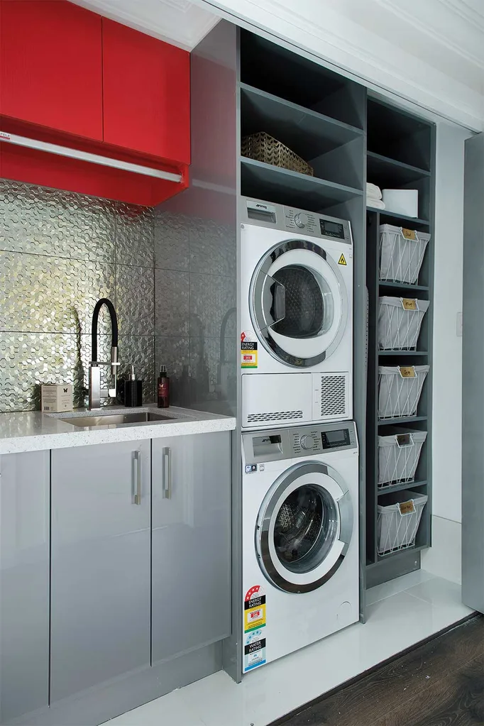
In the laundry however the judges weren’t as enthusiastic, saying they felt the brothers could have done more with the space. The idea of a hidden “European style” laundry peaked their interest but they were left feeling underwhelmed, particularly with the “80’s grey” colour in the cabinetry. Josh and Brandon scored 20/30 from the judges.
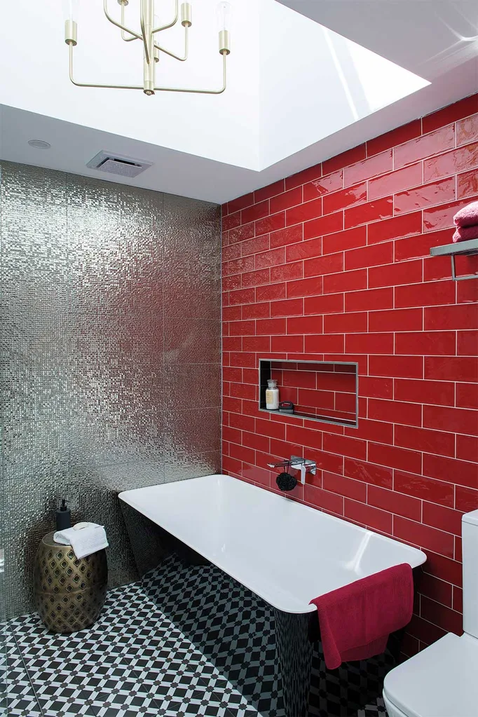
Toad & Mandy: (Bathroom and Ellie-Mae’s bedroom)
This is the final interior team home renovation for Toad and Mandy to complete as it will be their own home renovated next week – the last in the competition. They were therefore keen to finish well on the leaderboard to ensure a good place for the next stage of the competition.
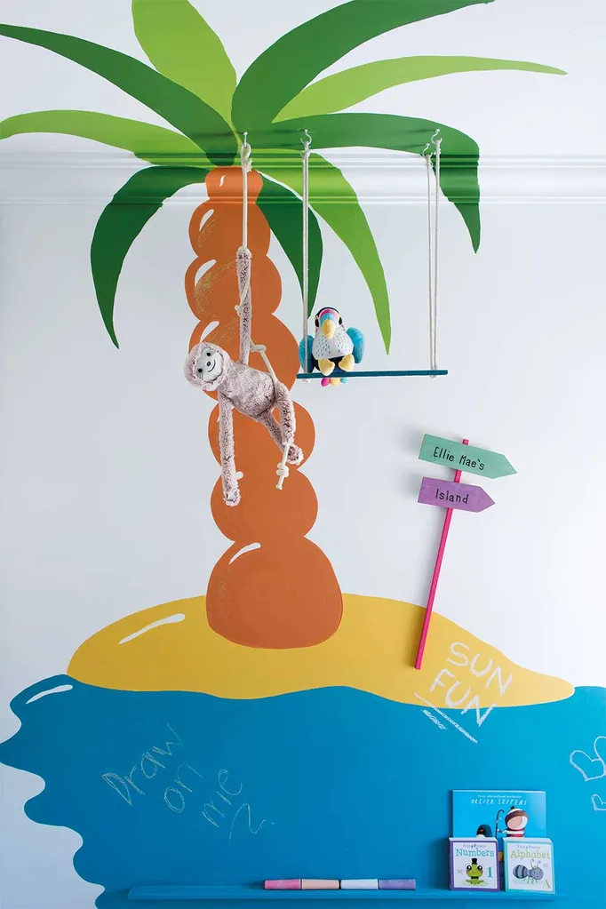
Two-year-old Ellie-Mae had asked for her room to come alive with animals and the pair went to great lengths to create a colourful and stimulating space for her, using “the best yellow [Wendy] had ever seen” and a bright and cheerful chalk-board palm tree mural climbing up one wall. On another wall they used velcro to attach a cute collection of toy animals in a clever and playful interactive feature.
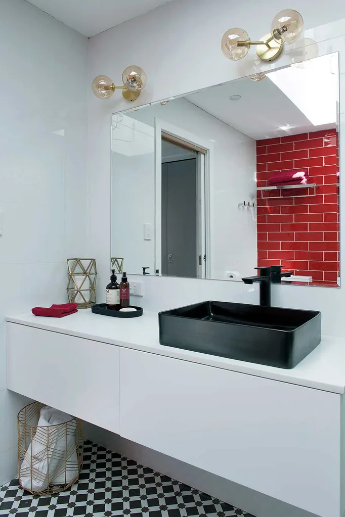
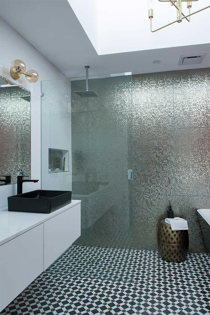
In the bathroom they really hit the House Rules and impressed all of the judges with their sophisticated interpretation of the colour palette. With a rule to “bring the glam” and incorporate the colours of red, gold and silver, this was no small task so their selection of tiles really impressed the judges. They came through with flying colours and LLB was, “Genuinely blown away!” and awarded his first 10 of the competition, saying they absolutely answered the rule to bring a six star hotel vibe.
The red wall was a winner, described by LLB as “The perfect shade of red.” Toad and Mandy’s total score from the judges was 25/30, which put them at the top of the leaderboard.
Mel & Dave: (Hallway and Kitchen)
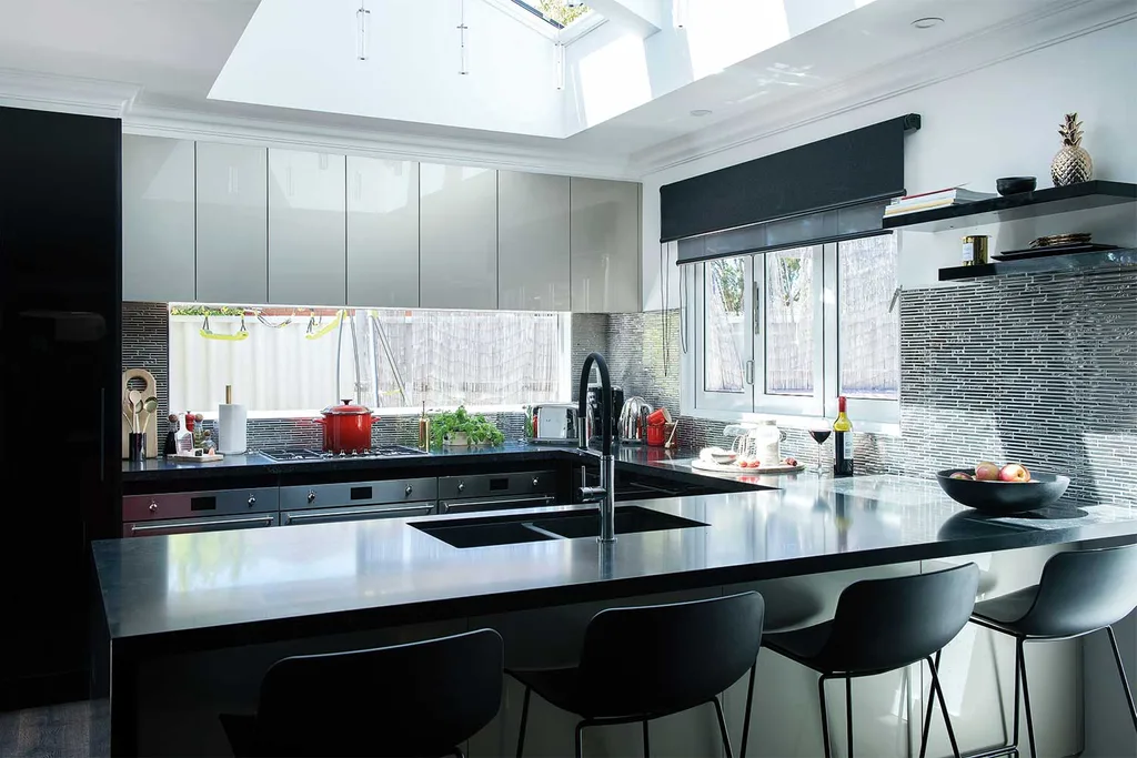
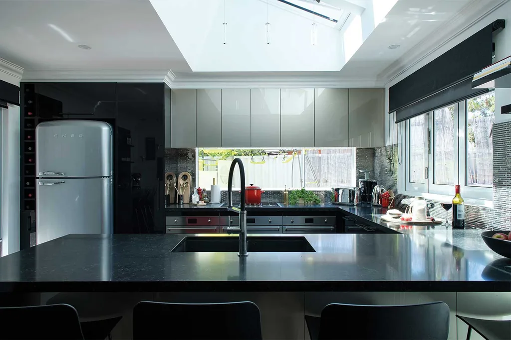
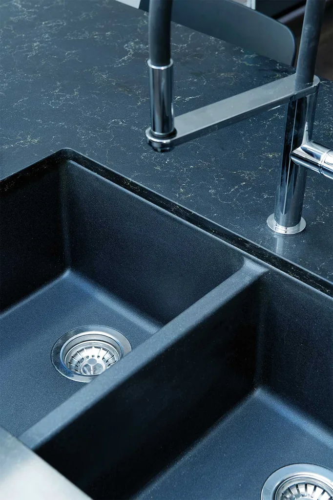
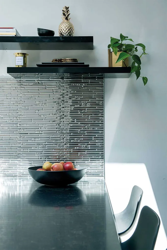
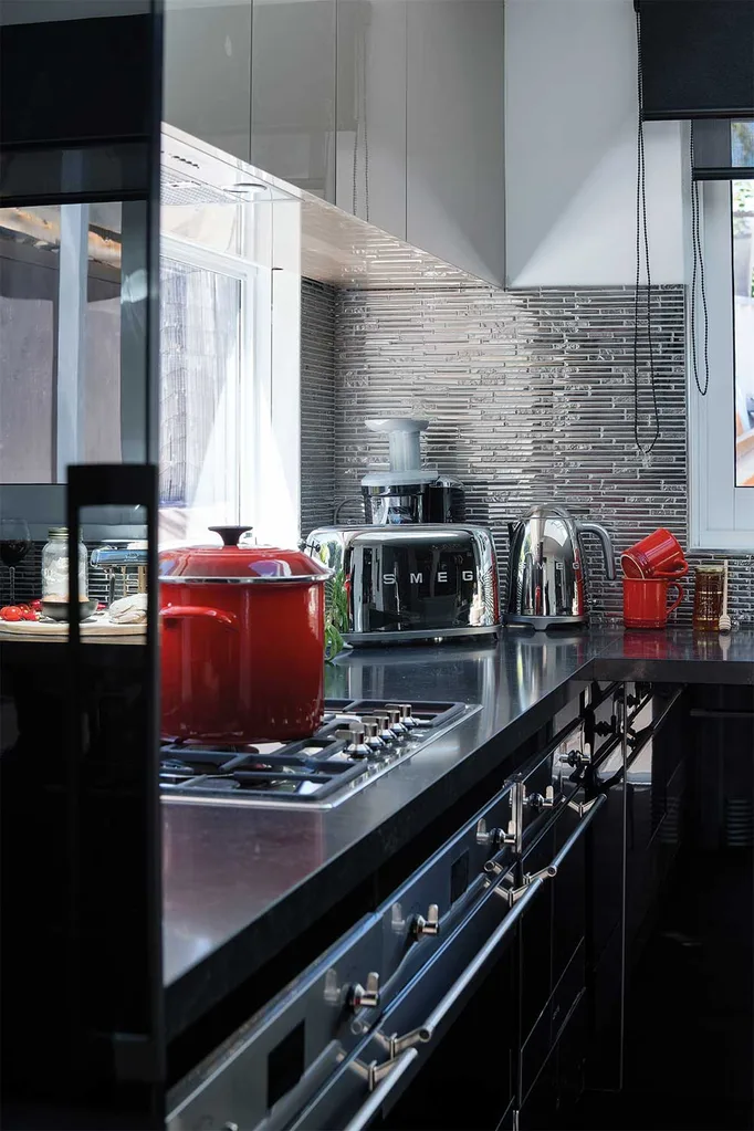
Mel and Dave were determined to retain their lead this week despite feeling the pressure of getting the kitchen right for Chiara. After negotiating with the other teams for space they finally worked out a layout that the judges felt worked very well for a family of five. Their choice of silver mosaic “blingey” tiles in the splashback and statement piece black double sink answered their specific House Rule to “Do something dramatic in a sparkly kitchen”.

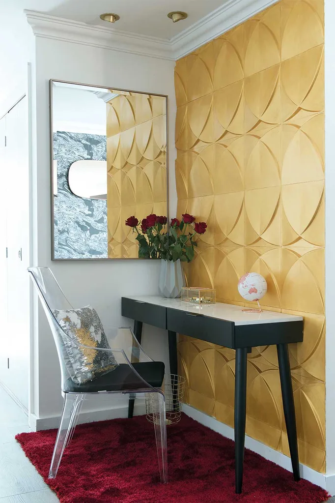
“Very 60’s-Bond Girl… I like impact in a hallway”
LLB on Mel & Dave’s hallway
Adjacent to the lounge room zone, Mel and Dave’s hallway was made bigger by Kim and Michelle’s decision to extend the adjoining wall. They seized the opportunity to make the most of the space, decorating with show-stopping 3D wall panels painted in gold and hung a dramatic artwork of a sulphur-crested cockatoo opposite. The judges were impressed.
Mel and Dave scored 22/30 and are sitting second on the leaderboard.
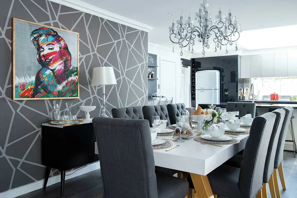
Leigh and Kristie: (Ensuite, Dining room and Bonus room)
Leigh and Kristie are not making any friends in the competition and seem to be burning bridges along the way, with heated negotiations over space and design in adjacent zones all week. In particular they stopped Kim and Michelle from being able to purchase wallpaper to continue into their zone, which didn’t allow a cohesive design across the dining and lounge rooms, costing the mother-and-daughter-team dearly in the judging.
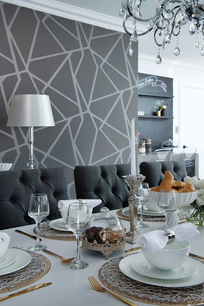
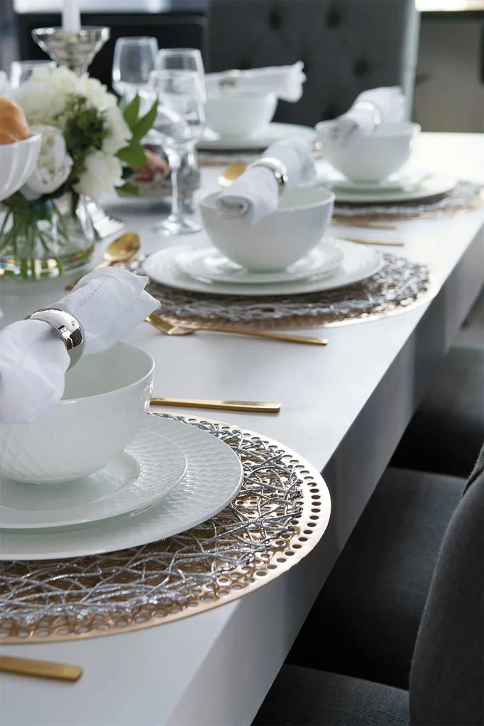
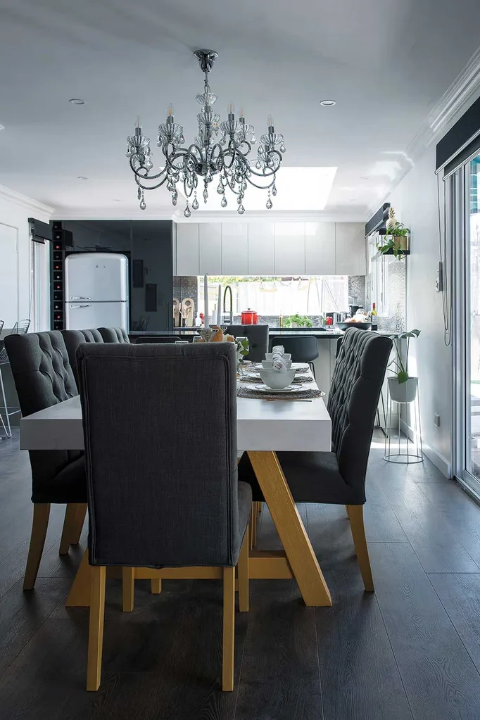
Leigh and Kristie’s dining room impressed the judges with its glamorous table styling – the wallpaper was admired by the judges and the upholstered dining chairs and glam table setting brought the glam luxe style to meet the House Rules.
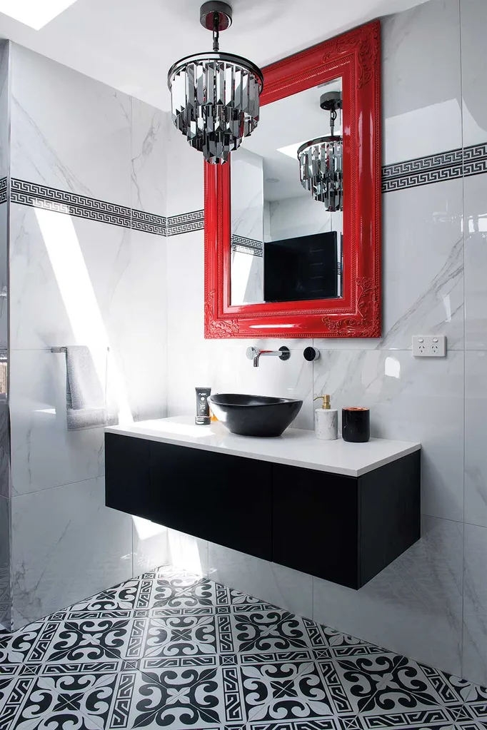
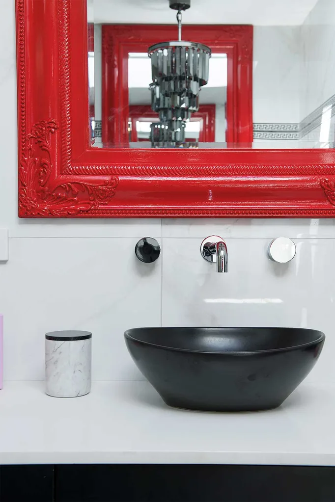
In the ensuite Leigh and Kristie’s red mirrors gave a wow factor in the judge’s eyes and LLB felt they’d done a good job interpreting the House Rules in the space.
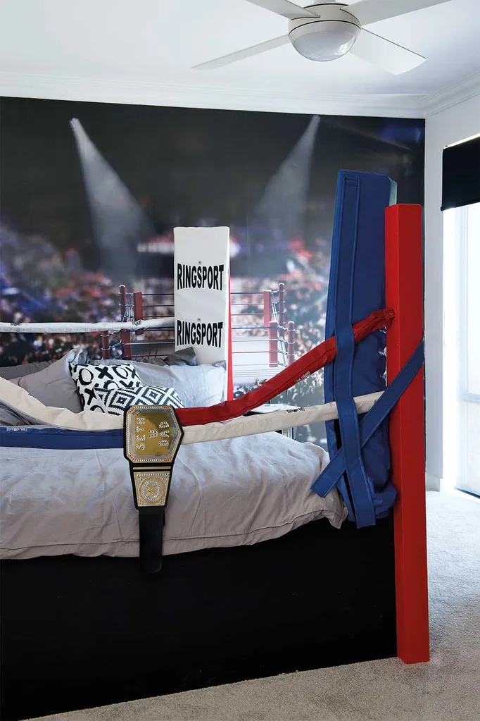
The competitive couple felt they had nailed the bonus room to create a “slamming wrestling bedroom” for 8-year-old Seth but it didn’t ring any bells with the judges. Drew felt there was only one idea in the room and said, “This room drives me mad,” as it was poorly executed and the feature wall had an image identical to the bed carpenter Leigh built himself.
Leigh and Kristie received a score of 19/30 from the judges.

Kim & Michelle: (Lounge room and Coffee nook)
Kim and Michelle struggled this week, sleeping on site in the tent and wedged between the two most competitive teams in the house. Zone disputes left them feeling it necessary to fight all the way for space and collaborative design to get the best results for the flowing spaces in Chiara and David’s home.
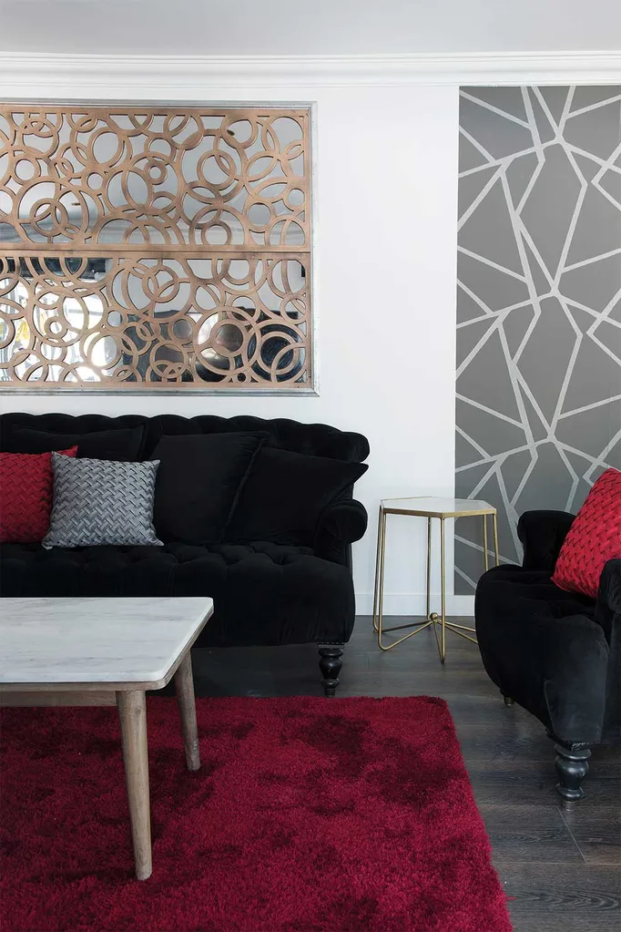
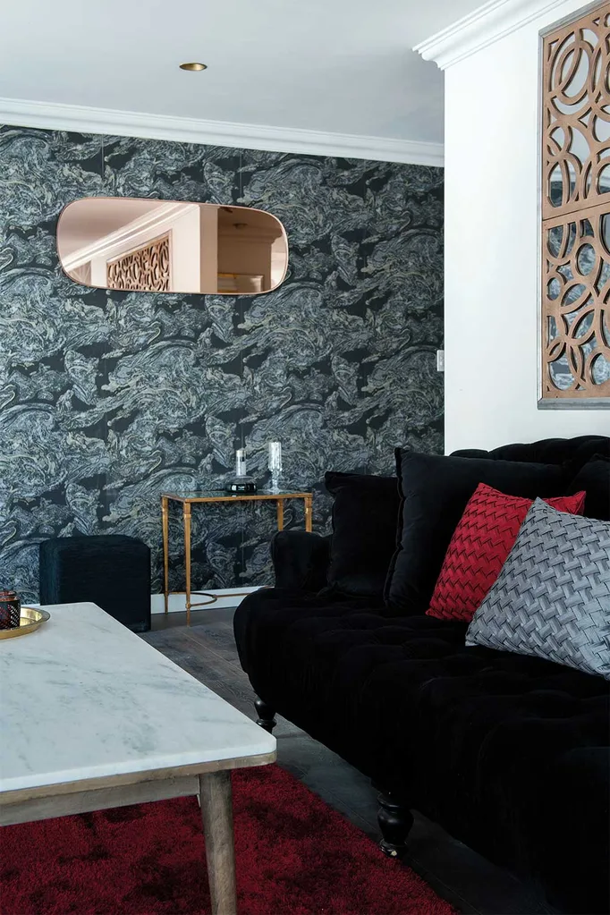
Their efforts were stalled with Leigh and Kristie, who blocked their wallpaper choice, leaving Michelle designing a decorative wallpiece at the eleventh hour in their “swanky cinema” lounge room that, in the end left the judges non-plussed. Wendy loved their wallpaper they used in the rest of their space saying, “I think that wallpaper is the best interpretation of the house rules because it is luxurious, it is a bit over the top – it’s got some really great guts behind it.”
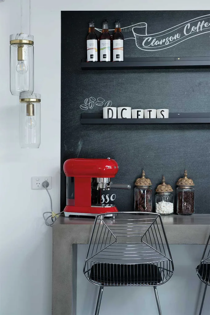
Likewise, their coffee nook suffered from a lack of coordination with the surrounding kitchen zone in their choice of finishes and the judges felt Kim and Michelle lost their way a little this week.
They scored a total of 16/30 and are sitting at the bottom of the leaderboard so may well spend another week in the tent!
The teams now await scores from Chiara and David when they return to their renovated home, where more drama is expected, along with a few characteristic tears.
You might also like:
House Rules reveal: Kim and Michelle’s Tweed Heads home makeover
House Rules Maryborough QLD reveal: a lad pad to love
House Rules QLD reveal: Hamptons style wins over judges

