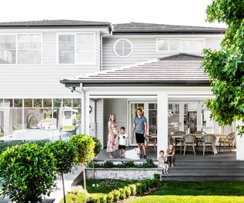
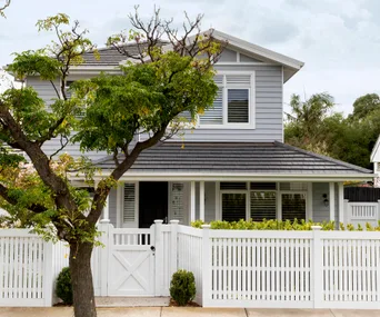
Back in 2019, Sonia tossed around the idea of a downsize with her husband Michael. Having spent the previous 15 years in the three-level house they’d built and raised four children in, she was keen for a sea change. Yet with their adult children still living at home, on and off, along with five pets, they required a large house. And with Michael’s work just down the road, they were also tied to the location.
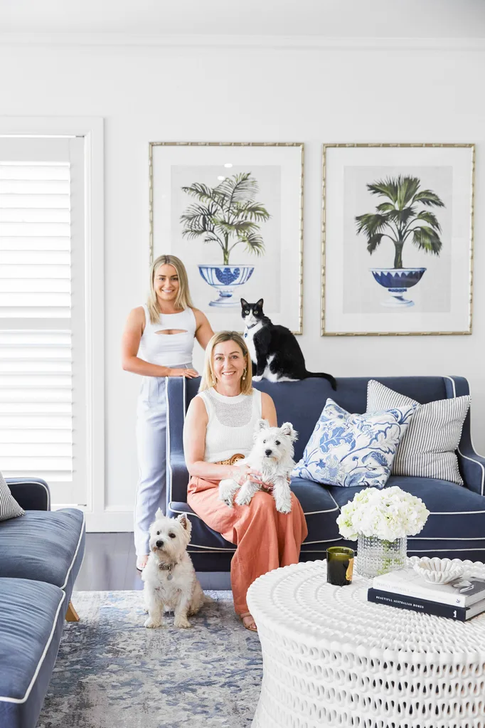
“[Hamptons style] is a look I love because white and blue is bright and fresh and always timeless,” says homeowner Sonia (pictured here, with daughter Isabella, cat Boots and dogs Maisie [left] and Poppy).
WHO LIVES HERE? Sonia; her husband Michael, a surgeon; their children, Alex, 30, Sam, 27, Connor, 24, and Isabella, 20; Maisie and Poppy the West Highland terriers; and cats Boots, Sweetpea and Luna.
WHERE? Sydney’s upper north shore.
TIME FRAME? A 12-week design, then a six-month renovation and a further two months for finishing touches.
THE DREAM? “To modernise the house we built 18 years ago and transform it into a stylish home where every space is used, enjoyed and looks beautiful,” says Sonia.
APPROACH: Extensive renovation. Rooms were reconfigured on the lower level, and the five bathrooms, powder room, laundry and kitchen were refurbished.
MUST HAVES: “A big kitchen with an island bench,” says Sonia. “I also wanted a bathroom sanctuary, and a whiskey room for Michael.”
WISHLIST: “I wanted to include new furniture, art and layers of interest,” says Sonia.
WHY IS THIS YOUR DREAM HOME? “We’ve got everything we’ve ever wanted and need here, and we get to enjoy it all,” says Sonia.
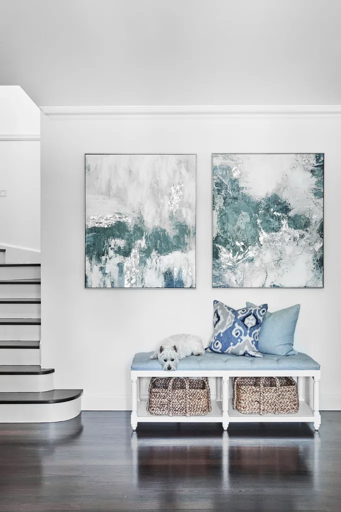
ENTRANCE Beyond the new front pivot door, Maisie commandeers an ‘Antoinette’ upholstered bench seat, beneath a pair of Cloud Sky artworks and both from Style My Home, set the tone for a Hamptons-inspired interior.
Instead of upending their life and moving, the couple decided the better option was to embark on a large-scale renovation and essentially turn their long-time house into a new home. Enlisting the expertise of Sarah Comerford, founder and design director of Home by Belle, Sonia and Michael embraced a clever redesign, which transformed and repurposed unused rooms, tweaked the layout to suit their lifestyle and injected a beautiful, Hamptons-inspired feel throughout.
“When we built the house, we did it at quite a basic level,” says Sonia. “So for me it was the opportunity to get everything on my wishlist, add little luxuries like heated floors, a sound system throughout and improve spaces that had never really worked.”
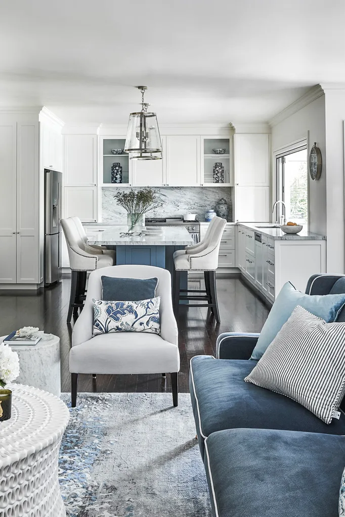
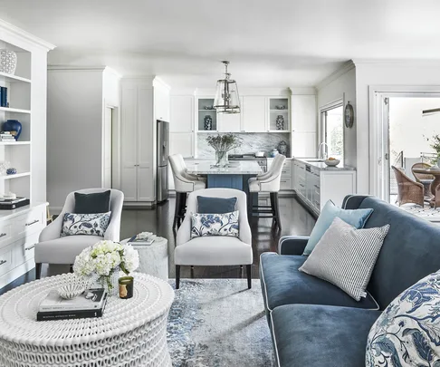
LIVING AREA After significant changes, the living area has become the home’s most popular space. “We closed off the entry to an unused formal dining area and ran joinery across the entire wall, which redirected the orientation of the room and maximised space and functionality,” says Sarah.
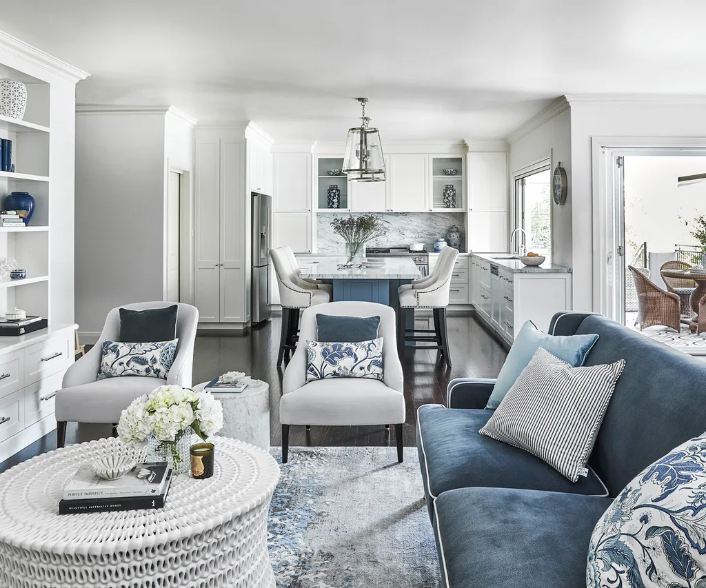
A glass sliding door was upgraded to taller bi-fold doors, which create a greater connection to the outdoor entertaining area. Blue velvet ‘Bondi’ sofa from One World, and an Oly ‘Pipa’ coffee table and occasional chairs, all from Coco Republic. A rug from Miss Amara adds another layer of interest on the floor.
Beyond thrilled with the transformation, the house has never been better utilised or appreciated. “The renovation has given us all a new lease of life and I can’t see us leaving any time soon,” enthuses Sonia. “It’s made the space feel so much bigger and brighter, and we can all be in separate areas but still together.” At the time the house was originally furnished, when the kids were little, practicality was top of mind. This time, Sonia chose pieces she simply loved.
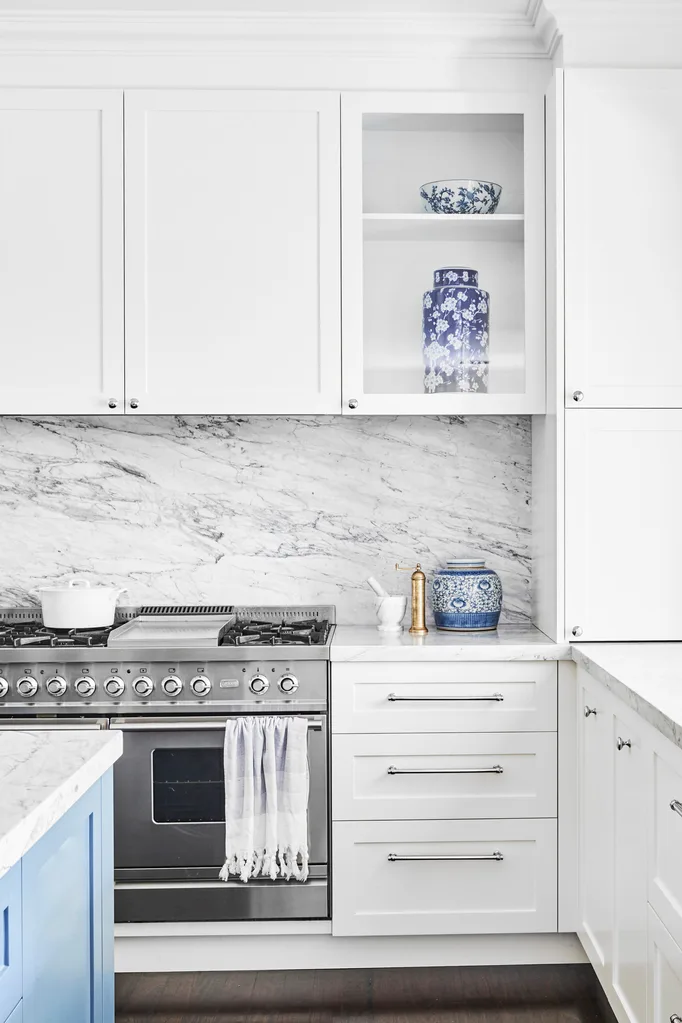
KITCHEN Everything apart from the Ilve oven was gutted to create a user-friendly zone featuring timeless Shaker cabinetry in Dulux White On White, chrome hardware and Carrara marble benchtops and splashback.
STYLE TIP – KITCHEN ISLAND
“An important element of the redesign was a huge central island that allows the family to spread out and enjoy creating meals together,” says Sarah .“It also allowed for extra storage on three sides – and the base, painted in porter’s paints blue steel, echoes the accent colours.”
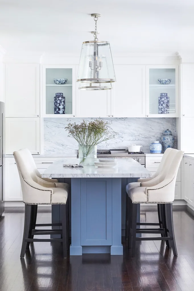
The original square island, which ran parallel to the back wall and blocked access, was replaced by a longer island orientated the opposite way to allow for seating on both sides.
The renovation process
Despite kicking off the project just as Covid first hit in March 2020, things ran on time and on budget. “It was all a really positive experience, and that is because Sarah is very professional and good at what she does,” says Sonia. Rather than move out during the project, she and Michael stayed. “We moved the kids and the furniture out, but with so many pets we found it hard to find somewhere to rent – so we lived in two rooms and moved around as needed during the build,” explains Sonia. “I unpacked the last of the big furniture pieces on Christmas Eve 2020 and we hosted a big family Christmas the next day.”
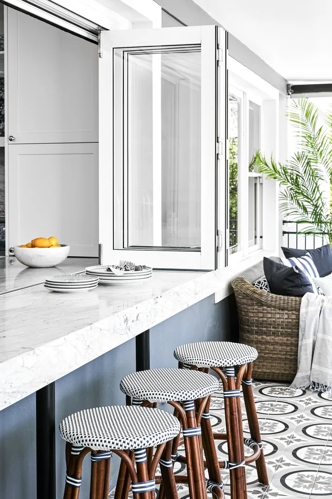
SERVERY BAR A bi-fold window and bench out from the kitchen enhances the natural light and makes a servery bar for effortless outdoor entertaining. The floor tiles are from Industrie Tapware.
Best renovating advice
Some of Sonia’s friends had bad renovating experiences and advised her to do her research before choosing a designer – and that’s exactly what she did. Before she engaged Sarah at Home by Belle, Sonia looked at the company’s previous work and chatted with past clients. “When I then met with Sarah and she explained how she worked, I knew she was the right person for the job,” says Sonia.
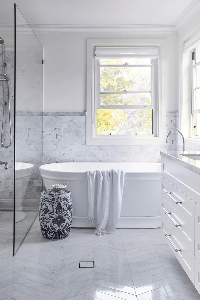
ENSUITE “In the ensuite we used long Bianco Carrara subway tiles in a chevron pattern on the floor and shorter, wider subways on the wall, both from Industrie Tapware,” says Sarah. “Finishing the look with an edging tile is a lovely decorative detail similar to a dado rail.”
Ensuite Renovation
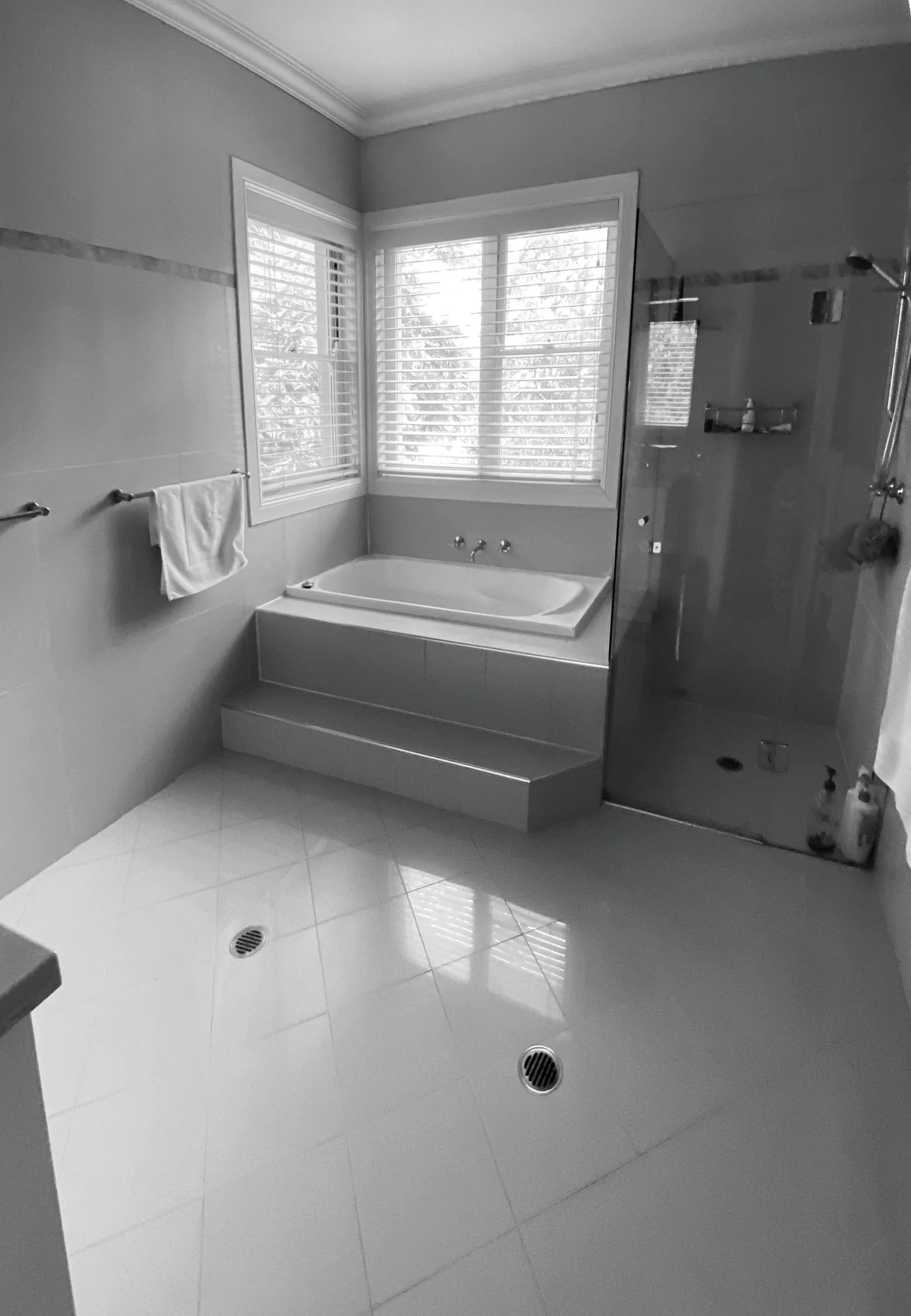
The renovation was the ideal opportunity to address issues that had ‘niggled’ Sonia and Michael for years, such as their ensuite. “The biggest problem was that you could see the toilet from the bedroom, which I hated,” says Sonia. The solution was to shuffle the layout and tuck the toilet behind the door. This means a new, deep bath from Industrie Tapware can sit window-side and be the focal point, alongside a generous walk-in shower. Dated finishes were also overhauled in favour of Carrara marble tiles and a custom floating vanity, also topped in Carrara marble, designed by Home by Belle and built by Instyle Design Interiors.
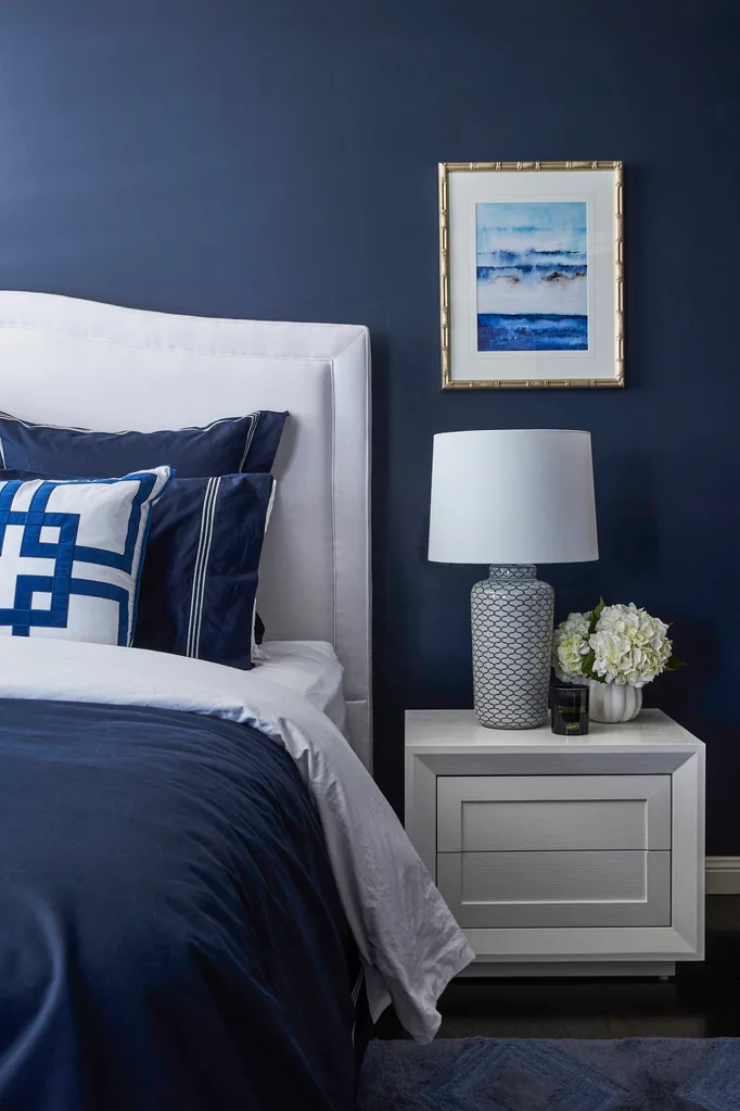
MAIN BEDROOM A colour change dramatically enhanced the ambience here. “I just love my blue room,” enthuses Sonia of the space enveloped in Dulux Sharp Blue. “As a room that doesn’t get a lot of natural light, I was initially worried when Sarah suggested the bold colour, but the effect of the blue is amazing.” The Globe West bedside table and Coco Republic bedhead contrast striking navy Sheridan linen. A Designer Boys artwork provides a subtle coastal reference for a fresh take on traditional Hamptons interiors.
Renovating Lessons learnt
Communication is vital. “Sarah ran the whole project and I discussed everything directly withher,which made the process simple,”says Sonia.”It’s important to choose a designer you get on with and can be honest with.” She also suggests researching surfaces and products. “Before investing in materials like marble and travertine, have a clear idea of what it will look like and what maintenance it requires,” says Sonia. Lastly, keep an open mind. “Sarah introduced things that I wouldn’t have considered, and I love it all.”
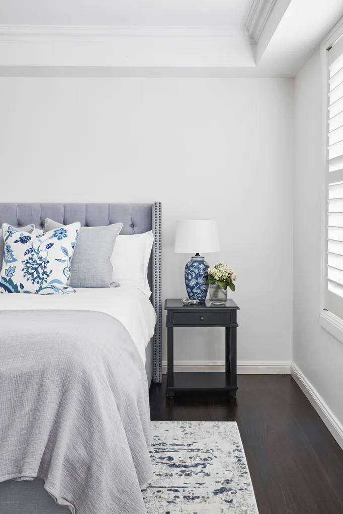
GUEST BEDROOM On the second level, the guest bedroom also received a Hamptons update. A Style My Home rug adds softness to the refurbished timber floor, while a Brosa bed was layered with Sheridan linen and a floral Style My Home cushion.
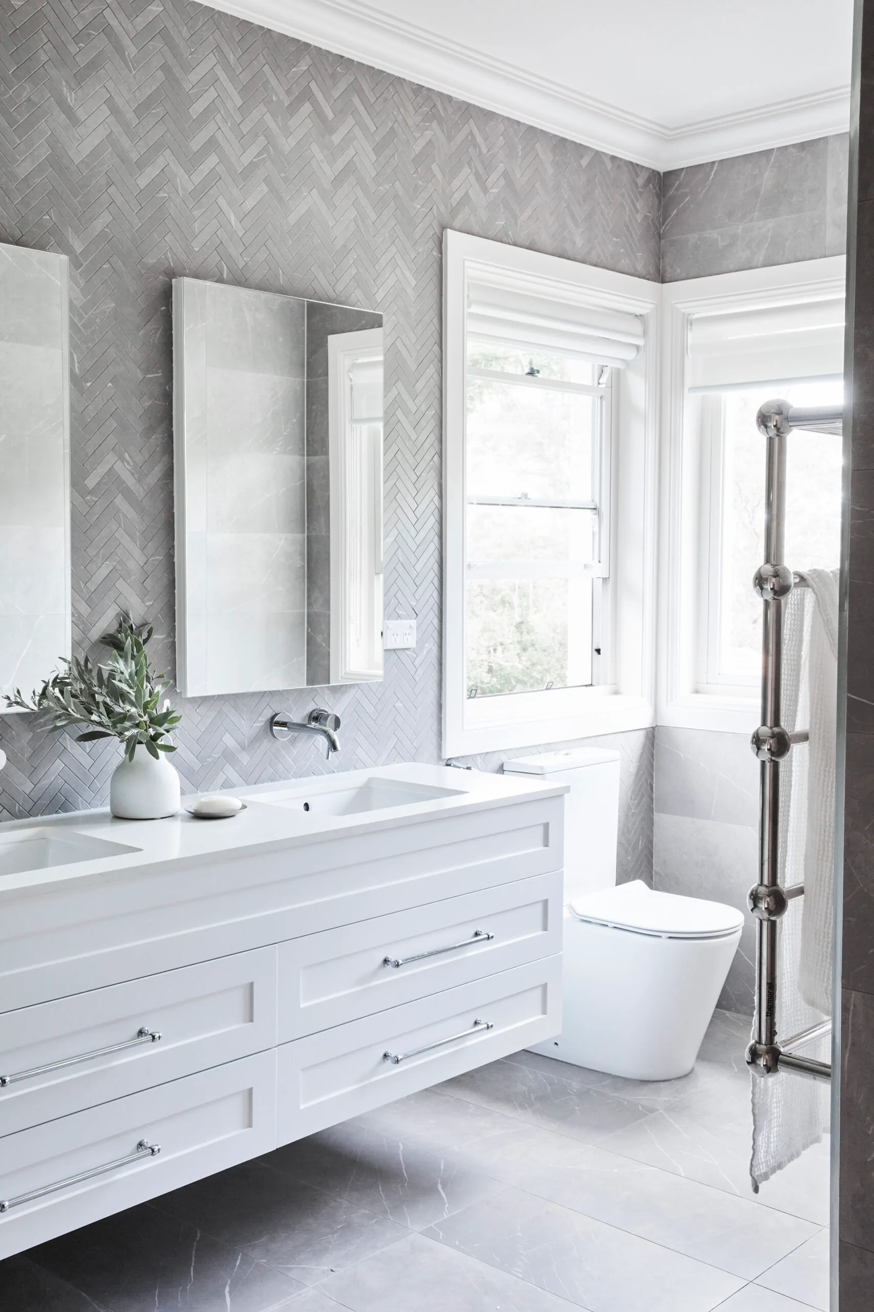
Prime bathroom real estate was redistributed between siblings. Sam and Connor’s bathroom (above) was downsized, with an unused bath ditched in favour of a double vanity. “It makes their space more modern and functional,” says Sonia. White Swirl vanity tops from WK Quantum Quartz are punctuated by grey tiles from Industrie Tapware that stretch to the ceiling.
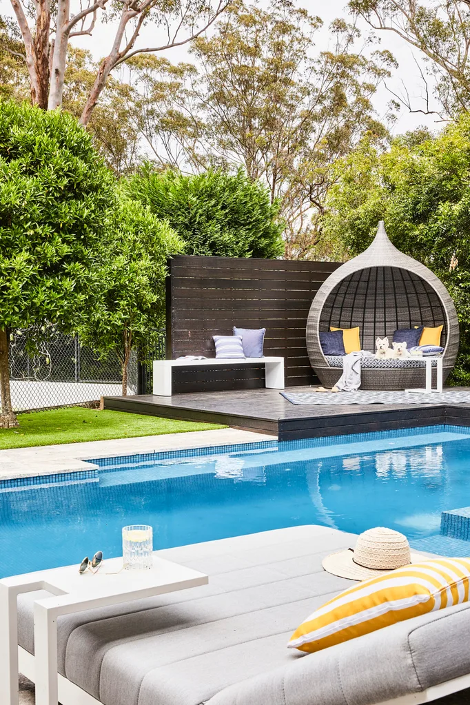
OUTDOOR AREA When the pool was first built, the budget didn’t stretch to all the “nice but not necessary additions”. Twenty years later, Sonia and Michael could choose exactly what they wanted and opted for a fully tiled pool interior featuring a blue glass mosaic mix from Industrie Tapware. The surrounds were updated with ‘Silver Travertine’ French pattern tiles, also from Industrie Tapware, and an outdoor sofa from Lounge Lovers. Westies Maisie and Poppy love to hang out poolside on a daybed from Osmen Outdoor Furniture.
BUDGET BREAKDOWN
Living, dining and entry: $165,000
Kitchen: $250,000
Main dedroom: $65,000
Main bedroom ensuite: $90,000
Guest bedroom and bathrooms: $87,000
Outdoor area: $150,000
SOURCE BOOK
Interior design & project management: Sarah Comerford, Home by Belle, (02) 9967 3336, homebybelle.com.au.
Joinery: Instyle Design Interiors, (02) 9939 7333.
 Photography: Sue Stubbs
