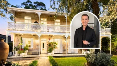
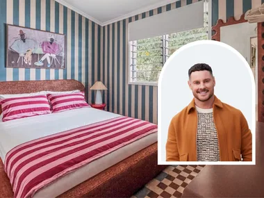
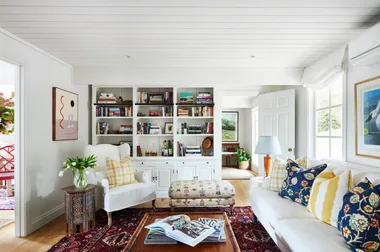
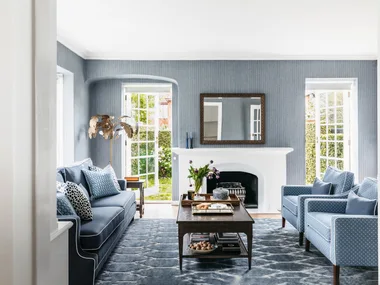
The dream of starting a family led Sydney couple Chantel and Joe to begin their search for the perfect house in 2017, as they wanted more space than the apartment they shared. “We wanted to be on the Lower North Shore, so started looking in the area and found a heritage home we fell in love with,” recalls Chantel. The house was originally designed by renowned architect William Hardy Wilson in about 1912.
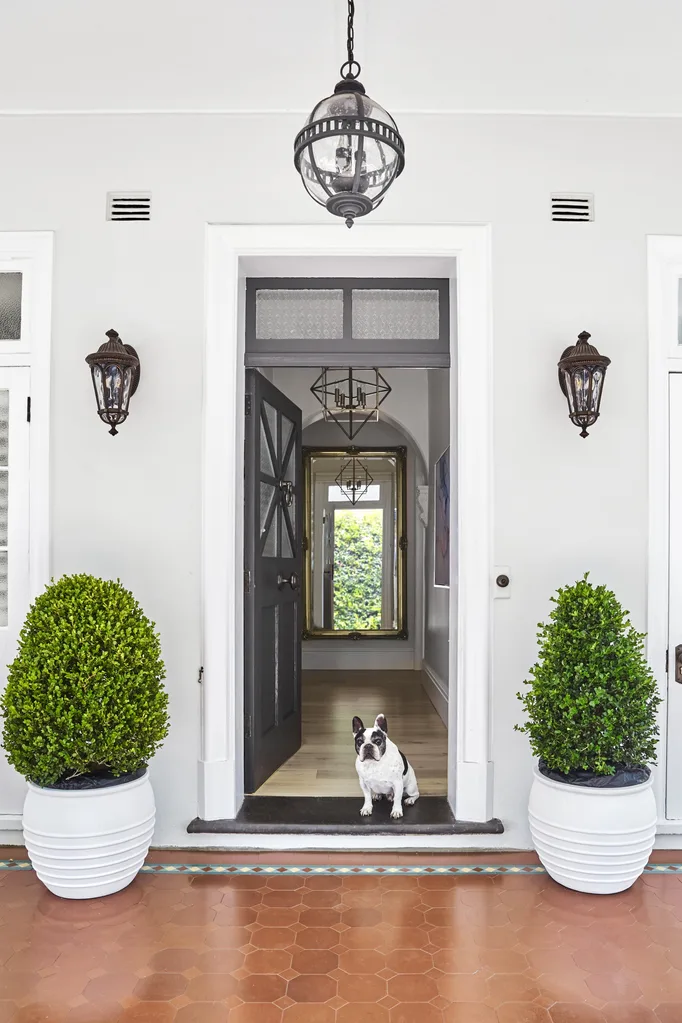
Who lives here? Chantel and Joe, their daughter, Sienna, and French Bulldog, Bronny.
Where? Neutral Bay, on Sydney’s Lower North Shore.
Time frame? The project took about eight months, with the family moving into the home in January 2022.
The dream? To create a more open-plan, spacious internal floor plan, with refreshed finishes throughout.
Approach? Complete renovation of a heritage home.
Must-haves? More storage space throughout, generous-sized bedrooms and light timber floors were essential in the redesign.
Wishlist? “I wanted to use beautiful stone on the kitchen benchtops, have a freestanding bath and I wanted an entire mirror wall in the living area, which added wow factor,” says Chantel.
Why is this your dream home? “I’ve always loved a French provincial, classic look and being able to bring that look and feel to our first family home is really special,” says Chantel.
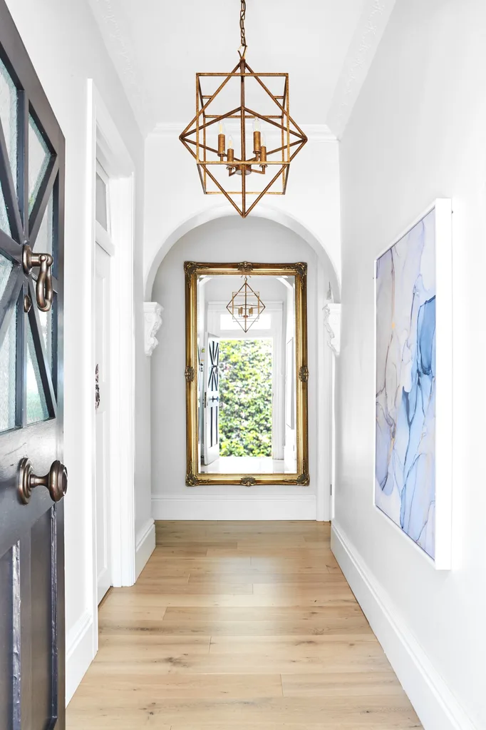
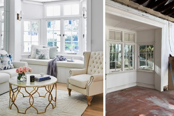
While she and Joe loved the period details, such as the Georgian-style columns, arches and fireplaces, she says the 100-year-old layout needed reworking. “All the rooms were really tiny and closed off, so our goal was to open it up, enlarge spaces and give everything a face lift,” explains Chantel. In 2021, after the couple’s daughter, Sienna, was born, the work began. Interior designer Danielle Bonello-Dunsford, of Danielle Victoria Design Studio, re-imagined the floor plan into a family friendly three-bedroom home infused with a French provincial feel.
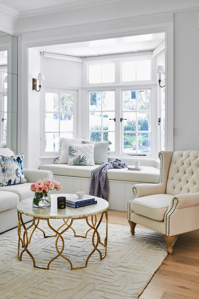
The result is a cherished home that skillfully blends new and old, where the couple can happily raise their family. “I got the French provincial look I’ve always dreamt of and it works so perfectly with the home’s heritage,” says Chantel. “I wanted the place to have a homely feel and it does. We couldn’t be happier.”
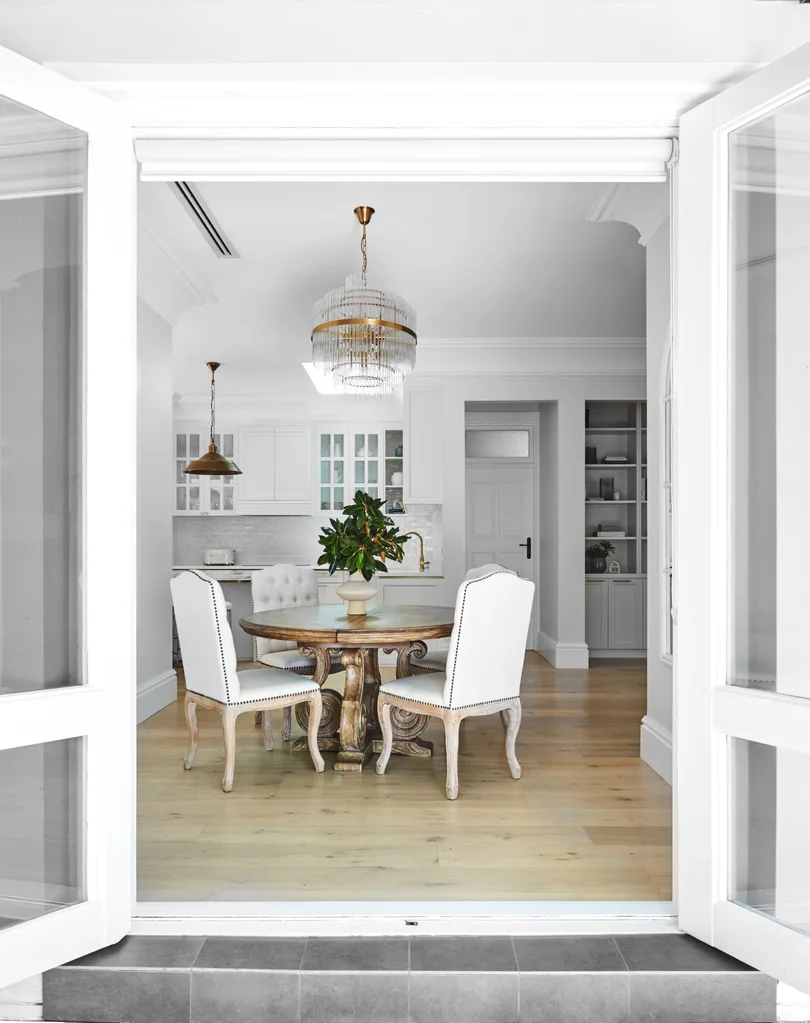
Rather than live in the house prior to renovating, the couple rented it out and continued living elsewhere for the duration of the eight-month renovation. The initial plans had been drawn up by architecture firm Project Techniques and demolition had already begun when interior designer Danielle joined the project to devise space-savvy solutions, which involved a layout reshuffle. Two smaller bedrooms were merged to create the main bedroom and the original dining room morphed into a new third bedroom.
“The renovation has maintained the home’s classic feel but given it a freshness, which I love.”
Chantel, homeowner
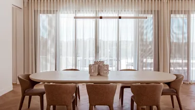
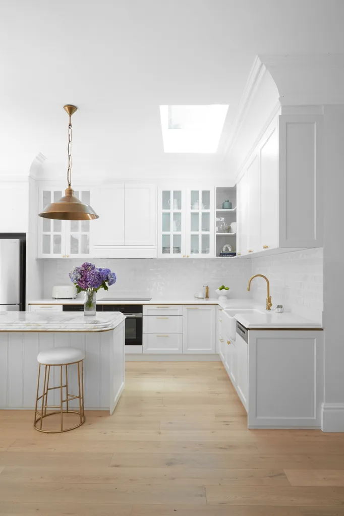
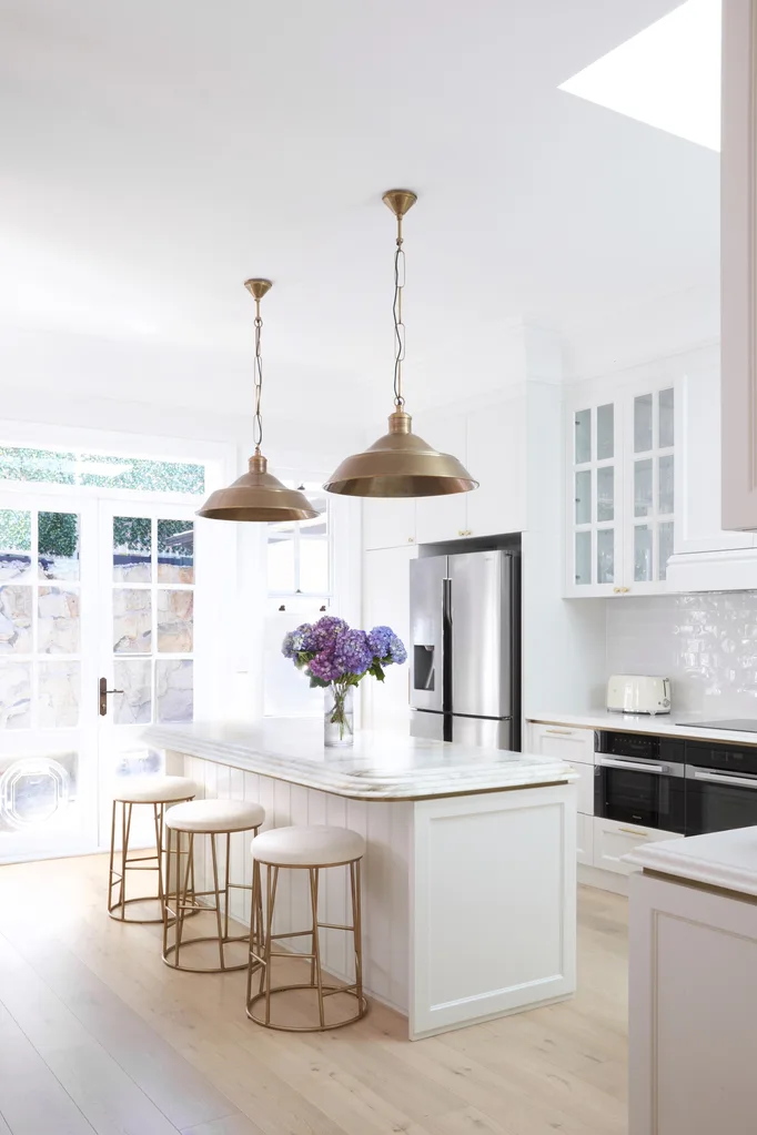
The kitchen was enlarged and shifted to a sunnier position and walls were modified to create a more open living and dining area. Previous plans for a European-style laundry were also shelved in favour of a full-sized laundry room. “The goal was to preserve the charm of the original building, yet with a modern, open-plan layout that embraced family life,” Danielle explains. The new kitchen’s splashback is handmade crackle-glazed tiles from Surface Gallery and the benchtops are Caesarstone Organic White.
Best advice
The adage ‘do it once and do it well’ rang true for Chantel and Joe, who decided to nudge the budget a little and invest in quality finishes that would stand the test of time. “This meant we spent more on the kitchen benchtops and timber flooring than originally planned, but they made the home what it is and were worth the expense,” says Chantel.
Lessons learnt
“We’d always intended to use an interior designer, but we only engaged Danielle after construction had begun,” says Chantel. “In hindsight, we should have involved her in the design process from the very beginning. Yet, despite some time pressures, Danielle did an amazing job and brought everything together really beautifully.”
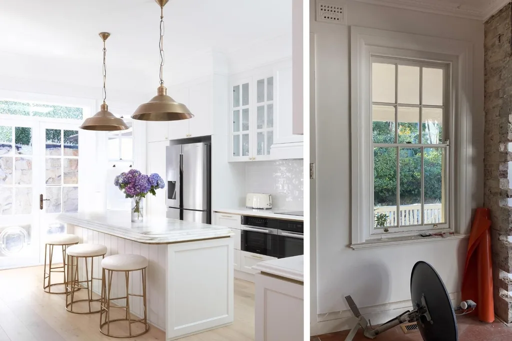
The star of the space is the island bench topped in Calacatta Oro Marble from Styled In Stone, with a waterfall edge. “It’s really special and perfectly complements the cream, white and gold colour scheme we used,” says Chantel. The rippled waterfall edge adds to its bespoke appeal.
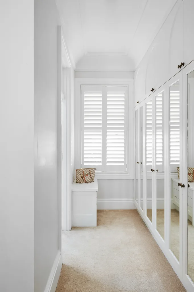
As is the case in many older homes, the bedrooms were small and storage was minimal. The solution was to combine two bedrooms to create the generous main, with some of the additional space used for custom wall-to-wall mirrored wardrobes.
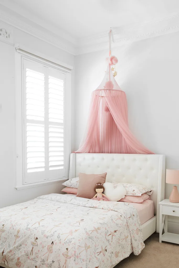
Sienna’s room is a little girl’s dream, with a bed from Brosa and a ‘Pom Pom’ canopy from One French Summer. The bedding is from Pottery Barn Kids, the ‘Bayswater’ bedside table is from Freedom and the ‘Brook’ table lamp in Nude Pink is from Adairs.
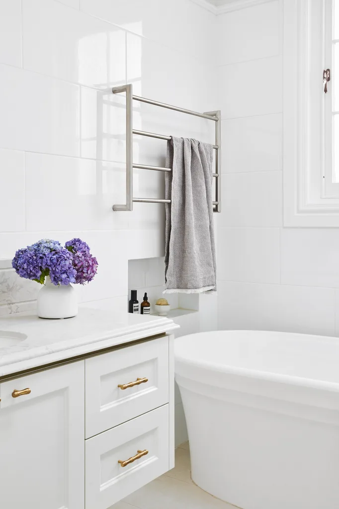
With clever spatial planning, the main bathroom was dramatically enhanced. The new custom-made vanity, in ‘Portofino’ quartz from Trendstone, adds luxury, while the freestanding Victoria & Albert bath from Just Bathroomware is ideal for bathing their young daughter.
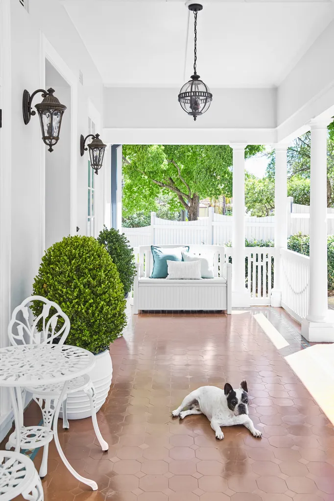
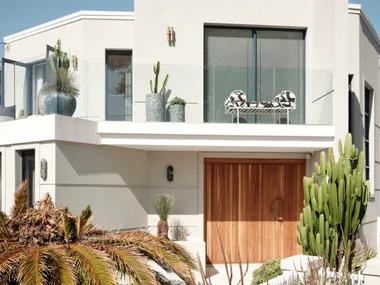
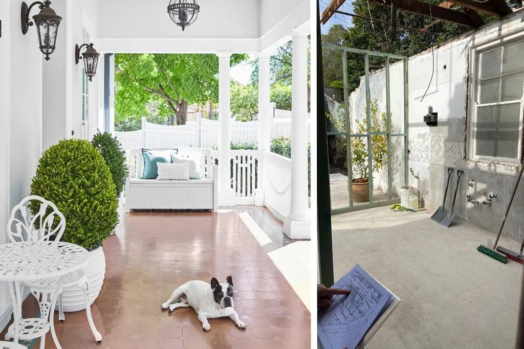
The dated green and yellow facade was freshened with classic white on white. Antique-style feature lights and potted topiary plants from Honeysuckle Garden add grandeur to the entrance. For similar lights, try Emac & Lawton.
Source book
Interior design: Danielle Victoria Design Studio, daniellevictoria.com.au.
Joinery: Exclusive Cabinetry, exclusivecabinetry.net.
Architect: Project Techniques, (02) 9716 7684.
Builder: Assett Group Services, (02) 9114 8400.
 Photography: Ess Creative

