Bringing an older property into the modern era takes masses of patience and a steadfast vision. For heritage-home lover Fleur, the intricacies of the renovation process are always worth the character-filled outcome. The home she shares with her husband Phil and their three children, Grace, 11, and six-year-old twins Max and Maddie, is her fourth renovation project.
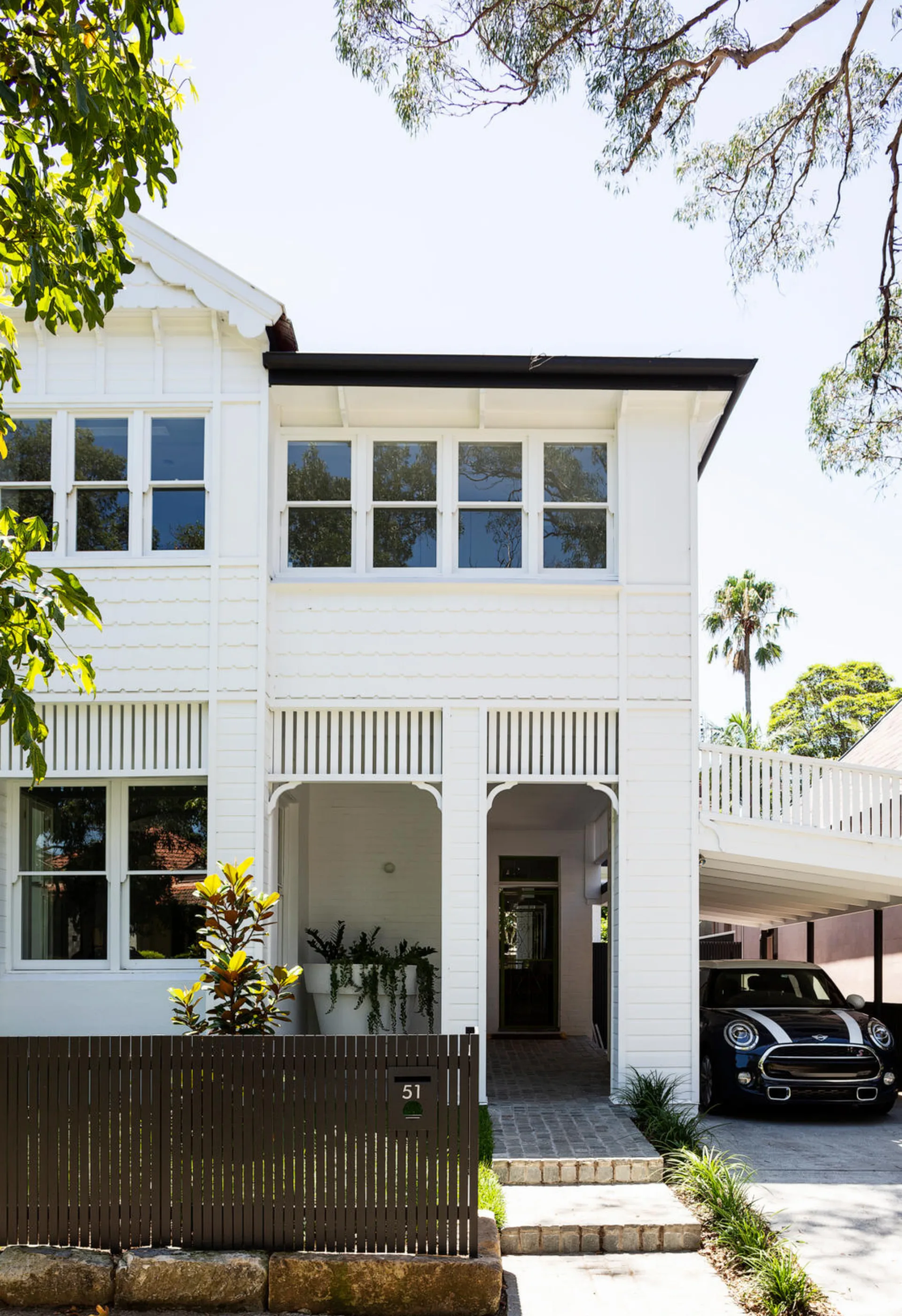
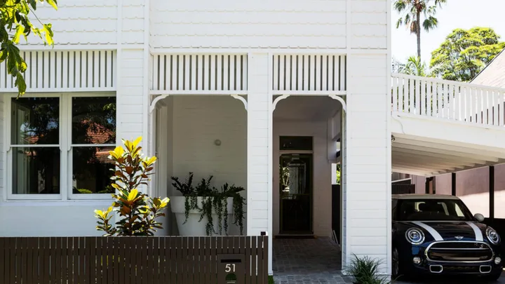
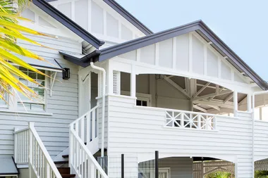
The five bedroom Victorian home in Sydney’s Mosman has been given a fresh start, with a polished original exterior and a historically minded modern interior. “I used to call it ‘The Cream Shack’ because everything inside and outside was cream,” says Fleur.
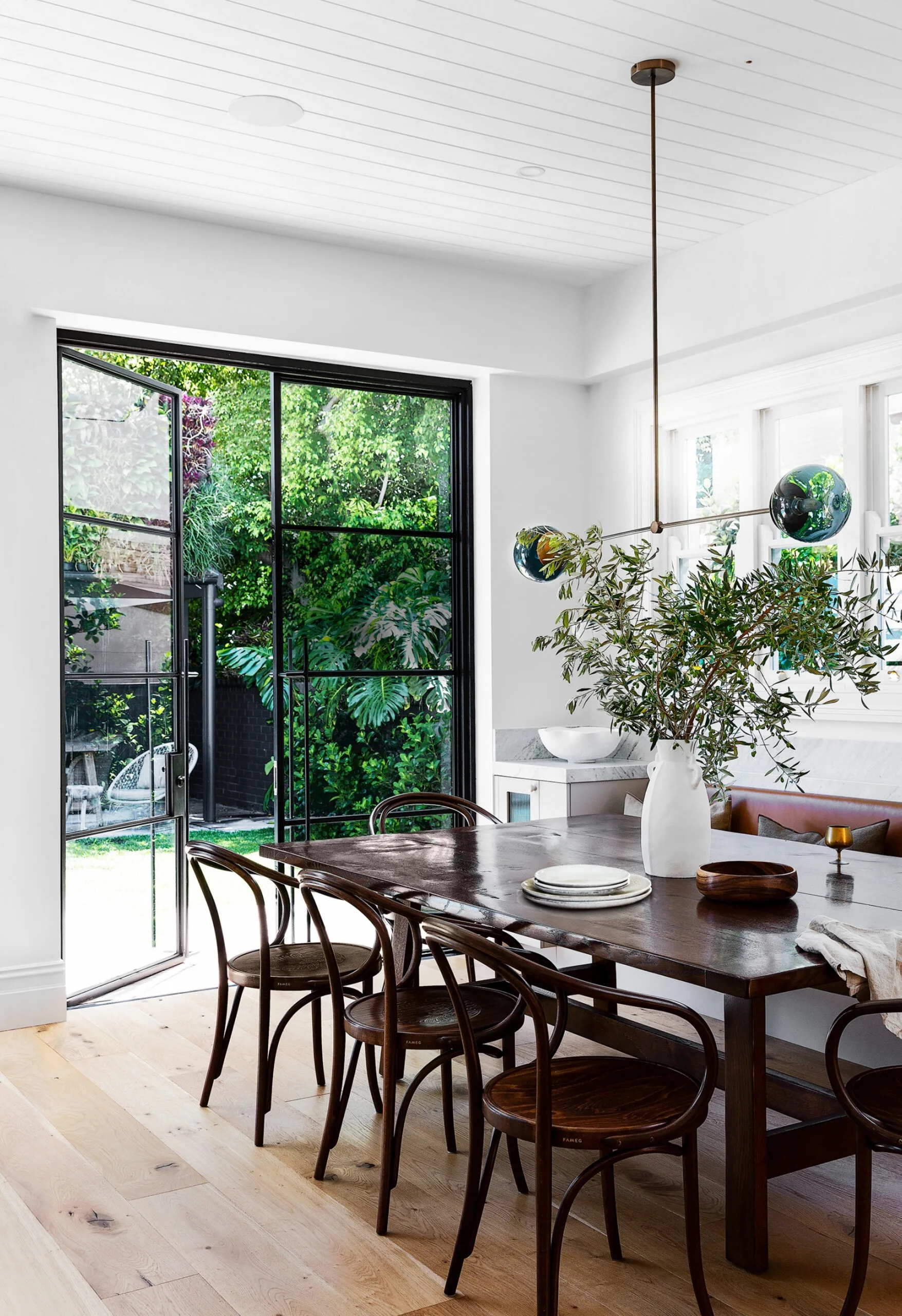
The North Shore Sydney home Fleur shares with her husband Phil and children Grace, 11, and six-year-old twins Max and Maddie is a celebration of indoor-outdoor living. With the feel of a Parisian bistro, the dining area is a place for relaxing and entertaining for all ages.
When the couple first viewed the property in 2013, the potential shimmered through those beige layers and decades of unceremonious updates. “Phil liked the size and tall ceilings, and I liked the style and the history of it,” explains Fleur. “I could see the beauty in it, but the layout was horrible and it had been added to and butchered.”
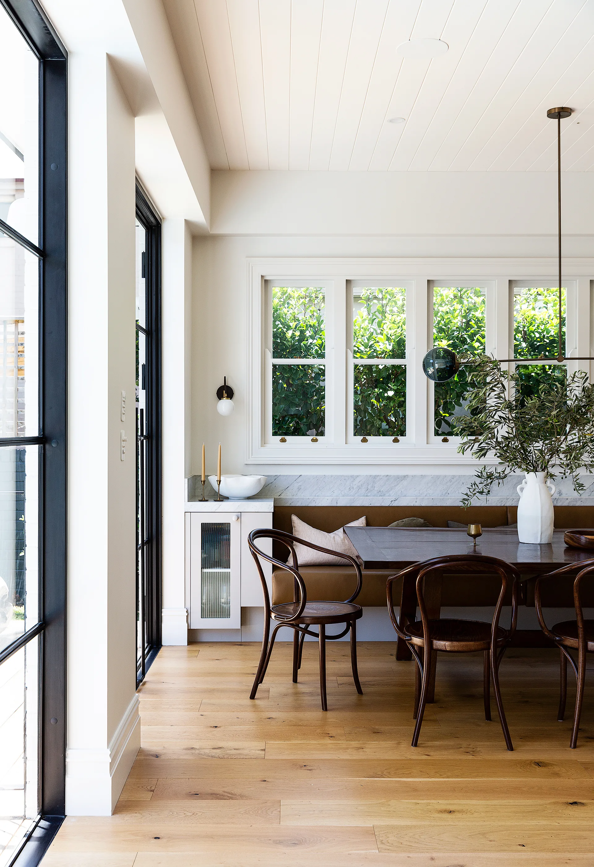
“When we have friends over, I want it to be ‘grown up’ but still casual so the kids can use this space without me worrying if someone is going to spill something!” says Fleur. Thonet ‘No. B9’ chairs and lighting in the form of a Douglas & Bec ‘Line’ pendant and a CTO Lighting ‘Array’ sconce from Spence & Lyda centre on a French oak table found in an antique store in New Zealand.
Fleur realised that, with the right team, she could bring back the original 1890s charm, creating a family friendly home that was, in her words, “beautiful but not precious”
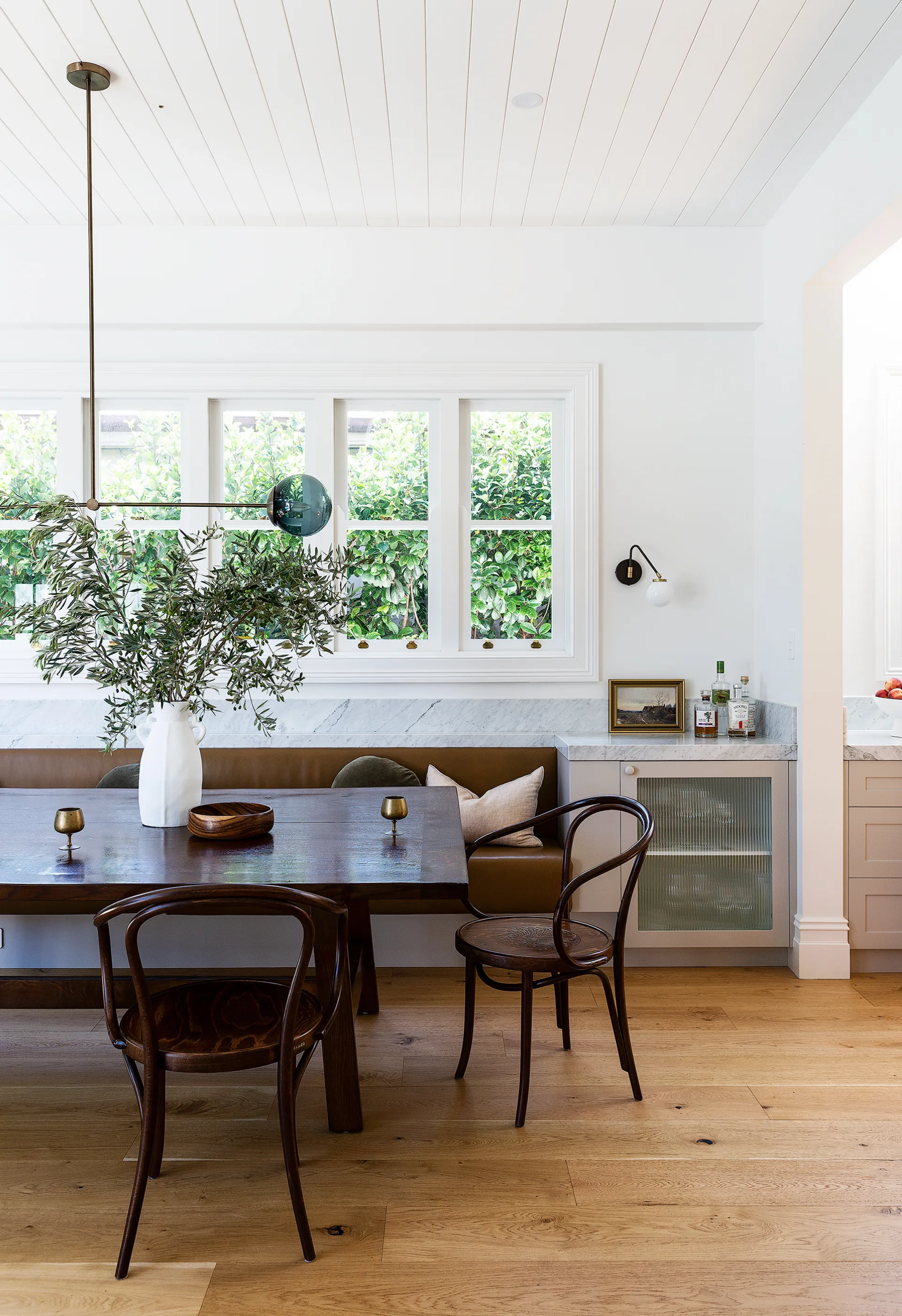
Daughter Grace at the dining banquette, which is upholstered in ‘Ascona’ leather in Tobacco from Pelle Leathers.
(Credit: Photography: Simon Whitbread)She and Phil engaged Helga ten Brummelaar of DTB Architects to strip the home to its authentic self and design a complementary layout that worked for family life.
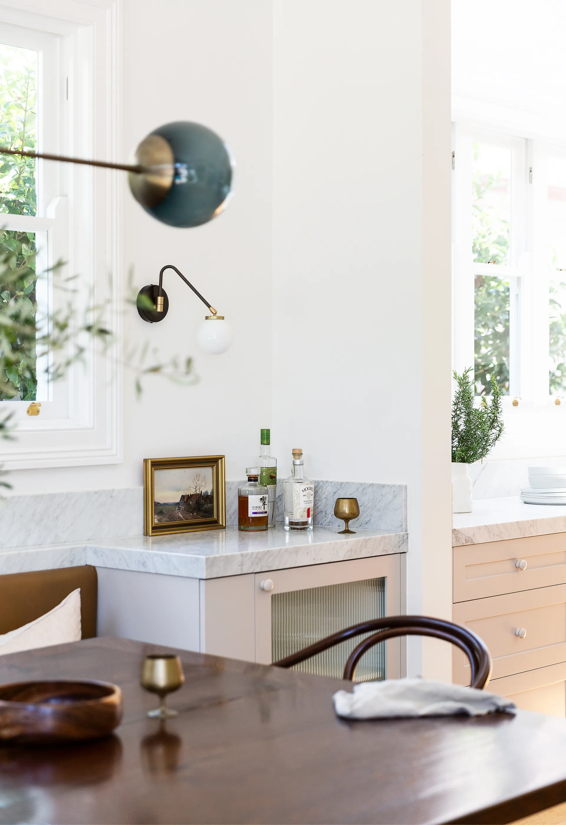
In the dining area, a CTO Lighting ‘Array’ sconce from Spence & Lyda.
Fleur and Helga delved deep into the local council archives to uncover the property’s story. “I think it’s important to do that before you do something detrimental to the house,” says Fleur.
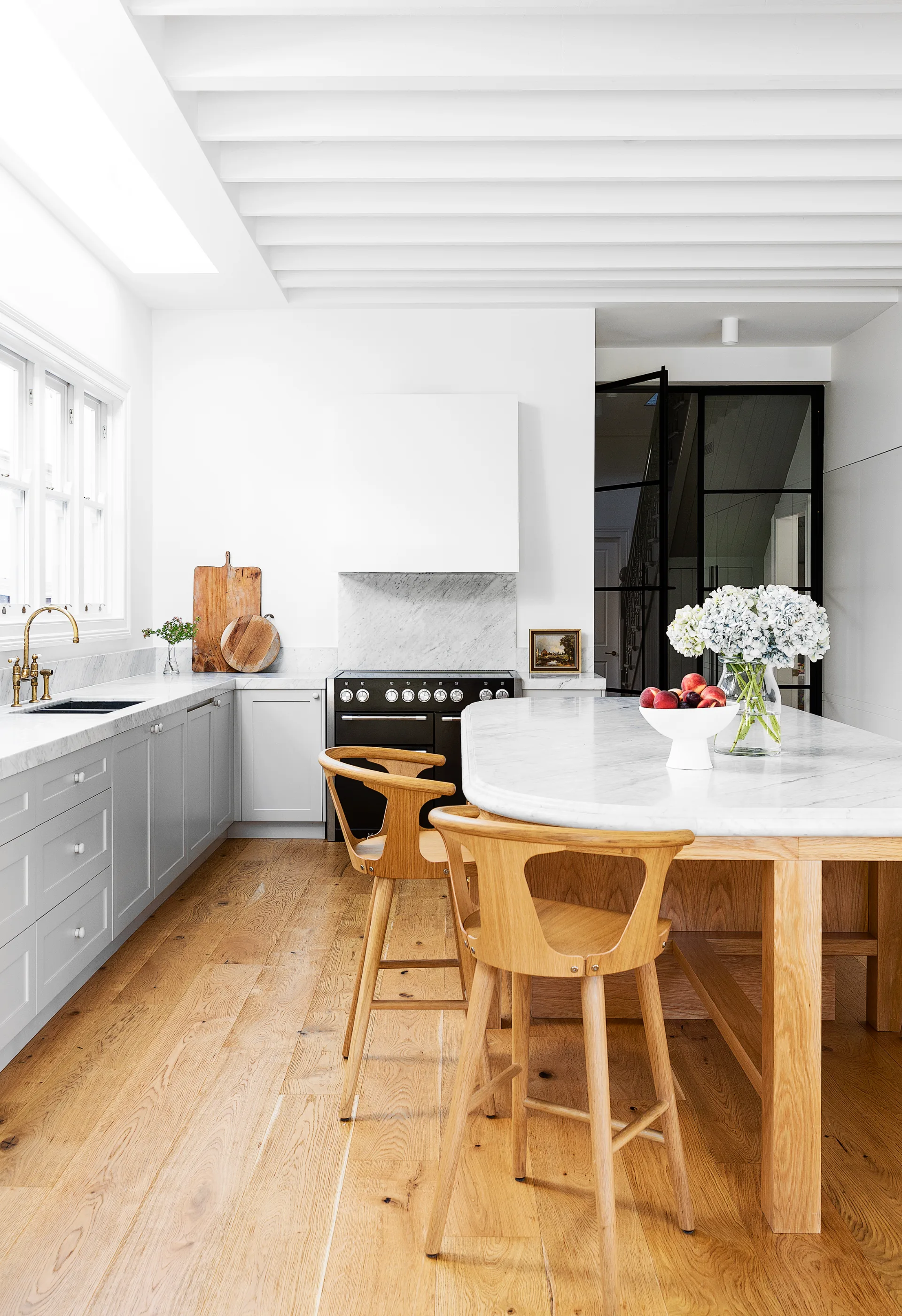
A seamless design by Smith + Levine has a bespoke island as its centrepiece. “It has different details and hardware to the rest of the kitchen and is intended to feel like a custom piece of timber furniture,” explain the designers.
If you change it too much, you ruin it and lose something you can never bring back.”
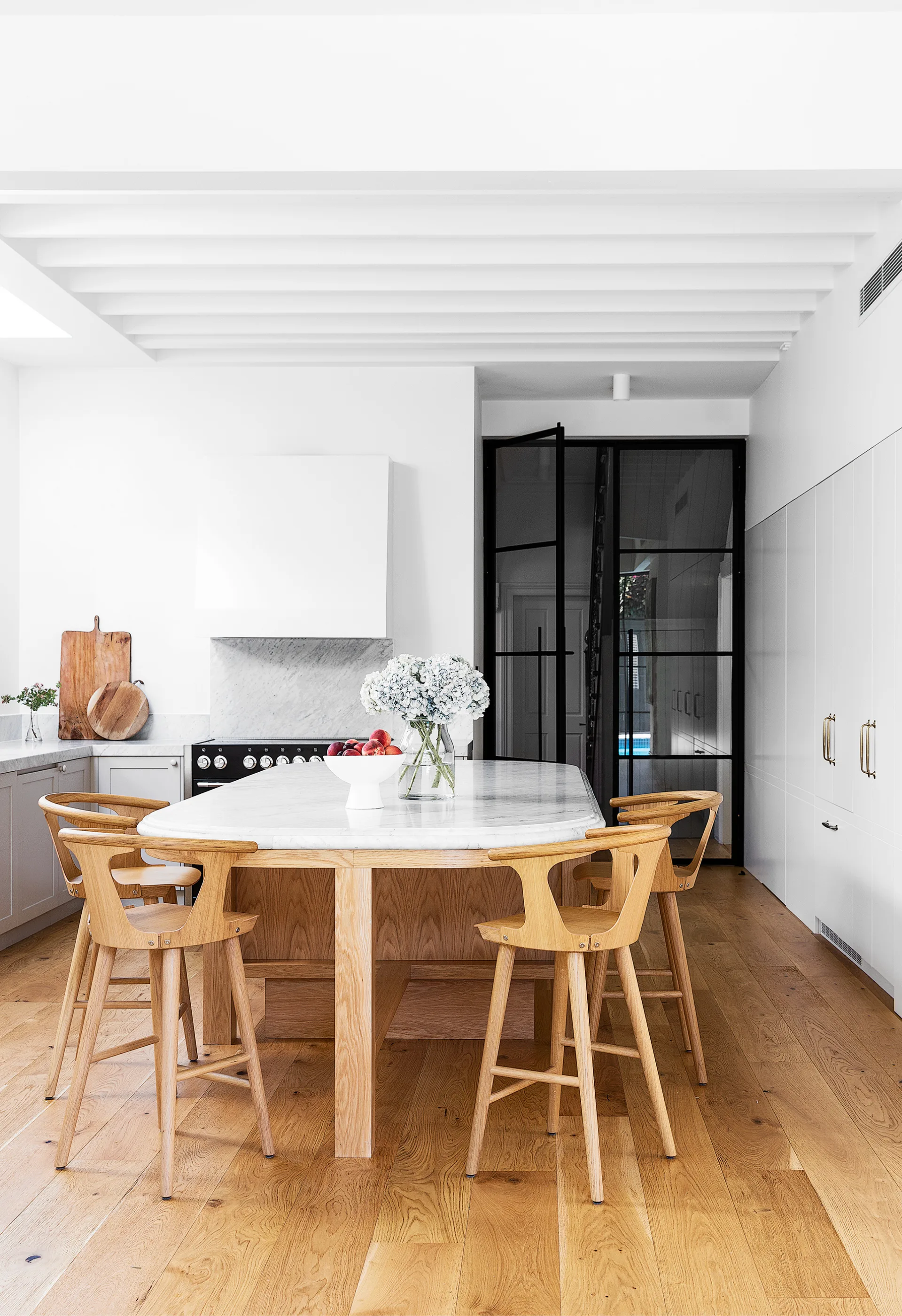
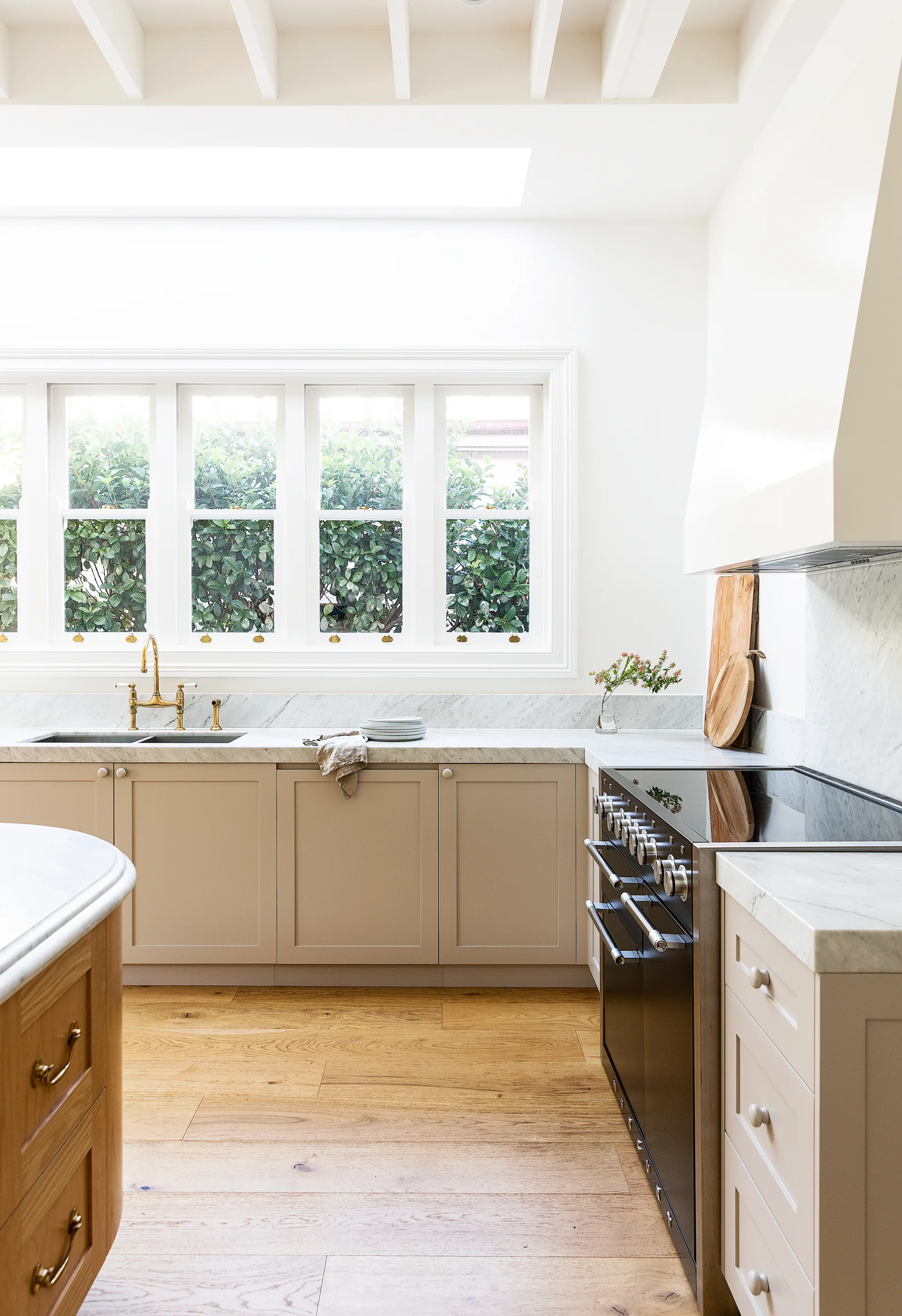
CDK Stone supplied the ‘Bianco Carrara’ honed marble for the benchtops and splashback, and oak veneer was chosen for the island base to match the oak floorboards from Woodos seen throughout the ground floor.
(Credit: Photography: Simon Whitbread / Styling: Jessica Bellef)The DA was approved in 2016, just as the family made a temporary move to New Zealand for Phil’s work. Their Mosman charmer was rented out, but Fleur never stopped planning.
Fleur added &Tradition ‘In Between SK7’ stools from Cult. “The colour match is perfect, and the curves work with the island,” she says.
(Credit: Photographer: Simon Whitbread)She started to design the interiors in 2018 before deciding it was too tricky to complete remotely and reached out to interior designers Louise Smith and Talia Levine of Smith + Levine. They conducted design presentations over Skype and FaceTime and posted samples for Fleur’s approval.
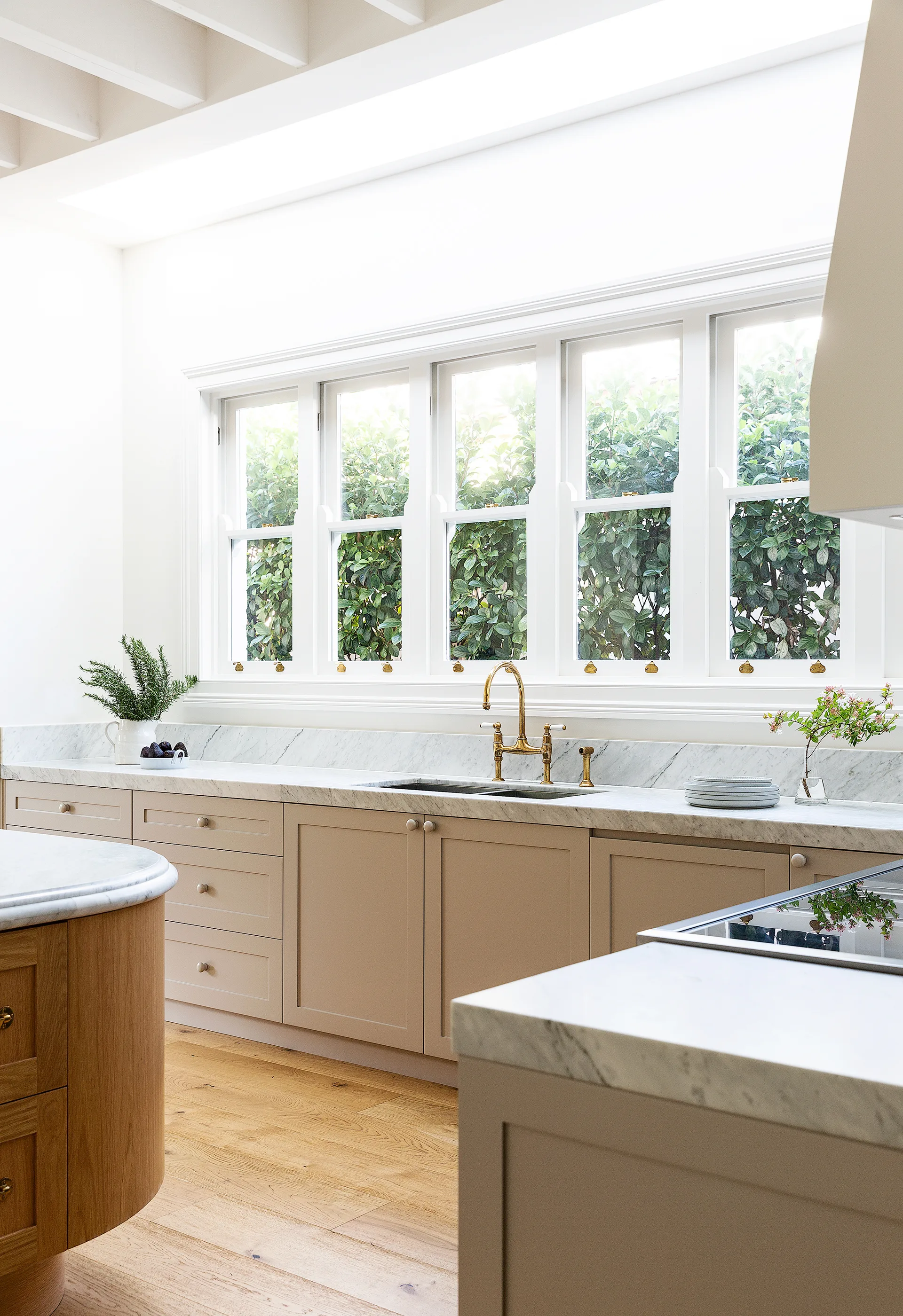
A skylight and sash windows bathe the space in light. Shaker-style cabinets in Dulux Heifer and brass Perrin & Rowe ‘Ionian’ tapware from The English Tapware Company complete a refined look.
(Credit: Photography: Simon Whitbread)The duo designed the beautiful kitchen and three bathrooms, as well as the joinery and lighting plans, and formed a cohesive finishes palette that fell in line with Fleur’s brief of “sophisticated but pared back”.
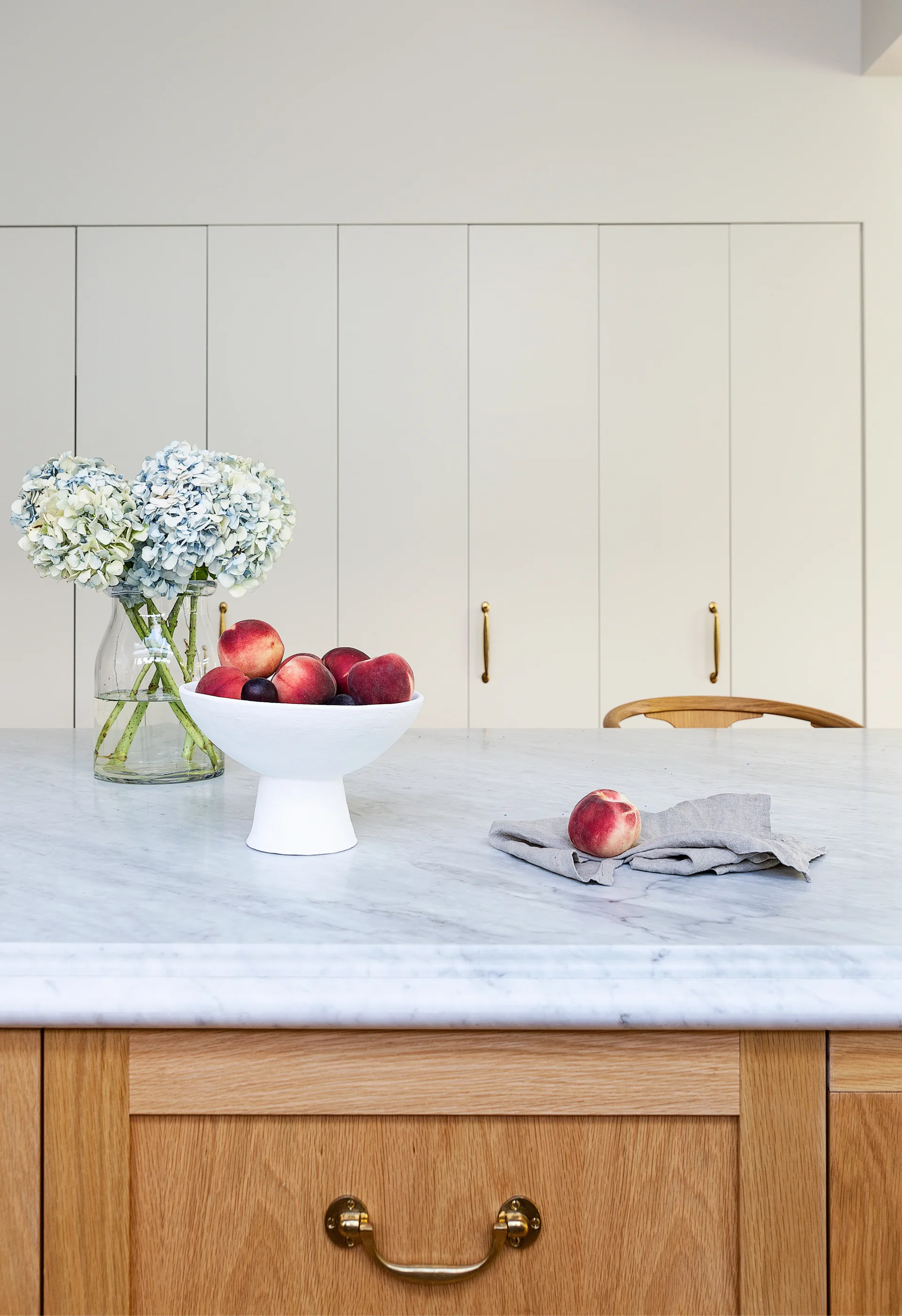
Dulux Natural White was the colour choice in all the living spaces.
Upon returning to Australia in 2019, Fleur, Phil, Grace and the twins lived in a nearby rental while BeareBuilt expertly turned the renovation around in a tight nine-month schedule.
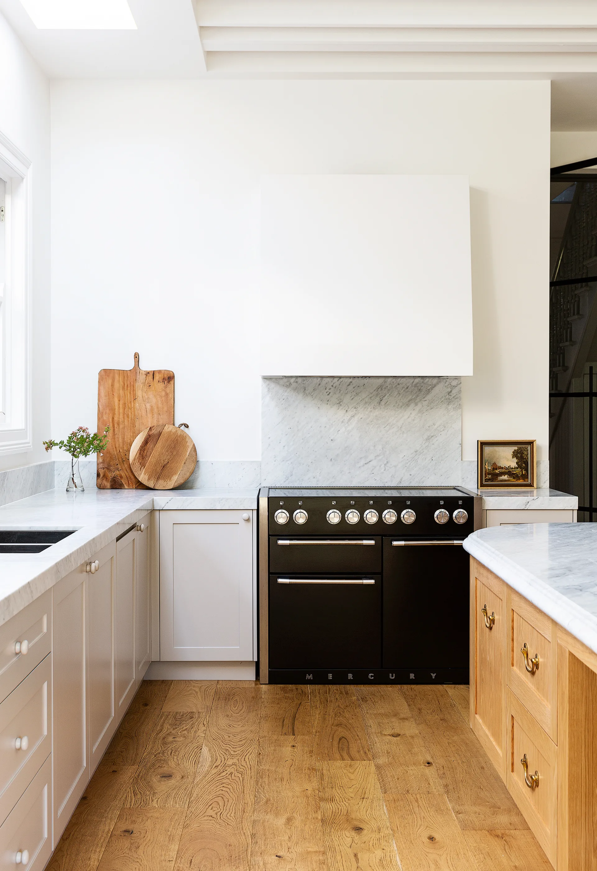
Daylight in the kitchen is enhanced by a skylight and walls in Dulux Natural White.
The upper level was extended, the ground floor received a layout shake-up and loads of custom cabinetry, joinery and classic finishes were added.
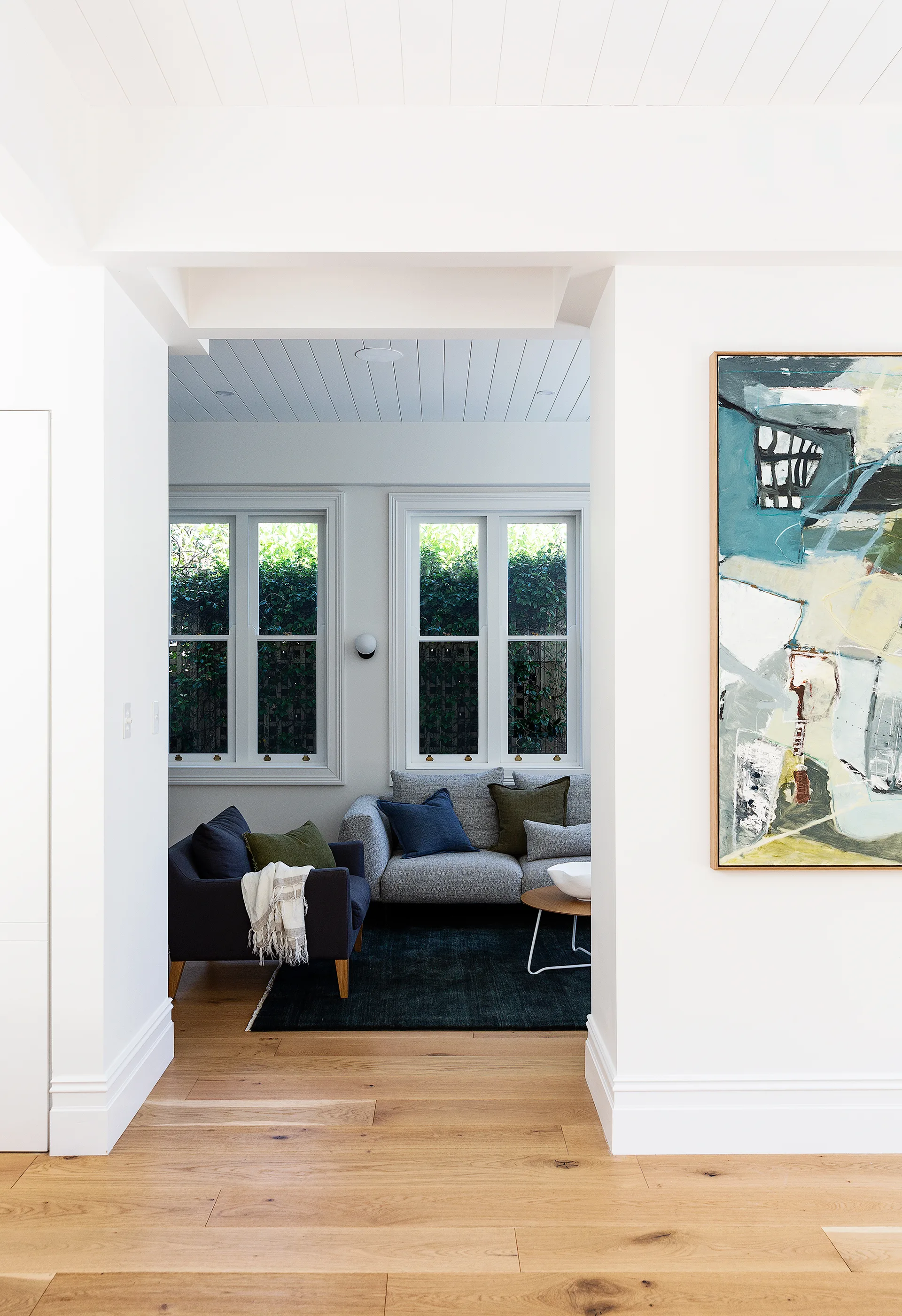
Tucked away behind a wall, the living area is kept cosy with a fireplace finished in veined ‘Concordia’ honed marble from Artedomus, an ‘Agra’ rug in Juniper from Armadillo and wall lights from Lighting Collective. A casual timber coffee table (try Trit House) and sturdy seating from Jardan is childproof – son Max can be seen reading on the ‘Miller’ sofa in Meadow.
The family happily moved back into their home in April 2020, and Fleur is just as happy to report that life in the updated Victorian has exceeded all expectations.
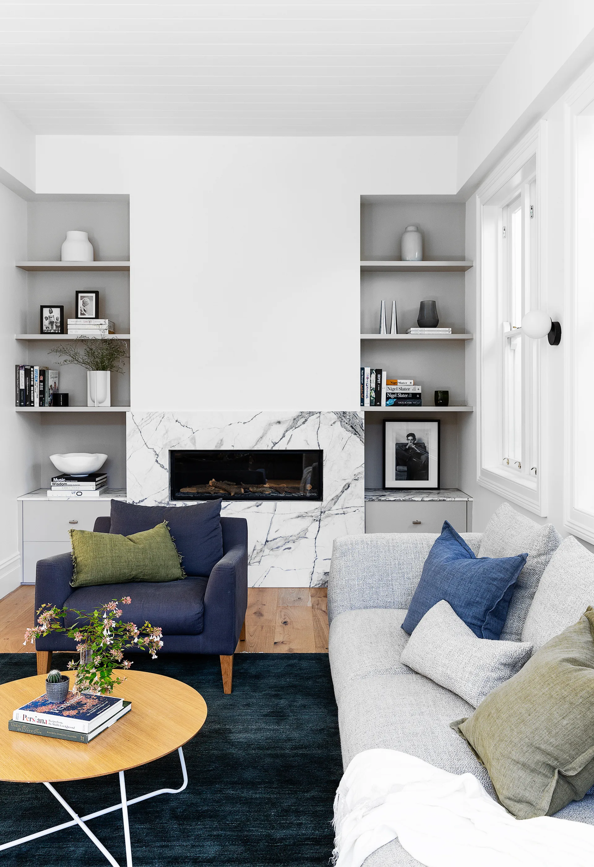
“Everybody tried to make the back part of the home totally open plan, but I said no because open-plan spaces are always so noisy,” says Fleur. Fleur chose the large tonal abstract artwork by Libby Mewing here for its soothing colour palette, while the framed photo of Al Pacino was a gift from former workmates.
“The biggest fear when you first start the renovation process is that you will design spaces that don’t get used – but we use everything here!” she says. That’s the success of this home. All of it is functional as well as beautiful.”
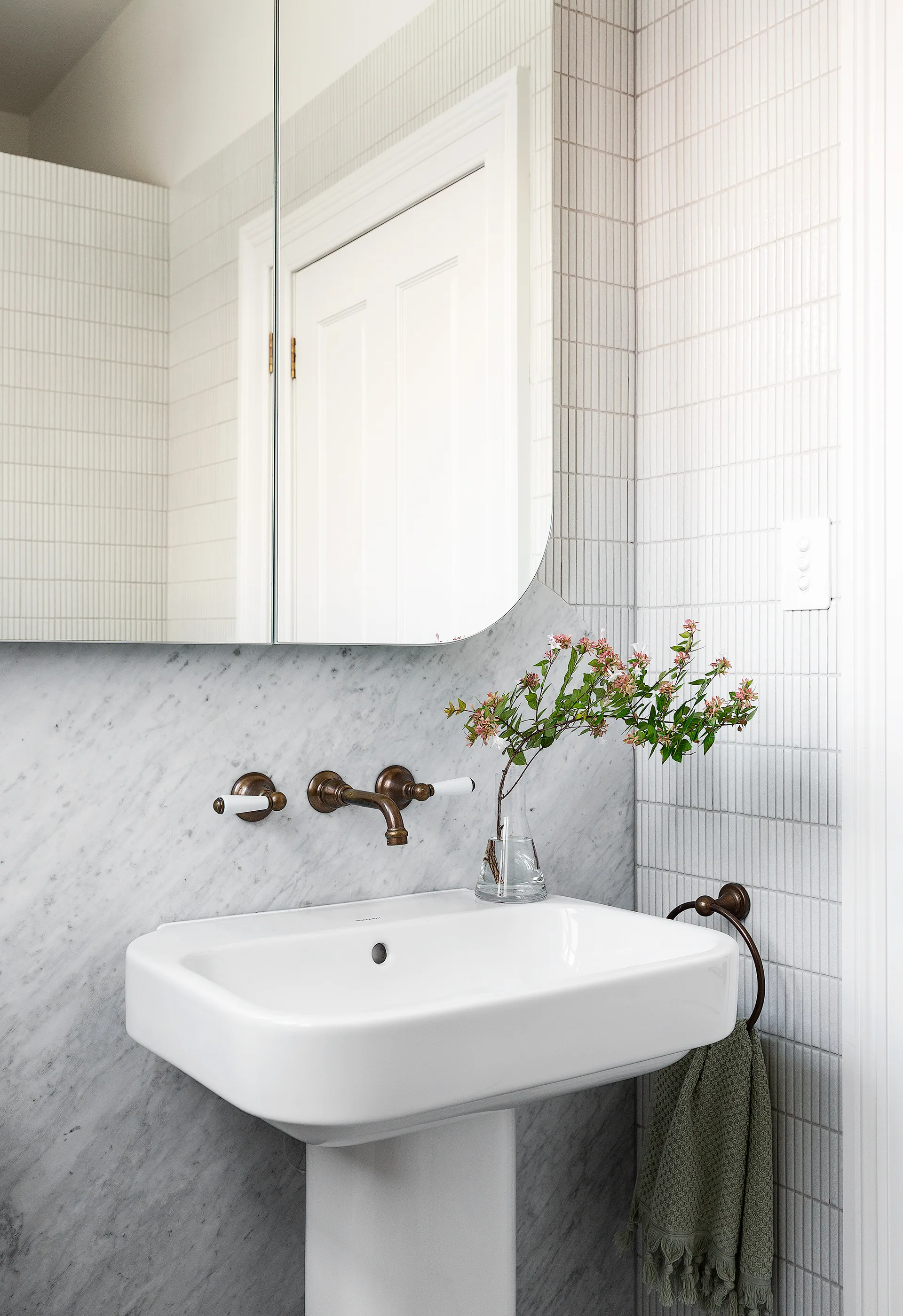
Curves appeal in this petite yet chic space, with a custom mirror designed by Smith + Levine and a ‘Happy D.2’ pedestal washbasin from Duravit. Teranova ‘Crackle’ finger tiles, Carrara marble from CDK Stone and aged brass ‘Olde English’ fittings from Astra Walker provide the backdrop.
“You design beautiful things because you want them to look lovely, but you actually have to use it all, too!” ~ Fleur
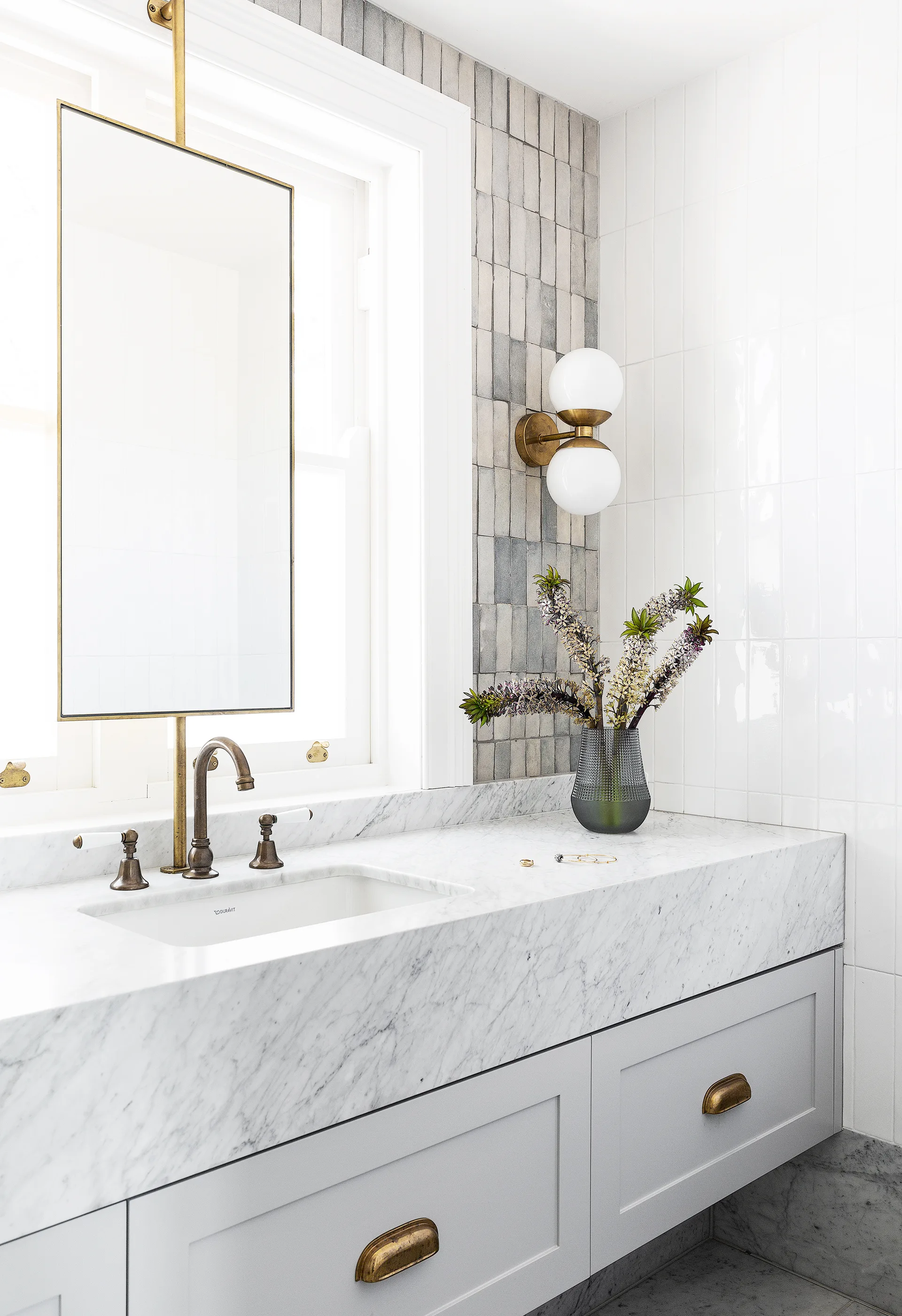
“We mixed muted tones and unpolished brass, knowing it will patina and age,” say interior designers Smith + Levine, who designed swivelling mirrors to work around the existing window placement.
“This house could have become quite minimalist, but I wanted a clean design, with just a little bit of fuss!” ~ Fleur
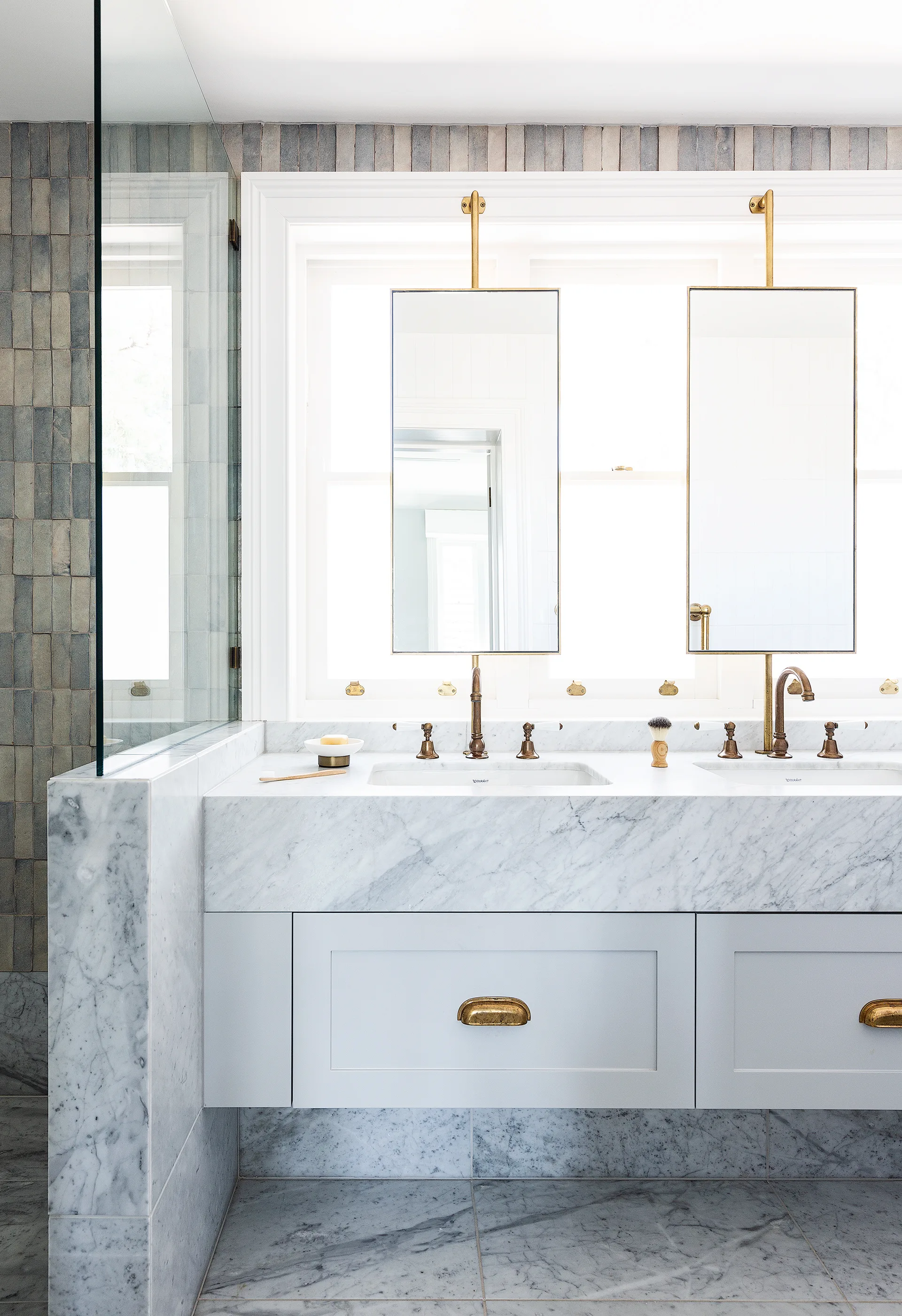
‘Casa’ handmade wall tiles in Grey Chine from Onsite Supply + Design were crucial in the home’s design process – Fleur carried one around in her handbag for months, using it as reference for other design decisions. The ensuite comes together with Carrara marble, brass fittings from Astra Walker, subway tiles from Skheme and a ‘Compact 2.0’ wall light from Douglas & Bec.
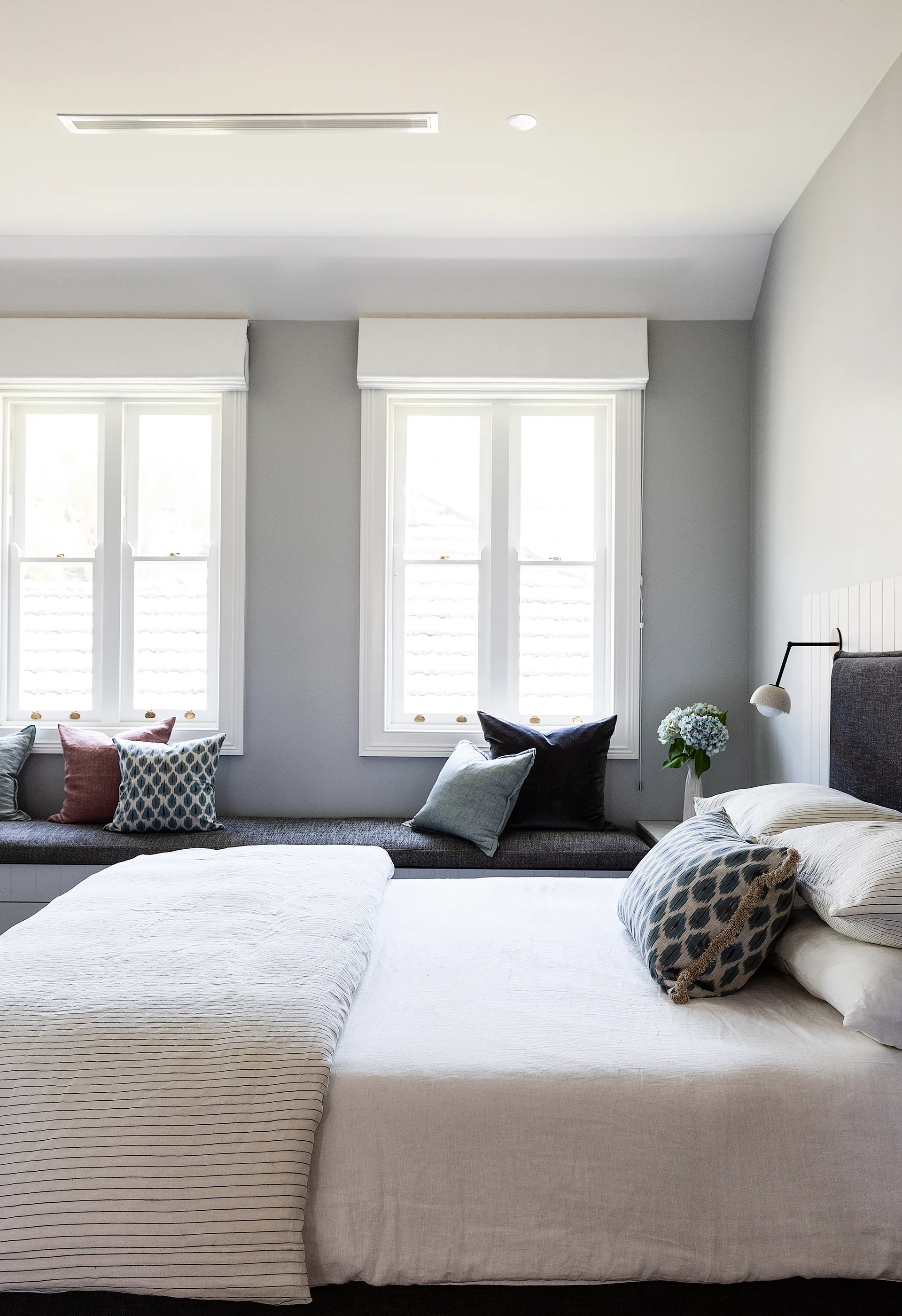
The soothing main bedroom has been painted in Dulux Tranquil Retreat, with ‘Tussore’ wool carpet in Madder from Bremworth underfoot. The Create Estate bed frame and the window-seat upholstery have been finished with Westbury Textiles fabrics for an elegant touch.
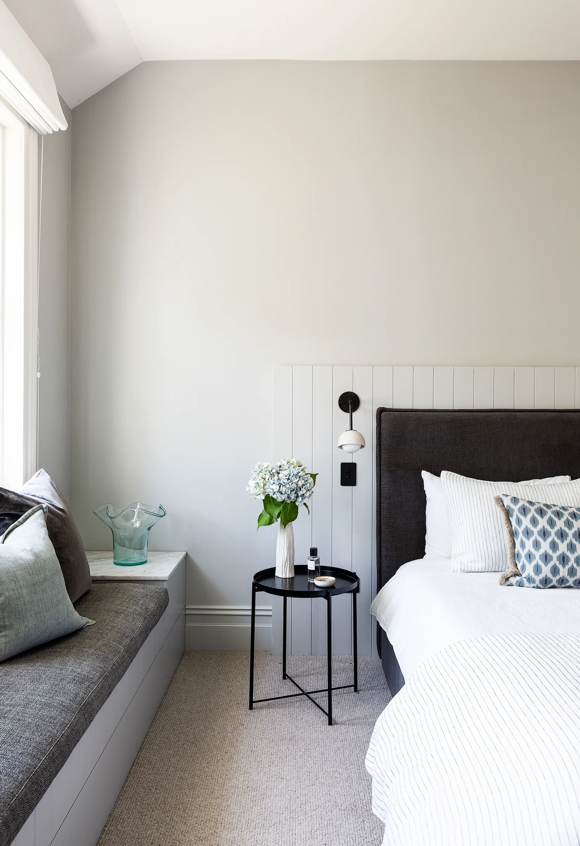
Pinstripe bedlinen from In Bed and cushions from No Chintz hint at pattern, while the ‘Terra O’ wall light from Marz Designs and Ikea ‘Gladom’ bedside table add contrast. Get the pannelled look (behind bedhead) with Easycraft ‘EasyVJ’ boards from Bunnings.
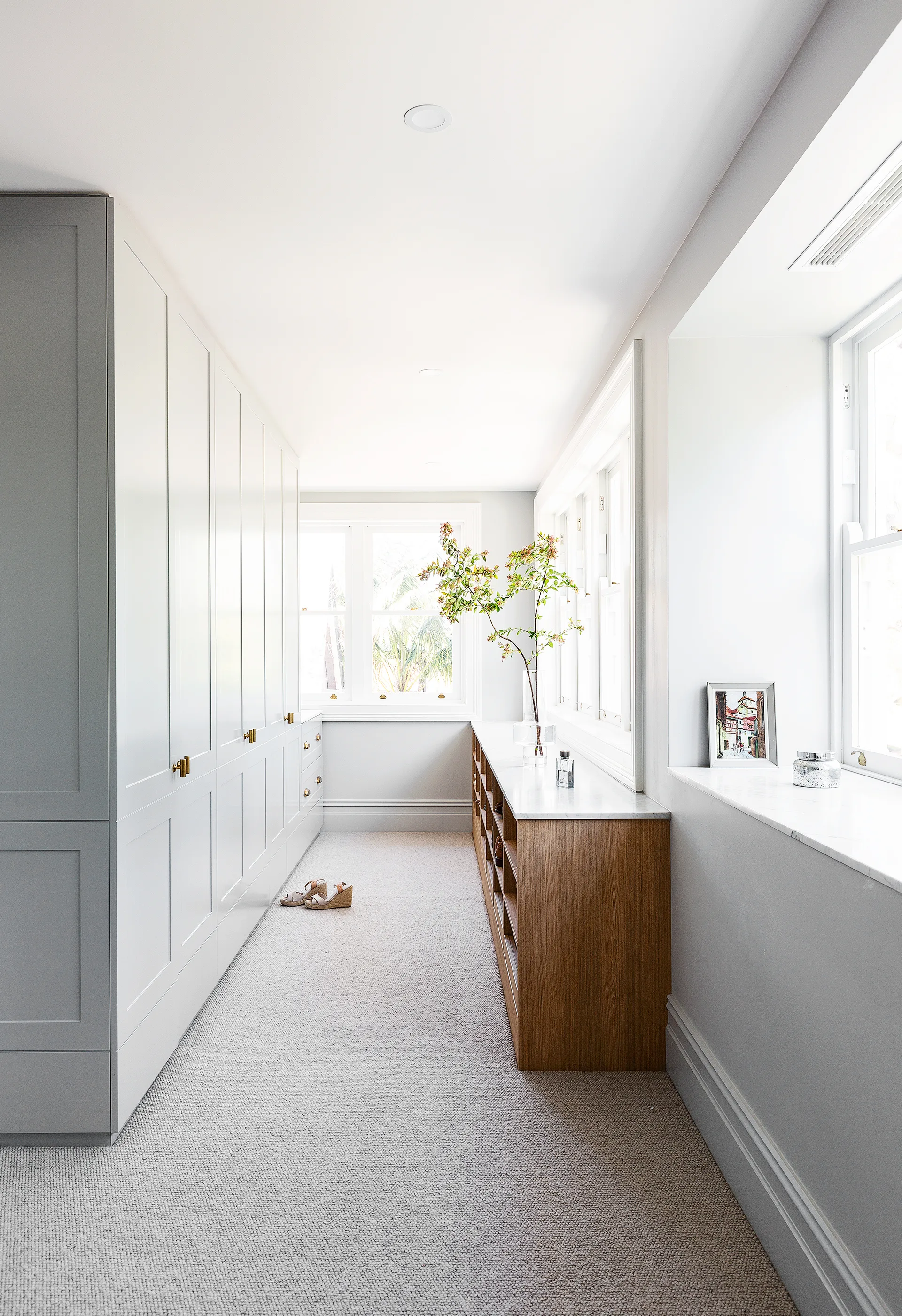
Custom joinery designed by Smith + Levine, painted in Dulux Endless Dusk, are key features to this swoon-worthy space, while a vintage painting gifted by Fleur’s father is a sweet addition.
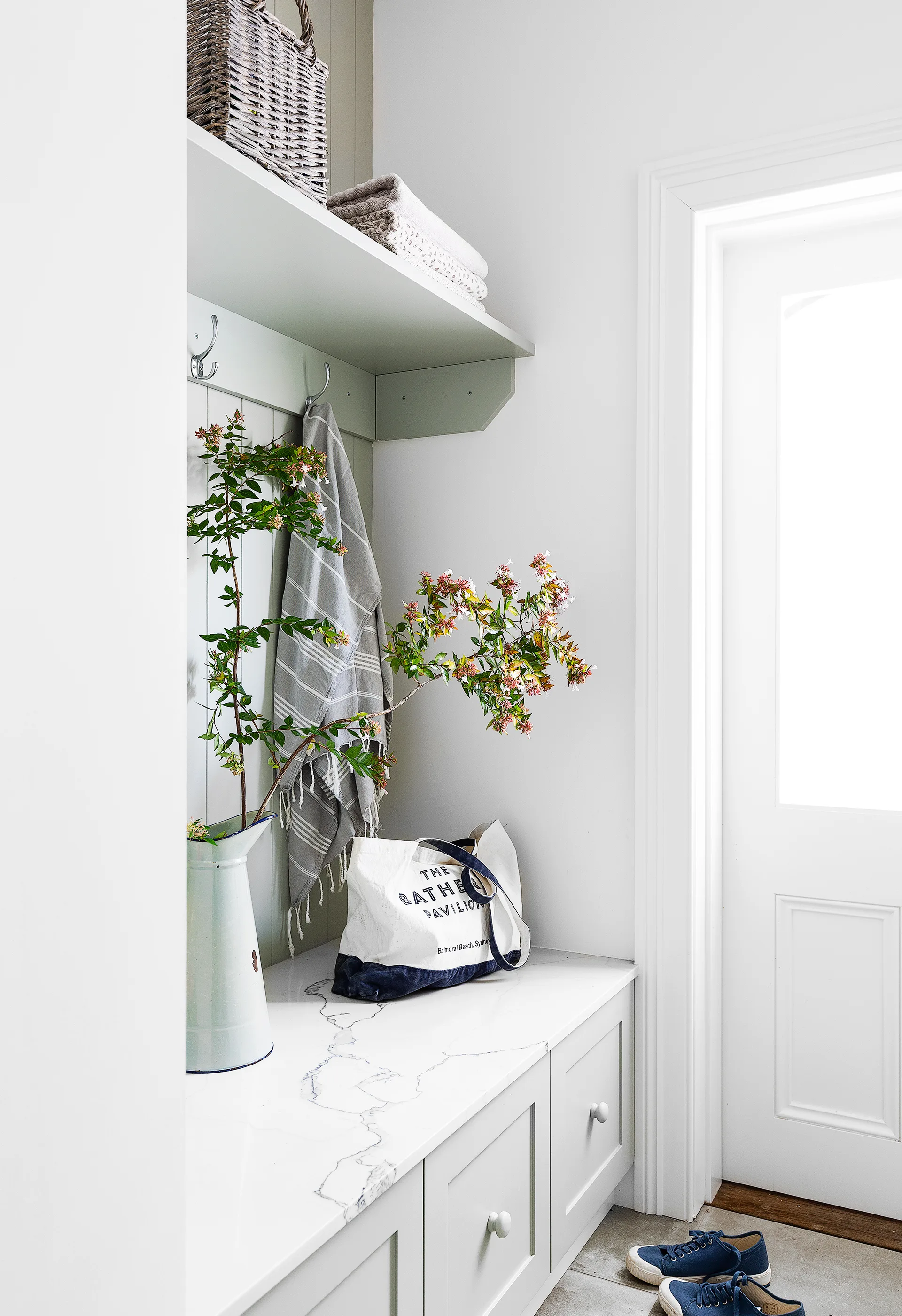
Calm tones continue with cabinetry in Dulux Waltzing and a ‘Statuario Maximus’ marble bench seat top from Caesarstone in the regularly used mud room.
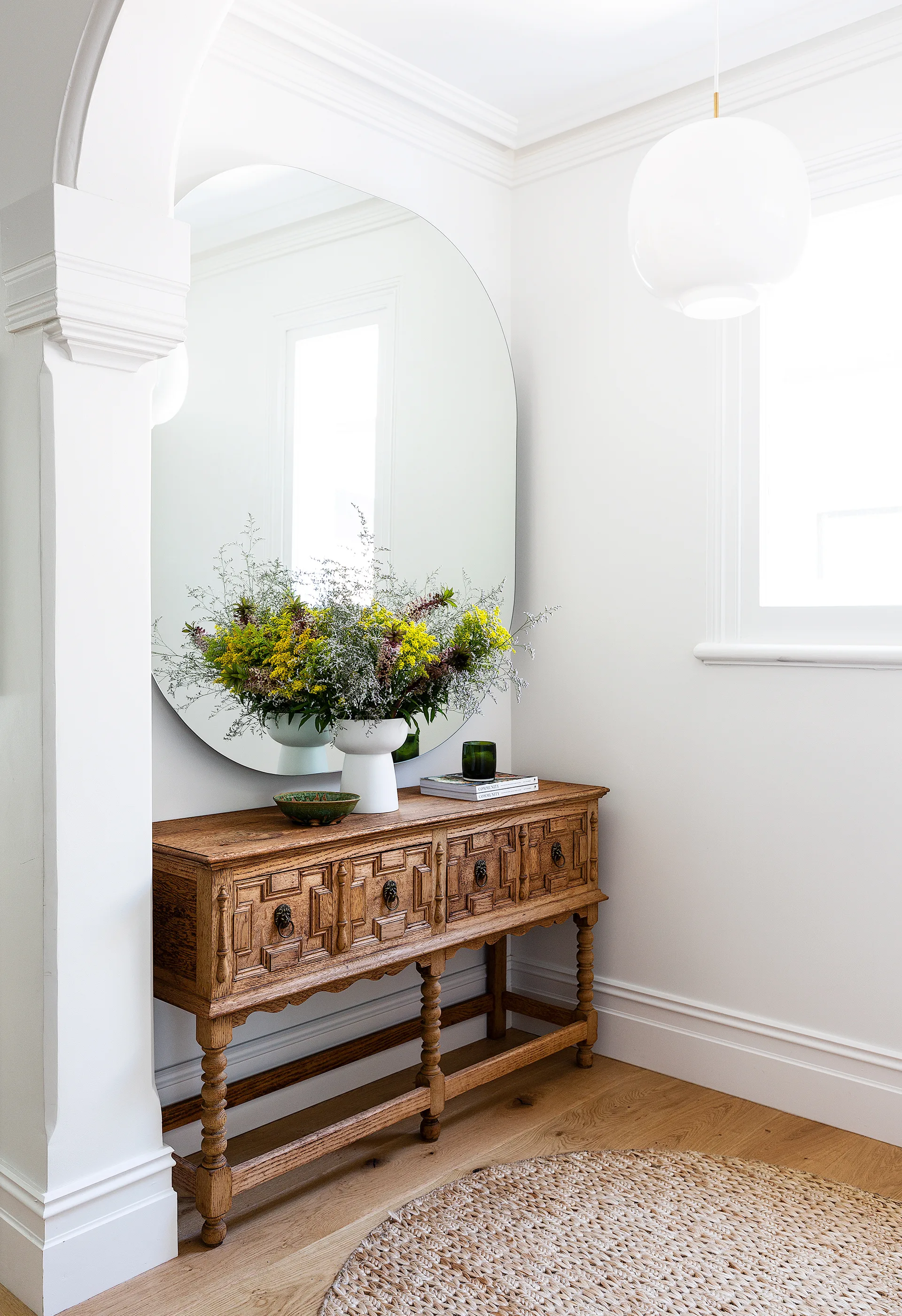
A Jacobean-era console from an antique store in New Zealand pairs with an MCM House mirror in the entry.
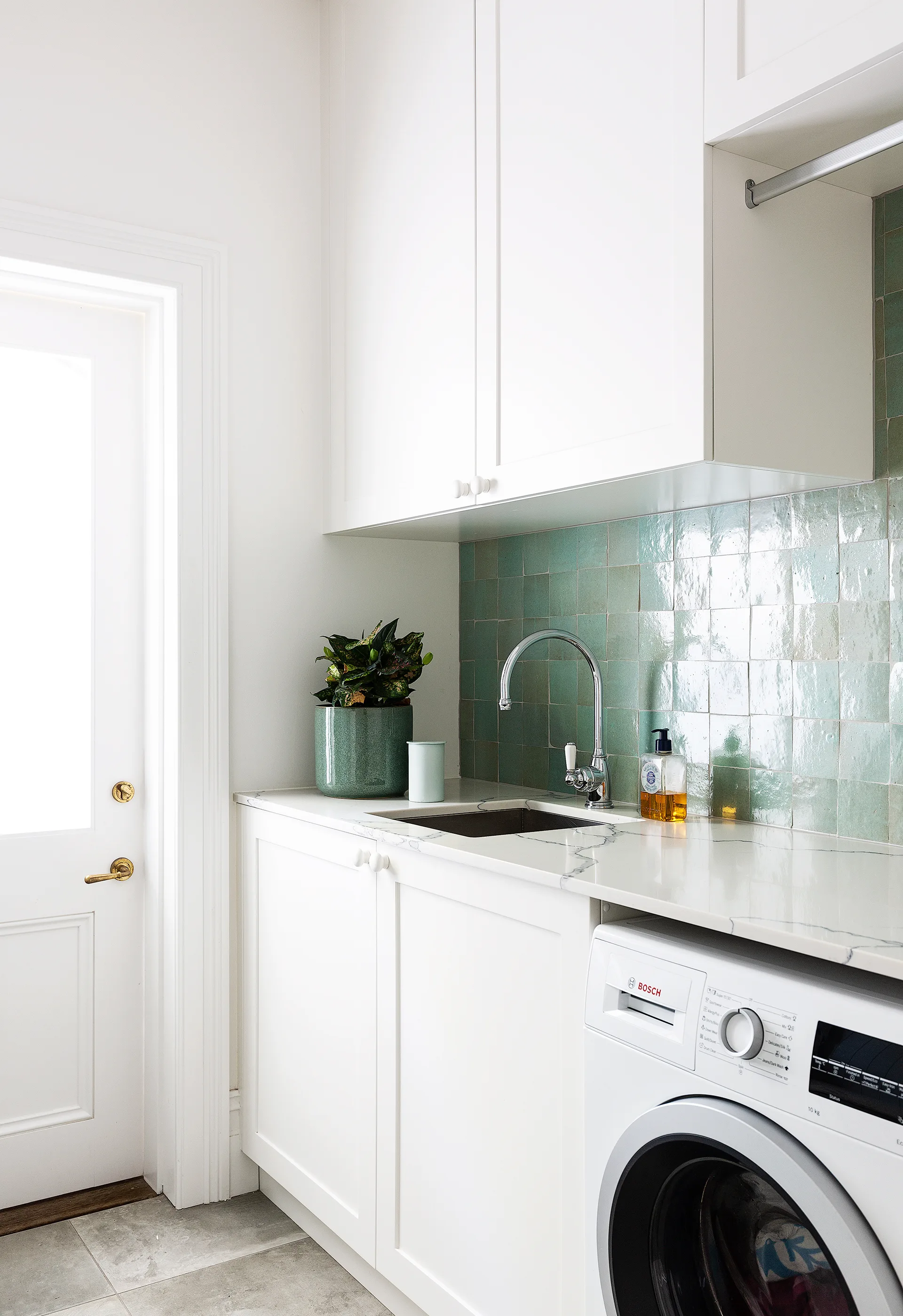
‘Zelij’ porcelain wall tiles and worn, concrete-look ‘Rawtech’ floor tiles, both from Di Lorenzo, spruce up the laundry.
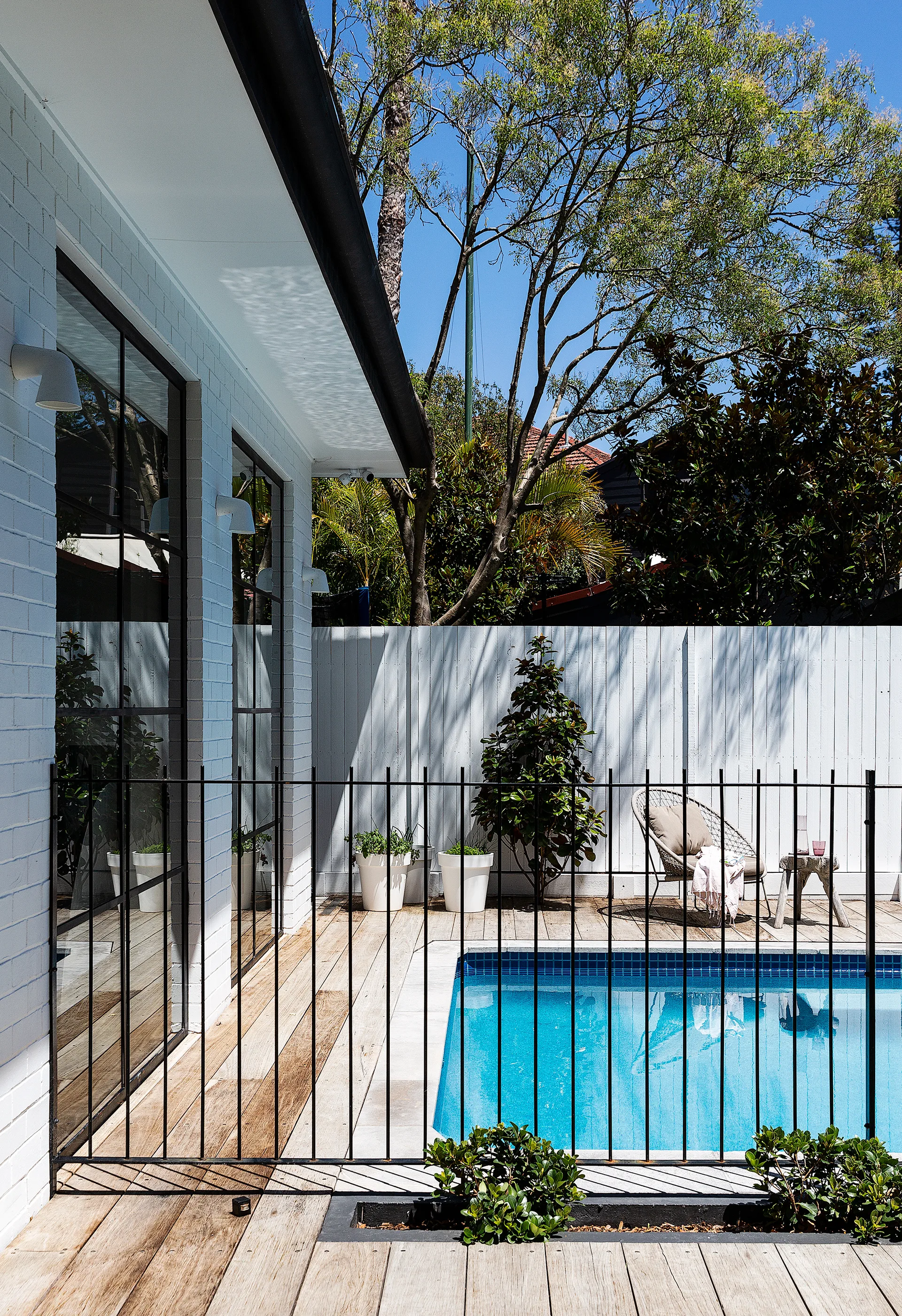
A classic iron fence and timber decking surround the family-friendly pool in the back garden.
(Credit: Photography: Simon Whitbread)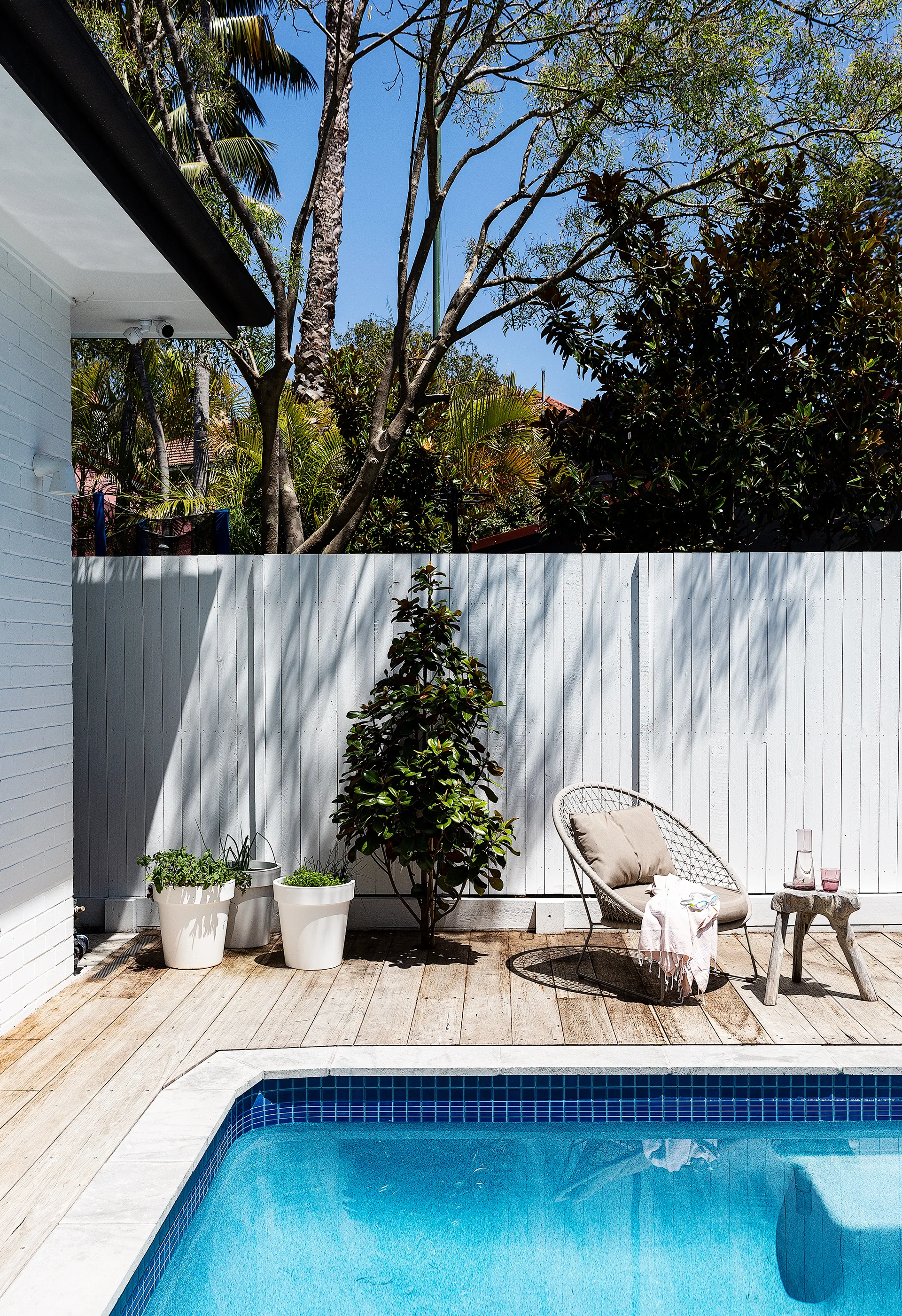
The pool is edged in limestone tiles.
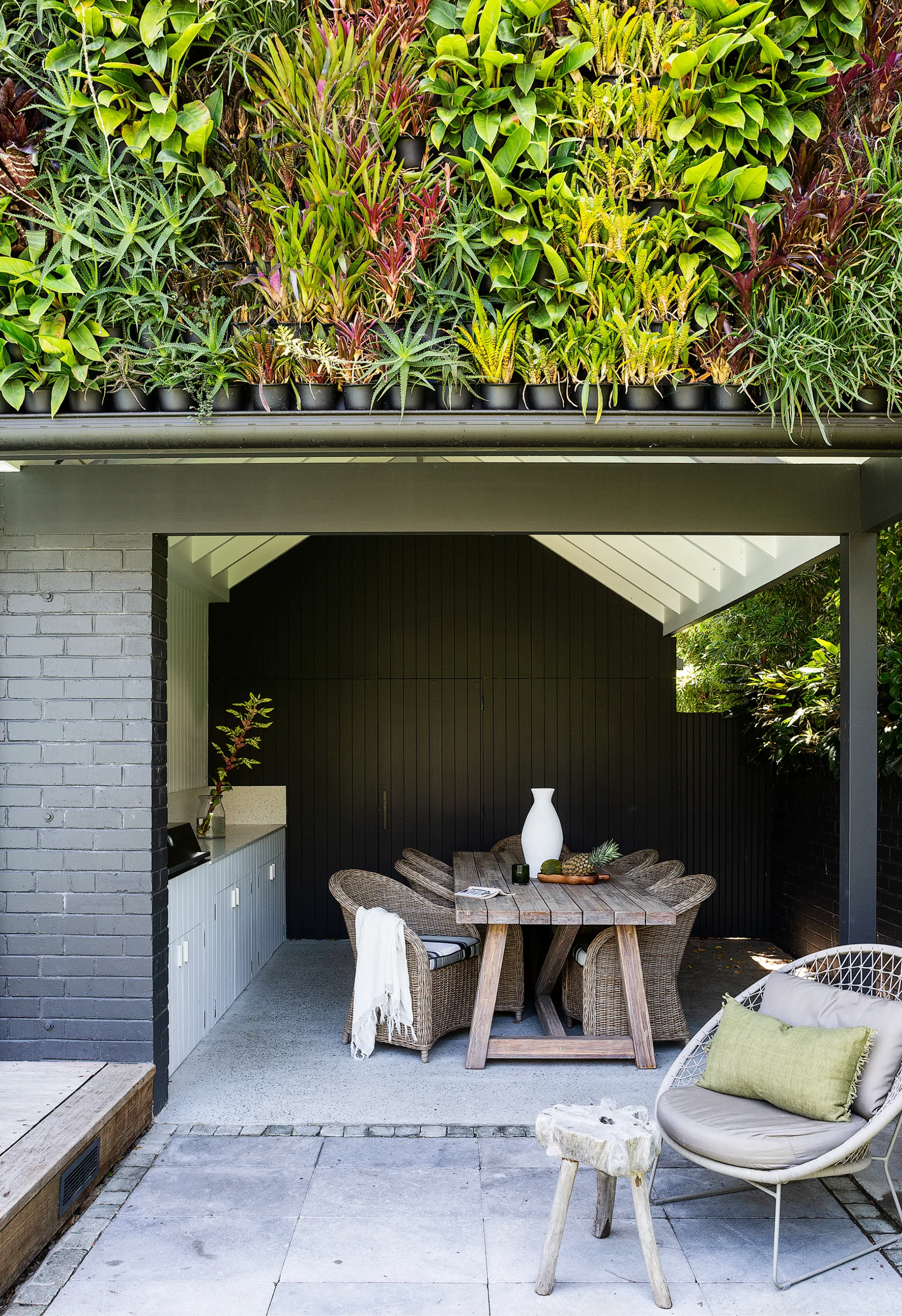
Exteriors in Dulux Monument create an inviting outdoor dining area. Try Domayne for similar furniture.
