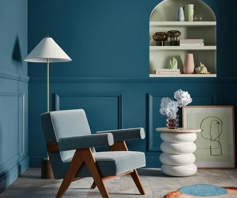
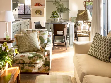
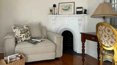
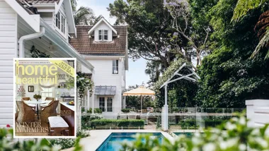
Have you ever looked at a colourful room and wished you had the courage to be as expressive in your own spaces? To spark inspiration, we’ve created a daring living room using the ‘Balance’ palette from the Dulux 2023 Colour Forecast range.
Inspired by the natural colours of the ocean, the ‘Balance’ palette is almost mesmerising. Deep greens and blues overlap soft greys and warm whites, with a touch of regal, ruby red as an accent colour.
This soothing scheme is a direct response to the events and evolution of the world in recent years. Collectively, the colours represent a yearning for balance and a sense of calm in our homes and workspaces, as we find solace in our personal environments.
“This palette is so incredibly beautiful and luxurious,” says Andrea Lucena-Orr, Dulux Colour and Communications Manager. “It works so well in any space that needs style and a sense of calm. Layered with smoky glass, luxurious fabrics like velvet, silk, and wool plus the cool confidence of stone, it feels like a contemporary classic with a dash of decadence.”
Below we show you how to bring bold colour into your home with the trending tones of 2023.
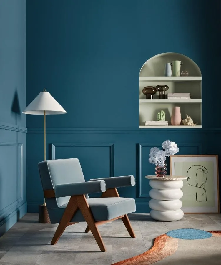
Dulux Kimberley Sea is featured on the walls, with Nephrite in Dulux Wash&Wear in the alcove.
BOLD AND BEAUTIFUL
For Andrea, the key to being bold with colour is creating a room that works at every level. The secret in doing this is to keep colours and textures within a tonal range or hue family.
“Colour plays such a powerful role in how we feel in a room and changing it up from safe neutrals can have a huge impact. The beauty of using a palette that’s already been expertly curated is that the combination can work perfectly together and ensure a sense of balance.
“Choosing a key colour for the walls is your starting point. You can then accentuate that with the complementary colours recommended. Look at the accent or contrasting colours to apply through furniture, furnishings, homewares, floral bouquets or artwork,” she suggests.
Selecting paint colours for your home is deeply personal, and can take a lot of time, thought and effort. Renowned for quality and finish, Dulux paints guarantee beautiful colours every time, inside and out.
TOP TONES IN 2023
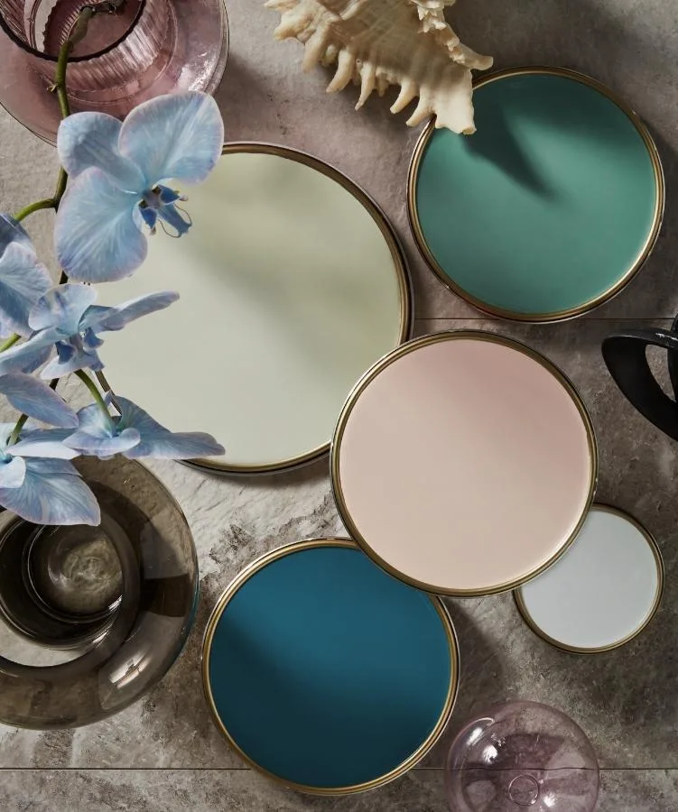
1. Dulux Green Alabaster Half
TOP LEFT: A soft green with a slightly grey undertone, Dulux ‘Green Alabaster Half’ works well with soft whites. Use it to add a subtle splash of colour to bedroom, bathroom, or living room walls.
2. Dulux Nephrite
TOP RIGHT: Pair this soothing marine-inspired green with a dusty pink such as Dulux ‘Mornington’, inspired by the soft pastels of seashells. Contrast with ocean blues to create a calm room.
3. Dulux Porcelain
MIDDLE: A soft pink shade, Dulux ‘Porcelain’ couples beautifully with the grey undertones of Dulux ‘Terrace White’ or the crispness of Dulux ‘Casper White Quarter’.
4. Dulux Kimberley Sea
BOTTOM LEFT: Like the waters off Western Australia, Dulux ‘Kimberley Sea’ is a deep blue with a touch of green at its base. “This sea-inspired blue is so stunning and immediately sets the tone of the room. It’s both elegant and calm at the same time,” shares Andrea.
5. Dulux Casper White Quarter
BOTTOM RIGHT: This soft, warmer white provides a neutral option that creates a flexible foundation for stronger colours.
Brought to you by Dulux.
