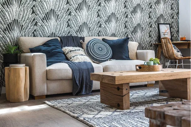
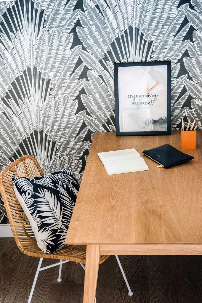
A feature wall of a dramatic black wallpaper in Leigh and Kristie’s home scored highly with the House Rules judges.
Colourful and knowledgeable, judge and interiors expert Laurence Llewelyn-Bowen is a big fan of wallpaper and shares his tips on how to make it work in a home.
“Wallpaper is very much becoming a mainstay on House Rules now,” he says. “This wall [in Leigh and Kristie’s house] really sold the idea of wallpaper to the contestants, as far as we were concerned; it absolutely changed everyone’s view.”
UK-based Laurence admits that wallpaper is more common in England – “we revived it 20 years ago so we’ve been going a lot longer” – so he feels the English are more comfortable with the product and thinks Australians are still learning how to make it work.
“It’s still a new product out here,” he says.
His tip with the wallpaper used in Rye is that it could have worked even better had it been paired with darker painted walls in the room, rather than white.
“That feature wall with the wallpaper is magnificent, but in fact, the rest of the room should have been painted a lovely dark charcoal,” he observes. “This is a snug, this is an escape. It doesn’t need to be a light bright area.”
“Never forget, something like a dark charcoal is the ultimate, ultimate neutral. It’s an amazing colour.”
Laurence Llewelyn-Bowen
“Feature walls have to have a relationship to the other walls. It can’t just be a collision. And actually, it’s often better with a flat colour. In Australia, there’s often too much light, so actually, a colour like dark charcoal is a great way of doing stuff about that.”
“I want to see a reinterpretation of traditional shapes. These are the sort of things people are really enjoying in Europe at the moment.”
Laurence Llewelyn-Bowen
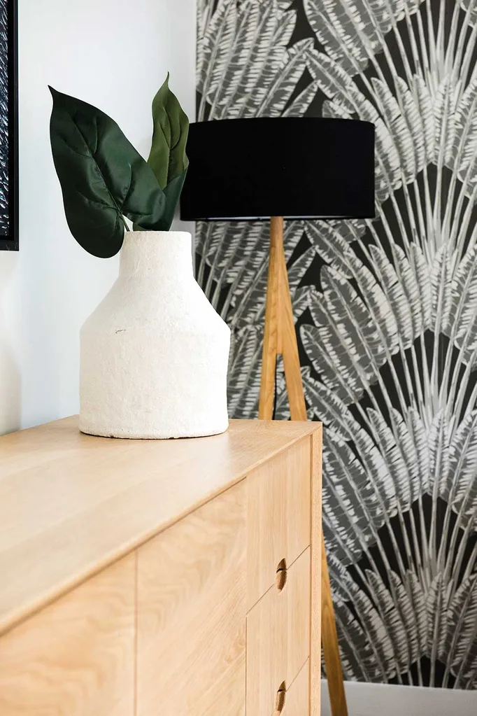
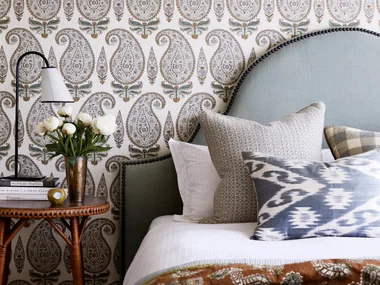
Laurence is a big fan of design icon and wallpaper innovator Florence Broadhurst, and feels that she has been often overlooked by her fellow Australians. He singled out the interiors of the Auction home as an example of how her designs can be used in a contemporary way.
“It’s my mission to get everyone out of that good taste, mid-century modern cliché,” he says. “Australia deserves much more than that. I want to see more heritage coming in, but in a very modern way. Obviously, I want to see a lot more colour. You think back to Florence Broadhurst, or the Australian impressionist painters.
“I’m using very, very deliberate flash points, from the Australian design aesthetic history, to get our contestants to move things forward a bit.
