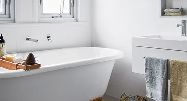
When the bathroom taps and toilet began failing in the Melbourne home of interior designer and architect Melanie Beynon of Meme Design, she and her husband, James, knew they couldn’t avoid a renovation any longer. “We’d put off renovating the bathroom because we knew it was going to be a long, clumsy and expensive exercise,” says Melanie, who had already revamped the Edwardian home’s living, kitchen and dining areas. “It was a long time coming.” The couple and their two children moved out and a complete reconfiguration began, with the aim of maximising the available space.
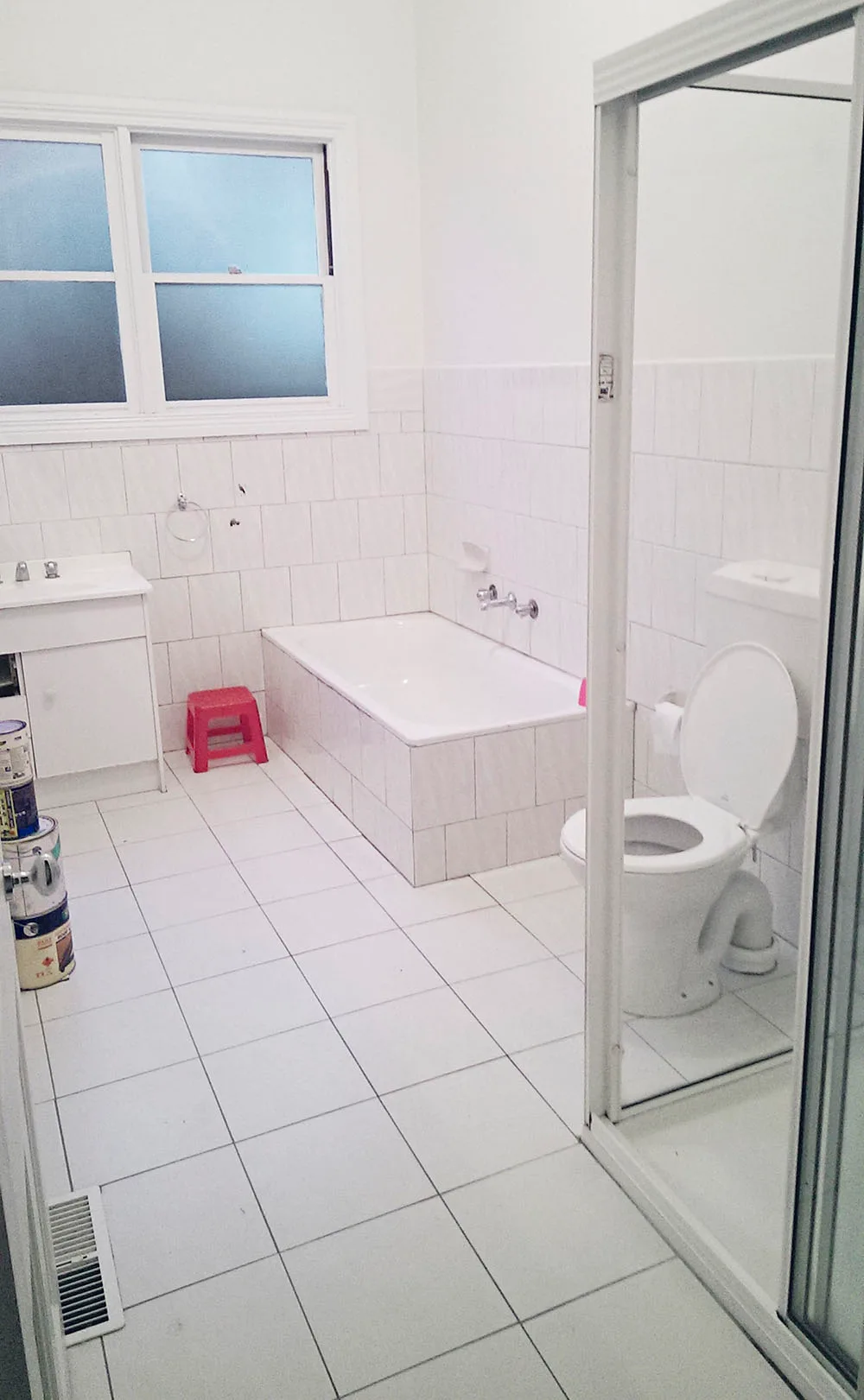
Before: not a lot to love
Supplied
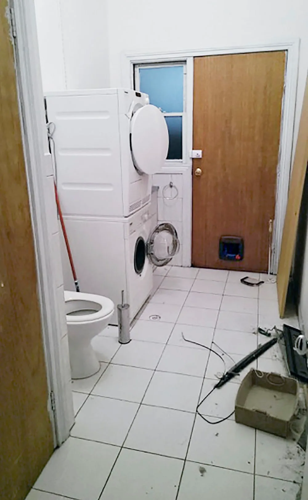
Supplied
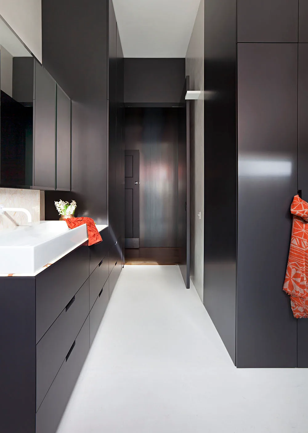
After: a modern, functional space
Shania Shegedyn
“Essentially, it was a square made up of two separate rooms: a bathroom and a laundry [above, left and centre],” explains Melanie. “There was no ensuite.” The new layout (above, right) was designed to produce two new zones: a combined ensuite and laundry off the main bedroom and a separate bathroom for the kids. “I paced it out with the builder to get the right balance of storage and circulation space,” says Melanie. “It was important that wherever you turn, something useful was going on.” The new ensuite exudes serenity and is a perfectly balanced composition of style and functionality. The designer played on the height of the ceilings by lining the walls with tall dark joinery and adding ‘Sol’ wall lights from Euroluce Lighting that beam upwards. A simple design decision to add a second door that leads to the hallway immediately enhances the room’s usability and efficiency.
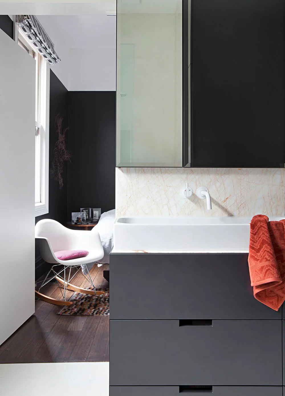
Shania Shegedyn
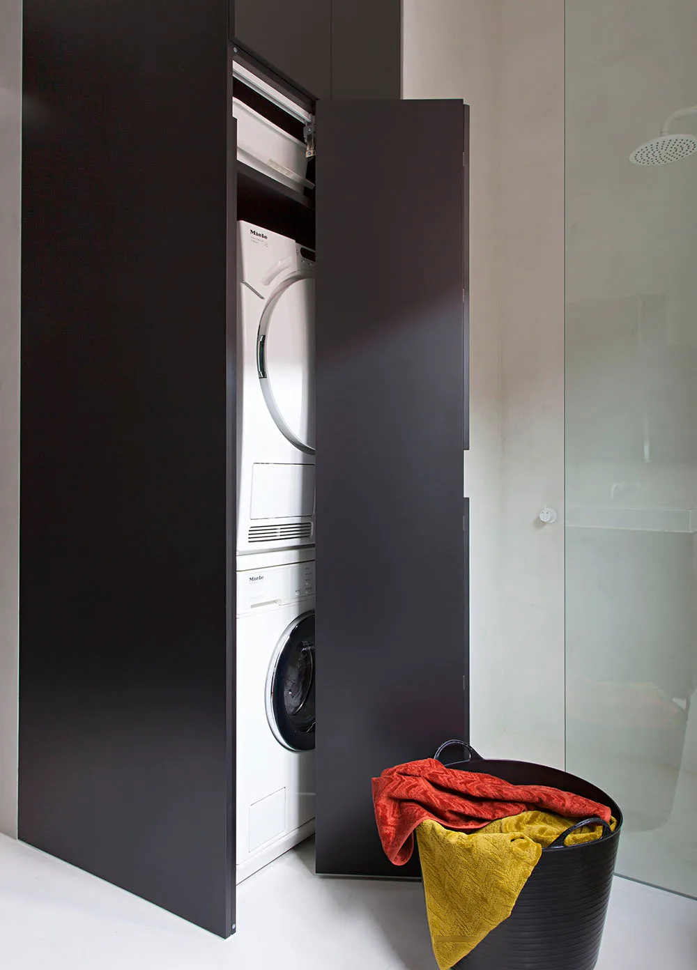
Shania Shegedyn
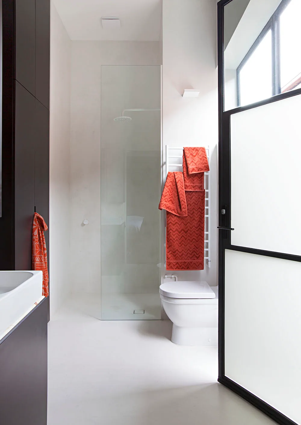
Shania Shegedyn
Another door by the vanity (above, left) gives access to the main bedroom. A Miele washer and dryer are stacked and concealed behind a bi-fold door (above, centre). The walls and floor were treated to an X-Bond overlay – a polymer mix that gives a polished concrete look, but is warmer and quieter underfoot, and easier to apply than concrete. White finishes – a Hydrotherm ‘H4’ towel rail, an Astra Walker ‘Icon’ wall-mounted showerhead and a Vola shower mixer – disappear against the walls (above, right), streamlining the look and fulfilling the ‘fuss-free’ requirement. Natural light glows through a steel Skyrange Windows door. A white translucent film was applied to the door panels to provide privacy and the windows above were left clear. “It’s interesting how black actually works with light,” comments Melanie.
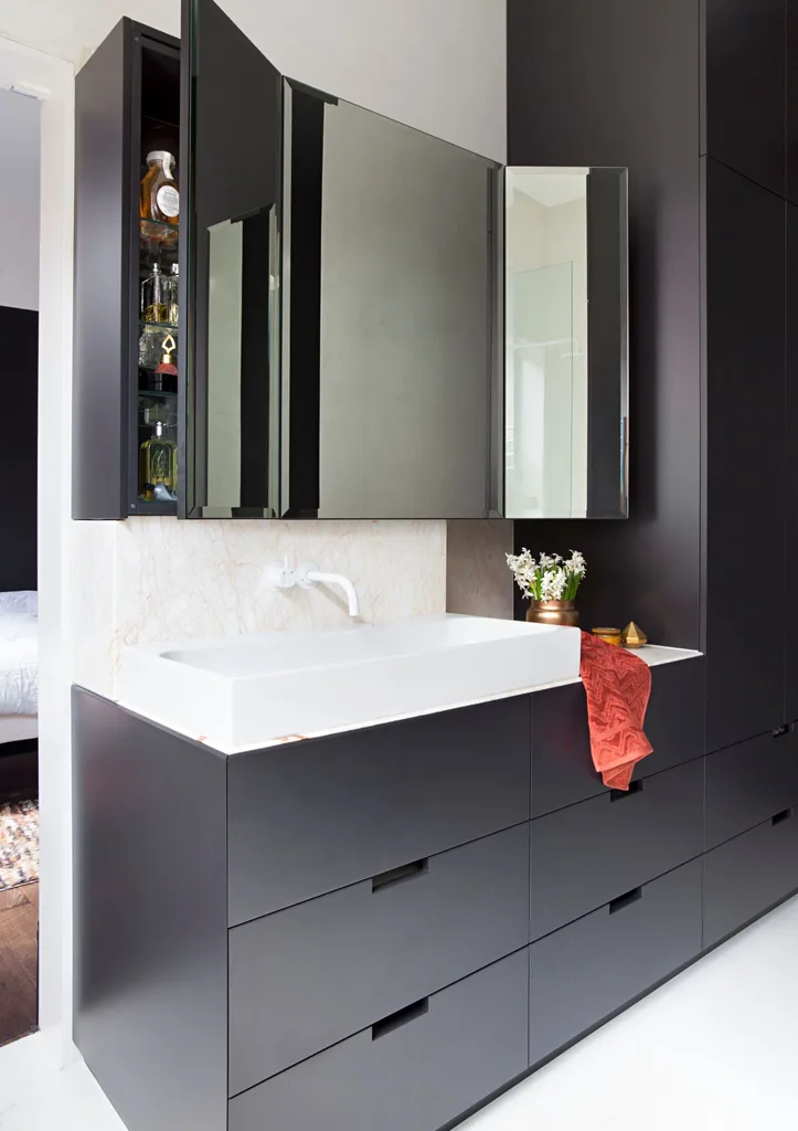
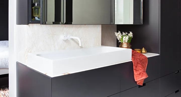
Melanie sourced an unusual Greek marble called ‘Golden Spider’ for the benchtop and splashback from a stone quarry in Melbourne. “I went looking for something really striking, something you don’t often see,” she says. The storage cabinet has winged mirror doors. “I wanted it to have the feel of a dresser to align with the Art Deco theme we had going on with the black and white and bevelled edges,” Melanie explains. The striking white Vola ‘111’ mixer from Mary Noall and a Studio Bagno ‘Unit 80’ basin provide contrast to the 2-pac joinery, in Dulux Deep Onyx.
 Shania Shegedyn

