Kitchen and laundry week is perhaps the most important, most anticipated week on The Block. As the saying goes, “Kitchens sell houses,” which means The Block contestants definitely had their work cut out for them. But what could go wrong when you’re renovating two of the home’s hardest-working rooms in a week? A lot, it turns out. Many contestants found themselves in a world of agony over the debate: to butler’s pantry, or not to butler’s pantry? Spoiler alert: all of the contestants included butler’s pantries, but the effort wasn’t exactly rewarded with praise like the contestants hoped for.
Connect with trusted tradies. Receive instant quotes for your next job with hipages.

Despite this, the judges loved the way all of the kitchens looked. Kyle and Leslie in House 1 received praise for their “sexy” retro-inspired kitchen. Leah and Ash’s tiled island bench was a standout feature Neale called “absolutely gorgeous.” Kristy and Brett’s statement island bench had the judges swooning, with Darren claiming he wanted to “meld” with it. In Steph and Gian’s kitchen, Shaynna said “I can’t knock one aesthetic look,” calling the couple’s choice of marble, “divine”. But it was Eliza and Liberty in House 5 with their balance of form and function who won over the judges this week, winning fair and square (even without the helping hand of a sneaky, secret Gnome).
But we’re not here for all the good bits, are we? We’re here to take notes on all of the things The Block contestants got wrong so we can avoid making the same mistakes in our own homes.
Mistake #1 – Bungling butler’s pantries
Butler’s pantries were a real sore point with the judges this week, and not because they didn’t come with real butlers.
All week the contestants wrangled with floorplans to include a ‘must-have’ butlers pantry, but in the end, they needn’t have bothered.
House 2’s Leah and Ash went against their better instincts to present a butler’s pantry as part of a “bold and courageous” kitchen that had judge Darren Palmer “besotted”. But in the end, the butler’s pantry simply took too much space away from the main kitchen, resulting in an island bench that felt too tiny for a luxury home. “I think this is a mistake,” announced Shaynna.
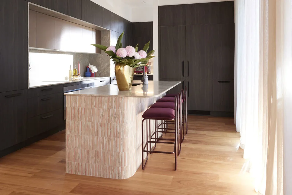
But Leah and Ash weren’t the only ones who were called out for a bad butler’s pantry. In House 1, Kyle and Leslie’s butler’s pantry interrupted the home’s indoor-outdoor flow, while in House 4 Steph and Gian’s butler’s pantry somehow reduced the functionality of the main kitchen, rather than enhancing it.
Do this instead
Former Block contestant Kara of professional renovating duo Kyal and Kara recently took to Instagram to share her controversial opinion that butler’s pantries are overrated. “We have a large kitchen, we have the space for one, but I find I just gather clutter in there. I think I’ve seen too many people with smaller living spaces sacrifice a functional kitchen because they really want a butler’s pantry when something like an appliance cupboard or pull-out pantry may be better suited to their space.”
But if you do have the space, here are 10 butler’s pantry must-haves.
Mistake #2 – Disturbing the sanctity of the island bench
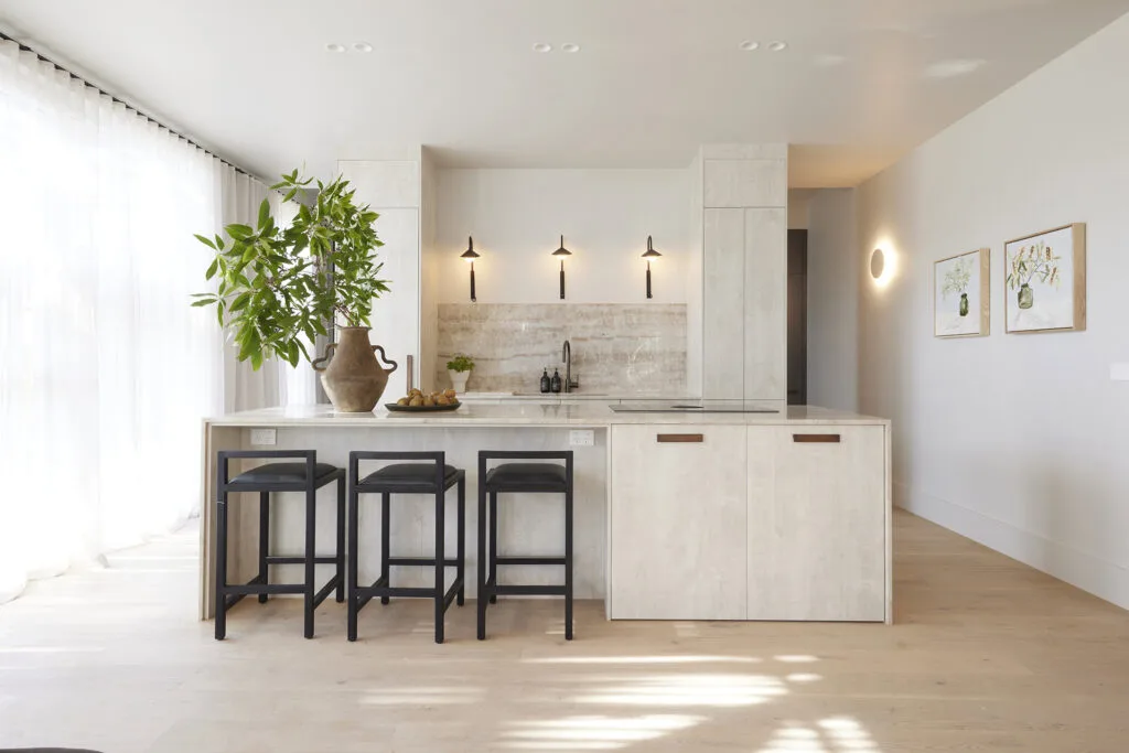
This week the judges had a lot to say about kitchen islands, and not all of it was good. One of the points they made in Leah and Ash’s home as well as Steph and Gian’s home was the choice to ‘disturb the sanctity of the island bench’ (my quote, not theirs). Because, despite what you might think, many designers try to keep services like stoves and sinks out of the island bench completely.
On her podcast Undercover Architect, architect and serial renovator Amelia Lee had this to say on the topic. “When the sink is in use … it’s messy,” she says, adding, “If the sink is in your island bench, then that’s going to be in the middle of your kitchen. I actually had someone on my socials call a sink in the island bench ‘a throne to the dishes’ which I thought was funny and apt because when the sink is in your island bench, it does draw a lot of attention as the focal point within the focal point of the kitchen.
So if sinks are definitely out, what about a stove? Steph and Gian’s kitchen was far from perfect (despite being very easy on the eye), but one of the biggest criticisms from the judges was the inclusion of a stove in the island. “It will spit, it will have smoke, it will have aromas, it will have all sorts of sensory input” said Darren. So that’s a firm no.
Do this instead
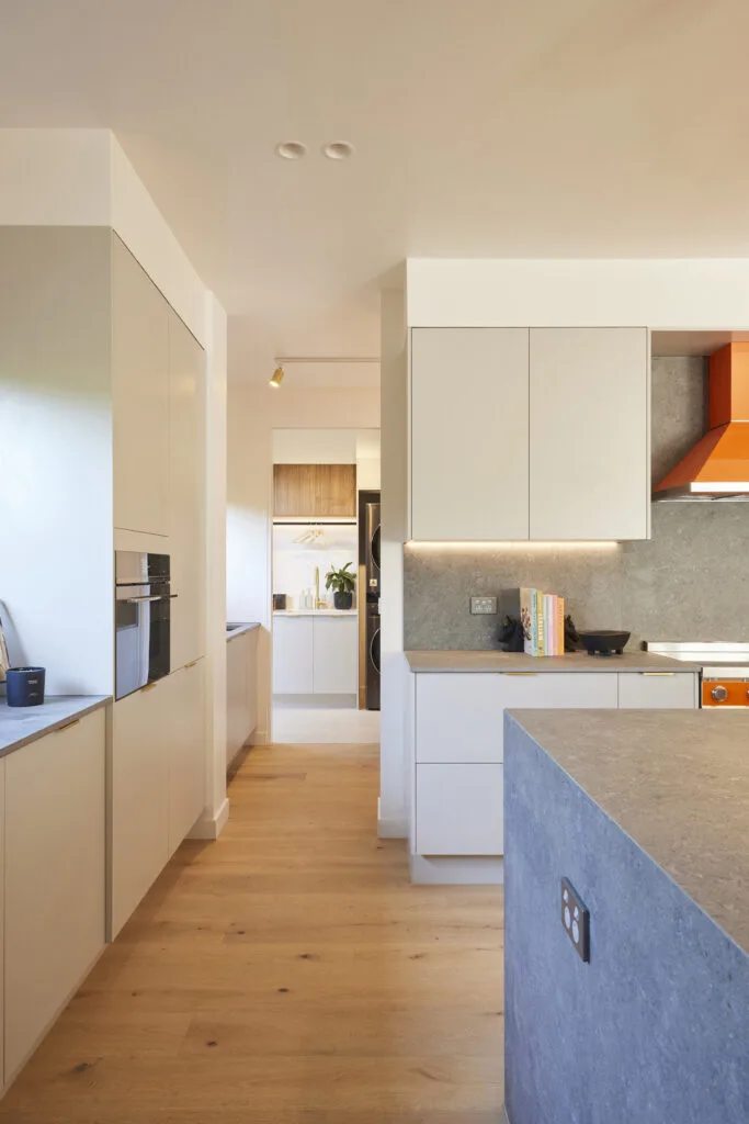
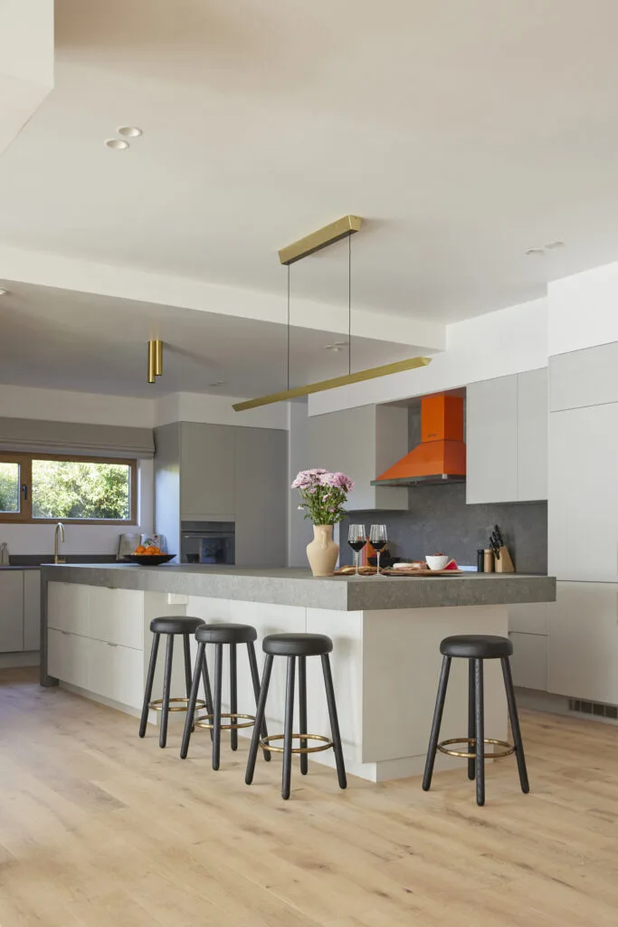
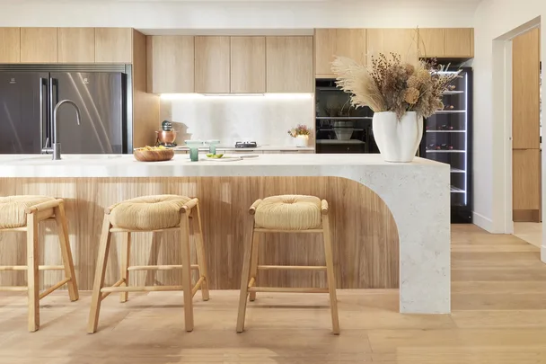
In most cases, the island bench is the most visible, central element of a kitchen. If you have enough space, keep functional elements including sinks or stoves out of it completely. Otherwise, you run the risk of putting all of a kitchen’s least-glamorous aspects on a pedestal. When the judges entered Eliza and Liberty’s kitchen, Neale remarked, “This is the first bench today isn’t it, that doesn’t have a cooktop or a sink in it. It’s just pure, unadulterated, bench.”
All of the utilitarian elements including the stove, sink and ovens were located in the kitchen’s perimeter, allowing the oversized kitchen bench to truly shine.
Mistake #3 – Laundry as an afterthought
Okay, so maybe this mistake isn’t entirely the fault of The Block contestants, I mean, who decided renovating kitchens and laundries in the same week was a good idea? But anyway, most contestants had their minds focused on getting the kitchen just right that the laundries were kind of … an afterthought.
To make space for a butler’s pantry, Leah and Ash in House 2 adjusted their home’s layout, which led to the awkward location of the laundry, accessible via the bathroom. It was a move that perplexed the judges, especially Neale. “I think it’s a disadvantage to have a laundry that is this snug,” he said, after voicing his concerns that this rabbit-warren style layout would not satisfy a luxury home buyer.
Do this instead
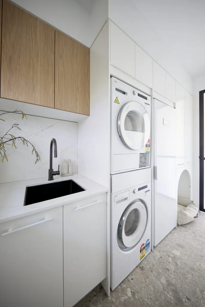
In 2017, LG’s Annual Household Survey found that Australians spend up to a year of their life doing laundry, which means the idea of the ‘laundry as an afterthought’ should really be a thing of the past. In order to be functional, a well-designed laundry should have the following elements:
- Enough room to swing a washing basket
- Bench space to fold and sort laundry
- A generous tub sink for soaking and handwashing
- Plenty of storage for laundry soaps, cleaning equipment and clean linen
- Energy-efficient laundry appliances
- Exhaust fan
- Access to outdoors to make hanging washing outdoors easy
- Be aesthetically pleasing to look at and work in
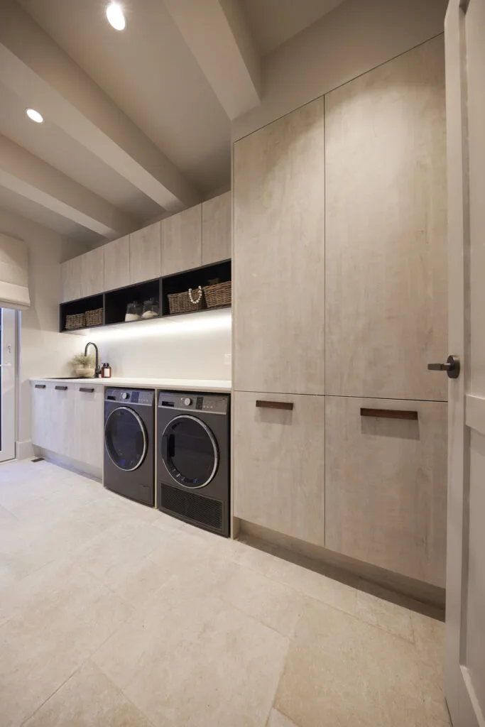
Two teams really nailed their laundry design this week. Steph and Gian in House 4 created a “brilliantly functional” room with a generous workbench, upper storage cabinets and an external door. Underdogs Eliza and Liberty also delivered an exceptional laundry, which featured everything you could ever want in a laundry, as well as a linen closet, a feature Shaynna was delighted to see. “Go girls,” she said.
 Nine
Nine
