Seasoned renovators Rachael and Alex have had plenty of practice turning ugly ducklings into beautifully refurbished swans, but their latest project, a new build in Melbourne’s bayside area, was a fresh experience for the design-savvy duo.
Building from scratch provided different challenges but, most excitingly, it gave them the chance to create a truly bespoke home. “We’ve done a few houses before, so I had some strong ideas about what I wanted,” says Rachael.
Hunting for something close to the water, the couple, parents to daughter, Georgia, 15, and son, Charlie, 14, was finally rewarded with the perfect place: a nothing-special California bungalow sitting on 600 square metres – a palatial site for this inner-suburban area.
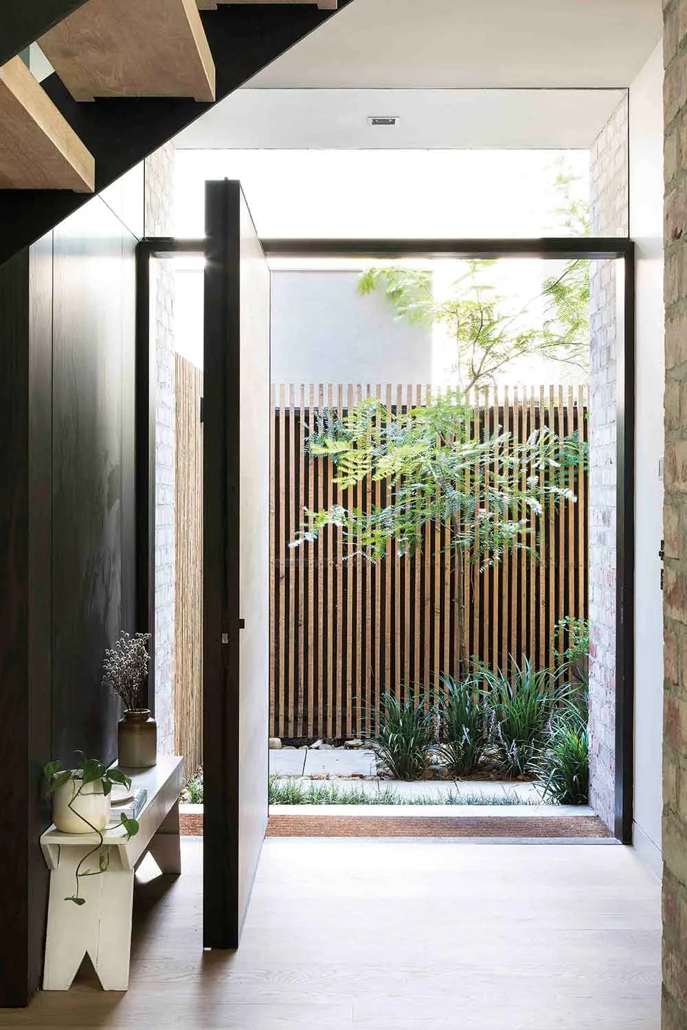
The original plan was to divide the block in two, creating one lovely house for themselves and a twin to sell, but ultimately the home’s planned size swelled by a third.
Despite this, the couple stayed true to their original intention, which was not to overbuild on the block, and were still able to subdivide. “We were quite clear in our minds that we didn’t want to create massive rooms just for the sake of having big rooms,” says Rachael.
“We wanted it to be quite economical in the space.”
Rachael, Homeowner
The result is a house that feels light and airy, without being overly large. There are plenty of spaces for the family to entertain and spend time together, as well as quiet nooks to get away from it all.
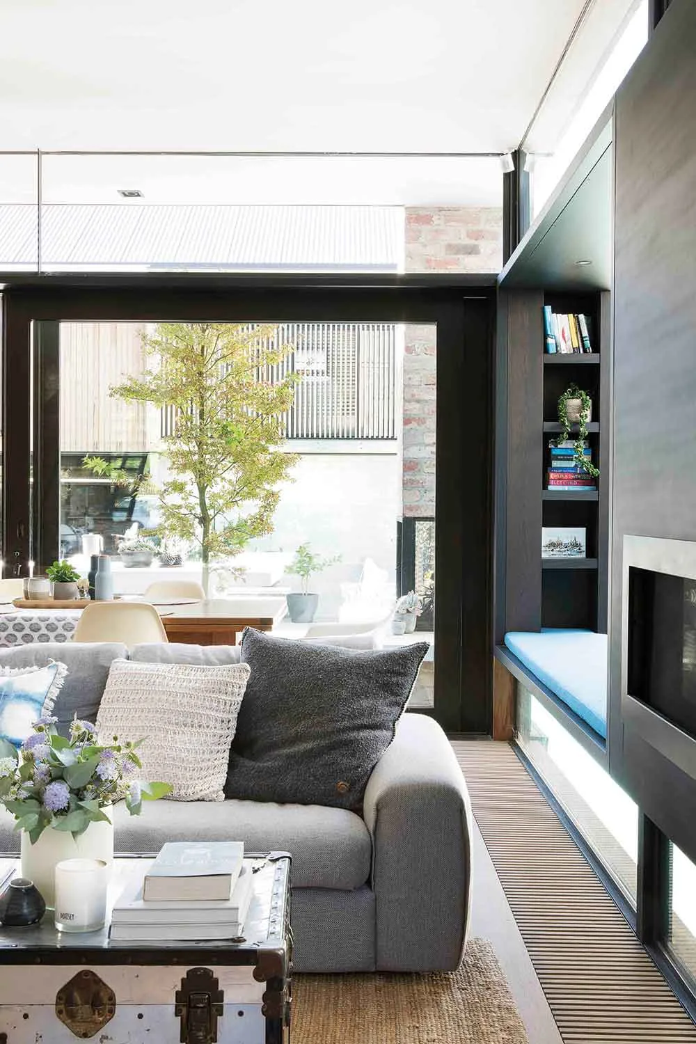
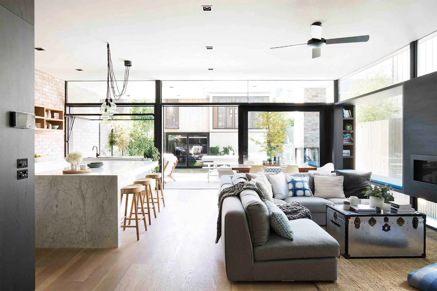
Most importantly, everything feels very connected, courtesy of a central void, internal windows and flowing open-plan spaces. The practical rooms – laundry, powder room, pantry – are hidden away in two black ‘boxes’, removing them from notice.
Alex is the co-founder of Smarter Bathrooms, so one of the couple’s major goals was to make a showpiece kitchen and two-and-a-half bathrooms. Setting the team loose on the spaces, they achieved designated chef Rachael’s dream kitchen and an award-winning bathroom design, snagging the HIA Bathroom of the Year award in 2016.
“We spent so long thinking about this house and how we wanted it to work with our family.”
Rachael, Homeowner
The pair had seen enough new builds to know what they definitely didn’t want, steering away from anything too shiny and new-looking, and leaning towards natural materials rich with texture.
“Being a brand new house, we wanted to avoid that boxy feel,” explains Rachael. Yet, building from scratch has had one amazing advantage: there’s been little need to compromise.
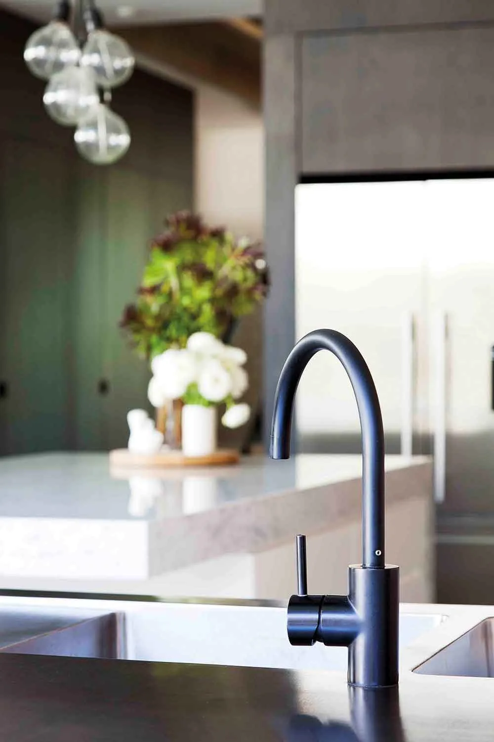
Kitchen
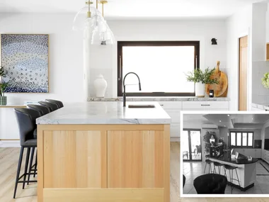
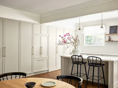
A cafe-style tilt window pushes out and up to connect the kitchen to the deck and barbecue area. The bar stools, inside and out, are from a homewares store in Sorrento. “Good bar stools are hard to find,” explains Rachael.
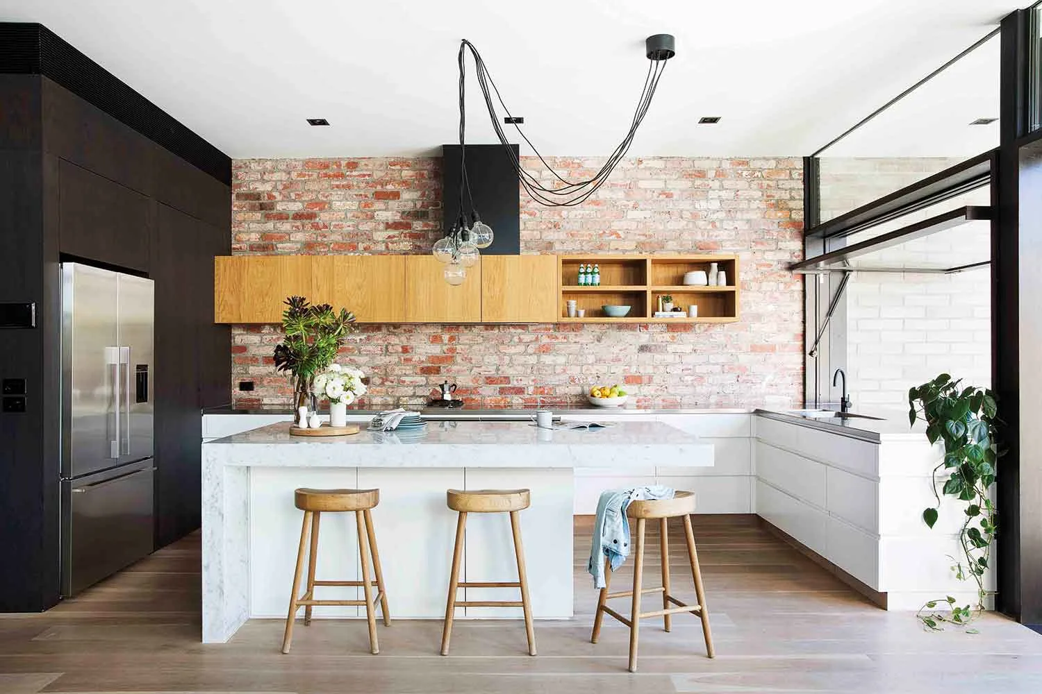
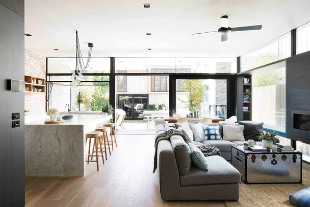
Inside echoes with touchable textures: Carrara marble, two tones of American oak veneer (dark stained and polished, and rough cut) and that stunning brick wall.
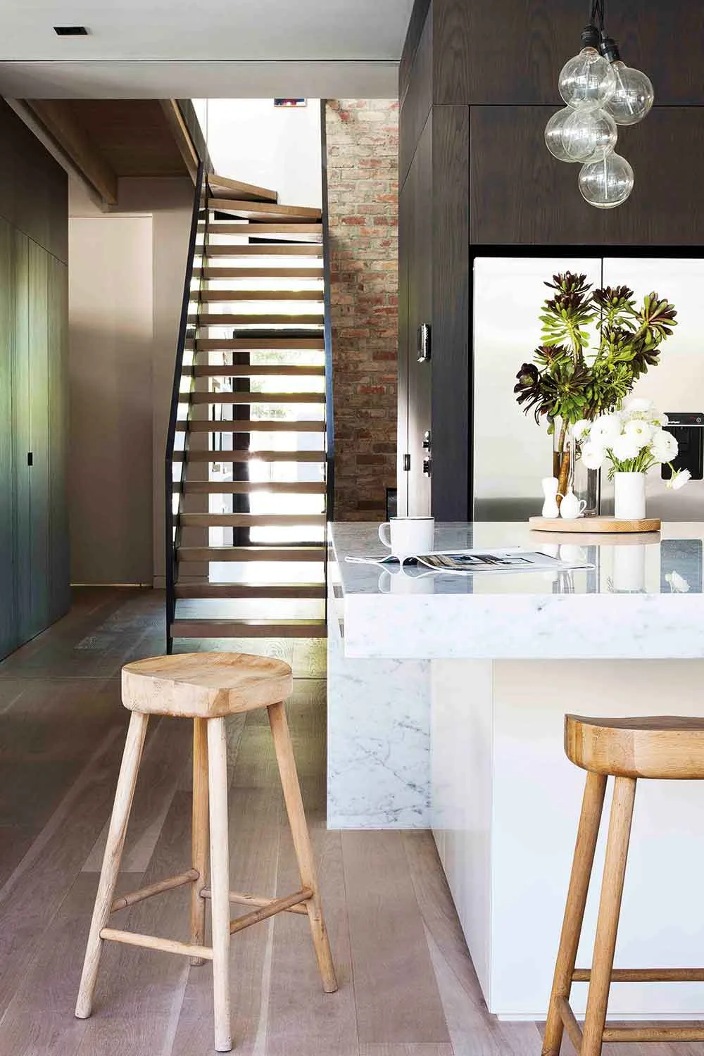
The living area is made still more snug through framing on three sides by darkness: on one side, the powder-coated steel box that houses the fireplace, and on two other sides, the American oak boxes that discreetly house utility rooms (with laundry and powder room in one, and study nook and pantry in another).
“We drew on mistakes made in the past and things we’d seen done well elsewhere.”
Rachael, Homeowner
Main bedroom
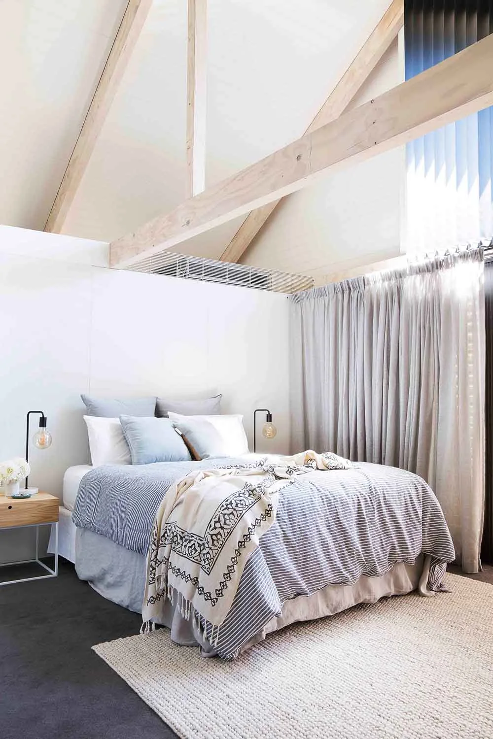
Pale timber beams and soaring double-height windows steal the show in Rachael and Alex’s bedroom, which needs little more by way of adornment than a simple choice of essential furnishings: bedsides from Globe West, lamps from Freedom and a striped linen duvet and throw from Cultiver. The half wall conceals the walk-in wardrobe.
“The difference with living in a brand new house that we’ve had complete control over is that it’s completely finished and it’s exactly what we wanted.”
Rachael, Homeowner
Bathrooms
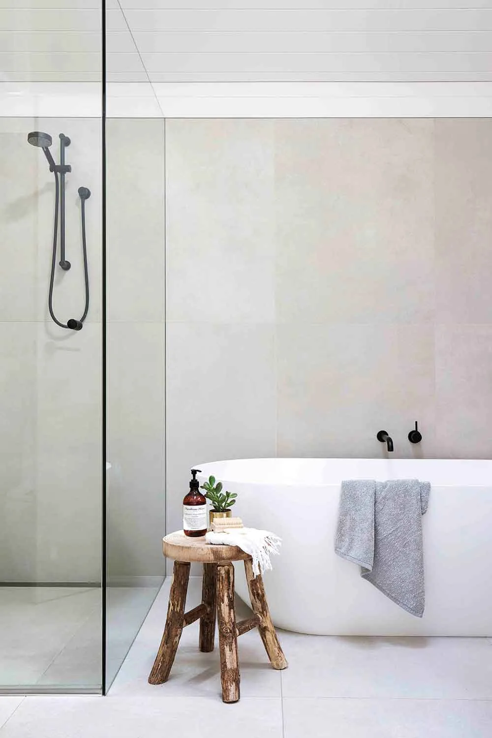
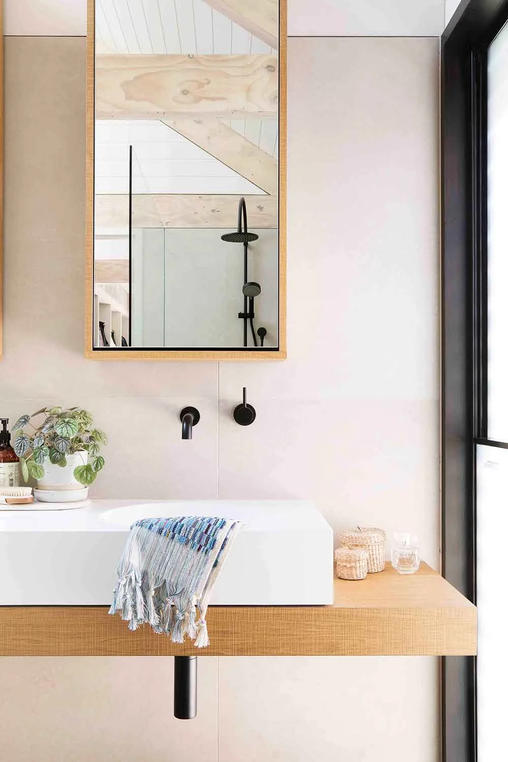
With Alex and the Smarter Bathrooms crew on the case, the bathrooms were always going to be the showpieces of the house. Using the same tiles, fixtures and fittings in each, the rooms offer a calming continuity – both are lined in huge tiles. Combined with colour-matched (and mould-resistent) epoxy grout, Rachael says, “it reads almost as one massive tile, rather than lots of smaller ones”. Elegant Clearwater ‘Formoso’ baths and black Astra Walker tapware epitomise simple sophistication.
“We wanted the house to have a lot of texture and be a bit Scandi, but warm and not too bare or minimal”
Rachael
That lived-in look
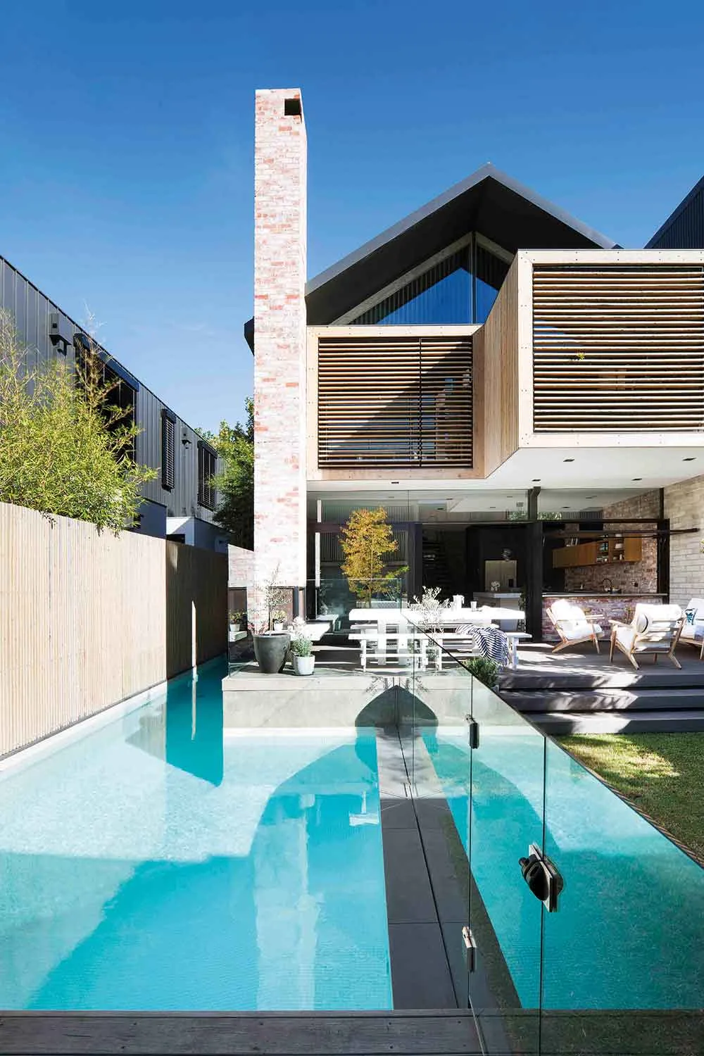
While Alex and Rachael’s property is a brand-spanking new build, the couple was keen to avoid a show-home look, so opted for multiple layers of matt and recycled materials. From the back, a towering chimney of recycled brick rises from a wood-burning outdoor fire, while cypress timber panelling upstairs adds wonderful texture and warmth. An 18-metre lap pool, including a splash zone for the couple’s teenage children (and friends), was a must-have, while a sizeable deck is ideal for entertaining a crowd.
 Shania Shegedyn
