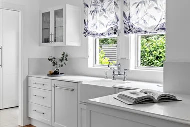
We bring you up to date with the latest looks and how to make them work in your own kitchen design.
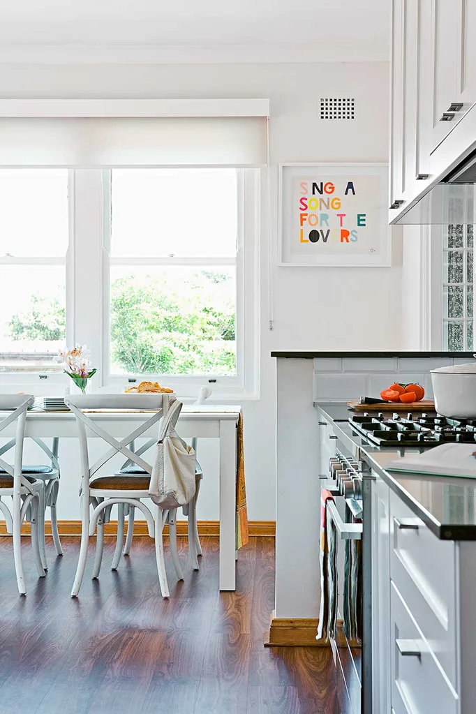
1. Nib wall
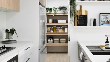
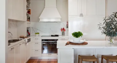
Including a nib wall in your kitchen layout can be a great way to resolve the safety issues around the placement of your stove. Whilst building codes vary from state-to-state they are important to adhere to, however complying with them can often play havoc with the placement of appliances in relation to the rest of the room. A nib wall separates the spaces whilst maintaining the feeling of openness in the kitchen for air, and traffic flow.
2. Break up colour blocks
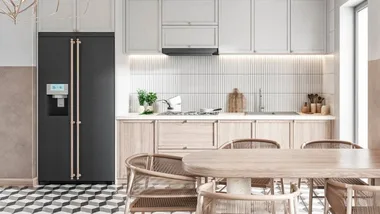
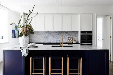
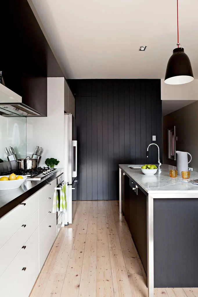
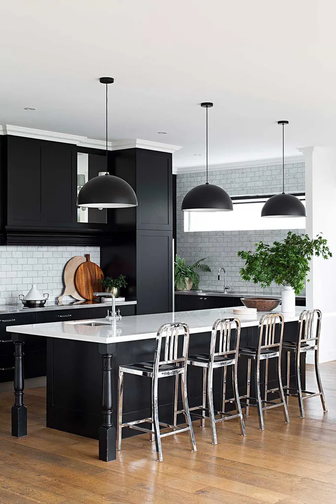
When introducing bold sections of colour in your kitchen space, break it up with whites and textures on some surfaces in between. Consider your flooring as a colour block itself and choose tones for your cabinetry that are complimentary. Dark coloured walls or cabinetry makes a stronger statement when broken up with a mixture light or white cabinetry in the island or overhead cupboards, rather than applying it everywhere.
3. Add interest with collectibles
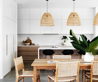
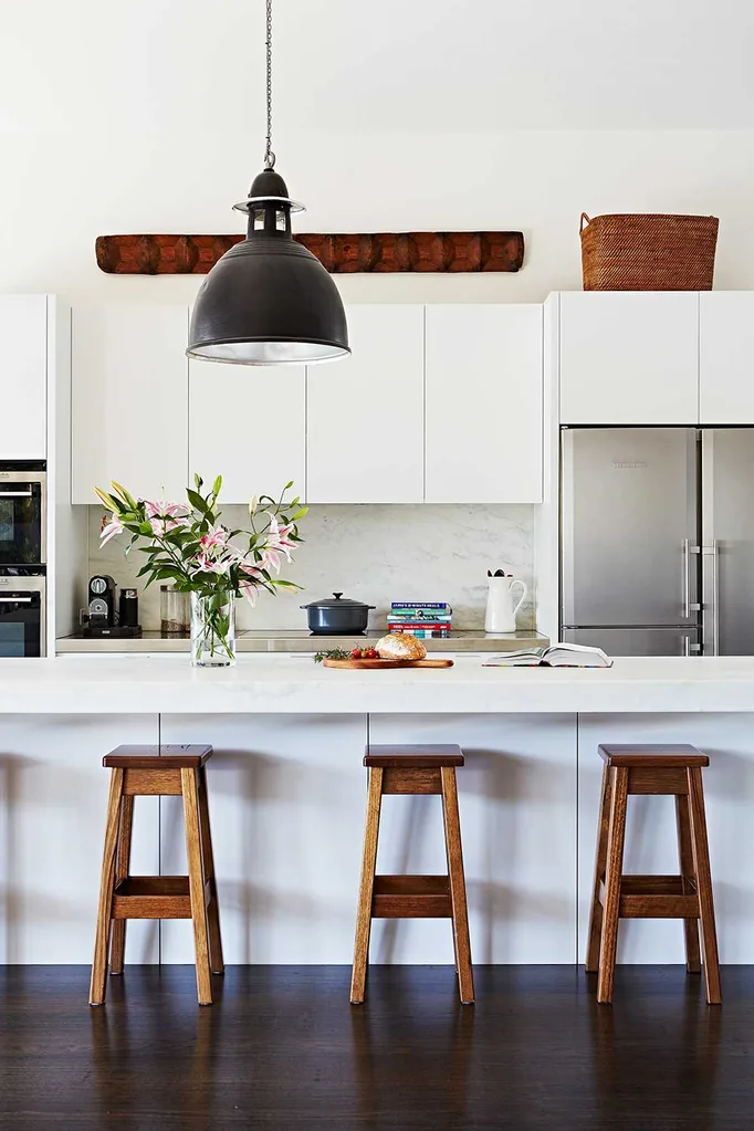
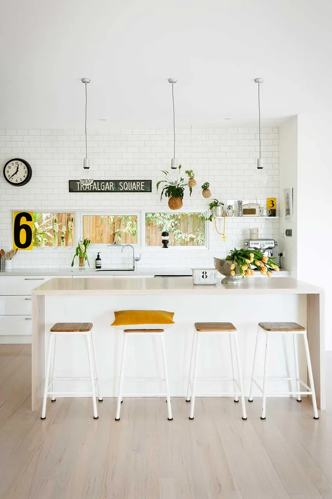
Items you have collected in your travels serve well as decorative accents in a kitchen to add texture and interest. An all-white kitchen is softened from the addition of timber and woven baskets; use handmade ceramics in platters and jugs to display fruit and flowers.
4. Balance odd with even & use a mixture of surfaces
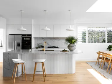
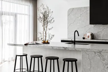
Displaying decorative items in multiples of three is a good rule of thumb when designing your layout. Where this is not possible, try to throw to another grouping within the room to create balance. Three pendant lights work beautifully above this island bench, anchored by 4 stools. The metallic finish of the stools reflects light, rather than appearing heavy in an otherwise dark colour scheme.
5. Take it to the top
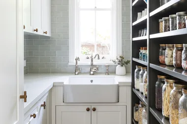
Taking these subway tiles all the way to the ceiling makes a stronger design statement than if they stopped half way up the wall. Making a feature of details in grouting, pendant lighting cords and a pale waterfall benchtop bring in texture and interest whilst keeping the palette simple and neutral. The window splashback borrows from the garden outside to bring in green and timber tones.
For more inspiration click here.
 Marcel Aucar
